by Calculated Risk on 5/25/2018 03:16:00 PM
Friday, May 25, 2018
Lawler: "US Deaths Jumped in 2017"
From housing economist Tom Lawler: US Deaths Jumped in 2017
Provisional estimates from the National Center for Health Statistics (NCHS) indicate that the number of US deaths increased sharply last year, both in absolute terms and adjusted for age. According to the NCHS’ “mortality dashboard”, the “crude” US death rate (deaths per 100,000 of population) averaged 866.2 in 2017, up from 839.3 in 2016. The NCHS’ “age-adjusted” death rate (which adjusts for the changing age distribution of the population) for 2017 was 733.6, up from 728.8 in 2017 and the highest age-adjusted death rate since 2011. These data suggest that the total number of US deaths last year was around 2.821 million, compared to 2.744 million in 2016.
While data on deaths by age (or full-year deaths by cause) are not yet available, these data suggest that the recent alarming trend of significantly higher death rates among teenagers and non-elderly adults (shown in the table below) continued last year.
| US Death Rates (deaths per 100,000 population), Total and Selected Age Groups (NCHS) | ||||||||
|---|---|---|---|---|---|---|---|---|
| 2017 | 2016 | 2015 | 2014 | 2013 | 2012 | 2011 | 2010 | |
| All Ages | 866.2 | 839.3 | 844.0 | 823.7 | 821.5 | 810.2 | 807.3 | 799.5 |
| <1 | 587.0 | 589.6 | 588.0 | 594.7 | 599.3 | 600.1 | 623.4 | |
| 1-4 | 25.2 | 24.9 | 24.0 | 25.5 | 26.3 | 26.3 | 26.5 | |
| 5-14 | 13.4 | 13.2 | 12.7 | 13.0 | 12.6 | 13.2 | 12.9 | |
| 15-24 | 74.9 | 69.5 | 65.5 | 64.8 | 66.4 | 67.7 | 67.7 | |
| 25-34 | 129.0 | 116.7 | 108.4 | 106.1 | 105.4 | 104.7 | 102.9 | |
| 35-44 | 192.2 | 180.1 | 175.2 | 172.0 | 170.7 | 172.0 | 170.5 | |
| 45-54 | 405.5 | 404.0 | 404.8 | 406.1 | 405.4 | 409.8 | 407.1 | |
| 55-64 | 883.8 | 875.3 | 870.3 | 860.0 | 854.2 | 849.4 | 851.9 | |
| 65-74 | 1788.6 | 1796.8 | 1786.3 | 1802.1 | 1802.5 | 1846.2 | 1875.1 | |
| 75-84 | 4474.8 | 4579.2 | 4564.2 | 4648.1 | 4674.5 | 4753.0 | 4790.2 | |
| 85+ | 13392.1 | 13673.9 | 13407.9 | 13660.4 | 13678.6 | 13779.3 | 13934.3 | |
| Age Adjusted | 733.6 | 728.8 | 733.1 | 724.6 | 731.9 | 732.8 | 741.3 | 747.0 |
What is especially striking about this table is the substantial increase in death rates for the 15-44 year old age groups from 2014 to 2016.
While full-year provisional estimates of deaths by cause are not yet available, here are some death rates by selected causes for the four-quarters ending in the second quarter.
| Death Rate (per 100,000 population) by Selected Cause | |||
|---|---|---|---|
| Four Quarter Period Ended: | Drug Overdose | Firearm Injury | Suicide |
| Q2/2017 | 21.0 | 14.1 | 11.6 |
| Q2/2016 | 17.8 | 13.8 | 12.2 |
With respect to drug overdose deaths, the “trending” quarterly data suggest that drug overdose deaths in 2017 were probably around 70,000. Here is a table showing recent history
| Drug Overdose Deaths by Selected Age Groups, NCHS | ||||||||
|---|---|---|---|---|---|---|---|---|
| 15-24 | 25-34 | 35-44 | 45-54 | 55-64 | 65+ | Total | ||
| 2012 | 3,518 | 8,508 | 8,948 | 11,895 | 6,423 | 2,094 | 41,386 | |
| 2013 | 3,664 | 8,947 | 9,320 | 12,045 | 7,551 | 2,344 | 43,871 | |
| 2014 | 3,798 | 10,055 | 10,134 | 12,263 | 8,122 | 2,568 | 46,940 | |
| 2015 | 4,235 | 11,880 | 11,505 | 12,974 | 8,901 | 2,760 | 52,255 | |
| 2016 | 5,376 | 15,443 | 14,183 | 14,771 | 10,632 | 3,075 | 63,480 | |
| 2017 | 70,0001 | |||||||
| 1estimate | ||||||||
For folks who rely on Census population projections to forecast other variables such as labor force growth, household growth, etc., these recent death statistics suggest that they should not do so. The latest Census long-term population projections not only did not reflect the increased death rates for certain age groups from 2014 to 2016, but also assumed that death rates for most age groups would decline from the assumed rates for 2017. E.g., here is a table showing the projected deaths in the Census population projections (released earlier this year) for the year ended 6/30/2017 compared to the NCHS data for deaths for calendar year 2016.
| Age Group | Census 2017 Projections 7/1/15-6/30/17 | NCHS 2016 (Calendar Year) | Difference |
|---|---|---|---|
| <1 | 39,741 | 23,161 | 16,580 |
| 1-4 | 8,482 | 4,045 | 4,437 |
| 5-9 | 2,422 | 2,490 | -68 |
| 10-14 | 2,883 | 3,013 | -130 |
| 15-24 | 23,543 | 32,575 | -9,032 |
| 25-34 | 43,981 | 57,616 | -13,635 |
| 35-44 | 62,599 | 77,792 | -15,193 |
| 45=54 | 151,976 | 173,516 | -21,540 |
| 55-64 | 330,420 | 366,445 | -36,025 |
| 65-74 | 493,422 | 512,080 | -18,658 |
| 75-84 | 619,610 | 636,916 | -17,306 |
| >85 | 909,723 | 854,462 | 55,261 |
| N/A | 137 | -137 | |
| Total | 2,688,802 | 2,744,248 | -55,446 |
Note that the latest Census population projections were dramatically too high for infant deaths (they made a mistake) and too high for the very elderly, but way too low for the 15-84 year old groups.
Here is another table comparing the death assumptions in the latest Census population projection to NCHS data.
| Census 2017 Projections 12 month period ended 6/30 | NCHS Calendar Year | |
|---|---|---|
| 2016 | 2,744,248 | |
| 2017 | 2,688,802 | 2,821,379* |
| 2018 | 2,717,297 | |
| 2019 | 2,744,661 | |
| 2020 | 2,772,160 |
If death rates by age were to move back down to 2016 levels from 2018 to 2020, then deaths from 2018 to 2020 would cumulatively be about 260,000 higher than those in the Census’ latest projection. However, deaths of 15-84 year olds would be whopping 496,000 higher over this three year period than what is shown in the Census’ latest projections, while deaths of 85 year olds and older would be about 180,000 fewer. These are actually fairly large number.
Net, the latest provisional data on US deaths is bad news from a societal perspective. They also indicate that the latest Census population projections are of limited usefulness, and analysts relying on population projection to forecast other key variables must actually produce their own population projections based on reasonable assessments of population growth’s key drivers – births, deaths, and net international migration – the latter of which is an even thornier issue, which I won’t touch on today.
Sometime in the near future I will produce updated population projections by age incorporating the recently release “Vintage 2017” estimates, more realistic death assumptions, and different scenarios for net international migration.
Q2 GDP Forecasts
by Calculated Risk on 5/25/2018 11:18:00 AM
From Merrill Lynch:
On balance, today's data added a tenth to 2Q GDP tracking, to 3.5% qoq saar [May 25 estimate].From Goldman Sachs:
emphasis added
[W]e are lowering our Q2 GDP tracking estimate by one tenth to +3.4% (qoq ar). [May 24 estimate]And from the Altanta Fed: GDPNow
The GDPNow model estimate for real GDP growth (seasonally adjusted annual rate) in the second quarter of 2018 is 4.0 percent on May 25, down from 4.1 percent on May 16. [May 25 estimate]From the NY Fed Nowcasting Report
The New York Fed Staff Nowcast stands at 3.0% for 2018:Q2. [May 25 estimate]CR Note: These early estimates suggest real annualized GDP in the 3% to 4% in Q2.
Fed Chair Powell: "Financial Stability and Central Bank Transparency"
by Calculated Risk on 5/25/2018 09:30:00 AM
An excerpt from Fed Chair Jerome Powell's comments at "350 years of Central Banking: The Past, the Present and the Future," in Stockholm, Sweden: Financial Stability and Central Bank Transparency
The post-crisis framework remains novel and unfamiliar. Some of these new policies, such as stress testing and resolution planning, are inherently complex and challenging for all involved. As a result, transparency and accountability around financial stability tools present particular challenges. We will continue to strive to find better ways to enhance transparency around our approach to preserving financial stability. Efforts to engage with the public‑‑including consumer groups, academics, and the financial sector‑‑are likely to lead to improved policies. Moreover, ongoing dialogue will work to enhance public trust, as well as our ability to adapt to new threats as they emerge.
There is every reason to expect that technology and communications will continue to rapidly evolve, and to affect the financial system and financial stability in ways that we cannot fully anticipate. While future innovations may well improve the delivery of financial services and make the system stronger, they may also contain the seeds of potential future systemic vulnerabilities. We will need to keep up with the pace of innovation, which will doubtless require changes to our approach to financial stability. As we consider such changes, it will remain critically important to provide transparency and accountability. By doing so, we strengthen the foundation of democratic legitimacy that enables central banks to serve the needs of our citizens, in the long and proud tradition of the Riksbank.
Thursday, May 24, 2018
Friday: Durable Goods
by Calculated Risk on 5/24/2018 08:43:00 PM
Friday:
• At 8:30 AM, Durable Goods Orders for April from the Census Bureau. The consensus is for a 1.3% decrease in durable goods orders.
• At 9:20 AM, Panel Discussion, Fed Chair Jerome Powell, Financial Stability and Central Bank Transparency, At the Sveriges Riksbank Conference: 350 Years of Central Banking--The Past, The Present and The Future, Stockholm, Sweden
• At 10:00 AM, University of Michigan's Consumer sentiment index (Final for May). The consensus is for a reading of 99.0, up from 98.8.
Housing Inventory Tracking
by Calculated Risk on 5/24/2018 03:59:00 PM
Update: Watching existing home "for sale" inventory is very helpful. As an example, the increase in inventory in late 2005 helped me call the top for housing.
And the decrease in inventory eventually helped me correctly call the bottom for house prices in early 2012, see: The Housing Bottom is Here.
And in 2015, it appeared the inventory build in several markets was ending, and that boosted price increases.
I don't have a crystal ball, but watching inventory helps understand the housing market.
Here is a table from housing economist Tom Lawler showing the year-over-year (YoY) change for National inventory from the NAR, and the YoY change for California from the CAR.
It appears the YoY declines are slowing nationally, and inventory has started to increase YoY in California.
| YOY % Change, Existing SF Homes for Sale | ||
|---|---|---|
| NAR (National) | CAR (California) | |
| Sep-17 | -8.4% | -11.2% |
| Oct-17 | -10.4% | -11.5% |
| Nov-17 | -9.7% | -11.5% |
| Dec-17 | -11.5% | -12.0% |
| Jan-18 | -9.5% | -6.6% |
| Feb-18 | -8.6% | -1.3% |
| Mar-18 | -7.2% | -1.0% |
| Apr-18 | -6.3% | 1.9% |
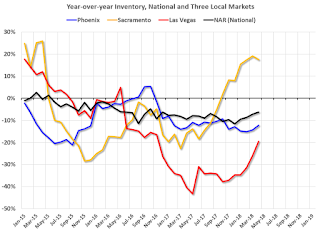
The graph below shows the year-over-year change for non-contingent inventory in Las Vegas, Phoenix and Sacramento (through April), and also total existing home inventory as reported by the NAR (also through April 2018).
 Click on graph for larger image.
This shows the year-over-year change in inventory for Phoenix, Sacramento, and Las Vegas. The black line if the year-over-year change in inventory as reported by the NAR.
Note that inventory in Sacramento was up 18% year-over-year in April (inventory was still very low), and has increased year-over-year for seven consecutive months.
Also note that inventory is still down in Las Vegas (red), but the YoY decline has been getting smaller.
Inventory is a key for the housing market, and I will be watching inventory for the impact of the new tax law and higher mortgage rates on housing. Currently I expect national inventory to be up YoY by the end of 2018 (but still be low).
A Few Comments on April Existing Home Sales
by Calculated Risk on 5/24/2018 01:08:00 PM
Earlier: NAR: "Existing-Home Sales Slide 2.5 Percent in April"
A few key points:
1) As usual, housing economist Tom Lawler's forecast was closer to the NAR report than the consensus. See: Lawler: Early Read on Existing Home Sales in April.
2) Inventory is still very low and falling year-over-year (YoY) with inventory down 6.3% year-over-year in March). This was the 35th consecutive month with a year-over-year decline in inventory, however the YoY declines have been getting smaller. And some areas of the country are now reporting YoY increases in inventory.
More inventory would probably mean smaller price increases, and less inventory somewhat larger price increases.
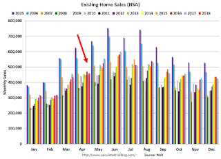
The following graph shows existing home sales Not Seasonally Adjusted (NSA).

Sales NSA in April (460,000, red column) were above sales in April 2017 (447,000, NSA).
Sales NSA through April are down about 1% from the same period in 2017.
This is a small decline - and it is too early to tell if there is an impact from higher interest rates and / or the changes to the tax law on home sales.
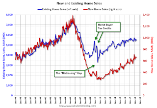
And here is another update to the "distressing gap" graph that I first started posting a number of years ago to show the emerging gap caused by distressed sales. Now I'm looking for the gap to close over the next several years.

Following the housing bubble and bust, the "distressing gap" appeared mostly because of distressed sales. The gap has persisted even though distressed sales are down significantly, since new home builders focused on more expensive homes.
I expect existing home sales to move more sideways, and I expect this gap to slowly close, mostly from an increase in new home sales.
However, this assumes that the builders will offer some smaller, less expensive homes. If not, then the gap will persist.

This ratio was fairly stable from 1994 through 2006, and then the flood of distressed sales kept the number of existing home sales elevated and depressed new home sales. (Note: This ratio was fairly stable back to the early '70s, but I only have annual data for the earlier years).
In general the ratio has been trending down since the housing bust, and this ratio will probably continue to trend down over the next several years.
Note: Existing home sales are counted when transactions are closed, and new home sales are counted when contracts are signed. So the timing of sales is different.
Kansas City Fed: Regional Manufacturing Activity "Continued to Expand Rapidly" in May
by Calculated Risk on 5/24/2018 11:00:00 AM
From the Kansas City Fed: Tenth District Manufacturing Activity Continued to Expand Rapidly
The Federal Reserve Bank of Kansas City released the May Manufacturing Survey today. According to Chad Wilkerson, vice president and economist at the Federal Reserve Bank of Kansas City, the survey revealed that Tenth District manufacturing activity continued to expand at a rapid pace, and optimism remained high for future activity.So far all of the regional Fed surveys have shown strong growth in May.
“Our composite index rose to another record high in May, with continued optimism for future growth,” said Wilkerson. “Prices indexes were stable but remained at high levels.”
...
The month-over-month composite index was 29 in May, up from readings of 26 in April and 17 in March. The composite index is an average of the production, new orders, employment, supplier delivery time, and raw materials inventory indexes. Factory activity increased at both durable and nondurable goods plants, particularly at nondurable plants producing chemicals and food. Most month-over-month indexes continued to rise. The production index jumped from 33 to 41, and the shipments, new orders, and new orders for exports indexes also moved higher. In contrast, the order backlog and employment indexes eased somewhat. The raw materials inventory index edged up from 17 to 19, and the finished goods inventory index also increased.
emphasis added
NAR: "Existing-Home Sales Slide 2.5 Percent in April"
by Calculated Risk on 5/24/2018 10:09:00 AM
From the NAR: Existing-Home Sales Slide 2.5 Percent in April
After moving upward for two straight months, existing-home sales retreated in April on both a monthly and annualized basis, according to the National Association of Realtors®. All four major regions saw no gain in sales activity last month.
Total existing-home sales, which are completed transactions that include single-family homes, townhomes, condominiums and co-ops, decreased 2.5 percent to a seasonally adjusted annual rate of 5.46 million in April from 5.60 million in March. With last month’s decline, sales are now 1.4 percent below a year ago and have fallen year-over-year for two straight months.
...
Total housing inventory at the end of April increased 9.8 percent to 1.80 million existing homes available for sale, but is still 6.3 percent lower than a year ago (1.92 million) and has fallen year-over-year for 35 consecutive months. Unsold inventory is at a 4.0-month supply at the current sales pace (4.2 months a year ago).
emphasis added
 Click on graph for larger image.
This graph shows existing home sales, on a Seasonally Adjusted Annual Rate (SAAR) basis since 1993.
Sales in April (5.46 million SAAR) were 2.5% lower than last month, and were 1.4% below the April 2017 rate.
The second graph shows nationwide inventory for existing homes.
 According to the NAR, inventory increased to 1.80 million in April from 1.67 million in March. Headline inventory is not seasonally adjusted, and inventory usually decreases to the seasonal lows in December and January, and peaks in mid-to-late summer.
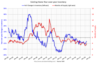
The last graph shows the year-over-year (YoY) change in reported existing home inventory and months-of-supply. Since inventory is not seasonally adjusted, it really helps to look at the YoY change. Note: Months-of-supply is based on the seasonally adjusted sales and not seasonally adjusted inventory.
 Inventory decreased 6.3% year-over-year in April compared to April 2017.
 Months of supply was at 4.0 months in April.
Sales were below the consensus view. For existing home sales, a key number is inventory - and inventory is still low. I'll have more later ...
Weekly Initial Unemployment Claims increase to 234,000
by Calculated Risk on 5/24/2018 08:33:00 AM
The DOL reported:
In the week ending May 19, the advance figure for seasonally adjusted initial claims was 234,000, an increase of 11,000 from the previous week's revised level. The previous week's level was revised up by 1,000 from 222,000 to 223,000. The 4-week moving average was 219,750, an increase of 6,250 from the previous week's revised average. The previous week's average was revised up by 250 from 213,250 to 213,500.The previous week was revised up.
Claims taking procedures in Puerto Rico and in the Virgin Islands have still not returned to normal.
emphasis added
The following graph shows the 4-week moving average of weekly claims since 1971.
 Click on graph for larger image.
The dashed line on the graph is the current 4-week average. The four-week average of weekly unemployment claims increased to 219,750.
This was higher than the consensus forecast. The low level of claims suggest few layoffs.
Wednesday, May 23, 2018
Thursday: Unemployment Claims, Existing Home Sales
by Calculated Risk on 5/23/2018 08:31:00 PM
Thursday:
• At 8:30 AM ET: The initial weekly unemployment claims report will be released. The consensus is for 220 thousand initial claims, down from 222 thousand the previous week.
• At 9:00 AM: FHFA House Price Index for March 2018. This was originally a GSE only repeat sales, however there is also an expanded index.
• At 10:00 AM: Existing Home Sales for April from the National Association of Realtors (NAR). The consensus is for 5.60 million SAAR, unchanged from 5.60 million in March. Housing economist Tom Lawler estimates the NAR will reports sales of 5.48 million SAAR for April.
• At 11:00 AM: the Kansas City Fed manufacturing survey for May.


