by Calculated Risk on 3/30/2017 04:46:00 PM
Thursday, March 30, 2017
Census: "One-third of the adult population in the United States has a bachelor’s degree or higher"
From the Census Bureau: More than one-third of the adult population in the United States has a bachelor’s degree or higher
More than one-third of the adult population in the United States has a bachelor’s degree or higher marking the first time in decades of data.
“The percentage rose to 33.4 percent in 2016, a significant milestone since the Current Population Survey began collecting educational attainment in 1940,” said Kurt Bauman, Chief of the Education and Social Stratification Branch. “In 1940, only 4.6 percent had reached that level of education.”
In 2010, less than 30 percent of those 25 and older had completed a bachelor’s degree or higher, and in 2006, 28 percent had reached that level of education.
emphasis added
 This graph shows the percent of adults, 25 years and older, with a bachelor's degree or higher.
 More education is one of the reasons I've argued the Future is Bright!
Hotels: Hotel Occupancy Rate Solid in March
by Calculated Risk on 3/30/2017 11:23:00 AM
After some weakness early in the year, hotel occupancy has picked up in recent weeks and is now close to the record year (2015 was the record).
From HotelNewsNow.com: STR: US hotel results for week ending 25 March
U.S. hotels saw year-over-year performance increases for the week of 19-25 March. Occupancy rose 5% to 68.7%, ADR increased 2.9% to $127.68 and RevPAR jumped 7.9% to $87.75.The following graph shows the seasonal pattern for the hotel occupancy rate using the four week average.
STR analysts note that performance growth was boosted by an Easter calendar shift (27 March 2016). In comparison with the week of 20-26 March 2016, the industry reported the following in year-over-year comparisons:
Occupancy: +5.0% to 68.7%
Average daily rate (ADR): +2.9% to US$127.68
Revenue per available room (RevPAR): +7.9% to US$87.75
emphasis added
 The red line is for 2017, dashed is 2015, blue is the median, and black is for 2009 - the worst year since the Great Depression for hotels.
2015 was the best year on record for hotels.
For hotels, occupancy will now move mostly sideways until the summer travel season.
Data Source: STR, Courtesy of HotelNewsNow.com
Weekly Initial Unemployment Claims decrease to 258,000
by Calculated Risk on 3/30/2017 08:40:00 AM
The DOL reported:
In the week ending March 25, the advance figure for seasonally adjusted initial claims was 258,000, a decrease of 3,000 from the previous week's unrevised level of 261,000. The 4-week moving average was 254,250, an increase of 7,750 from the previous week's unrevised average of 246,500.The previous week was revised up.
emphasis added
The following graph shows the 4-week moving average of weekly claims since 1971.
 Click on graph for larger image.
The dashed line on the graph is the current 4-week average. The four-week average of weekly unemployment claims increased to 254,250.
This was above the consensus forecast.
The low level of claims suggests relatively few layoffs.
Wednesday, March 29, 2017
Thursday: GDP, Unemployment Claims
by Calculated Risk on 3/29/2017 06:03:00 PM
From Matthew Graham at Mortgage News Daily: Mortgage Rates Steady, Depending on Lender
Compared to yesterday, today's mortgage rates are a moving target depending on the lender. Some are better. Some are worse. On average, rates are unchanged from yesterday's latest rate sheets. The variability has to do with yesterday's fairly sharp losses in bond markets (which dictate rates).Thursday:
...
4.25% remains the most prevalently-quoted conventional 30yr fixed rate for top tier scenarios.
emphasis added
• At 8:30 AM ET, The initial weekly unemployment claims report will be released. The consensus is for 247 thousand initial claims, down from 258 thousand the previous week.
• Also at 8:30 AM, Gross Domestic Product, 4th quarter 2016 (third estimate). The consensus is that real GDP increased 2.0% annualized in Q4, up from the second estimate of 1.9%.
Zillow Forecast: "Case-Shiller national index is forecast to grow 6 percent year-over-year" in February
by Calculated Risk on 3/29/2017 11:55:00 AM
The Case-Shiller house price indexes for January were released yesterday. Zillow forecasts Case-Shiller a month early, and I like to check the Zillow forecasts since they have been pretty close.
From Zillow: February Case-Shiller Forecast: Year-Over-Year Price Gains to Continue
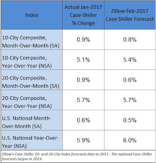
Annual gains in the S&P CoreLogic Case-Shiller home price indices are expected to maintain their smoking pace in February, while month-over-month gains are expected to slow, according to Zillow’s February Case-Shiller forecast.The year-over-year change for the Case-Shiller national index will probably increase in February.
The February Case-Shiller national index is forecast to grow 6 percent year-over-year and 0.5 percent from January, up from January’s 5.9 percent annual growth but down a bit from its 0.6 percent monthly growth. The smaller 10- and 20-city indices are expected to post annual growth of 5.4 percent and 5.7 percent, respectively, up from 5.1 percent for the 10-city index and even with the 20-city index’s performance in January.
The 10- and 20-city indices are projected to post seasonally adjusted, month-over-month gains of 0.8 percent and 0.6 percent, respectively. Both would represent slowing from the 0.9 percent growth they each saw between December and January.
Zillow’s February Case-Shiller forecast is shown below. These forecasts are based on today’s January Case-Shiller data release and the February 2017 Zillow Home Value Index. The February S&P CoreLogic Case-Shiller Indices will not be officially released until Tuesday, April 25.

NAR: Pending Home Sales Index increased 5.5% in February, up 2.6% year-over-year
by Calculated Risk on 3/29/2017 10:06:00 AM
From the NAR: Pending Home Sales Leap 5.5% in February
The Pending Home Sales Index,* www.nar.realtor/topics/pending-home-sales, a forward-looking indicator based on contract signings, jumped 5.5 percent to 112.3 in February from 106.4 in January. Last month's index reading is 2.6 percent above a year ago, is the highest since last April (113.6) and the second highest since May 2006 (112.5).This was well above expectations of a 1.8% increase for this index. The warm weather in February might have impacted this index. Note: Contract signings usually lead sales by about 45 to 60 days, so this would usually be for closed sales in March and April.
...
The PHSI in the Northeast rose 3.4 percent to 102.1 in February, and is now 6.6 percent above a year ago. In the Midwest the index jumped 11.4 percent to 110.8 in February, but is still 0.6 percent lower than February 2016.
Pending home sales in the South climbed 4.3 percent to an index of 127.8 in February and are now 4.2 percent above last February. The index in the West increased 3.1 percent in February to 97.5, but is still 0.2 percent higher than a year ago.
emphasis added
MBA: Mortgage Applications Decrease Slightly in Latest Weekly Survey
by Calculated Risk on 3/29/2017 07:00:00 AM
From the MBA: Mortgage Applications Slightly Decrease in Latest MBA Weekly Survey
Mortgage applications decreased 0.8 percent from one week earlier, according to data from the Mortgage Bankers Association’s (MBA) Weekly Mortgage Applications Survey for the week ending March 24, 2017.
... The Refinance Index decreased 3 percent from the previous week. The seasonally adjusted Purchase Index increased 1 percent from one week earlier. The unadjusted Purchase Index increased 2 percent compared with the previous week and was 4 percent higher than the same week one year ago.
...
The average contract interest rate for 30-year fixed-rate mortgages with conforming loan balances ($424,100 or less) decreased to 4.33 percent from 4.46 percent, with points increasing to 0.43 from 0.41 (including the origination fee) for 80 percent loan-to-value ratio (LTV) loans
emphasis added
 Click on graph for larger image.
The first graph shows the refinance index since 1990.
Refinance activity remains low - and would not increase significantly unless rates fall sharply.
 The second graph shows the MBA mortgage purchase index.
 Even with the increase in mortgage rates over the last few months, purchase activity is still holding up.
However refinance activity has declined significantly since rates increased.
Tuesday, March 28, 2017
A few comments on the Seasonal Pattern for House Prices
by Calculated Risk on 3/28/2017 05:33:00 PM
CR Note: This is a repeat of a previous post with updated graphs.
A few key points:
1) There is a clear seasonal pattern for house prices.
2) The surge in distressed sales during the housing bust distorted the seasonal pattern.
3) Even though distressed sales are down significantly, the seasonal factor is based on several years of data - and the factor is now overstating the seasonal change (second graph below).
4) Still the seasonal index is probably a better indicator of actual price movements than the Not Seasonally Adjusted (NSA) index.
For in depth description of these issues, see Trulia chief economist Jed Kolko's article "Let’s Improve, Not Ignore, Seasonal Adjustment of Housing Data"
Note: I was one of several people to question the change in the seasonal factor (here is a post in 2009) - and this led to S&P Case-Shiller questioning the seasonal factor too (from April 2010). I still use the seasonal factor (I think it is better than using the NSA data).

This graph shows the month-to-month change in the CoreLogic (through January 2017) and NSA Case-Shiller National index since 1987 (through January 2017). The seasonal pattern was smaller back in the '90s and early '00s, and once the bubble burst.
The seasonal swings have declined since the bubble.

The swings in the seasonal factors has started to decrease, and I expect that over the next several years - as the percent of distressed sales declines further and recent history is included in the factors - the seasonal factors will move back towards more normal levels. However, as Kolko noted, there will be a lag with the seasonal factor since it is based on several years of recent data.
Real House Prices and Price-to-Rent Ratio in January
by Calculated Risk on 3/28/2017 12:41:00 PM
Here is the earlier post on Case-Shiller: Case-Shiller: National House Price Index increased 5.9% year-over-year in January
It has been more than ten years since the bubble peak. In the Case-Shiller release this morning, the seasonally adjusted National Index (SA), was reported as being 1.9% above the previous bubble peak. However, in real terms, the National index (SA) is still about 14.5% below the bubble peak.
The year-over-year increase in prices is mostly moving sideways now just over 5%. In January, the index was up 5.9% YoY.
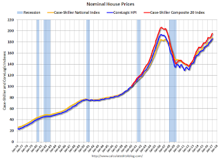
In the earlier post, I graphed nominal house prices, but it is also important to look at prices in real terms (inflation adjusted). Case-Shiller, CoreLogic and others report nominal house prices. As an example, if a house price was $200,000 in January 2000, the price would be close to $280,000 today adjusted for inflation (40%). That is why the second graph below is important - this shows "real" prices (adjusted for inflation).
Nominal House Prices

In nominal terms, the Case-Shiller National index (SA) is at a new peak, and the Case-Shiller Composite 20 Index (SA) is back to September 2005 levels, and the CoreLogic index (NSA) is back to September 2005.
Real House Prices

In real terms, the National index is back to April 2004 levels, the Composite 20 index is back to December 2003, and the CoreLogic index back to March 2004.
In real terms, house prices are back to late 2003 / early 2004 levels.
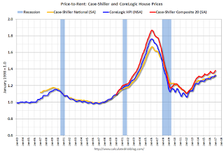
Price-to-Rent
In October 2004, Fed economist John Krainer and researcher Chishen Wei wrote a Fed letter on price to rent ratios: House Prices and Fundamental Value. Kainer and Wei presented a price-to-rent ratio using the OFHEO house price index and the Owners' Equivalent Rent (OER) from the BLS.

This graph shows the price to rent ratio (January 1998 = 1.0).
On a price-to-rent basis, the Case-Shiller National index is back to November 2003 levels, the Composite 20 index is back to August 2003 levels, and the CoreLogic index is back to July 2003.
In real terms, and as a price-to-rent ratio, prices are back to late 2003 / early 2004 - and the price-to-rent ratio maybe moving a little more sideways now.
Richmond Fed: Regional Manufacturing Activity Expanded in March
by Calculated Risk on 3/28/2017 10:56:00 AM
From the Richmond Fed: Manufacturing Firms Upbeat in March with Shipments, New Orders, and Employment Indexes Rising
Manufacturers in the Fifth District were generally upbeat in March, according to the latest survey by the Federal Reserve Bank of Richmond. The index for shipments and new orders both rose and employment gains were more common. This improvement led to a composite index for manufacturing that rose from 17 in February to 22 in March — the strongest reading for that index since April 2010. In addition to improvement in the employment index, more firms reported longer workweeks and wage increases appeared to be more widespread. ...This was the last of the regional Fed surveys for March.
emphasis added
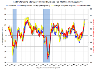
Here is a graph comparing the regional Fed surveys and the ISM manufacturing index:
 Click on graph for larger image.
The New York and Philly Fed surveys are averaged together (yellow, through March), and five Fed surveys are averaged (blue, through March) including New York, Philly, Richmond, Dallas and Kansas City. The Institute for Supply Management (ISM) PMI (red) is through February (right axis).
It seems likely the ISM manufacturing index will show solid expansion in March (to be released next week).


