 RSS Feed
 by Calculated Risk on 5/12/2015 10:09:00 AM
Tuesday, May 12, 2015
BLS: Jobs Openings at 5.0 million in March, Up 19% Year-over-year
From the BLS: Job Openings and Labor Turnover Summary
There were 5.0 million job openings on the last business day of March, little changed from 5.1 million in February, the U.S. Bureau of Labor Statistics reported today. Hires were little changed at 5.1 million in March and separations were little changed at 5.0 million....The following graph shows job openings (yellow line), hires (dark blue), Layoff, Discharges and other (red column), and Quits (light blue column) from the JOLTS.
...
Quits are generally voluntary separations initiated by the employee. Therefore, the quits rate can serve as a measure of workers’ willingness or ability to leave jobs. ... There were 2.8 million quits in March, little changed from February.
This series started in December 2000.
Note: The difference between JOLTS hires and separations is similar to the CES (payroll survey) net jobs headline numbers. This report is for March, the most recent employment report was for April.
 Click on graph for larger image.
Note that hires (dark blue) and total separations (red and light blue columns stacked) are pretty close each month. This is a measure of labor market turnover. When the blue line is above the two stacked columns, the economy is adding net jobs - when it is below the columns, the economy is losing jobs.
Jobs openings decreased in March to 4.994 million from 5.144 million in February.
The number of job openings (yellow) are up 19% year-over-year compared to March 2014.
Quits are up 14% year-over-year. These are voluntary separations. (see light blue columns at bottom of graph for trend for "quits").
This is another solid report. It is a good sign that job openings are around 5 million, and that quits are increasing solidly year-over-year.
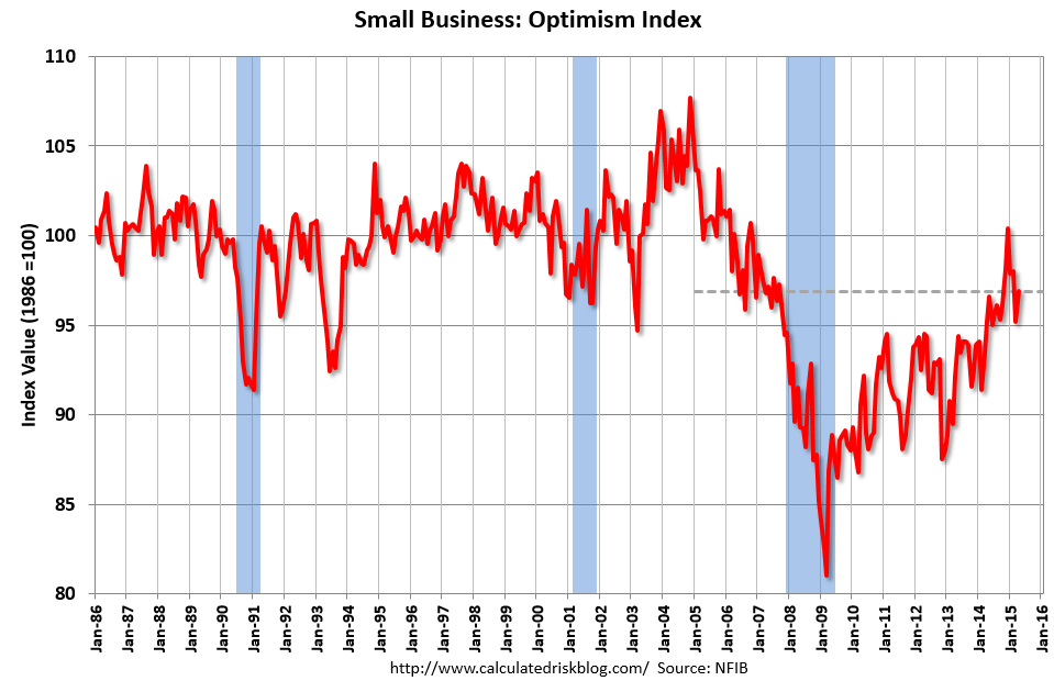
NFIB: Small Business Optimism Index increased in April
by Calculated Risk on 5/12/2015 09:06:00 AM
From the National Federation of Independent Business (NFIB): Small Business Optimism Rises, But Future Sales Cloud Outlook
The Small Business Optimism Index increased 1.7 points from March to 96.9, this in spite of a quarter of virtually no economic growth. Unfortunately, the Index remained below the January reading. Nine of the 10 Index components gained, only real sales expectations were weaker. But this still leaves the Index below its historical average, oscillating between 95 and 98 but never breaking out except for December, when the Index just tipped past 100, only to fall again.More good news: Only 11 percent of companies reported "poor sales" as the most important problem, down from 16% a year ago, and a recession high of 34%.
...
Small businesses posted another decent month of job creation. Those that hired were more aggressive than those reducing employment, producing an average increase of 0.14 workers per firm, continuing a string of solid readings for 2015. ... Twenty-seven percent of all owners reported job openings they could not fill in the current period, up 3 points from March. A net 11 percent plan to create new jobs, up 1 point and a solid reading.
emphasis added
 Click on graph for larger image.
This graph shows the small business optimism index since 1986.
The index increased to 96.9 in April from 95.2 in March.
Monday, May 11, 2015
Tuesday: Job Openings, Q1 Household Debt and Credit Report
by Calculated Risk on 5/11/2015 09:27:00 PM
A couple of posts on consumers ...
From Professor Hamilton at Econbrowser: Energy prices and consumer spending
Whatever the explanation, the facts seem to be that, unlike what we usually observed historically, consumers have been using much of the gains from lower energy prices to bolster their saving rather than using it to increase spending on other goods and services.And from Dr. Altig at Macroblog: All Eyes on the Consumer
... the "fundamentals" suggest the four-month annualized growth of consumer spending should have been in excess of 4 percent, as opposed to the approximately 1.5 percent we actually saw. That is a story we don't expect to persist, and our current view of the year is that first-quarter consumer spending results are not indicative of future performance.My sense is the increase in consumer spending will be larger in Q2.
Consumers are, of course, a forward-looking bunch, and it is possible the recent weak spending reflects a looming reality not captured by the simple model described above. But our forecast for now is that consumers will move to the fundamentals, and not vice versa.
Tuesday:
• At 9:00 AM ET, NFIB Small Business Optimism Index for April.
• At 10:00 AM, the Job Openings and Labor Turnover Survey for March from the BLS. Jobs openings increased in February to 5.133 million from 4.965 million in January. This was the highest level for job openings since January 2001. The number of job openings (yellow) were up 23% year-over-year, and Quits were up 10% year-over-year.
• At 11:00 AM, the The New York Fed will release their Q1 2015 Household Debt and Credit Report
Research: Natural Rate of Unemployment under 5% and Falling
by Calculated Risk on 5/11/2015 05:32:00 PM
From the Chicago Fed: Changing labor force composition and the natural rate of unemployment Excerpts:
We estimate our baseline natural rate of unemployment as of 2014:Q4 to be 4.9% —0.5 percentage points lower than the CBO’s estimate of the short-run natural rate. We project this rate to fall by about 0.06 percentage points per year through the end of the decade, reaching 4.5% at the end of 2020—0.7 percentage points below the CBO’s estimate.
Two broad assumptions underlie these simple calculations. First, demographics and educational attainment are fundamental determinants of unemployment, and thus, changes in them over time should drive overall levels of aggregate unemployment. Second, the unemployment rate was at its natural rate in late 2005. Both of these assumptions seem plausible, but neither is completely unassailable. ...
...
While great progress has been made over the past few years, significant labor market slack remains. We estimate the natural rate at or below 5%, at least half of a percentage point below its actual level as of March 2015. This estimate of slack, in combination with labor market measures such as LFP and involuntary part-time workers, may help explain why wage inflation and price inflation remain so low. Moreover, we estimate that absent major new developments, demographic and educational changes will persist, potentially reducing the trend unemployment rate to around 4.4% to 4.8% by 2020.
Demographics, Unemployment Rate and Inflation
by Calculated Risk on 5/11/2015 03:19:00 PM
It wasn't long ago that several FOMC members were arguing inflation would pick up when the unemployment rate declined to 6%. They were wrong with the unemployment rate now at 5.4%. I think they were looking at the '70s and ignoring the demographic differences.
The first graph shows the year-over-year change in the prime working age population (25 to 54 years old) with projections for the next 25 years.
If there is a demographic component to inflation, then we would have expected inflation to increase in the '70s, and be very low now.
Note: Ignore the steps up and down - the data was affected by changes in population controls.
The dashed red line is based on Census Bureau projections through 2040.
 Click on graph for larger image.
A key is the prime working age population was declining in the early part of this decade and has only started increasing again recently.
This is very similar to what happened in the '60s. In the early '60s, there was a slow increase in the prime working age population until the baby boomers started pouring into the labor force.
Now the prime working age population is growing again, and we can expect growth to pick up over the next decade. However there will not be as large in increase in the prime working age labor force like in the '70s and '80s.
 The second graph shows the unemployment rate and year-over-year change in CPI measured inflation.
In the 1960s, inflation didn't pickup until the unemployment rate had fallen close to 4% - and when the early baby boomers started entering the labor force.
The current period is similar to the '60s (although there won't be as large a group entering the labor force). And the current period - from a demographics perspective - is very different from the '70s and '80s.
Ignoring for the moment monetary and fiscal policy differences between the '60s and now, demographics suggests that the unemployment rate will have to fall below 5% before inflation picks up.
More Employment Graphs: Duration of Unemployment, Unemployment by Education, Construction Employment and Diffusion Indexes
by Calculated Risk on 5/11/2015 11:58:00 AM
By request, a few more employment graphs ...
Here are the previous posts on the employment report:
• April Employment Report: 223,000 Jobs, 5.4% Unemployment Rate
• Employment Report Comments and Graphs
 This graph shows the duration of unemployment as a percent of the civilian labor force. The graph shows the number of unemployed in four categories: less than 5 week, 6 to 14 weeks, 15 to 26 weeks, and 27 weeks or more.
The general trend is down for all categories, and the "less than 5 weeks", "6 to 14 weeks" and "15 to 26 weeks" are all close to normal levels.
The long term unemployed is less than 1.6% of the labor force - the lowest since November 2008 - however the number (and percent) of long term unemployed remains elevated.
 This graph shows the unemployment rate by four levels of education (all groups are 25 years and older).
Unfortunately this data only goes back to 1992 and only includes one previous recession (the stock / tech bust in 2001). Clearly education matters with regards to the unemployment rate - and it appears all four groups are generally trending down.
Although education matters for the unemployment rate, it doesn't appear to matter as far as finding new employment.
Note: This says nothing about the quality of jobs - as an example, a college graduate working at minimum wage would be considered "employed".
 This graph shows total construction employment as reported by the BLS (not just residential).
Since construction employment bottomed in January 2011, construction payrolls have increased by 951 thousand.
Construction employment is still far below the bubble peak - and below the level in the late '90s.
 The BLS diffusion index for total private employment was at 57.0 in April, down from 59.5 in March.
 For manufacturing, the diffusion index was at 50.6, up from 45.6 in March.
Think of this as a measure of how widespread job gains are across industries. The further from 50 (above or below), the more widespread the job losses or gains reported by the BLS. Above 60 is very good. From the BLS:
Figures are the percent of industries with employment increasing plus one-half of the industries with unchanged employment, where 50 percent indicates an equal balance between industries with increasing and decreasing employment.Overall private job growth was less widespread in April.
FNC: Residential Property Values increased 4.6% year-over-year in March
by Calculated Risk on 5/11/2015 09:31:00 AM
In addition to Case-Shiller, and CoreLogic, I'm also watching the FNC, Zillow and several other house price indexes.
FNC released their March 2015 index data today. FNC reported that their Residential Price Index™ (RPI) indicates that U.S. residential property values increased 0.9% from February to March (Composite 100 index, not seasonally adjusted).
The 10 city MSA increased 0.6% in March, and the 20-MSA and 30-MSA RPIs both increased by about 0.9% in March. These indexes are not seasonally adjusted (NSA), and are for non-distressed home sales (excluding foreclosure auction sales, REO sales, and short sales).
Notes: In addition to the composite indexes, FNC presents price indexes for 30 MSAs. FNC also provides seasonally adjusted data.
The year-over-year (YoY) change was slightly higher in March than in February, with the 100-MSA composite up 4.6% compared to March 2014. For FNC, the YoY increase had been slowing since peaking in March at 9.0%, but had held steady for the last few months.
The index is still down 18.6% from the peak in 2006 (not inflation adjusted).
 Click on graph for larger image.
This graph shows the year-over-year change based on the FNC index (four composites) through March 2015. The FNC indexes are hedonic price indexes using a blend of sold homes and real-time appraisals.
Most of the other indexes are also showing the year-over-year change mostly steady at around 5% for the last several months.
Note: The March Case-Shiller index will be released on Tuesday, May 26th.
Sunday, May 10, 2015
Sunday Night Futures
by Calculated Risk on 5/10/2015 08:28:00 PM
On Greece from the NY Times: I.M.F. and Central Bank Loom Large Over Greece’s Debt Talks
Greece is expected to repay 750 million euros, or $840 million, to the monetary fund on Tuesday as scheduled. For the rest of the year, however, its debt repayments to the fund and the central bank total nearly €12 billion.Monday:
...
Discussions in the Greek government have included assessing the pros and cons of not paying the central bank and the monetary fund ... a few of the debt specialists ... contend that they have a strong intellectual case for defaulting on debt owed to the central bank and the monetary fund. For too long, they assert, Greece has been stuck in a cycle of having to borrow more money to pay off maturing debts. And each time it borrows more, it must accept economic austerity measures that deflate its economy.
A result, they argue, is that five years after Greece’s first bailout, the nation’s economy has contracted by a quarter, and its debt burden is approaching 200 percent of its gross domestic product.
• At 10:00 AM ET, the Fed will release the monthly Labor Market Conditions Index (LMCI).
Weekend:
• Schedule for Week of May 10, 2015
• Lawler: Analyzing/Projecting Household Formations: It’s Not Just “Demographics”
From CNBC: Pre-Market Data and Bloomberg futures: currently S&P futures and DOW futures are mostly unchanged (fair value).
Oil prices were mixeed over the last week with WTI futures at $59.30 per barrel and Brent at $65.41 per barrel. A year ago, WTI was at $100, and Brent was at $108 - so, even with the recent increases, prices are down 40%+ year-over-year.
Below is a graph from Gasbuddy.com for nationwide gasoline prices. Nationally prices are up to $2.67 per gallon (down about $1.00 per gallon from a year ago).
If you click on "show crude oil prices", the graph displays oil prices for WTI, not Brent; gasoline prices in most of the U.S. are impacted more by Brent prices.
| Orange County Historical Gas Price Charts Provided by GasBuddy.com |
The Projected Improvement in Life Expectancy
by Calculated Risk on 5/10/2015 10:07:00 AM
Note: This is an update to a post I wrote some time ago with more recent data and projections.
Here is something different, but it is important when looking at demographics ...
The following data is from the CDC United States Life Tables, 2010 by Elizabeth Arias.
The most frequently used life table statistic is life expectancy (ex), which is the average number of years of life remaining for persons who have attained a given age (x). ... Life expectancy at birth (e0) for 2010 for the total population was 78.7 years. ... Another way of assessing the longevity of the period life table cohort is by determining the proportion that survives to specified ages. ... To illustrate, 57,188 persons out of the original 2010 hypothetical life table cohort of 100,000 (or 57.2 %) were alive at exact age 80.Instead of look at life expectancy, here is a graph of survivors out of 100,000 born alive, by age for three groups: those born in 1900-1902, born in 1949-1951 (baby boomers), and born in 2010.
emphasis added
 Click on graph for larger image.
There was a dramatic change between those born in 1900 (blue) and those born mid-century (orange). The risk of infant and early childhood deaths dropped sharply, and the risk of death in the prime working years also declined significantly.
The CDC is projecting further improvement for childhood and prime working age for those born in 2010, but they are also projecting that people will live longer.
 The second graph uses the same data but looks at the number of people who die before a certain age, but after the previous age. As an example, for those born in 1900 (blue), 12,448 of the 100,000 born alive died before age 1, and another 5,748 died between age 1 and age 5. That is 18.2% of those born in 1900 died before age 5.
In 1950, only 3.5% died before age 5. In 2010, it was 0.7%.
The peak age for deaths didn't change much for those born in 1900 and 1950 (between 76 and 80, but many more people born in 1950 will make it).
Now the CDC is projection the peak age for deaths - for those born in 2010 - will increase to 86 to 90!
Also the number of deaths for those younger than 20 will be very small (down to mostly accidents, guns, and drugs). Self-driving cars might reduce the accident components of young deaths.
In 1900, 25,2% died before age 20. And another 26.8% died before 55.
In 1950, 5.3% died before age 20. And another 18.7% died before 55. A dramatic decline in early deaths.
In 2010, 1.5% are projected to die before age 20. And only 9.7% before 55. A dramatic decline in prime working age deaths.
An amazing statistic: for those born in 1900, about 13 out of 100,000 made it to 100. For those born in 1950, 199 are projected to make to 100 - an significant increase. Now the CDC is projecting that 1,968 out of 100,000 born in 2010 will make it to 100. Stunning!
Some people look at this data and worry about supporting all the old people. To me, this is all great news - the vast majority of people can look forward to a long life - with fewer people dying in childhood or during their prime working years. Awesome!
Saturday, May 09, 2015
Lawler: Analyzing/Projecting Household Formations: It’s Not Just “Demographics”
by Calculated Risk on 5/09/2015 02:31:00 PM
From housing economist Tom Lawler: Analyzing/Projecting Household Formations: It’s Not Just “Demographics” (With a Special Focus on the 60’s and 70’s)
When talking about the outlook for housing, economists, analysts, and even home builders themselves often focus on “demographics.” Probably the most common discussion relates to recent trends in and future projections of the US population by age, with special emphasis on the age distribution of adults.
One of the simplest “models” used to analyze and project household growth is one that breaks out the actual and projected population by age buckets (or cohorts); looks at “recent” trends in “headship” rates, and then make what is often a “subjective” assumption of headship rates by age cohort based both on recent trends and historical “averages.”
There are, of course, several “challenges” related to this approach: first, of course, there are no timely reliable estimates of US households; rather, there are multiple and conflicting estimates based on different Census surveys. The only relatively reliable estimates come from the decennial Census, which is (1) seldom timely; and (2) provides analysts with only very infrequent “snapshots.”
The second challenge is that both headship and homeownership rates were decidedly unstable in the latter half of the last century, with many of the “swings” related not just to “economic” conditions but also to massive social and cultural changes.
Consider this simple example. Suppose that at the beginning of each decade one had perfect information on what the US population – both total and by age – would be a decade later, and suppose further that one assumed that “headship” rates (or the number of householders as a percent of the population) would be the same at the end of a decade as they were at the beginning of a decade for each age cohort. Here is what the resulting forecast for the increase in the number of households would have been compared to the “actual” increase in the number of households.
| Actual | Projected Assuming Previous Census Headship Rates | Difference | |
|---|---|---|---|
| 1960-1970 | 10,425,812 | 6,781,855 | 3,643,957 |
| 1970-1980 | 16,939,926 | 12,747,585 | 4,192,341 |
| 1980-1990 | 11,557,737 | 13,267,479 | -1,709,742 |
| 1990-2000 | 13,532,691 | 14,292,026 | -759,335 |
| 2000-2010 | 11,236,191 | 13,546,146 | -2,309,955 |
As the table indicates, a “constant for a decade headship-rate” model for household growth produced household projections that were massively to low during the 60’s and 70’s, but were significantly too high over the subsequent 30 years.
As I hope most folks know, the 60’s and 70’s were a time of huge social and cultural upheaval and change, and I won’t discuss these. One result, however, was a massive surge in the number of people living alone – from 1960 to 1980 the number of people living alone increased to 18.2 million from 7.1 million. The 158% jump in the number on one-person households from 1960 to 1980 obviously vastly exceeded the 26.3% increase in the overall population, and the share of people living alone increased for each “adult” age group – with especially large increases in “young” adults living alone. This “explosion” in the number of people living alone reflected substantial declines in marriage rates, sizable increases in the divorce rate (from 1970 to 1980 the number of divorced people living alone double), and significant increases in the number of widows living alone. It did not, interestingly, reflect a decline in the number of young adults living at home. Rather, it reflected a surge in the number of young adults who left home to live alone.
| Share of Population Living Alone by Age Group | |||
|---|---|---|---|
| Age | 1980 | 1970 | 1960 |
| 15-64 | 7.4% | 4.9% | 3.9% |
| 15-24 | 4.0% | 1.7% | |
| 25-34 | 9.0% | 3.8% | |
| 35-44 | 5.9% | 3.3% | |
| 45-64 | 10.3% | 9.3% | |
| 65+ | 27.7% | 24.6% | 17.5% |
The surge in the number of people living alone, which was driven as much by and probably more so by social and cultural changes as opposed to “economic” changes, produced sized increases in “headship” rates (and big declines in average household sizes), and as a result household growth massively outpaced population growth in a fashion not readily explainable by “demographics.”
Given the surge in the number of people living along, especially among “younger adults,” from 1970 to 1980, one might have expected the overall US homeownership rate to have declined over this period (the homeownership rate for one-person households has traditionally been way below that for married-couple families). In fact, however, the overall homeownership rate increased, mainly reflecting sizable increases in the homeownership rates for married-couple families in all age groups.
| Homeowership Rates | |||
|---|---|---|---|
| 1980 | 1970 | ||
| Total | 64.4% | 62.9% | |
| Married Couple Households | 77.8% | 70.7% | |
| 15-24 | 36.5% | 26.0% | |
| 25-34 | 66.9% | 56.9% | |
| 35-44 | 82.6% | 76.7% | |
| 45-64 | 87.1% | 80.8% | |
| 65+ | 83.0% | 78.4% | |
| Other 2+ Households | 43.8% | 49.5% | |
| One-Person Households | 43.5% | 42.4% | |
During most of the 1970’s the “typical” home buyer purchased a home that was much more modest than was the case in subsequent decades, both in terms of size, price relative to income, and housing expense relative to income, as during most of the decade buyers typically purchased a home mainly as a place to live rather than as an investment. In addition, manufactured housing was a much more important source of “affordable” housing back then – in 1980 16% of owner-occupied housing units built between 1970 and 1980 were manufactured homes/trailers.
As inflation accelerated during the decade, however, an increasing number of buyers, looking for a “hedge” against inflation, began to focus more on housing as an investment as well. That trend, which was temporarily halted by the surge in interest rates and the exceptionally severe recession of the early 1980’s, accelerated in the latter half of the 1980’s for a variety of reasons, and continued to accelerate (with a brief recession-related respite in the early 90’s) through much of last decade.
But that discussion will be in a subsequent edition.


