by Calculated Risk on 3/10/2015 11:24:00 AM
Tuesday, March 10, 2015
Las Vegas Real Estate in February: Sales Decline 2.6%, Non-contingent Inventory up 16% YoY
This is a key distressed market to follow since Las Vegas has seen the largest price decline of any of the Case-Shiller composite 20 cities.
The Greater Las Vegas Association of Realtors reported GLVAR report points to steady housing market, prices still up about 8 percent for year
According to GLVAR, the total number of existing local homes, condominiums and townhomes sold in February was 2,452, up from 2,239 in January, but down from 2,518 one year ago. At this sales pace, Lynam said Southern Nevada continues to have roughly a four-month supply of available homes, while a six-month supply is considered to be a balanced market.There are several key trends that we've been following:
...
GLVAR is tracking a two-year trend of fewer distressed sales and more traditional sales, where lenders are not controlling the transaction. In February, 9.3 percent of all local sales were short sales – which occur when lenders allow borrowers to sell a home for less than what they owe on the mortgage. That’s down from 9.7 percent in January and from 14 percent one year ago. Another 9.7 percent of February sales were bank-owned, up from 9.4 percent in January, but down from 12 percent last year.
...
The total number of single-family homes listed for sale on GLVAR’s Multiple Listing Service in February was 13,188, up 4.1 percent from 12,666 in January, but down 3.2 percent from one year ago. GLVAR tracked a total of 3,558 condos, high-rise condos and townhomes listed for sale on its MLS in February, up 3.8 percent from 3,429 in January, but down 0.1 percent from February 2014.
By the end of February, GLVAR reported 7,313 single-family homes listed without any sort of offer. That’s down 0.9 percent from January, but up 15.8 percent from one year ago. For condos and townhomes, the 2,425 properties listed without offers in February represented a 4.2 percent increase from January and a 9.6 percent increase from one year ago.
emphasis added
1) Overall sales were down 2.6% year-over-year.
2) However conventional (equity, not distressed) sales were up 6.6% year-over-year. In February 2014, only 74.0% of all sales were conventional equity. In February 2015, 81.0% were standard equity sales. Note: In February 2013 (two years ago), only 51.9% were equity! A significant change.
3) The percent of cash sales has declined year-over-year from 46.8% in February 2014 to 37.4% in February 2015. (investor buying appears to be declining).
4) Non-contingent inventory is up 15.8% year-over-year. The table below shows the year-over-year change for non-contingent inventory in Las Vegas. Inventory declined sharply through early 2013, and then inventory started increasing sharply year-over-year. It appears the inventory build is slowing - but still ongoing.
| Las Vegas: Year-over-year Change in Non-contingent Inventory | |
|---|---|
| Month | YoY |
| Jan-13 | -58.3% |
| Feb-13 | -53.4% |
| Mar-13 | -42.1% |
| Apr-13 | -24.1% |
| May-13 | -13.2% |
| Jun-13 | 3.7% |
| Jul-13 | 9.0% |
| Aug-13 | 41.1% |
| Sep-13 | 60.5% |
| Oct-13 | 73.4% |
| Nov-13 | 77.4% |
| Dec-13 | 78.6% |
| Jan-14 | 96.2% |
| Feb-14 | 107.3% |
| Mar-14 | 127.9% |
| Apr-14 | 103.1% |
| May-14 | 100.6% |
| Jun-14 | 86.2% |
| Jul-14 | 55.2% |
| Aug-14 | 38.8% |
| Sep-14 | 29.5% |
| Oct-14 | 25.6% |
| Nov-14 | 20.0% |
| Dec-14 | 18.0% |
| Jan-15 | 12.9% |
| Feb-15 | 15.8% |
BLS: Jobs Openings at 5.0 million in January, Up 28% Year-over-year
by Calculated Risk on 3/10/2015 10:10:00 AM
From the BLS: Job Openings and Labor Turnover Summary
There were 5.0 million job openings on the last business day of January, little changed from 4.9 million in December, the U.S. Bureau of Labor Statistics reported today. ...The following graph shows job openings (yellow line), hires (dark blue), Layoff, Discharges and other (red column), and Quits (light blue column) from the JOLTS.
...
Quits are generally voluntary separations initiated by the employee. Therefore, the quits rate can serve as a measure of workers’ willingness or ability to leave jobs. ... There were 2.8 million quits in January, little changed from December.
This series started in December 2000.
Note: The difference between JOLTS hires and separations is similar to the CES (payroll survey) net jobs headline numbers. This report is for January, the most recent employment report was for February.
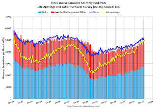 Click on graph for larger image.
Note that hires (dark blue) and total separations (red and light blue columns stacked) are pretty close each month. This is a measure of labor market turnover. When the blue line is above the two stacked columns, the economy is adding net jobs - when it is below the columns, the economy is losing jobs.
Jobs openings increased in January to 4.998 million from 4.877 million in December.
The number of job openings (yellow) are up 28% year-over-year compared to January 2014.
Quits are up 17% year-over-year. These are voluntary separations. (see light blue columns at bottom of graph for trend for "quits").
This is another very positive report. It is a good sign that job openings are at 5 million, and that quits are increasing significantly year-over-year.
NFIB: Small Business Optimism Index Increased slightly in February
by Calculated Risk on 3/10/2015 09:04:00 AM
From the National Federation of Independent Business (NFIB): Small Business Optimism Rises Despite Falling Sales Trends
The NFIB Small Business Optimism Survey for February rose 0.1 points to 98.0 a solid result despite some unfavorable conditions.
“In spite of slow economic activity and awful weather in a lot of the country, small business owners are finding reasons to hire and spend which is great news. Of the ten components, owners reporting hard-to-fill job openings was the largest gain increasing three points to a 29 percent which is a nine year high.
“Large firms have been powering the economic recovery since the Great Recession, but that may be shifting to the small business sector. February’s data suggests there are fundamental domestic economic currents leading business owners to add workers and these should bubble up in the official statistics and support stronger growth in domestic output.” ...
...
Fourteen percent cited the availability of qualified labor as their top business problem, the highest since September 2007. The job openings figure is one of the highest in 40 years and this suggests that labor markets are tightening and that there will be more pressure on compensation in the coming months.
emphasis added
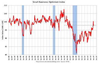 Click on graph for larger image.
This graph shows the small business optimism index since 1986.
The index increased to 98.0 in February from 97.9 in January.
Monday, March 09, 2015
Tuesday: Job Openings, Small Business Survey
by Calculated Risk on 3/09/2015 07:06:00 PM
On mortgage rates from Matthew Graham at Mortgage News Daily: Mortgage Rates Recover Tiny Portion of Friday's Losses
Mortgage rates managed to recover only some of Friday's heavy losses. The most prevalent conventional 30yr rate for top tier scenarios remains at its new perch of 4.0%, though a few lenders remain at 3.875%.CR Note: The Ten Year yield decreased to 2.20% today from 2.24% on Friday.
Tuesday:
• 7:30 AM ET, NFIB Small Business Optimism Index for February.
• At 10:00 AM, Job Openings and Labor Turnover Survey for January from the BLS. Jobs openings increased in December to 5.028 million from 4.847 million in November. The number of job openings were up 28% year-over-year, and Quits were up 12% year-over-year.
• Also at 10:00 AM, Monthly Wholesale Trade: Sales and Inventories for January. The consensus is for a 0.1% decrease in inventories.
Why the Prime Labor Force Participation Rate has Declined
by Calculated Risk on 3/09/2015 02:38:00 PM
Complaining about the decline in the overall labor force participation rate is the last refuge of scoundrels. A significant decline in the participation rate was expected based on demographics (there is an ongoing debate about how much is due to demographics, and how much of the decline is cyclical - however, as I've pointed out many time, a careful analysis suggests most of the decline is due to demographics).
But what about the decline in the prime working age labor force participation rate?
Each month I post the following graph of the participation rate and employment-population rate for prime working age (25 to 54 years old) workers.

In the earlier period the participation rate for this group was trending up as women joined the labor force. Starting in the early '90s, the participation rate moved more sideways, with a downward drift starting around '00 - and with ups and downs related to the business cycle.
The 25 to 54 participation rate decreased in February to 81.0%, and the 25 to 54 employment population ratio increased to 77.3%. As the recovery continues, I expect the participation rate for this group to increase a little more (or at least stabilize for a couple of years) - although the participation rate has been trending down for this group since the late '90s.
A couple of key points:
1) Analyzing and forecasting the labor force participation requires looking at a number of factors. Everyone is aware that there is a large cohort has moved into the 50 to 70 age group, and that that has pushing down the overall participation rate. Another large cohort has been moving into the 16 to 24 year old age group - and many in this cohort are staying in school (a long term trend that has accelerated recently) - and that is another key factor in the decline in the overall participation rate.
2) But there are other long term trends. One of these trends is for a decline in the participation rate for prime working age men (25 to 54 years old). For some reasons, see: Possible Reasons for the Decline in Prime-Working Age Men Labor Force Participation and on demographics from researchers at the Atlanta Fed: "Reasons for the Decline in Prime-Age Labor Force Participation"
First, here is a graph of the participation rate by 5 year age groups for the years 2000, 2005, 2010, and 2015.
1) the participation rate for the "prime working age" (25 to 54) is fairly flat (the six highest participation rates).
2) However, the lowest participation rate is for the 50 to 54 age group.
3) And notice that the participation rate for EACH prime age group was declining BEFORE the recession. (Dark blue is January 2000, and light blue is January 2005).
Everyone is aware that there large cohorts moving into retirement - and a large cohort in the 20 to 24 age group - but there has also been in a shift in the prime working age groups.

Since the lowest prime participation is for the 50 to 54 age group (the second lowest is for the 25 to 29 age group), lets focus on those two groups. The 50 to 54 age group is the red line (now the largest percentage of the prime working age) and the 25 to 29 age group is the blue line (now the second largest percentage). Just these shifts in prime demographics would lead to a somewhat lower prime working age participation rate. Overall, the impact of this shift is small compared to long term trends.
Lets focus on just one age group and just for men to look at the long term trend.

This fourth graph shows the 40 to 44 year old men participation rate since 1976 (note the scale doesn't start at zero to better show the change).
There is a clear downward trend, and a researcher looking at this trend in the year 2000 might have predicted the 40 to 44 year old men participation rate would about the level as today (see trend line).
Clearly there are other factors than "economic weakness" causing this downward trend. I listed some reasons a few months ago, and new research from Pew Research suggests stay-at-home dads is one of the reasons: Growing Number of Dads Home with the Kids

Note: This is a rolling 12 month average to remove noise (data is NSA), and the scale doesn't start at zero to show the change.
Clearly there is a downward trend for all 5 year age groups. When arguing about the decline in the prime participation rate, we need to take these long term trends into account.

The bottom line is that the participation rate was declining for prime working age workers before the recession, there the key is understand and adjusting for the long term trend..
Here is a look at the participation rate of women in the prime working age groups over time.

Note: This is a rolling 12 month average to remove noise (data is NSA), and the scale doesn't start at zero to show the change.
For women, the participation rate increased significantly until the late 90s, and then started declining slowly. This is a more complicated story than for men, and that is why I used prime working age men to show the gradual downward decline in participation that has been happening for decades (and is not just recent economic weakness).

The bottom line is that the participation rate was declining for prime working age workers before the recession, there are several reasons for this decline (not just recent "economic weakness") and the prime working age participation rate is probably close to expected without the recession.
CBO Projection: Budget Deficit to be lower than previous forecast
by Calculated Risk on 3/09/2015 11:15:00 AM
The Congressional Budget Office (CBO) released their new Updated Budget Projections: 2015 to 2025
Under the assumption that current laws will generally remain unchanged, the budget deficit is projected to decline in 2016, to $455 billion, or 2.4 percent of GDP, and then to hold roughly steady relative to the size of the economy through 2018. Beyond that time, however, the gap between spending and revenues is projected to grow faster than GDP: The deficit in 2025 is projected to reach $1.0 trillion, or 3.8 percent of GDP ...The CBO projects the deficit will decline further in 2015, 2016 and 2017, and be below 3% of GDP for the next five years.
CBO’s estimate of the deficit for 2015 is $18 billion greater than the shortfall it projected in January, mostly because the agency has increased estimated outlays for student loans, Medicare, and Medicaid. In contrast, the projected deficits for the 2016–2025 period total $431 billion less than the cumulative deficit that CBO projected in January. The largest factor underlying that reduction is a downward revision to projected growth in private health insurance spending, which is estimated to lower the net cost of the provisions of the Affordable Care Act (ACA) that are related to insurance coverage and to increase overall revenues from income and payroll taxes (because a larger share of employees’ compensation over the coming decade is now projected to be paid in the form of taxable wages and salaries).
emphasis added
This is a significant improvement from the previous forecast. As an example, last year, the CBO forecast the deficit to be 2.9% in 2016; now the CBO is forecasting the deficit will be 2.4% in 2016.
 Click on graph for larger image.
This graph shows the actual budget deficit each year as a percent of GDP, and an estimate for the next ten years based on estimates from the CBO.
After 2017, the deficit will start to increase again according to the CBO.
From a policy perspective and using these projections, further short term deficit reduction is not a priority.
Black Knight Mortgage Monitor: Foreclosure Starts increase in January
by Calculated Risk on 3/09/2015 07:30:00 AM
Black Knight Financial Services (BKFS) released their Mortgage Monitor report for January today. According to BKFS, 5.56% of mortgages were delinquent in January, down from 5.64% in December. BKFS reported that 1.61% of mortgages were in the foreclosure process, down from 2.35% in January 2014.
This gives a total of 7.17% delinquent or in foreclosure. It breaks down as:
• 1,701,000 properties that are 30 or more days, and less than 90 days past due, but not in foreclosure.
• 1,112,000 properties that are 90 or more days delinquent, but not in foreclosure.
• 815,000 loans in foreclosure process.
For a total of 3,628,000 loans delinquent or in foreclosure in January. This is down from 4,315,000 in January 2014.

From Black Knight:
The month’s data showed that both first-time and repeat foreclosure starts reached 12-month highs, although there was clear separation in the levels of increase between the two. According to Trey Barnes, Black Knight’s senior vice president of Loan Data Products, separation also continues to be seen between judicial and non-judicial foreclosure states across multiple performance indicators.This is still mostly clearing out the backlog.
“Overall foreclosure starts hit a 12-month high in January, and that held true when looking at both first-time and repeat foreclosure starts individually,” said Barnes. “Repeat foreclosure starts made up 51 percent of all foreclosure starts and increased 11 percent from December. In contrast, first-time foreclosure starts were up just a fraction of a percent from the month prior. Similarly, Black Knight found that January foreclosure starts jumped about 10 percent from December in judicial states as compared to just a 1.7 percent increase in non-judicial states. Judicial states are also seeing higher levels of both new problem loans and serious delinquencies (loans 90 or more days delinquent, but not yet in foreclosure) than non-judicial states, although volumes are down overall in both categories.
Sunday, March 08, 2015
Sunday Night Futures
by Calculated Risk on 3/08/2015 07:54:00 PM
From Bloomberg: Greek Tensions Revived as Creditors Reject Reform List
The list of measures Greece’s government sent to euro region finance ministers last Friday, including the idea of hiring non-professional tax collectors such as tourists, is “far” from complete and the country probably won’t receive an aid disbursement this month, Eurogroup chairman Jeroen Dijsselbloem said on Sunday.Ouch.
Monday:
• Early, Black Knight Mortgage Monitor for January
• At 10:00 AM ET, the Fed will release the monthly Labor Market Conditions Index (LMCI).
Weekend:
• Schedule for Week of March 8, 2015
From CNBC: Pre-Market Data and Bloomberg futures: currently S&P futures are unchanged and DOW futures are up 12 (fair value).
Oil prices were mixed over the last week with WTI futures at $49.47 per barrel and Brent at $59.26 per barrel. A year ago, WTI was at $102, and Brent was at $108 - so prices are down around 50% year-over-year.
Below is a graph from Gasbuddy.com for nationwide gasoline prices. Nationally prices are up to $2.45 per gallon (down about $1.00 per gallon from a year ago). Prices in California have risen significantly due to a refinery fire in February and a strike.
If you click on "show crude oil prices", the graph displays oil prices for WTI, not Brent; gasoline prices in most of the U.S. are impacted more by Brent prices.
| Orange County Historical Gas Price Charts Provided by GasBuddy.com |
Update: Prime Working-Age Population Growing Again
by Calculated Risk on 3/08/2015 11:49:00 AM
An update: Last year, I posted some demographic data for the U.S., see: Census Bureau: Largest 5-year Population Cohort is now the "20 to 24" Age Group, Decline in the Labor Force Participation Rate: Mostly Demographics and Long Term Trends, and The Future's so Bright ...
I pointed out that "even without the financial crisis we would have expected some slowdown in growth this decade (just based on demographics). The good news is that will change soon."
Changes in demographics are an important determinant of economic growth, and although most people focus on the aging of the "baby boomer" generation, the movement of younger cohorts into the prime working age is another key story in coming years. Here is a graph of the prime working age population (this is population, not the labor force) from 1948 through February 2015.

There was a huge surge in the prime working age population in the '70s, '80s and '90s - and the prime age population has been mostly flat recently (even declined a little).
The prime working age labor force grew even quicker than the population in the '70s and '80s due to the increase in participation of women. In fact, the prime working age labor force was increasing 3%+ per year in the '80s!
So when we compare economic growth to the '70s, '80, or 90's we have to remember this difference in demographics (the '60s saw solid economic growth as near-prime age groups increased sharply).
The prime working age population peaked in 2007, and appears to have bottomed at the end of 2012. The good news is the prime working age group has started to grow again, and should be growing solidly by 2020 - and this should boost economic activity in the years ahead.
Saturday, March 07, 2015
More Employment Graphs: Duration of Unemployment, Unemployment by Education, Construction Employment and Diffusion Indexes
by Calculated Risk on 3/07/2015 08:04:00 PM
By request, a few more employment graphs ...
Here are the previous posts on the employment report:
• February Employment Report: 295,000 Jobs, 5.5% Unemployment Rate
• Employment Report Comments and Graphs
 This graph shows the duration of unemployment as a percent of the civilian labor force. The graph shows the number of unemployed in four categories: less than 5 week, 6 to 14 weeks, 15 to 26 weeks, and 27 weeks or more.
The general trend is down for all categories, and both the "less than 5 weeks" and 6 to 14 weeks" are close to normal levels.
The long term unemployed is close to 1.7% of the labor force - the lowest since December 2008 - however the number (and percent) of long term unemployed remains a serious problem.
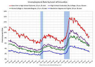 This graph shows the unemployment rate by four levels of education (all groups are 25 years and older).
Unfortunately this data only goes back to 1992 and only includes one previous recession (the stock / tech bust in 2001). Clearly education matters with regards to the unemployment rate - and it appears all four groups are generally trending down.
Although education matters for the unemployment rate, it doesn't appear to matter as far as finding new employment.
Note: This says nothing about the quality of jobs - as an example, a college graduate working at minimum wage would be considered "employed".
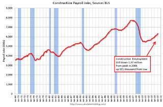 This graph shows total construction employment as reported by the BLS (not just residential).
Since construction employment bottomed in January 2011, construction payrolls have increased by 921 thousand.
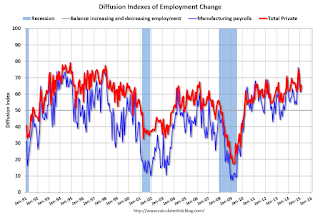 The BLS diffusion index for total private employment was at 65.4 in February, up from 62.0 in January.
For manufacturing, the diffusion index was at 64.4, up from 61.3 in January.
Think of this as a measure of how widespread job gains are across industries. The further from 50 (above or below), the more widespread the job losses or gains reported by the BLS. Above 60 is very good. From the BLS:
Figures are the percent of industries with employment increasing plus one-half of the industries with unchanged employment, where 50 percent indicates an equal balance between industries with increasing and decreasing employment.Overall job growth was widespread in February - another good sign.


