by Calculated Risk on 2/06/2015 02:02:00 PM
Friday, February 06, 2015
Public and Private Sector Payroll Jobs: Carter, Reagan, Bush, Clinton, Bush, Obama
By request, here is an update on an earlier post through the January employment report.
NOTE: Several readers have asked if I could add a lag to these graphs (obviously a new President has zero impact on employment for the month they are elected). But that would open a debate on the proper length of the lag, so I'll just stick to the beginning of each term.
Important: There are many differences between these periods. Overall employment was smaller in the '80s, however the participation rate was increasing in the '80s (younger population and women joining the labor force), and the participation rate is generally declining now. But these graphs give an overview of employment changes.
First, here is a table for private sector jobs. The top two private sector terms were both under President Clinton. Reagan's 2nd term saw about the same job growth as during Carter's term. Note: There was a severe recession at the beginning of Reagan's first term (when Volcker raised rates to slow inflation) and a recession near the end of Carter's term (gas prices increased sharply and there was an oil embargo).
| Term | Private Sector Jobs Added (000s) |
|---|---|
| Carter | 9,041 |
| Reagan 1 | 5,360 |
| Reagan 2 | 9,357 |
| GHW Bush | 1,510 |
| Clinton 1 | 10,885 |
| Clinton 2 | 10,070 |
| GW Bush 1 | -844 |
| GW Bush 2 | 381 |
| Obama 1 | 2,018 |
| Obama 2 | 5,5421 |
| 124 months into 2nd term: 11,084 pace. | |
1Currently Obama's 2nd term is on pace to be the best ever.
The first graph shows the change in private sector payroll jobs from when each president took office until the end of their term(s). President George H.W. Bush only served one term, and President Obama is in the second year of his second term.
Mr. G.W. Bush (red) took office following the bursting of the stock market bubble, and left during the bursting of the housing bubble. Mr. Obama (blue) took office during the financial crisis and great recession. There was also a significant recession in the early '80s right after Mr. Reagan (yellow) took office.
There was a recession towards the end of President G.H.W. Bush (purple) term, and Mr Clinton (light blue) served for eight years without a recession.
 Click on graph for larger image.
The first graph is for private employment only.
The employment recovery during Mr. G.W. Bush's (red) first term was sluggish, and private employment was down 844,000 jobs at the end of his first term. At the end of Mr. Bush's second term, private employment was collapsing, and there were net 463,000 private sector jobs lost during Mr. Bush's two terms.
Private sector employment increased slightly under President G.H.W. Bush (purple), with 1,510,000 private sector jobs added.
Private sector employment increased by 20,955,000 under President Clinton (light blue), by 14,717,000 under President Reagan (yellow), and 9,041,000 under President Carter (dashed green).
There were only 2,018,000 more private sector jobs at the end of Mr. Obama's first term. Twenty four months into Mr. Obama's second term, there are now 7,560,000 more private sector jobs than when he initially took office.
 A big difference between the presidencies has been public sector employment. Note the bumps in public sector employment due to the decennial Census in 1980, 1990, 2000, and 2010.
 The public sector grew during Mr. Carter's term (up 1,304,000), during Mr. Reagan's terms (up 1,414,000), during Mr. G.H.W. Bush's term (up 1,127,000), during Mr. Clinton's terms (up 1,934,000), and during Mr. G.W. Bush's terms (up 1,744,000 jobs).
However the public sector has declined significantly since Mr. Obama took office (down 688,000 jobs). These job losses have mostly been at the state and local level, but more recently at the Federal level. This has been a significant drag on overall employment.
And a table for public sector jobs. Public sector jobs declined the most during Obama's first term, and increased the most during Reagan's 2nd term.
| Term | Public Sector Jobs Added (000s) |
|---|---|
| Carter | 1,304 |
| Reagan 1 | -24 |
| Reagan 2 | 1,438 |
| GHW Bush | 1,127 |
| Clinton 1 | 692 |
| Clinton 2 | 1,242 |
| GW Bush 1 | 900 |
| GW Bush 2 | 844 |
| Obama 1 | -702 |
| Obama 2 | 141 |
| 124 months into 2nd term, 28 pace | |
Looking forward, I expect the economy to continue to expand for the next two years (at least), so I don't expect a sharp decline in private employment as happened at the end of Mr. Bush's 2nd term (In 2005 and 2006 I was warning of a coming recession due to the bursting of the housing bubble).
For the public sector, the cutbacks are clearly over at the state and local levels, and it appears cutbacks at the Federal level have slowed. Right now I'm expecting some increase in public employment during Obama's 2nd term, but nothing like what happened during Reagan's second term.
Employment Report Comments and Graphs
by Calculated Risk on 2/06/2015 11:00:00 AM
Earlier: January Employment Report: 257,000 Jobs, 5.7% Unemployment Rate
This was a very solid employment report with 257,000 jobs added, and job gains for November and December were revised up significantly.
There was even a little good news on wage growth, from the BLS: "In January, average hourly earnings for all employees on private nonfarm payrolls increased by 12 cents to $24.75, following a decrease of 5 cents in December. Over the year, average hourly earnings have risen by 2.2 percent."
Hopefully wages will be a positive 2015 story!
A few more numbers: Total employment increased 257,000 from December to January and is now 2.5 million above the previous peak. Total employment is up 11.2 million from the employment recession low.
Private payroll employment increased 267,000 from December to January, and private employment is now 3.0 million above the previous peak. Private employment is up 11.8 million from the recession low.
In January, the year-over-year change was 3.21 million jobs. This was the highest year-over-year gain since the '90s.
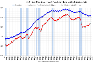
Employment-Population Ratio, 25 to 54 years old

In the earlier period the participation rate for this group was trending up as women joined the labor force. Since the early '90s, the participation rate moved more sideways, with a downward drift starting around '00 - and with ups and downs related to the business cycle.
The 25 to 54 participation rate increased in January to 81.1%, and the 25 to 54 employment population ratio increased to 77.2%. As the recovery continues, I expect the participation rate for this group to increase a little more (or at least stabilize for a couple of years) - although the participation rate has been trending down for this group since the late '90s.
Average Hourly Earnings

The blue line shows the nominal year-over-year change in "Average Hourly Earnings" for all private employees. Nominal wage growth has been running close to 2% since 2010 and might be picking up a little.
Note: CPI has been running under 2%, so there has been some real wage growth.
Part Time for Economic Reasons

The number of persons employed part time for economic reasons (sometimes referred to as involuntary part-time workers) was essentially unchanged in January at 6.8 million.The number of persons working part time for economic reasons increased slightly in January to 6.810 million from 6.790 million in December. This suggests slack still in the labor market. These workers are included in the alternate measure of labor underutilization (U-6) that increased to 11.3% in January from 11.2% in December.
Unemployed over 26 Weeks
 This graph shows the number of workers unemployed for 27 weeks or more.
 According to the BLS, there are 2.800 million workers who have been unemployed for more than 26 weeks and still want a job. This was up from 2.785 in December. This is trending down, but is still very high.
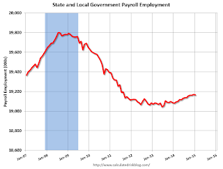
State and Local Government
 This graph shows total state and government payroll employment since January 2007. State and local governments lost jobs for four straight years. (Note: Scale doesn't start at zero to better show the change.)
 In January 2014, state and local governments lost 4,000 jobs. State and local government employment is now up 123,000 from the bottom, but still 635,000 below the peak.
State and local employment is now generally increasing. And Federal government layoffs have slowed, but are ongoing (Federal payrolls decreased by 6 thousand in January).
Overall this was a very solid employment report.
January Employment Report: 257,000 Jobs, 5.7% Unemployment Rate
by Calculated Risk on 2/06/2015 08:48:00 AM
From the BLS:
Total nonfarm payroll employment rose by 257,000 in January, and the unemployment rate was little changed at 5.7 percent, the U.S. Bureau of Labor Statistics reported today. Job gains occurred in retail trade, construction, health care, financial activities, and manufacturing.
...
The change in total nonfarm payroll employment for November was revised from +353,000 to +423,000, and the change for December was revised from +252,000 to +329,000. With these revisions, employment gains in November and December were 147,000 higher than previously reported. Monthly revisions result from additional reports received from businesses since the last published estimates and the monthly recalculation of seasonal factors. The annual benchmark process also contributed to these revisions.
...
[Benchmark revision] The total nonfarm employment level for March 2014 was revised upward by 91,000.
emphasis added
 Click on graph for larger image.
The first graph shows the monthly change in payroll jobs, ex-Census (meaning the impact of the decennial Census temporary hires and layoffs is removed - mostly in 2010 - to show the underlying payroll changes).
Total payrolls increased by 257 thousand in January (private payrolls increased 267 thousand).
Payrolls for November and December were revised up by a combined 147 thousand, putting November over 400 thousand!
 This graph shows the year-over-year change in total non-farm employment since 1968.
In January, the year-over-year change was 3.21 million jobs.
This was the highest year-over-year gain since the '90s.
And improved earnings: "In January, average hourly earnings for all employees on private nonfarm payrolls increased by 12 cents to $24.75, following a decrease of 5 cents in December. Over the year, average hourly earnings have risen by 2.2 percent."
 The third graph shows the employment population ratio and the participation rate.
The Labor Force Participation Rate increased in January to 62.9%. This is the percentage of the working age population in the labor force. A large portion of the recent decline in the participation rate is due to demographics.
The Employment-Population ratio was increased to 59.3% (black line).
I'll post the 25 to 54 age group employment-population ratio graph later.
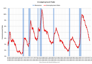
 The fourth graph shows the unemployment rate.
 The unemployment rate increased in January to 5.7%.
This was above expectations of 230,000, and with the upward revisions to prior months, this was another strong report.
I'll have much more later ...
Thursday, February 05, 2015
Friday: Jobs, Jobs, Jobs
by Calculated Risk on 2/05/2015 08:39:00 PM
Here was an employment preview I posted earlier: Preview for January Employment Report: Taking the Under
Friday:
• At 8:30 AM ET, the Employment Report for January. The consensus is for an increase of 230,000 non-farm payroll jobs added in January, down from the 252,000 non-farm payroll jobs added in December. The consensus is for the unemployment rate to be unchanged at 5.6% in January from 5.6% the previous month.
Notes: The annual benchmark revision will be released with the January report. The preliminary estimate was an additional 7,000 jobs as of March 2014.
Also, the new population controls will be used in the Current Population Survey (CPS) estimation process. It is important to note that "household survey data for January 2015 will not be directly comparable with data for December 2014 or earlier periods".
• At 3:00 PM, Consumer Credit for December from the Federal Reserve. The consensus is for credit to increase $15.0 billion.
Duy: Fed Updates
by Calculated Risk on 2/05/2015 05:17:00 PM
Tim Duy provides a number of thoughts, and I'd like to highlight one: Fed Updates
3.) Fed ready to lower NAIRU? I have argued in the past that if the Fed is faced with ongoing slow wage growth, they would need to reassess their estimates of NAIRU. Cardiff Garcia reminded me:There is much more in Duy's post.
@TheStalwart @TimDuy Whether/extent to which Fed reverts nat-rate estimates to pre-2010 range is one of 2015's big Qs pic.twitter.com/CKieHx2zRCWhile David Wessel adds today:
— Cardiff Garcia (@CardiffGarcia) February 4, 2015
JPMorgan run the Fed's statistical model of the economy and says the NAIRU (which was 5.6%+ through 2013 data) is now down to 5%.Jim O'Sullivan from High Frequency Economics says not yet:
— David Wessel (@davidmwessel) February 5, 2015
"Hard-to-fill" @NFIB jobs series up to 26 in Jan (+1). Corroborates unempl decline, with no sign of lower #NAIRU pic.twitter.com/DVYGyGV4e6A reduction in the Fed's estimate of the natural rate of unemployment would likely mean a delayed and more gradual path of policy tightening, should of course the Fed ever get the chance to pull off the zero bound. Keep an eye on this issue!
— Jim O'Sullivan (@osullivanEcon) February 5, 2015
NAHB: Builder Confidence improves Year-over-year for the 55+ Housing Market in Q4
by Calculated Risk on 2/05/2015 02:20:00 PM
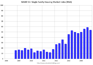
This is a quarterly index from the the National Association of Home Builders (NAHB) and is similar to the overall housing market index (HMI). The NAHB started this index in Q4 2008 (during the housing bust), so the readings were initially very low. Note that this index is Not Seasonally Adjusted (NSA) and usually dips in Q4 compared to Q3 (just seasonal).
From the NAHB: Builder Confidence in the 55+ Housing Market Ends Fourth Quarter on a Record High
The fourth quarter results of the National Association of Home Builders’ (NAHB) latest 55+ Housing Market Index (HMI) released today show that builders are feeling quite positive about the market. All segments of the market—single-family homes, condominiums and multifamily rental—registered increases compared to the same quarter a year ago. The single-family index increased six points to a level of 54, which is the highest fourth-quarter reading since the inception of the index in 2008 and the 13th consecutive quarter of year over year improvements.
...
All components of the 55+ single-family HMI posted increases from a year ago: present sales increased five points to 58, expected sales for the next six months rose two points to 64 and traffic of prospective buyers increased six points to 39.
“The strength of the 55+ segment of the housing industry has been fueled in part by rising home values,” said NAHB Chief Economist David Crowe. “Older home owners are finding it easier to sell their existing homes at a favorable price, allowing them to rent or buy a new home in a 55+ community.”
emphasis added
 Click on graph for larger image.
This graph shows the NAHB 55+ HMI through Q4 2014. The index increased in Q4 to 54 from 48 in Q4 2013. This indicates that more builders view conditions as good than as poor.
There are two key drivers in addition to the improved economy: 1) there is a large cohort moving into the 55+ group, and 2) the homeownership rate typically increases for people in the 55 to 70 year old age group. So demographics should be favorable for the 55+ market.
Goldman Sachs Employment Forecast: 210,000 jobs added, Unemployment Rate decline to 5.5%
by Calculated Risk on 2/05/2015 12:40:00 PM
Note: Yesterday I wrote: Preview for January Employment Report: Taking the Under
From Goldman Sachs economist David Mericle: January Payrolls Preview
We forecast nonfarm payroll job growth of 210k in January, below the consensus forecast of 230k. Payroll employment growth exceeded 250k in each of the last four months and averaged 246k over the 12 months of 2014, a substantial pick-up from the 194k average gain in 2013. On balance, labor market indicators were softer in January, with the decline in the ISM non-manufacturing employment index the most notable sign of slower hiring. We also expect a moderately positive two-month back-revision. The January report will also include annual benchmark revisions to payroll employment, but the preliminary revisions released in September indicated very little change.
...
We expect employment gains to push the unemployment rate down to 5.5% in January from an unrounded 5.565% in December, though new population controls that will be included with the January report create some uncertainty.
...
The two-tenths decline in average hourly earnings was the major surprise of the December payrolls report. But as we argued last month, calendar distortions and an unusual pattern of holiday retail hiring likely accounted for most of the downside surprise. We therefore expect average hourly earnings to rebound this month, growing an above-trend +0.4% in January, although we see some risk of a softer January gain coupled with an upward revision to December. Average hourly earnings rose just 1.7% over the year ending in December, contributing to the soft 2.1% year-on-year increase in our wage tracker. We expect an acceleration to around 2.75% by year-end, still well below the 3-4% rate of wage growth that Fed Chair Janet Yellen has identified as normal.
emphasis added
Trade Deficit increases in December to $46.6 Billion
by Calculated Risk on 2/05/2015 08:55:00 AM
The Department of Commerce reported:
The U.S. Census Bureau and the U.S. Bureau of Economic Analysis, through the Department of Commerce, announced today that the goods and services deficit was $46.6 billion in December, up $6.8 billion from $39.8 billion in November, revised. December exports were $194.9 billion, down $1.5 billion from November. December imports were $241.4 billion, up $5.3 billion from November.The trade deficit was much larger than the consensus forecast of $38.0 billion.
The first graph shows the monthly U.S. exports and imports in dollars through December 2014.
 Click on graph for larger image.
Imports increased and exports decreased in December.
Exports are 17% above the pre-recession peak and up 1% compared to December 2013; imports are 4% above the pre-recession peak, and up about 5% compared to December 2013.
The second graph shows the U.S. trade deficit, with and without petroleum, through December.
 The blue line is the total deficit, and the black line is the petroleum deficit, and the red line is the trade deficit ex-petroleum products.
Oil imports averaged $73.64 in December, down from $82.95 in November, and down from $91.33 in December 2013. The petroleum deficit has generally been declining and is the major reason the overall deficit has declined since early 2012.
Note: There is a lag due to shipping and long term contracts, but oil prices will really decline over the next several months - and the oil deficit will get much smaller.
The trade deficit with China increased to $28.3 billion in December, from $24.5 billion in December 2013. The deficit with China is a large portion of the overall deficit.
The increase in the trade deficit was due to a higher volume of oil imports (volatile month-to-month), a larger deficit with China, and a larger deficit with the Euro Area ($11.7 billion in Dec 2014 compared to $8.8 billion in Dec 2013).
Weekly Initial Unemployment Claims increased to 278,000
by Calculated Risk on 2/05/2015 08:33:00 AM
The DOL reported:
In the week ending January 31, the advance figure for seasonally adjusted initial claims was 278,000, an increase of 11,000 from the previous week's revised level. The previous week's level was revised up by 2,000 from 265,000 to 267,000. The 4-week moving average was 292,750, a decrease of 6,500 from the previous week's revised average. The previous week's average was revised up by 750 from 298,500 to 299,250.The previous week was revised up to 267,000.
There were no special factors impacting this week's initial claims.
The following graph shows the 4-week moving average of weekly claims since January 2000.
 Click on graph for larger image.
The dashed line on the graph is the current 4-week average. The four-week average of weekly unemployment claims decreased to 292,750.
This was lower than the consensus forecast of 290,000, and the low level of the 4-week average suggests few layoffs.
Wednesday, February 04, 2015
Thursday: Trade Deficit, Unemployment Claims
by Calculated Risk on 2/04/2015 08:46:00 PM
The West Coast port slowdown is ongoing and will have an impact on the December trade report. From Reuters: Contract negotiators for U.S. West Coast ports hit snag
Shipping companies and terminal operators for 29 U.S. West Coast ports appeared to have hit a snag on Wednesday in protracted labor negotiations with the dockworkers' union, calling a news conference to publicly address the status of the talks.Also falling oil prices will have an impact on the trade deficit. Oil imports averaged $82.95 per barrel in November, and will probably be close to $70 in December (and fall further in January).
The negotiations, joined in recent weeks by a federal mediator, have coincided with chronic cargo backups hampering freight traffic through waterfronts handling nearly half of U.S. maritime trade and more than 70 percent of imports from Asia.
...
The congestion has been most pronounced at Los Angeles and Long Beach, the nation's two busiest shipping hubs. During the past two days, port authorities there reported more than 20 freighters left idled at anchor, waiting for berths to open.
Thursday:
• At 8:30 AM ET, the initial weekly unemployment claims report will be released. The consensus is for claims to increase to 290 thousand from 265 thousand.
• Also at 8:30 AM, the Trade Balance report for December from the Census Bureau. The consensus is for the U.S. trade deficit to be at $38.0 billion in December from $39.0 billion in November.


