by Calculated Risk on 8/23/2013 04:46:00 PM
Friday, August 23, 2013
DOT: Vehicle Miles Driven decreased 0.4% in June
The Department of Transportation (DOT) reported:
Travel on all roads and streets changed by -0.4% (-0.9 billion vehicle miles) for June 2013 as compared with June 2012. Travel for the month is estimated to be 258.1 billion vehicle miles.
The following graph shows the rolling 12 month total vehicle miles driven.
The rolling 12 month total is still mostly moving sideways.
 Click on graph for larger image.
In the early '80s, miles driven (rolling 12 months) stayed below the previous peak for 39 months.
Currently miles driven has been below the previous peak for 67 months - over 5 1/2 years - and still counting.
The second graph shows the year-over-year change from the same month in the previous year.
 Gasoline prices were up in June compared to June 2012. In June 2013, gasoline averaged of $3.69 per gallon according to the EIA. In 2012, prices in June averaged $3.60 per gallon. Gasoline prices were up even more year-over-year in July, so I expect miles driven to be down more year-over-year in July. However prices were down year-over-year in August, so miles might be up.
As we've discussed, gasoline prices are just part of the story. The lack of growth in miles driven over the last 5+ years is probably also due to the lingering effects of the great recession (high unemployment rate and lack of wage growth), the aging of the overall population (over 55 drivers drive fewer miles) and changing driving habits of young drivers.
With all these factors, it might take several more years before we see a new peak in miles driven.
5% 30 Year Mortgage Rates?
by Calculated Risk on 8/23/2013 02:50:00 PM
It seems like yesterday that I wrote 4% 30 Year Mortgage Rates? (it was a few months ago in May).
Now there is some discussion of 5% 30 year mortgage rates. Here is what mortgage banker Lou Barnes wrote today:
Release of the Fed’s July 31 meeting minutes on Wednesday collapsed the last courage in the bond market, 10-year T-notes to 2.90% and low-down, low-fee mortgages to 5.00%. The minutes were incomprehensible, but their failure to pull back from taper of QE3 means that it is still a “go.”Barnes is talking about "low-down, low-fee" 30 year mortgages hitting 5%, but his comment made me wonder at what 10 year Treasury yield, mortgage rates in the Freddie Mac survey would probably rise to 5%?
This morning Treasury short-sellers so pleased with themselves got clobbered by word that new home sales had fainted 13.4% in July, and June was revised down by 8%. The 10-year briefly to 2.81%. New home sales are measured by new contracts written, thus these June-July results are the first since mortgage rates jumped 1% from May to June. Correlation is not cause ... some of the weakness is due to a shortage of inventory in turn caused by a shortage of credit to developers and builders.
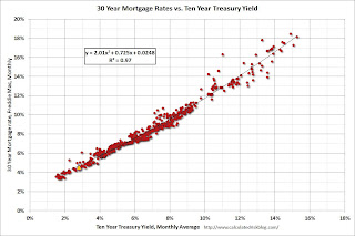
Here is an update to a graph that shows the relationship between the monthly 10 year Treasury Yield and 30 year mortgage rates from the Freddie Mac survey.
 Click on graph for larger image.
Currently the 10 year Treasury yield is 2.82% and 30 year mortgage rates are at 4.58% (according to Freddie Mac). Based on the relationship from the graph, the 30 year mortgage rate (Freddie Mac survey) would be around 5% when 10-year Treasury yields are around 3.33%.
Note: The yellow marker is the current (last week) relationship.
1 Long term readers will remember the quote about "neutron loans" from mortgage banker Lou Barnes in 2007:
“All of the old-timers knew that subprime mortgages were what we called neutron loans — they killed the people and left the houses,” said Louis S. Barnes, 58, a partner at Boulder West, a mortgage banking firm in Lafayette, Colo.
Comments on New Home Sales
by Calculated Risk on 8/23/2013 11:20:00 AM
Three key comments:
1. This is just one month of data (I note this whenever we see a weak or strong sales report). There is plenty of month-to-month noise for new home sales and frequent large revisions.
2. The downward revisions to previous months were expected (In the weekly schedule I wrote: "Based on the homebuilder reports, there will probably be some downward revisions to sales for previous months."). But these revisions do suggest the housing recovery was not as strong as previously thought.
3. Important: Any impact from rising mortgage rates would show up in the New Home sales report before the existing home sales report. New home sales are counted when contracts are signed, and existing home sales when the transactions are closed - so the timing is different. For existing home sales, I think there was a push to close before the mortgage interest rate lock expired - so closed existing home sales in July were strong - and I expect a decline in existing home sales in August.
For New Home sales, I expect some buyers were shocked by the increase in rates - and they held off signing a contract in July. But this doesn't mean the housing recovery is over - far from it. In fact I think the housing recovery (starts / new home sales) has just begun.
Earlier: New Home Sales decline sharply to 394,000 Annual Rate in July
Looking at the first seven months of 2013, there has been a significant increase in sales this year. The Census Bureau reported that there were 271 new homes sold in the first half of 2013, up 21.5% from the 223 thousand sold during the same period in 2012. This was the highest sales for the first seven months of the year since 2008.
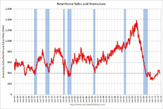
And even though there has been a large increase in the sales rate, sales are just above the lows for previous recessions. This suggests significant upside over the next few years. Based on estimates of household formation and demographics, I expect sales to increase to 750 to 800 thousand over the next several years - substantially higher than the current sales rate.
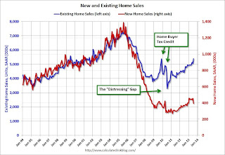
And here is another update to the "distressing gap" graph that I first started posting over four years ago to show the emerging gap caused by distressed sales. Now I'm looking for the gap to close over the next few years.
 Click on graph for larger image.
The "distressing gap" graph shows existing home sales (left axis) and new home sales (right axis) through June 2013. This graph starts in 1994, but the relationship has been fairly steady back to the '60s.
Following the housing bubble and bust, the "distressing gap" appeared mostly because of distressed sales. The flood of distressed sales kept existing home sales elevated, and depressed new home sales since builders weren't able to compete with the low prices of all the foreclosed properties.
I don't expect much of an increase in existing home sales (distressed sales will slowly decline and be offset by more conventional sales). But I do expect this gap to continue to close - mostly from an increase in new home sales.
Note: Existing home sales are counted when transactions are closed, and new home sales are counted when contracts are signed. So the timing of sales is different.
New Home Sales decline sharply to 394,000 Annual Rate in July
by Calculated Risk on 8/23/2013 10:00:00 AM
The Census Bureau reports New Home Sales in July were at a seasonally adjusted annual rate (SAAR) of 394 thousand. This was down from 455 thousand SAAR in June (June sales were revised down from 497 thousand).
April sales were revised down from 453 thousand to 446 thousand, and May sales were revised down from 459 thousand to 439 thousand.
The first graph shows New Home Sales vs. recessions since 1963. The dashed line is the current sales rate.
"Sales of new single-family houses in July 2013 were at a seasonally adjusted annual rate of 394,000, according to estimates released jointly today by the U.S. Census Bureau and the Department of Housing and Urban Development. This is 13.4 percent below the revised June rate of 455,000, but is 6.8 percent above the July 2012 estimate of 369,000.
 Click on graph for larger image in graph gallery.
The second graph shows New Home Months of Supply.
The months of supply increased in July to 5.2 months from 4.3 months in June.
The all time record was 12.1 months of supply in January 2009.
 This is now in the normal range (less than 6 months supply is normal).
"The seasonally adjusted estimate of new houses for sale at the end of July was 171,000. This represents a supply of 5.2 months at the current sales rate."On inventory, according to the Census Bureau:
"A house is considered for sale when a permit to build has been issued in permit-issuing places or work has begun on the footings or foundation in nonpermit areas and a sales contract has not been signed nor a deposit accepted."Starting in 1973 the Census Bureau broke this down into three categories: Not Started, Under Construction, and Completed.
 This graph shows the three categories of inventory starting in 1973.
The inventory of completed homes for sale is near the record low. The combined total of completed and under construction is increasing, but still very low.
The last graph shows sales NSA (monthly sales, not seasonally adjusted annual rate).
In July 2013 (red column), 35 thousand new homes were sold (NSA). Last year 33 thousand homes were sold in July. The high for July was 117 thousand in 2005, and the low for July was 26 thousand in 2010.

This was well below expectations of 487,000 sales in July, and a very weak report. I'll have more later today.
Jackson Hole Economic Symposium Agenda
by Calculated Risk on 8/23/2013 08:26:00 AM
Note: the presented papers are usually posted to the Kansas City Fed's site fairly quickly. On twitter.
2013 Economic Symposium: Global Dimensions of Unconventional Monetary Policy. Times listed on program are Mountain Standard Time.
Friday Aug 23rd
Chair: Stanley Fischer, former Governor, Bank of Israel
8:00 AM: “The Natural Rate of Interest, Financial Crises and the Zero Lower Bound,” presented by Robert E. Hall, Stanford University, Discussant: Hyun Song Shin, professor, Princeton University
9:00 AM" “The Transmission of Unconventional Monetary Policy” presented by Arvind Krishnamurthy, Northwestern University
Discussant: Anil Kashyap, professor, University of Chicago
10:25 AM: Panel on Monetary Policy Options and Tools. Panelists: Augustin Carstens, Governor, Bank of Mexico, David Daokui Li, professor, Tsinghua University, Frank Smets, Director General of Directorate General Research, European Central Bank
12:15 PM: Luncheon Address by Christine Lagarde, Managing Director, International Monetary Fund
Saturday Aug 24th
Chair: Janet Yellen, vice chair, Board of Governors of the Federal Reserve System
8:00 AM: “Global Liquidity” presented by Jean-Pierre Landau, fellow, Sciences Po, Discussant: Claudio Borio, Bank of International Settlements
9:00 AM: “Cross-Border Capital Flows” presented by Helene Rey, professor, London Business School, Discussant: Terrence Checki, executive vice president, New York Fed
10:25 AM: Overview Panel. Panelists: Charles Bean, deputy governor, Bank of England, Haruhiko Kuroda, governor, Bank of Japan
Thursday, August 22, 2013
Friday: New Home Sales
by Calculated Risk on 8/22/2013 07:09:00 PM
An excellent review of Bernanke's years at the Federal Reserve from Binyamin Appelbaum at the NY Times: Bernanke, the Audacious Pragmatist. A few excerpts:
The recession, prompted by the collapse of the housing bubble that Mr. Bernanke — and most other experts — failed to see coming, ended an era of minimalism in central banking. And there is no better marker than the views of Mr. Bernanke, the world’s most influential central banker, who now argues that the Fed needs to consider a range of previously unthinkable actions, including trying to pop bubbles when necessary, because sometimes the cost of doing nothing is worse.Some random comments: I think Bernanke was slow to recognize the problem, but once he did he was effective (see my post from Feb 2011: I come to praise Bernanke).
Mr. Bernanke, who plans to step down in January after eight years as Fed chairman, will be remembered for helping to arrest the collapse of the financial system in 2008. This shy, methodical economist who had been expected to serve as the keeper of Alan Greenspan’s flame — to preserve the Fed’s hard-won success in moderating inflation — emerged under pressure as perhaps the most innovative and daring leader in the Fed’s history.
But what Mr. Bernanke did after the crisis may prove to have even more enduring influence. For almost three decades, the Fed focused on moderating inflation in the belief that this was the best and only way to help the economy. In the wake of the crisis, Mr. Bernanke forged a broader vision of the Fed’s responsibilities, starting experimental, incomplete campaigns to reduce unemployment and to prevent future crises.
“The thing I think he’ll be known for, if it lasts, is depersonalizing the institution,” Professor Gertler said.
I don't know about "most" experts missing the housing bubble, but clearly most people in government missed the bubble (I wrote Speculation is the Key in April 2005 - and housing was almost all I wrote about during that period - I was very worried). There were quite a few other people warning about the bubble too (Tom Lawler, Dean Baker, Paul Krugman, and many others).
I argued in the '90s that the Fed should try to "pop" the stock bubble by a combination of speeches, increases in interest rates, and increases in margin requirements. I made similar arguments in the mid-00s about housing (I urged regulators to push for tighter lending standards). Not all bubbles are obvious, but the stock and housing bubbles were pretty clear - and I'm glad to see the thinking at the Fed has changed.
Also as Professor Gertler noted, Bernanke did a good job of "depersonalizing the institution" (hopefully we won't go back to a Greenspan type personality). Also the changes at the Fed - to be more open, hold press conferences (I think there should be a presser after every FOMC meeting), setting a formal 2% inflation target, stress testing the banks - in addition to the monetary policy response, have all improved the institution.
There will be many more laudatory articles for Chairman Bernanke - well deserved. The bottom line is we were lucky to have him as Fed Chair during the worst of the crisis (there is still work to be done).
Friday:
• At 8:30 AM ET, New Home Sales for July from the Census Bureau. The consensus is for a decrease in sales to 487 thousand Seasonally Adjusted Annual Rate (SAAR) in July from 497 thousand in June. Based on the homebuilder reports, there will probably be some downward revisions to sales for previous months.
Freddie Mac: Mortgage Rates at highest level since 2011
by Calculated Risk on 8/22/2013 03:41:00 PM
From Freddie Mac today: Mortgage Rates up on Taper Timing Speculation
Freddie Mac today released the results of its Primary Mortgage Market Survey® (PMMS®), showing average fixed mortgage rates following bond yields higher, and reaching new highs for the year, with the expectant release of the Fed's comments around taper timing of its bond purchase program. ...
30-year fixed-rate mortgage (FRM) averaged 4.58 percent with an average 0.8 point for the week ending August 22, 2013, up from last week when it averaged 4.40 percent. A year ago at this time, the 30-year FRM averaged 3.66 percent.
15-year FRM this week averaged 3.60 percent with an average 0.7 point, up from last week when it averaged 3.44 percent. A year ago at this time, the 15-year FRM averaged 2.89 percent.
 Click on graph for larger image.
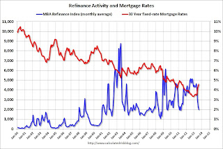
This graph shows the 30 year fixed rate mortgage interest rate from the Freddie Mac Primary Mortgage Market Survey® compared to the MBA refinance index.
The refinance index has dropped sharply recently (down 62% over the last 3 months) and will probably decline further if rates stay at this level.
 The second graph shows mortgage rates and new home sales since 1971. I'll have more on this soon.
Philly Fed: State Coincident Indexes increased in 34 states in July
by Calculated Risk on 8/22/2013 01:12:00 PM
From the Philly Fed:
The Federal Reserve Bank of Philadelphia has released the coincident indexes for the 50 states for July 2013. In the past month, the indexes increased in 34 states, decreased in nine states, and remained stable in seven, for a one-month diffusion index of 50. Over the past three months, the indexes increased in 38 states, decreased in nine, and remained stable in three, for a three-month diffusion index of 58.Note: These are coincident indexes constructed from state employment data. An explanation from the Philly Fed:
The coincident indexes combine four state-level indicators to summarize current economic conditions in a single statistic. The four state-level variables in each coincident index are nonfarm payroll employment, average hours worked in manufacturing, the unemployment rate, and wage and salary disbursements deflated by the consumer price index (U.S. city average). The trend for each state’s index is set to the trend of its gross domestic product (GDP), so long-term growth in the state’s index matches long-term growth in its GDP.
 Click on graph for larger image.
This is a graph is of the number of states with one month increasing activity according to the Philly Fed. This graph includes states with minor increases (the Philly Fed lists as unchanged).
In July, 38 states had increasing activity, the same as in June (including minor increases). This measure has been and up down over the last few years ...
 Here is a map of the three month change in the Philly Fed state coincident indicators. This map was all red during the worst of the recession, and all green at times during the recovery.
There are several states with declining activity again.
Kansas City Fed: Regional Manufacturing Activity "Improved Further" in August
by Calculated Risk on 8/22/2013 11:00:00 AM
From the Kansas City Fed: Tenth District Manufacturing Survey Improved Further
The Federal Reserve Bank of Kansas City released the August Manufacturing Survey today. According to Chad Wilkerson, vice president and economist at the Federal Reserve Bank of Kansas City, the survey revealed that Tenth District manufacturing activity improved further, and producers’ expectations also edged higher after easing last month.A few industry comments from the survey:
“Although some District firms noted weakness in August associated with federal spending cuts and difficulties finding workers, we were encouraged to see another solid gain in our composite index and most of its components,” said Wilkerson
The month-over-month composite index was 8 in August, up from 6 in July and -5 in June ... production index remained solid at 21, and the new orders and order backlog indexes also rose moderately. The new orders for exports index edged higher from 2 to 4, and the employment index moved into positive territory for the first time in six months.
emphasis added
“More projects are being delayed by government-related entities.”Earlier today Markit released their Flash PMI: Manufacturing recovery gains momentum as order growth hits seven-month high
“Our defense business is down significantly.”
“Sequestration is hitting us very hard. The heavy infrastructure market is way down due to lack of federal spending.”
The Markit Flash U.S. Manufacturing Purchasing Managers’ Index™ (PMI™) signalled the strongest improvement in manufacturing business conditions in five months during August. The flash PMI index, which is based on approximately 85% of usual monthly replies, was up slightly from July’s 53.7 to 53.9, and suggested a moderate expansion of the manufacturing sector.The Dallas and Richmond Fed regional surveys for August will be released early next week. So far the regional surveys (and the Markit Flash PMI) suggest continued expansion for manufacturing in August.
Firms received a larger volume of new orders in August, with a number of companies linking this to greater demand and new client wins. Moreover, the rate of growth was strong and, having accelerated for the fourth month running, the fastest since January.
...
Manufacturing employment increased for the second month running in August. The rate of job creation was moderate and, having quickened slightly since July, the fastest in four months. Firms that hired additional staff generally cited increased workloads.
Weekly Initial Unemployment Claims increase to 336,000, Four Week Average Lowest since November 2007
by Calculated Risk on 8/22/2013 08:30:00 AM
The DOL reports:
In the week ending August 17, the advance figure for seasonally adjusted initial claims was 336,000, an increase of 13,000 from the previous week's revised figure of 323,000. The 4-week moving average was 330,500, a decrease of 2,250 from the previous week's revised average of 332,750.
The previous week was revised up from 320,000.
The following graph shows the 4-week moving average of weekly claims since January 2000.
 Click on graph for larger image.
The dashed line on the graph is the current 4-week average. The four-week average of weekly unemployment claims decreased to 330,500.
The 4-week average is at the lowest level since November 2007 (before the recession started). Claims were above the 329,000 consensus forecast.
 Here is a long term graph of the 4-week average of weekly unemployment claims back to 1971.


