by Calculated Risk on 7/30/2013 03:40:00 PM
Tuesday, July 30, 2013
Housing: "Drought of properly priced homes"
Some interesting comments on inventory in an article by Nick Timiraos at the WSJ: Home Prices Jump, but Headwinds Build
For now, inventories remain extremely tight in a majority of the nation's major housing markets. The Wall Street Journal's survey of quarterly housing-market conditions in 28 metro areas found that Phoenix, Seattle, Denver, and Sacramento, Calif., had less than a 2.5-month supply of homes for sale at the current sales pace. Dallas, Los Angeles, San Diego, Washington, D.C., and Orlando, Fla., had less than three months of supply, according to data compiled by John Burns Real Estate Consulting in Irvine, Calif.I think we've seen the bottom for inventories in many areas, but many of the new listings are overpriced (no offer in the first 30 to 60 days suggests the property is overpriced).
...
There are signs inventory declines will ease as price gains increase. In Sacramento, Calif., the number of homes for sale in June stood 7.5% above the level of a year ago, while inventories in Atlanta rose 9.7%. ...
In Orange County, Calif., inventories have increased 68% since March, standing roughly unchanged from year-ago levels at the end of June and reversing what had been a large year-over-year drop. Steven Thomas, a local housing analyst, says buyers are growing frustrated because sellers are getting greedy. "There is a drought of properly priced homes," he wrote in a recent report. Reports of rising home prices "have enticed a herd of homeowners to come on the market who all have thrown discretion out the door."
Angela Creech, a real-estate agent with Redfin in Irvine, Calif., says she's refused more listings in the past month because sellers are asking for too much money. "There are more really unrealistic sellers," she said.
HVS: Q2 2013 Homeownership and Vacancy Rates
by Calculated Risk on 7/30/2013 12:45:00 PM
The Census Bureau released the Housing Vacancies and Homeownership report for Q2 2013 this morning.
This report is frequently mentioned by analysts and the media to track the homeownership rate, and the homeowner and rental vacancy rates. However, there are serious questions about the accuracy of this survey.
This survey might show the trend, but I wouldn't rely on the absolute numbers. The Census Bureau is investigating the differences between the HVS, ACS and decennial Census, and analysts probably shouldn't use the HVS to estimate the excess vacant supply, or rely on the homeownership rate, except as a guide to the trend.
 Click on graph for larger image.
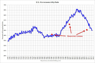
The Red dots are the decennial Census homeownership rates for April 1st 1990, 2000 and 2010. The HVS homeownership rate was unchanged at 65.0% in Q2.
I'd put more weight on the decennial Census numbers and that suggests the actual homeownership rate is probably in the 64% to 65% range - and given changing demographics, the homeownership rate is probably close to a bottom.
 The HVS homeowner vacancy rate decreased to 1.9% in Q2 from 2.1% in Q1.
It isn't really clear what this means. Are these homes becoming rentals?
Once again - this probably shows that the trend is down, but I wouldn't rely on the absolute numbers.
 The rental vacancy rate declined in Q2 to 8.2%, from 8.6% in Q1.
I think the Reis quarterly survey (large apartment owners only in selected cities) is a much better measure of the rental vacancy rate - and Reis reported that the rental vacancy rate is at the lowest level since 2001.
The quarterly HVS is the most timely survey on households, but there are many questions about the accuracy of this survey. Unfortunately many analysts still use this survey to estimate the excess vacant supply. However this does suggest that most of the bubble excess is behind us.
Earlier on House Prices:
• Case-Shiller: Comp 20 House Prices increased 12.2% year-over-year in May
• Comment on House Prices: Real Prices, Price-to-Rent Ratio, Cities
Comment on House Prices: Real Prices, Price-to-Rent Ratio, Cities
by Calculated Risk on 7/30/2013 10:59:00 AM
First a comment from Zillow Economist Dr. Svenja Gudell:
“Three straight months of national home value appreciation above 10 percent is not normal, not sustainable and, frankly, not very believable. As the overall housing market continues to improve, the impact of foreclosure re-sales on the Case-Shiller indices continues to be pronounced, as homes previously sold under duress trade again under more normal circumstances, leading to inflated and misleading markups in price,” said Zillow Senior Economist Svenja Gudell. “It’s increasingly critical that the average American homeowner not read numbers like today’s Case-Shiller results and assume their homes must also have appreciated at these levels over the past year, or will continue to appreciate at these levels going forward. In reality, typical home values have appreciated at roughly half this pace for the past several months, which is still very robust. Looking ahead, a combination of rising mortgage interest rates, flagging investor demand and more inventory entering the market will all help to moderate the pace of home value appreciation and stabilize the market.”I agree with Gudell on these two key points: 1) I also think right now the Case-Shiller index is overstating price increases for most homeowners (both because of the handling of distressed sales and weighting of some coastal areas), and 2) I also think price appreciation will slow going forward.
emphasis added
I also think it is important to look at prices in real terms (inflation adjusted). Case-Shiller, CoreLogic and others report nominal house prices. As an example, if a house price was $200,000 in January 2000, the price would be close to $275,000 today adjusted for inflation.
Earlier: Case-Shiller: Case-Shiller: Comp 20 House Prices increased 12.2% year-over-year in May
Nominal House Prices
 The first graph shows the quarterly Case-Shiller National Index SA (through Q1 2013), and the monthly Case-Shiller Composite 20 SA and CoreLogic House Price Indexes (through May) in nominal terms as reported.
In nominal terms, the Case-Shiller National index (SA) is back to Q3 2003 levels (and also back up to Q4 2008), and the Case-Shiller Composite 20 Index (SA) is back to March 2004 levels, and the CoreLogic index (NSA) is back to May 2004.
Real House Prices
 The second graph shows the same three indexes in real terms (adjusted for inflation using CPI less Shelter). Note: some people use other inflation measures to adjust for real prices.
In real terms, the National index is back to Q2 2000 levels, the Composite 20 index is back to October 2001, and the CoreLogic index back to February 2002.
In real terms, house prices are back to early '00s levels.
Price-to-Rent
In October 2004, Fed economist John Krainer and researcher Chishen Wei wrote a Fed letter on price to rent ratios: House Prices and Fundamental Value. Kainer and Wei presented a price-to-rent ratio using the OFHEO house price index and the Owners' Equivalent Rent (OER) from the BLS.
 Here is a similar graph using the Case-Shiller National, Composite 20 and CoreLogic House Price Indexes.
This graph shows the price to rent ratio (January 1998 = 1.0).
On a price-to-rent basis, the Case-Shiller National index is back to Q2 2000 levels, the Composite 20 index is back to April 2002 levels, and the CoreLogic index is back to June 2002.
In real terms - and as a price-to-rent ratio - prices are mostly back to early 2000 levels.
Nominal Prices: Cities relative to Jan 2000
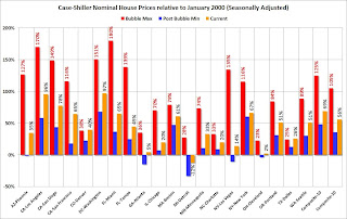
 The last graph shows the bubble peak, the post bubble minimum, and current nominal prices relative to January 2000 prices for all the Case-Shiller cities in nominal terms.
As an example, at the peak, prices in Phoenix were 127% above the January 2000 level. Then prices in Phoenix fell slightly below the January 2000 level, and are now up 35% above January 2000. Two cities - Denver and Dallas - are at new highs (no other Case-Shiller Comp 20 city is close). Detroit prices are still below the January 2000 level.
Case-Shiller: Comp 20 House Prices increased 12.2% year-over-year in May
by Calculated Risk on 7/30/2013 09:00:00 AM
S&P/Case-Shiller released the monthly Home Price Indices for May ("May" is a 3 month average of March, April and May prices).
This release includes prices for 20 individual cities, two composite indices (for 10 cities and 20 cities).
Note: Case-Shiller reports Not Seasonally Adjusted (NSA), I use the SA data for the graphs.
From S&P: Home Prices Continue to Increase in May 2013 According to the S&P/Case-Shiller Home Price Indices
Data through May 2013, released today by S&P Dow Jones Indices for its S&P/Case-Shiller Home Price Indices ... showed increases of 2.5% and 2.4% for the 10- and 20-City Composites in May versus April. Dallas and Denver reached record levels surpassing their pre-financial crisis peaks set in June 2007 and August 2006. ...
The 10- and 20-City Composites annual returns rose slightly from April to May as they posted the best year-over-year gains since March 2006. All 20 cities increased from May 2012 to May 2013 and from April 2013 to May 2013. ...
“Home prices continue to strengthen,” says David M. Blitzer, Chairman of the Index Committee at S&P Dow Jones Indices. “Two cities set new highs, surpassing their pre-crisis levels and five cities – Atlanta, Chicago, San Diego, San Francisco and Seattle – posted monthly gains of over three percent, also a first time event. ... “The overall report points to some shifts among various markets: Washington DC is no longer the standout leader and the eastern Sunbelt cities, Miami and Tampa, are lagging behind their western counterparts.”
All 20 cities showed positive monthly returns for May. Ten cities – Chicago, Denver, Detroit, Las Vegas, Miami, New York, Phoenix, Portland, Seattle and Tampa – showed acceleration. Chicago posted an impressive monthly rate of 3.7% in May; it was higher than in April by one percentage point. Miami and Seattle had their largest monthly gains since August 2005 and April 1990, respectively.
 Click on graph for larger image.
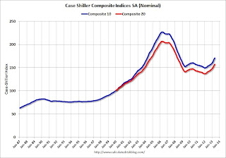
 The first graph shows the nominal seasonally adjusted Composite 10 and Composite 20 indices (the Composite 20 was started in January 2000).
The Composite 10 index is off 24.8% from the peak, and up 1.1% in May (SA). The Composite 10 is up 14.0% from the post bubble low set in Jan 2012 (SA).
The Composite 20 index is off 24.0% from the peak, and up 1.0% (SA) in May. The Composite 20 is up 14.7% from the post-bubble low set in Jan 2012 (SA).
 The second graph shows the Year over year change in both indices.
The Composite 10 SA is up 11.8% compared to May 2012.
The Composite 20 SA is up 12.2% compared to May 2012. This was the twelfth consecutive month with a year-over-year gain and this was the largest year-over-year gain for the Composite 20 index since 2006.
Prices increased (SA) in 18 of the 20 Case-Shiller cities in May seasonally adjusted. Prices in Las Vegas are off 51.4% from the peak, and prices in Denver and Dallas are at new highs.
This was close to the consensus forecast for a 12.3% YoY increase. I'll have more on prices later.
Monday, July 29, 2013
Tuesday: Case-Shiller House Price Index
by Calculated Risk on 7/29/2013 09:48:00 PM
Some horrible reporting on the next Fed Chair decision, first from he usually excellent Binyamin Appelbaum and Annie Lowrey at the NY Times who wrote:
Richard W. Fisher, president of the Federal Reserve Bank of Dallas, said this year that if the president chose Ms. Yellen, the decision would be “driven by gender.”What Fisher actually said (NY Times correction):
“It’s a presidential decision, and we’ll see if it is driven by gender or other considerations and so on. Janet is extremely capable. There are other capable people.”And from the WSJ:
Nancy Pelosi has bellowed her support [for Yellen]What Pelosi actually said:
I want to see whomever the President appoints. Let me say that I think it would be great to have a woman, first woman chairman of the Fed. No question about it. Yellen would be, is extremely talented, it is not just that she is a woman. Larry Summers has been a patriotic leader in our country, working hard. ... Either one would make an excellent Chairman I'm sure.Pretty poor reporting ...
Tuesday:
• At 9:00 AM ET, S&P/Case-Shiller House Price Index for May. Although this is the May report, it is really a 3 month average of March, April and May. The consensus is for a 12.3% year-over-year increase in the Composite 20 index (NSA) for May. The Zillow forecast is for the Composite 20 to increase 12.1% year-over-year, and for prices to increase 1.3% month-to-month seasonally adjusted.
• At 10:00 AM, the Conference Board's consumer confidence index for July. The consensus is for the index to decrease to 81.0 from 81.4.
• Also at 10:00 AM, the Q2 Housing Vacancies and Homeownership report from the Census Bureau. This report is frequently mentioned by analysts and the media to report on the homeownership rate, and the homeowner and rental vacancy rates. However, this report doesn't track with other measures (like the decennial Census and the ACS) and this survey probably shouldn't be used to estimate the excess vacant housing supply.
Weekly Update: Existing Home Inventory is up 17.6% year-to-date on July 29th
by Calculated Risk on 7/29/2013 04:50:00 PM
Weekly Update: One of key questions for 2013 is Will Housing inventory bottom this year?. Since this is a very important question, I'm tracking inventory weekly in 2013.
There is a clear seasonal pattern for inventory, with the low point for inventory in late December or early January, and then peaking in mid-to-late summer.
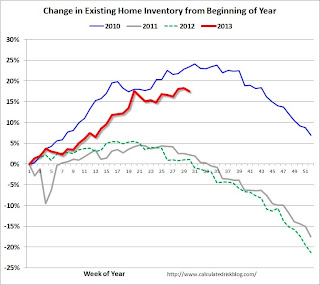
The Realtor (NAR) data is monthly and released with a lag (the most recent data was for June). However Ben at Housing Tracker (Department of Numbers) has provided me some weekly inventory data for the last several years. This is displayed on the graph below as a percentage change from the first week of the year (to normalize the data).
In 2010 (blue), inventory increased more than the normal seasonal pattern, and finished the year up 7%. However in 2011 and 2012, there was only a small increase in inventory early in the year, followed by a sharp decline for the rest of the year.
 Click on graph for larger image.
Note: the data is a little weird for early 2011 (spikes down briefly).
So far in 2013, inventory is up 17.6%, and I expect some further increases over the next month or two.
It now seems likely that inventory bottomed early this year.
It is important to remember that inventory is still very low, and is down 11% from the same week last year according to Housing Tracker. Once inventory starts to increase (more than seasonal), I expect price increases to slow.
A comment on Fed Forecasting Records
by Calculated Risk on 7/29/2013 02:41:00 PM
Jon Hilsenrath and Kristina Peterson write about a "WSJ analysis of more than 700 economic predictions between 2009 and 2012 by Fed policymakers shows ... Janet Yellen ... the most prescient": Federal Reserve 'Doves' Beat 'Hawks' in Economic Prognosticating
As the U.S. emerged from recession in the summer of 2009, Janet Yellen, then president of the Federal Reserve Bank of San Francisco, took a grim view of the economy's prospects.A few comments:
"I expect the pace of the recovery will be frustratingly slow," she said in a San Francisco speech. A month later, addressing fears that money flooding into the economy from the Federal Reserve would stoke inflation, Ms. Yellen said not to worry in a speech to Idaho bankers: High unemployment and the weak economy would tamp wages and prices.
Others at the Fed spoke forcefully in the other direction. Unless the central bank reversed the easy money course, Philadelphia Fed President Charles Plosser warned in December 2009, "the inflation rate is likely to rise to levels that most would consider unacceptable."
Ms. Yellen was proved right.
1) The title of the article is about 'Doves' beating 'Hawks'. A good Fed Chair would be hawkish (raise rates) or dovish (lower rates) at the correct times. Over the period in question, 'dove' was synonymous with 'correct'. But no one should think Yellen is a perma-dove. As Professor Hamilton noted this weekend (He knows Yellen), she will certainly change her mind as circumstances change.
2) It is important to remember that Yellen was ahead of most other Fed presidents in the period between 2005 and 2008 (before this WSJ analysis). In 2005 Yellen was expressing concerns about housing, "analyses do indicate that house prices are abnormally high—that there is a "bubble" element, even accounting for factors that would support high house prices", and 'ghost towns' of the West in 2006. In 2007 she gave a speech correctly identifying some of the spillover effects from subprime.
3) This doesn't mean Yellen has a "crystal ball". She doesn't. Instead this means she has a strong understanding of macroeconomics and paid close attention to the data. A key for any successful manager is to be able to use a wide-angle lens (see the big picture) and also to be able to zoom in on the details (data driven) when necessary. Yellen's track record suggests to me that she excels at both.
Dallas Fed: "Texas Manufacturing Activity Increases but at a Slower Pace" in July
by Calculated Risk on 7/29/2013 10:30:00 AM
From the Dallas Fed: Texas Manufacturing Activity Increases but at a Slower Pace
Texas factory activity continued to expand in July, according to business executives responding to the Texas Manufacturing Outlook Survey. The production index, a key measure of state manufacturing conditions, fell from 17.1 to 11.4, suggesting output growth continued but at a slower pace than in June. ...Here is a graph comparing the regional Fed surveys and the ISM manufacturing index:
The new orders index was positive for the third month in a row, although it edged down from 13 to 10.8. ...Perceptions of broader business conditions improved again in July. The general business activity index posted a second consecutive positive reading, although it edged down from 6.5 to 4.4.
Labor market indicators reflected a pickup in labor demand. The employment index rose to 9.3, its highest reading in nearly a year. ...
Expectations regarding future business conditions remained optimistic in July. The indexes of future general business activity and future company outlook fell five points but remained in strongly positive territory. Indexes for future manufacturing activity also remained solidly positive.
emphasis added
 Click on graph for larger image.
The New York and Philly Fed surveys are averaged together (dashed green, through July), and five Fed surveys are averaged (blue, through July) including New York, Philly, Richmond, Dallas and Kansas City. The Institute for Supply Management (ISM) PMI (red) is through June (right axis).
All of the regional surveys - except Richmond - showed expansion in July. The ISM index for July will be released Thursday August 1st, and the consensus is for an increase to 53.1 from 50.9 in June (above is expansion).
NAR: Pending Home Sales index declined 0.4% in June
by Calculated Risk on 7/29/2013 10:04:00 AM
From the NAR: Pending Home Sales Slip in June
The Pending Home Sales Index, a forward-looking indicator based on contract signings, edged down 0.4 percent to 110.9 in June from a downwardly revised 111.3 in May, but is 10.9 percent higher than June 2012 when it was 100.0; the data reflect contracts but not closings. Pending sales have been above year-ago levels for the past 26 months, and the pace in May was the highest since December 2006 when it reached 112.8.Contract signings usually lead sales by about 45 to 60 days, so this would usually be for closed sales in July and August.
...
The PHSI in the Northeast was unchanged at 87.2 in June but is 12.2 percent higher than a year ago. In the Midwest the index slipped 1.0 percent to 114.3 in June but is 19.5 percent above June 2012. Pending home sales in the South fell 2.1 percent to an index of 118.3 in June but are 9.5 percent higher than a year ago. The index in the West rose 3.3 percent in June to 114.2, and is 4.4 percent above June 2012.
With limited inventory at the low end and fewer foreclosures, we might see flat existing home sales going forward.
LPS: House Price Index increased 1.3% in May, Up 7.9% year-over-year
by Calculated Risk on 7/29/2013 09:27:00 AM
Notes: I follow several house price indexes (Case-Shiller, CoreLogic, LPS, Zillow, FHFA, FNC and more). The timing of different house prices indexes can be a little confusing. LPS uses April closings only (not a three month average like Case-Shiller or a weighted average like CoreLogic), excludes short sales and REOs, and is not seasonally adjusted.
From LPS: LPS Home Price Index Report: May Transactions Show U.S. Home Prices Up 1.3 Percent for the Month; Up 7.9 Percent Year-Over-Year
Lender Processing Services ... today released its latest LPS Home Price Index (HPI) report, based on May 2013 residential real estate transactions. Beginning with this month's release, the LPS HPI has significantly expanded its property data tracking and now covers approximately 25 percent more U.S. counties - nearly 1,900 in total - and more than 18,500 ZIP codes. The LPS HPI combines the company’s extensive property and loan-level databases to produce a repeat sales analysis of home prices as of their transaction dates every month for each of the ZIP codes covered. The LPS HPI represents the price of non-distressed sales by taking into account price discounts for REO and short sales.The LPS HPI is off 16.3% from the peak in June 2006. Note: The press release has data for the 20 largest states, and 40 MSAs. LPS shows prices off 47.9% from the peak in Las Vegas, 39.0% off from the peak in Riverside-San Bernardino, CA (Inland Empire), and at a new peak in Austin, Dallas, Denver and Houston!
Note: Case-Shiller for May will be released tomorrow.


