by Calculated Risk on 7/07/2013 03:49:00 PM
Sunday, July 07, 2013
House Prices and Mortgage Rates
A week ago I posted a couple of graphs comparing House Prices and Mortgage Rates. The first graph used nominal house prices and the second graph used real house prices (adjusted for inflation).
In that post I noted that historically there has been no strong correlation between interest rates and home prices (I was agreeing with a quote from Douglas Duncan, chief economist at Fannie Mae).
As a caveat, I noted that a "key difference now compared to earlier periods, is that there is more investor buying. And investors will compare their returns on different investments - and rising rates will probably slow investor demand for real estate, even if they are all cash buyers."
Overall my conclusion was that other factors (like a stronger economy) have a bigger impact on house prices than changes in mortgage rates.
Today I looked at several previous periods of sharply rising mortgage rates as summarized in the table below. (I looked for periods when rates increased significantly more than 100 bps in a short period.
During all of these periods the economy was growing as mortgage rates increased sharply. In all of the periods nominal house prices increased, and only in 1994 did real prices decline (that was during the housing bust in several key states like California in the early to mid-90s).
My view is rising rates might slow price increases but not lead to a decline in prices (other than some seasonal declines). As far as the housing recovery (residential investment such as housing starts and new home sales), I think rising mortgage rates will have a minimal impact.
| House Prices During Periods with a Sharp Increase in Mortgage Rates | |||||
|---|---|---|---|---|---|
| Date | Mortgage Rate1 | Date | Mortgage Rate | Nominal House Price Change2 | Real House Price Change3 |
| May-83 | 12.63% | Jul-84 | 14.67% | 6.6% | 1.9% |
| Mar-87 | 9.04% | Oct-87 | 11.26% | 5.2% | 2.8% |
| Oct-93 | 6.83% | Dec-94 | 9.20% | 1.2% | -1.6% |
| Apr-99 | 6.92% | May-00 | 8.52% | 10.9% | 7.5% |
| Apr-13 | 3.45% | ||||
| 1 Mortgage Rates are 30 year fixed from the Freddie Mac Primary Mortgage Market Survey® 2 House Prices are based on the CoreLogic House Price Index. 3 Real prices are adjusted for inflation. | |||||
Lumber Prices off 25% from recent peak
by Calculated Risk on 7/07/2013 11:47:00 AM
Just two months ago I mentioned that lumber prices were nearing the housing bubble highs. Since then prices have declined sharply, with prices off about 25% from the highs in early May.
Some of the decline could be related to additional supply coming on the market, and some due to less buying from China (several sources are reporting that China has pulled back significantly on buying North American lumber).
On additional supply, a few months ago the WSJ had an article about some producers increasing supply:
Georgia-Pacific, the largest U.S. producer of plywood ... plans to invest about $400 million over the next three years to boost softwood plywood and lumber capacity by 20%.
 Click on graph for larger image in graph gallery.
This graph shows two measures of lumber prices (not plywood): 1) Framing Lumber from Random Lengths through last week (via NAHB), and 2) CME framing futures.
Lumber prices are now about 25% off the recent highs.
Saturday, July 06, 2013
Public and Private Sector Payroll Jobs: Reagan, Bush, Clinton, Bush, Obama
by Calculated Risk on 7/06/2013 07:02:00 PM
In April, I posted two graphs comparing changes in public and private sector payrolls during the Bush and Obama presidencies. Several readers asked if I could add Presidents Reagan and Clinton (I've also added the single term of President George H.W. Bush). Below are updates through the June report.
Important: There are many differences between these periods. Overall employment was smaller in the '80s, so a better comparison might be to look at the percentage change, but this gives an overall view of employment changes.
The first graph shows the change in private sector payroll jobs from when each president took office until the end of their term(s). President George H.W. Bush only served one term, and President Obama has just started his second term.
Mr. G.W. Bush (red) took office following the bursting of the stock market bubble, and left during the bursting of the housing bubble. Mr. Obama (blue) took office during the financial crisis and great recession. There was also a significant recession in the early '80s right after Mr. Reagan (yellow) took office.
There was a recession towards the end of President G.H.W. Bush (purple) term, and Mr Clinton (light blue) served for eight years without a recession.
 Click on graph for larger image.
The first graph is for private employment only.
The employment recovery during Mr. G.W. Bush's (red) first term was very sluggish, and private employment was down 946,000 jobs at the end of his first term. At the end of Mr. Bush's second term, private employment was collapsing, and there were net 665,000 private sector jobs lost during Mr. Bush's two terms.
Private sector employment increased slightly under President G.H.W. Bush (purple), with 1,490,000 private sector jobs added.
Private sector employment increased by 20,864,000 under President Clinton (light blue) and 14,688,000 under President Reagan (yellow).
There were only 1,933,000 more private sector jobs at the end of Mr. Obama's first term. A few months into Mr. Obama's second term, there are now 3,003,000 more private sector jobs than when he initially took office.
 A big difference between the presidencies has been public sector employment. Note the bumps in public sector employment due to the decennial Census in 1990, 2000, and 2010.
The public sector grew during Mr. Reagan's terms (up 1,414,000), during Mr. G.H.W. Bush's term (up 1,127,000), during Mr. Clinton's terms (up 1,934,000), and during Mr. G.W. Bush's terms (up 1,748,000 jobs).
However the public sector has declined significantly since Mr. Obama took office (down 732,000 jobs). These job losses have mostly been at the state and local level, but more recently at the Federal level. This has been a significant drag on overall employment.
Looking forward, I expect the economy to continue to expand for the next few years, so I don't expect a sharp decline in employment as happened at the end of Mr. Bush's 2nd term (In 2005 and 2006 I was warning of a coming recession due to the bursting of the housing bubble).
A big question is when the public sector layoffs will end. It appears the cutbacks are mostly over at the state and local levels, but there are ongoing cutbacks at the Federal level.
Schedule for Week of July 7th
by Calculated Risk on 7/06/2013 03:27:00 PM
The focus this week will be on the FOMC minutes for the June meeting (for further hints on QE3 tapering plans), and on the speech that follows a couple of hours later by Fed Chairman Ben Bernanke.
For prices, PPI for June will be released on Friday.
Also Reis will release their Q2 2013 Office and Apartment vacancy rate survey this week.
Early: Reis Q2 2013 Office Survey of rents and vacancy rates.
3:00 PM ET: Consumer Credit for May from the Federal Reserve. The consensus is for credit to increase $13.0 billion in May.
Early: Reis Q2 2013 Apartment Survey of rents and vacancy rates.
7:30 AM ET: NFIB Small Business Optimism Index for June. The consensus is for an increase to 94.7 from 94.4 in May.
 10:00 AM: Job Openings and Labor Turnover Survey for May from the BLS.
 This graph shows job openings (yellow line), hires (purple), Layoff, Discharges and other (red column), and Quits (light blue column) from the JOLTS.
Jobs openings decreased in April to 3.757 million, down from 3.875 million in March. The number of job openings (yellow) has generally been trending up, and openings are up 7% year-over-year compared to April 2012.
Quits were up in April, and quits are up about 8% year-over-year. These are voluntary separations. (see light blue columns at bottom of graph for trend for "quits").
7:00 AM: The Mortgage Bankers Association (MBA) will release the results for the mortgage purchase applications index.
10:00 AM: Monthly Wholesale Trade: Sales and Inventories for May. The consensus is for a 0.3% increase in inventories.
2:00 PM: FOMC Minutes for Meeting of June 18-19, 2013.
4:10 PM: Speech by Fed Chairman Ben Bernanke, A Century of U.S. Central Banking: Goals, Frameworks, Accountability, At the National Bureau of Economic Research Conference: The First 100 Years of the Federal Reserve: The Policy Record, Lessons Learned, and Prospects for the Future, Cambridge, Mass.
8:30 AM: The initial weekly unemployment claims report will be released. The consensus is for a decrease to 337 thousand from 343 thousand last week.
8:30 AM: Producer Price Index for June. The consensus is for a 0.5% increase in producer prices (0.2% increase in core).
9:55 AM: Reuter's/University of Michigan's Consumer sentiment index (preliminary for July). The consensus is for a reading of 84.1 unchanged from June.
Unofficial Problem Bank list declines to 743 Institutions
by Calculated Risk on 7/06/2013 08:28:00 AM
This is an unofficial list of Problem Banks compiled only from public sources.
Here is the unofficial problem bank list for July 5, 2013.
Changes and comments from surferdude808:
Not many fireworks to report with the Unofficial Problem Bank List this week. The only changes are removals through unassisted mergers. After removal, the list stands at 743 institutions with assets of $271.5 billion. A year ago, the list held 913 institutions with assets of $353.4 billion.Yesterday on the employment report:
The FDIC and the State Banking Department allowed the Metropolitan Bank Group, Inc., Chicago IL to merge its problem banks into its lead bank -- North Community Bank, Chicago, IL ($789 million), which has been operating under an enforcement action since 2011 that was recently modified in May 2013. The subsidiaries merged were Metrobank, Berwyn, IL ($622 million); Archer Bank, Chicago, IL ($469 million); Plaza Bank, Norridge, IL ($327 million); and Oswego Community Bank, Oswego, IL ($194 million). Other banks finding merger partners were The Bank of Southern Connecticut, New Haven, CT ($121 million) and Nevada National Bank, Las Vegas, NV ($52 million).
Next week will likely be quiet unless the FDIC gets back in the closing business after taking the past four weeks off.
• June Employment Report: 195,000 Jobs, 7.6% Unemployment Rate
• Employment Report: More Hiring, Wages Up, Still Weak Labor Market
Friday, July 05, 2013
Graphs: Duration of Unemployment, Unemployment by Education, Construction Employment and Diffusion Indexes
by Calculated Risk on 7/05/2013 08:31:00 PM
Earlier on the employment report:
• June Employment Report: 195,000 Jobs, 7.6% Unemployment Rate
• Employment Report: More Hiring, Wages Up, Still Weak Labor Market
A few more employment graphs by request ...
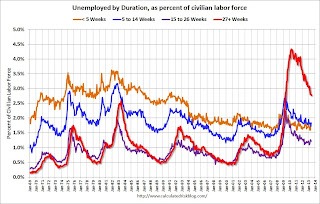 This graph shows the duration of unemployment as a percent of the civilian labor force. The graph shows the number of unemployed in four categories: less than 5 week, 6 to 14 weeks, 15 to 26 weeks, and 27 weeks or more.
The general trend is down for all categories, but only the less than 5 weeks is back to normal levels.
The long term unemployed is at 2.8% of the labor force - the lowest since May 2009 - however the number (and percent) of long term unemployed remains a serious problem.
 This graph shows the unemployment rate by four levels of education (all groups are 25 years and older).
Unfortunately this data only goes back to 1992 and only includes one previous recession (the stock / tech bust in 2001). Clearly education matters with regards to the unemployment rate - and it appears all four groups are generally trending down.
Although education matters for the unemployment rate, it doesn't appear to matter as far as finding new employment (all four categories are only gradually declining).
Note: This says nothing about the quality of jobs - as an example, a college graduate working at minimum wage would be considered "employed".
 This graph shows total construction employment as reported by the BLS (not just residential).
Since construction employment bottomed in January 2011, construction payrolls have increased by 377 thousand. Only 13 thousand construction jobs were added in June. Historically there is a lag between an increase in activity and more hiring - and it appears hiring should pickup significant in the 2nd half of 2013 (Merrill estimates 20 thousand construction jobs per month will be added this year, Goldman estimates 25 to 30 thousand jobs per month, Deutsche Bank around 50 thousand jobs per month in the 2nd half).
 The BLS diffusion index for total private employment was at 58.8 in June, down from 61.8 in May.
For manufacturing, the diffusion index decreased to 46.3, down from 48.1 in June..
Think of this as a measure of how widespread job gains are across industries. The further from 50 (above or below), the more widespread the job losses or gains reported by the BLS. From the BLS:
Figures are the percent of industries with employment increasing plus one-half of the industries with unchanged employment, where 50 percent indicates an equal balance between industries with increasing and decreasing employment.Job growth for total private employment was fairly widespread in June. This is a good sign for the economy. However, for manufacturing, more companies were decreasing employment than adding jobs again in June - for the third consecutive month.
Merrill Lynch on Taper Timing
by Calculated Risk on 7/05/2013 04:26:00 PM
A few excerpts from a research note by Ethan Harris and Michelle Meyer:
Fed officials must be scratching their heads in regards to the sharp reaction of markets to recent tapering talk. Every “core” member of the Committee has been saying tapering is data dependent: this assumes signs of a pick up in both growth and inflation.CR Note: My view is also that data dependent means data dependent. In the two plus weeks since the last FOMC meeting, the data has been below the Fed forecasts (see previous post). I think it will take a clear pickup in the economy during July and August for the FOMC to begin to taper in September; however the consensus is that September is a done deal. Maybe ... perhaps we will know more following the release of the June FOMC meeting minutes next week, and from Bernanke's speech next Wednesday.
In our view, both the markets and economists have not internalized the Fed’s reaction function. Even before the recent downward revisions, most economists surveyed by Bloomberg had weaker growth forecasts for this year than the Fed and yet more than half say tapering starts in September. ...
Why does data seem to matter so much to the Fed, but not to Fed forecasters? We think the Fed has convinced many forecasters that September tapering is a done deal. In May, Bernanke testified that the Fed could taper “in the next few meetings”; that is, by September. Then at his post-FOMC press conference he said he was “deputized” to lay out a specific exit plan: if our forecast is correct, he said, we will taper later this year and end QE by the middle of next year with an unemployment rate of 7%. In our view, he was describing a sensible reaction that will only be realized if their forecast is correct. By contrast, the market interpretation seems to be: “if they are being this specific and not offering any alternative paths, they must be fairly determined to start tapering.” ...
But we disagree with the market interpretation. Data dependent means data dependent. ...
Although the Fed has attempted to clarify its reaction function, we have become increasingly uncertain. The FOMC has zeroed in on the jobs market and to a lesser extent in reduced downside risks: both argue strongly for near-term tapering. However, the Fed’s mandate is to manage the overall economy and the gap between solid jobs and weakness in other growth and inflation indicators has gotten very big ...
Three scenarios seem plausible. (1) The rest of the economy quickly converges to the employment data and the Fed starts a steady move to the exit in September. (2) The Fed decides reduced downside risks make the case for a one-time dial down in QE, so they taper in September but then pause for an extended period waiting for clear broad-based improvement. In other words, subsequent moves are more data dependent than the first. (3) The Fed decides to wait for broad confirmation in data and doesn’t start tapering until December. The third option remains our base case, but clearly we are out of the consensus and September tapering is increasingly possible.
Update: Four Charts to Track Timing for QE3 Tapering
by Calculated Risk on 7/05/2013 01:58:00 PM
We now have data to update all four charts that I'm using to track when the Fed will start tapering the QE3 purchases.
At the June FOMC press conference, Fed Chairman Ben Bernanke said:
"If the incoming data are broadly consistent with this forecast, the Committee currently anticipates that it would be appropriate to moderate the monthly pace of purchases later this year. And if the subsequent data remain broadly aligned with our current expectations for the economy, we would continue to reduce the pace of purchases in measured steps through the first half of next year, ending purchases around midyear. In this scenario, when asset purchases ultimately come to an end, the unemployment rate would likely be in the vicinity of 7%, with solid economic growth supporting further job gains, a substantial improvement from the 8.1% unemployment rate that prevailed when the committee announced this program."
 Click on graph for larger image.
The first graph is for GDP.
The current forecast is for GDP to increase between 2.3% and 2.6% from Q4 2012 to Q4 2013.
The first quarter was below the FOMC projections (red), and it appears the second quarter will also be below the FOMC forecast - if so, then GDP will have to pickup in the 2nd half of 2013 for the Fed to start tapering QE3 purchases in December.
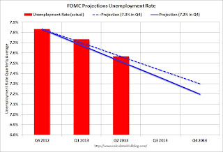 The second graph is for the unemployment rate.
The current forecast is for the unemployment rate to decline to 7.2% to 7.3% in Q4 2013.
We now have data through Q2, and so far the unemployment rate is tracking at the high end of the forecast.
If the participation rate ends the year at 63.6% (level for the year), then job growth will have to pickup up a little in the 2nd half to meet the FOMC projections. See the Atlanta Fed's Jobs Calculator tool to estimate how many jobs per month will be needed to reach a certain unemployment level.
 The third graph is for PCE prices.
The current forecast is for prices to increase 0.8% to 1.2% from Q4 2012 to Q4 2013.
We only have data through May, but so far PCE prices are below this projection - and this projection is significantly below the FOMC target of 2%. Clearly the FOMC expects inflation to pickup, and a key is if the recent decline in inflation is "transitory".
 The fourth graph is for core PCE prices.
The current forecast is for core prices to increase 1.2% to 1.3% from Q4 2012 to Q4 2013.
Once again we only have data through May, but so far core PCE prices are below this projection - and, once again, this projection is significantly below the FOMC target of 2%. Clearly the FOMC expects core inflation to pickup too.
It has only been just over two weeks since the FOMC press conference, and all of the data has been worse than the FOMC forecasts (GDP revised down, unemployment rate at high end, prices below forecast). It would be a stretch to say the incoming data has been "broadly inconsistent" with the June FOMC projections, but clearly the economy will have to pickup before the FOMC would meet their "broadly consistent" goal and start to taper QE3 purchases in December. (September tapering seems less likely now since the key data has been worse than forecast, but still not impossible).
Employment Report: More Hiring, Wages Up, Still Weak Labor Market
by Calculated Risk on 7/05/2013 11:04:00 AM
The good news: This was the best first half for private employment gains since 1999. Also hourly and weekly wages increased 0.4% in June, and hourly wages are now up 2.2% over the last year (weekly wages are up 2.5% year-over-year).
Some bad news: the employment-population ratio for the 25 to 54 year old group (prime working age) declined, the number of part time workers (for economic reasons) increased and U-6 (an alternative measure of labor underutilization) increased to 14.3%.
Some numbers: Total nonfarm employment is up 2.293 million over the last 12 months, and up 1.211 million so far in 2013 (a 2.42 million annual pace).
Private employment is up 2.357 million over the last year, and up 1.234 million so far in 2013 (a 2.47 million annual pace). The following table shows the first and second half and full year changes in private employment since 1998.
| Change in Private Payrolls (000s) | |||
|---|---|---|---|
| Year | First Half | Second Half | Full Year |
| 1998 | 1,389 | 1,312 | 2,701 |
| 1999 | 1,296 | 1,413 | 2,709 |
| 2000 | 953 | 727 | 1,680 |
| 2001 | -773 | -1,535 | -2,308 |
| 2002 | -531 | -234 | -765 |
| 2003 | -366 | 470 | 104 |
| 2004 | 1,111 | 761 | 1,872 |
| 2005 | 1,211 | 1,087 | 2,298 |
| 2006 | 1,109 | 753 | 1,862 |
| 2007 | 688 | 139 | 827 |
| 2008 | -861 | -2,936 | -3,797 |
| 2009 | -3,876 | -1,100 | -4,976 |
| 2010 | 434 | 801 | 1,235 |
| 2011 | 1,209 | 1,211 | 2,420 |
| 2012 | 1,146 | 1,123 | 2,269 |
| 2013 | 1,234 | ||
Of course public payrolls are continuing to shrink (four plus years of declining public payrolls now). Public employment was down 7 thousand in June (mostly at the Federal level), and public employment is down 64 thousand over the last year, and down 23 thousand so far in 2013 (a 46 thousand annual pace).
A few more graphs ...
Employment-Population Ratio, 25 to 54 years old
 Click on graph for larger image.
Since the participation rate declined recently due to cyclical (recession) and demographic (aging population) reasons, an important graph is the employment-population ratio for the key working age group: 25 to 54 years old.
In the earlier period the employment-population ratio for this group was trending up as women joined the labor force. The ratio has been mostly moving sideways since the early '90s, with ups and downs related to the business cycle.
The ratio decreased to 75.9% in June from 76.0% in May. This ratio should probably move close to 80% as the economy recovers.
The participation rate for this group also decreased in June to 81.1%. The decline in the participation rate for this age group is probably mostly due to economic weakness (as opposed to demographics) and this suggests the labor market is still very weak.
Percent Job Losses During Recessions

This graph shows the job losses from the start of the employment recession, in percentage terms - this time aligned at maximum job losses.
In the earlier post, the graph showed the job losses aligned at the start of the employment recession.
This financial crisis recession was much deeper than other post WWII recessions, and the recovery has been slower (the recovery from the 2001 recession was slow too). However, if we compare to other financial crisis recoveries, this recovery has actually been better than most.
Part Time for Economic Reasons
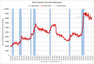 From the BLS report:
The number of persons employed part time for economic reasons (sometimes referred to as involuntary part-time workers) increased by 322,000 to 8.2 million in June. These individuals were working part time because their hours had been cut back or because they were unable to find a full-time job.The number of part time workers increased in June to 8.226 million.
These workers are included in the alternate measure of labor underutilization (U-6) that increased to 14.3% in June from 13.8% in May.
Unemployed over 26 Weeks
 This graph shows the number of workers unemployed for 27 weeks or more.
 According to the BLS, there are 4.328 million workers who have been unemployed for more than 26 weeks and still want a job. This was down slightly from 4.357 million in May. This is trending down, but is still very high. Long term unemployment remains one of the key labor problems in the US.
State and Local Government
 This graph shows total state and government payroll employment since January 2007. State and local governments lost jobs for four straight years. (Note: Scale doesn't start at zero to better show the change.)
 In June 2013, state and local governments lost 2,000 jobs, and state and local employment is up 23 thousand so far in 2013.
I think most of the state and local government layoffs are over. Of course total public employment declined again as the Federal government layoffs are ongoing - and with many more layoffs expected.
Overall this was a solid report - especially with the upward revisions to April and May employment and the pickup in wage gains. But the labor market is still weak and millions of people are unemployed or underemployed.
June Employment Report: 195,000 Jobs, 7.6% Unemployment Rate
by Calculated Risk on 7/05/2013 08:52:00 AM
From the BLS:
Total nonfarm payroll employment increased by 195,000 in June, and the unemployment rate was unchanged at 7.6 percent, the U.S. Bureau of Labor Statistics reported today. ...The headline number was above expectations of 161,000 payroll jobs added. Employment for April and May were also revised higher.
...
The change in total nonfarm payroll employment for April was revised from +149,000 to +199,000, and the change for May was revised from +175,000 to +195,000. With these revisions, employment gains in April and May combined were 70,000 higher than previously reported.
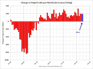 Click on graph for larger image.
NOTE: This graph is ex-Census meaning the impact of the decennial Census temporary hires and layoffs is removed to show the underlying payroll changes.
The second graph shows the unemployment rate.
The unemployment rate was unchanged in June at 7.6%.
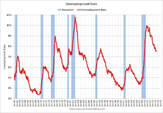 The unemployment rate is from the household report and the household report showed a sharp increase in employment, and that meant a lower unemployment rate.
The third graph shows the employment population ratio and the participation rate.
The Labor Force Participation Rate was increased to 63.5% in June (blue line) from 63.4% in May. This is the percentage of the working age population in the labor force.
 The participation rate is well below the 66% to 67% rate that was normal over the last 20 years, although a significant portion of the recent decline is due to demographics.
The Employment-Population ratio increased in June to 58.7% (black line). I'll post the 25 to 54 age group employment-population ratio graph later.
 The fourth graph shows the job losses from the start of the employment recession, in percentage terms, compared to previous post WWII recessions. The dotted line is ex-Census hiring.
This shows the depth of the recent employment recession - worse than any other post-war recession - and the relatively slow recovery due to the lingering effects of the housing bust and financial crisis.
This was above expectations and was a solid report including the upward revisions to April and May. I'll have much more later ...


