by Calculated Risk on 5/08/2013 03:21:00 PM
Wednesday, May 08, 2013
Update: California Revenues $4.6 Billion ahead of Projections through April
From California State Controller: Controller Releases April Cash Update
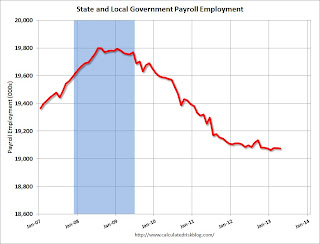
Through the first 10 months of the fiscal year, total revenues exceeded the Governor's January projections by $4.6 billion (+6.1 percent). ...This is just one state, but the drag from the cutbacks at the state and local governments levels are mostly over. Over the last four years, state and local governments have reduced budgets and employment substantially. Here are two graphs I've posted recently:
"We've reached an important milestone in California's economic recovery. For the first time in nearly six years, we closed out a month without borrowing from internal state funds to pay our bills," said Chiang. "But, there remains significant debt that must be shed before we can claim victory and these unanticipated revenues provide us with an important opportunity to take further steps toward long-term fiscal stability."
...
The State ended the last fiscal year with a cash deficit of $9.6 billion, and by April 30, 2013, that cash deficit narrowed to $5.8 billion. That deficit is being covered by $10 billion in external borrowing, which the State will begin repaying later this month.
 Click on graph for larger image.
This graph shows total state and government payroll employment since January 2007. State and local governments lost jobs for four straight years. (Note: Scale doesn't start at zero to better show the change.)
In April 2013, state and local governments lost 3,000 jobs, however state and local employment is unchanged so far in 2013.
The second graph shows the contribution to percent change in GDP for residential investment and state and local governments since 2005.
 The blue bars are for residential investment (RI), and RI was a significant drag on GDP for several years. Now RI has added to GDP growth for the last 8 quarters (through Q1 2013).
However the drag from state and local governments has continued. I was expecting the drag from state and local governments to end last year, but this unprecedented and relentless decline in state and local government spending has still been a drag on the economy in early 2013.
The good news is the drag has to end soon - in real terms, state and local government spending is back to early 2001 levels. And just ending the drag from state and local governments will be a positive for the economy.
Freddie Mac on Q1: $4.6 Billion Net Income, No Treasury Draw, REO Declines
by Calculated Risk on 5/08/2013 11:28:00 AM
From Freddie Mac: Freddie Mac Reports Net Income of $4.6 BILLION;
Freddie Mac today reported net income of $4.6 billion for the first quarter of 2013, compared to net income of $4.5 billion for the fourth quarter of 2012. ...
...
On a quarterly basis, the company determines whether a valuation allowance is necessary on its net deferred tax assets. After evaluating all available evidence, Freddie Mac continued to record a valuation allowance on a portion of its net deferred tax assets as of March 31, 2013. The valuation allowance as of March 31, 2013, was $30.1 billion. To the extent Freddie Mac releases the valuation allowance on its deferred tax assets in a future period, the amount released would be included as income in that period and would result in a corresponding increase in the company’s net worth as of the end of that period.
...
(Provision) benefit for credit losses was a benefit of $503 million for the first quarter of 2013, compared to a benefit of $700 million for the fourth quarter of 2012. The benefit for credit losses for the first quarter of 2013 was driven by continued improvement in national home prices combined with a further decrease in the volume of newly delinquent single-family loans.
 Click on graph for larger image.
On Real Estate Owned (REO), Freddie acquired 17,882 properties in Q1 2013, and disposed of 18,895 and the total REO fell to 47,974 at the end of Q1. This graph shows REO inventory for Freddie.
From Freddie:
In 1Q13, REO dispositions continued to exceed the volume of REO acquisitions. The volume of our single-family REO acquisitions in recent periods has been significantly affected by the length of the foreclosure process and a high volume of foreclosure alternatives, which result in fewer loans proceeding to foreclosure, and thus fewer properties transitioning to REO.
The North Central region comprised 42 percent of our REO property inventory at March 31, 2013. This region generally has experienced more challenging economic conditions, and includes a number of states with longer foreclosure timelines due to the local laws and foreclosure process in the region.
MBA: Mortgage Applications Increase, Purchase index at highest level since May 2010
by Calculated Risk on 5/08/2013 08:31:00 AM
From the MBA: Mortgage Applications Increase in Latest MBA Weekly Survey
The Refinance Index increased 8 percent from the previous week to the highest level since December 2012. The gain in the Refinance Index was due to increases in both the conventional and government refinance indices of 8.8 percent and 5.7 percent respectively. The seasonally adjusted Purchase Index increased 2 percent from one week earlier to the highest level since May 2010.
...
The average contract interest rate for 30-year fixed-rate mortgages with conforming loan balances ($417,500 or less) decreased to 3.59 percent, the lowest rate since December 2012, from 3.60 percent, with points increasing to 0.33 from 0.30 (including the origination fee) for 80 percent loan-to-value ratio (LTV) loans.
emphasis added
 Click on graph for larger image.
The first graph shows the refinance index.
There has been a sustained refinance boom for over a year.
This was the highest level for the refinance index since last December.
 The second graph shows the MBA mortgage purchase index. The 4-week average of the purchase index has generally been trending up over the last year, and the purchase index - and the 4-week average of the purchase index - are at the highest level since May 2010.
Tuesday, May 07, 2013
Temporary Help Services and Employment
by Calculated Risk on 5/07/2013 06:07:00 PM
Back in 2010, some analysts took the surge in temporary help services as a leading indicator for a pickup in employment. I was skeptical back then, first because of the distortion caused by temporary Census workers, second because housing was still weak, and third because it appeared there had been a change in hiring practices.
Once again there has been a pickup in temporary help services. From the BLS report:
In April, employment rose in temporary help services (+31,000) ...Temporary help services has added an average of 28,000 jobs per month over the last three months.
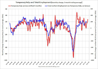
The following graph was a favorite of those expecting a huge rebound in employment in 2010 (see the red spike in 2010). The graph is a little complicated - the red line is the three month average change in temporary help services (left axis). This is shifted four months into the future.
The blue line (right axis) is the three month average change in total employment (excluding temporary help services and Census hiring).
 Click on graph for larger image.
 Unfortunately the data on temporary help services only goes back to 1990, but it does appear that temporary help leads employment by about four months (although noisy).
The thinking is that before companies hire permanent employees following a recession, employers will hire temporary employees. But there is also evidence of a recent shift by employers to more temporary workers.
This graph does suggest temporary help services does lead general employment, but the magnitude of the swings is less useful - and I don't think this suggests an imminent pickup in overall hiring.
Existing Home Inventory is up 12.2% year-to-date on May 6th
by Calculated Risk on 5/07/2013 01:16:00 PM
Weekly Update: One of key questions for 2013 is Will Housing inventory bottom this year?. Since this is a very important question, I'm tracking inventory weekly in 2013.
In normal times, there is a clear seasonal pattern for inventory, with the low point for inventory in late December or early January, and then peaking in mid-to-late summer.
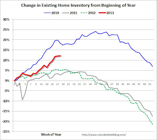
The Realtor (NAR) data is monthly and released with a lag (the most recent data was for March). However Ben at Housing Tracker (Department of Numbers) has provided me some weekly inventory data for the last several years. This is displayed on the graph below as a percentage change from the first week of the year (to normalize the data).
In 2010 (blue), inventory mostly followed the normal seasonal pattern, however in 2011 and 2012, there was only a small increase in inventory early in the year, followed by a sharp decline for the rest of the year.
 Click on graph for larger image.
Note: the data is a little weird for early 2011 (spikes down briefly).
In 2010, inventory was up 15% by the end of March, and close to 20% by the end of April.
For 2011 and 2012, inventory only increased about 5% at the peak and then declined for the remainder of the year.
So far in 2013, inventory is up 12.2%. This is well above the peak percentage increases for 2011 and 2012 and suggests to me that inventory is near the bottom. It is possible that inventory could bottom this year - especially if inventory is up 15% to 18% from the seasonal lows by mid-to-late summer.
It will probably be close. Inventory might have already bottomed in early 2013, or might bottom in early 2014. This will be important for price increases ... once inventory starts to increase (more than seasonal), buyer urgency will wane, and I expect price increases will slow.
Trulia: Asking House Prices increased in April, "Rent growth has slowed"
by Calculated Risk on 5/07/2013 11:46:00 AM
Press Release: Asking Home Prices Soared 8.3 Percent Year-Over-Year Nationwide, While Rents Rose Only 2.4 Percent
With the Spring house hunting season well underway, asking home prices rose 8.3 percent nationally year-over-year (Y-o-Y) in April. This time last year, asking prices fell 1.6 percent Y-o-Y. Seasonally adjusted, asking prices rose 1.3 percent month-over-month and 4.3 percent quarter-over-quarter. Regionally, asking prices were higher than one year ago in 95 of the 100 largest metros.On rents, this is similar to the quarterly Reis report on apartments. It appears that rent increases are slowing.
Strong job growth and the housing recovery go hand-in-hand. Nationally, job growth increased 1.5 percent Y-o-Y in March. In San Jose, Orange County, San Francisco, and Phoenix – where asking prices rose more than 18 percent Y-o-Y – job growth was well above the national average. In fact, only the Detroit suburb of Warren-Troy-Farmington Hills, MI was among the list of top 10 markets with the highest price gains without above average job growth.
Rents rose 2.4 percent Y-o-Y nationally, but rent growth has slowed. In 19 of the 25 largest rental markets, rent gains Y-o-Y was slower in April than in January. In some markets, rents and prices are moving in the opposite direction, or nearly so: the four metros with the slowest rent growth or even declines – San Francisco, Las Vegas, Sacramento, and Seattle – all had price gains of more than 15 percent Y-o-Y.
“Although some of the home-price growth is a bounce back from the housing bust, job growth is boosting housing demand and lifting home prices,” said Jed Kolko, Trulia’s Chief Economist. “Investors don’t deserve all the thanks – or blame – for rising prices. Households are doing their part, too, as the economy recovers and more people go back to work and get on more solid financial footing. Local markets with strong job growth will see home prices continue to recover even after investors decide to cash out their gains and exit the market.”
More from Jed Kolko: Not Just Investors: Local Job Growth Also Supporting Home Price Gains
Note: These asking prices are SA (Seasonally Adjusted) - and adjusted for the mix of homes - and this suggests further house price increases over the next few months on a seasonally adjusted basis.
BLS: Job Openings decreased slightly in March
by Calculated Risk on 5/07/2013 10:11:00 AM
From the BLS: Job Openings and Labor Turnover Summary
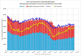
There were 3.8 million job openings on the last business day of March, little changed from 3.9 million in February, the U.S. Bureau of Labor Statistics reported today. The hires rate (3.2 percent) and separations rate (3.1 percent) were little changed in March....The following graph shows job openings (yellow line), hires (dark blue), Layoff, Discharges and other (red column), and Quits (light blue column) from the JOLTS.
...
Quits are generally voluntary separations initiated by the employee. Therefore, the quits rate can serve as a measure of workers’ willingness or ability to leave jobs. ... The number of quits (not seasonally adjusted) was little changed over the 12 months ending in March for total nonfarm, total private, and government.
This series started in December 2000.
Note: The difference between JOLTS hires and separations is similar to the CES (payroll survey) net jobs headline numbers. This report is for March, the most recent employment report was for April.
 Click on graph for larger image.
Notice that hires (dark blue) and total separations (red and light blue columns stacked) are pretty close each month. This is a measure of turnover. When the blue line is above the two stacked columns, the economy is adding net jobs - when it is below the columns, the economy is losing jobs.
Jobs openings decreased in March to 3.844 million, down from 3.899 million in February. The number of job openings (yellow) has generally been trending up, but openings are unchanged year-over-year compared to March 2012.
Quits were down in March, and quits are mostly unchanged year-over-year. These are voluntary separations. (see light blue columns at bottom of graph for trend for "quits").
Not much changes month-to-month in this report - and the data is noisy month-to-month, but the general trend suggests a gradually improving labor market.
CoreLogic: House Prices up 10.5% Year-over-year in March
by Calculated Risk on 5/07/2013 09:01:00 AM
Notes: This CoreLogic House Price Index report is for March. The recent Case-Shiller index release was for February. The CoreLogic HPI is a three month weighted average and is not seasonally adjusted (NSA).
From CoreLogic: CoreLogic Home Price Index Rises by 10.5 Percent Year Over Year in March
Home prices nationwide, including distressed sales, increased 10.5 percent on a year-over-year basis in March 2013 compared to March 2012. This change represents the biggest year-over-year increase since March 2006 and the 13th consecutive monthly increase in home prices nationally. On a month-over-month basis, including distressed sales, home prices increased by 1.9 percent in March 2013 compared to February 2013.
Excluding distressed sales, home prices increased on a year-over-year basis by 10.7 percent in March 2013 compared to March 2012. On a month-over-month basis, excluding distressed sales, home prices increased 2.4 percent in March 2013 compared to February 2013. Distressed sales include short sales and real estate owned (REO) transactions.
The CoreLogic Pending HPI indicates that April 2013 home prices, including distressed sales, are expected to rise by 9.6 percent on a year-over-year basis from April 2012 and rise by 1.3 percent on a month-over-month basis from March 2013. Excluding distressed sales, April 2013 home prices are poised to rise 12 percent year over year from April 2012 and by 2.7 percent month over month from March 2013.
...
“For the first time since March 2006, both the overall index and the index that excludes distressed sales are above 10 percent year over year,” said Dr. Mark Fleming, chief economist for CoreLogic. “The pace of appreciation has been accelerating throughout 2012 and so far in 2013 leading into the home buying season.”
 Click on graph for larger image.
 This graph shows the national CoreLogic HPI data since 1976. January 2000 = 100.
The index was up 1.9% in March, and is up 10.5% over the last year.
The index is off 25.1% from the peak - and is up 11.9% from the post-bubble low set in February 2012.
 The second graph is from CoreLogic. The year-over-year comparison has been positive for thirteen consecutive months suggesting house prices bottomed early in 2012 on a national basis (the bump in 2010 was related to the tax credit).
This is the largest year-over-year increase since 2006.
This was another very strong month-to-month increase. I expect more inventory to come on the market and slow the price increases.
Monday, May 06, 2013
Tuesday: JOLTS
by Calculated Risk on 5/06/2013 09:47:00 PM
The recent controversy surrounding historian Niall Ferguson reminds me of this post some time ago by Invictus: Open Mouth, Insert Foot: Going Viral?
This post [is] about [Ferguson's] recent Bloomberg TV interview with Erik Schatzker and Sara Eisen. And, in particular, one very specific part of that interview where Ferguson makes what is well beyond what I could even charitably refer to as a rookie mistake.So basically Ferguson thought incorrectly the short term hiring for Census 2010 was related to the stimulus (back then I was reporting the jobs report using both the headline number and the ex-Census number). Very amusing ...
...
At 3:55 into the clip, Sara asks Ferguson about the private sector job gains versus the massive public sector job losses we’ve seen under Obama. ...
Here’s what, by my transcription, Ferguson had to say (emphasis mine):
Well, that’s not really a part of the argument I made in the piece. The point I made in the piece was that the stimulus had a very short-term effect, which is very clear if you look , for example, at the Federal employment numbers there’s a huge spike in early 2010 and then it falls back down.Niall, babe, I got one word for you: Census (pdf).
Tuesday economic releases:
• At 10:00 AM ET, the BLS will release the Job Openings and Labor Turnover Survey for March. The number of job openings has generally been trending up, and openings were up 11% year-over-year in February. That was most job openings since May 2008.
• Also at 10:00 AM, the Trulia Price Rent Monitors for April. This is the index from Trulia that uses asking house prices adjusted both for the mix of homes listed for sale and for seasonal factors.
• At 3:00 PM, the Fed will release Consumer Credit for March. The consensus is for credit to increase $15.0 billion in March.
Fed Survey: Banks eased lending standards, "experienced stronger demand"
by Calculated Risk on 5/06/2013 02:50:00 PM
From the Federal Reserve: The April 2013 Senior Loan Officer Opinion Survey on Bank Lending Practices
The April 2013 Senior Loan Officer Opinion Survey on Bank Lending Practices addressed changes in the supply of, and demand for, bank loans to businesses and households over the past three months. This summary is based on responses from 68 domestic banks and 21 U.S. branches and agencies of foreign banks. In the April survey, domestic banks, on balance, reported having eased their lending standards and having experienced stronger demand in several loan categories over the past three months.In general this survey indicates lending standards are still tight, but some banks are loosening a little - and there is also increasing demand for certain loans. Here are some graphs from the Fed of lending standards and loan demand over time for various categories.
The survey results generally indicated that banks’ policies regarding lending to businesses eased over the past three months and demand increased, on balance. In particular, a relatively large fraction of domestic respondents reported having eased standards on C&I loans, and moderate to large net fractions of such respondents reportedly eased many terms on C&I loans to firms of all sizes. ...
On the household side, the survey results were more mixed. On balance, a few domestic banks reported having eased standards on prime residential mortgages over the past three months. For the fifth consecutive survey, respondents reported that demand for prime residential mortgage loans had strengthened on net. A small net fraction of respondents reported that they had eased standards on credit card and auto loans over the past three months, while standards on other consumer loans had remained about unchanged. On balance, banks reported having eased selected terms on auto loans, but terms on credit card and other consumer loans were reportedly little changed. emphasis added


