by Calculated Risk on 4/17/2013 10:12:00 AM
Wednesday, April 17, 2013
LA area Port Traffic decreases year-over-year in March
Container traffic gives us an idea about the volume of goods being exported and imported - and possibly some hints about the trade report for March since LA area ports handle about 40% of the nation's container port traffic.
The following graphs are for inbound and outbound traffic at the ports of Los Angeles and Long Beach in TEUs (TEUs: 20-foot equivalent units or 20-foot-long cargo container).
To remove the strong seasonal component for inbound traffic, the first graph shows the rolling 12 month average.
 Click on graph for larger image.
On a rolling 12 month basis, inbound traffic was up 2% in March, and outbound traffic down slightly, compared to the rolling 12 months ending in February.
In general, inbound traffic has been increasing slightly recently, and outbound traffic has been mostly moving sideways.
The 2nd graph is the monthly data (with a strong seasonal pattern for imports).
 Usually imports peak in the July to October period as retailers import goods for the Christmas holiday, and then decline sharply and bottom in February or March.
Sometimes the sharp seasonal decline happens in February, sometimes in March depending on the timing of the Chinese New Year. This year the sharp seasonal decline happened in March.
My guess is this suggests a decrease in the trade deficit with Asia for March.
MBA: Mortgage Applications Increase, Purchase Index highest since May 2010
by Calculated Risk on 4/17/2013 08:44:00 AM
From the MBA: Mortgage Applications Increase in Latest MBA Weekly Survey
The Refinance Index increased 5 percent from the previous week and is at its highest level since mid-January of 2013. The seasonally adjusted Purchase Index increased 4 percent from one week earlier is at its highest level since May of 2010 and the adjusted Conventional Purchase Index increased 3 percent to the highest level since October 2009.
...
The average contract interest rate for 30-year fixed-rate mortgages with conforming loan balances ($417,500 or less) decreased to 3.67 percent from 3.68 percent, with points increasing to 0.50 from 0.43 (including the origination fee) for 80 percent loan-to-value ratio (LTV) loans.
The average contract interest rate for 30-year fixed-rate mortgages with jumbo loan balances (greater than $417,500) decreased to 3.77 percent from 3.79 percent, with points decreasing to 0.27 from 0.36 (including the origination fee) for 80 percent LTV loans.
emphasis added
 Click on graph for larger image.
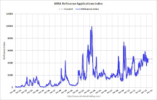
The first graph shows the refinance index.
There has been a sustained refinance boom for over a year.
However refinance activity will probably slow in 2013.
 The second graph shows the MBA mortgage purchase index. The 4-week average of the purchase index has generally been trending up over the last year, and the purchase index last week was at the highest level since May 2010.
Tuesday, April 16, 2013
Wednesday: Beige Book, Mortgage Applications
by Calculated Risk on 4/16/2013 08:23:00 PM
Another Spring slowdown?
From Tim Duy at EconomistsView Fed Watch: Another Spring Slowdown?
On net, I think the data is telling us a familiar story: The positives in the US economy are difficult to ignore. Housing starts are a very good indicator of the direction of the economy, and that direction appears to be up. But it doesn't pay to get too carried away with any one quarter's worth of data. Underlying growth has been slow and steady since the end of the recession, with positive quarters offset by negative quarters. And the impact of tighter fiscal policy looks likely to produce a similar trend this year. The light at the end of the tunnel, however, is that as the fiscal effect fades toward the end of this year and into next, activity could finally see a more of the sustained improvement we have been looking for.From Ylan Q. Mui at the WaPo: Spring is a season of growth — but not for the U.S. economy
But, at the moment, that sustained improvement looks ephemeral. That is the message of the bond market as yields plunged back to the 1.7 percent range since the beginning of the year. And the beat-down of commodity prices indicates nervousness on the global outlook as well. If I was a monetary policymaker, I would be paying attention, especially as the inflation numbers are not telling us that imminent tightening is necessary ...
For the third year in a row, the nation’s economic recovery seems to be petering out just as temperatures start to go up. Hiring has dropped off. Shoppers are putting away their wallets. Government spending cuts are looming.I think seasonal adjustments played a role in earlier slowdowns (as did the tsunami in Japan and the problems in Europe), but I think this slowdown is mostly related to fiscal tightening (mostly the payroll tax hike and the sequestration budget cuts). As Tim Duy notes, the fiscal effect should fade towards the end of this year.
That has fueled predictions of an abrupt slowdown over the next few months. Economists are forecasting tepid growth of just over 1 percent during the second quarter of the year.
...
No one seems to have a good explanation for why the recovery has taken a nosedive around the same time each year. ... At first, economists wondered whether the problem was purely technical. The 2008 financial crisis upended mathematical models for how many people are hired and fired on a normal basis, resulting, they hypothesized, in artificial boosts in the fall that evaporated by spring.
But that explanation for the swoon was almost too easy — and certainly too optimistic. It turns out the trouble lay not in the data but in the real world.
In 2011, the problem was international. A tsunami in Japan coincided with a financial crisis in Europe that pushed Greece into default and almost caused a collapse of the continent’s common currency. Last year, economists blamed the weather. The mild winter, they said, siphoned away traditional springtime jobs.
This year, all fingers are pointed at Washington.
Wednesday economic releases:
• At 7:00 AM ET, The Mortgage Bankers Association (MBA) will release the results for the mortgage purchase applications index.
• At 2:00 PM, Federal Reserve Beige Book, an informal review by the Federal Reserve Banks of current economic conditions in their Districts. Analysts will look for signs of a slow down.
Lawler: Updated Table of Short Sales and Foreclosures for Selected Cities in March
by Calculated Risk on 4/16/2013 04:33:00 PM
Economist Tom Lawler sent me the updated table below of short sales and foreclosures for several selected cities in March.
Look at the right two columns in the table below (Total "Distressed" Share for March 2013 compared to March 2012). In every area that has reported distressed sales so far, the share of distressed sales is down year-over-year - and down significantly in many areas.
This is worth repeating: Imagine that the number of total existing home sales doesn't change or even declines over the next year - some people would argue that is "bad" news and the housing market isn't recovering. But also imagine that the share of distressed sales declines sharply, and conventional sales increase significantly. That would be a positive sign - and that is what is now happening.
I think the two keys for existing housing are active inventory and the number of conventional sales.
| Short Sales Share | Foreclosure Sales Share | Total "Distressed" Share | ||||
|---|---|---|---|---|---|---|
| 13-Mar | 12-Mar | 13-Mar | 12-Mar | 13-Mar | 12-Mar | |
| Las Vegas | 33.3% | 26.6% | 11.2% | 40.7% | 44.5% | 67.3% |
| Reno | 32.0% | 34.0% | 9.0% | 32.0% | 41.0% | 66.0% |
| Phoenix | 15.1% | 25.7% | 11.6% | 21.1% | 26.8% | 46.8% |
| Sacramento | 27.0% | 29.0% | 10.5% | 30.7% | 37.5% | 59.7% |
| Minneapolis | 9.3% | 12.4% | 28.6% | 36.5% | 37.9% | 48.9% |
| Mid-Atlantic (MRIS) | 11.4% | 13.2% | 10.7% | 14.7% | 22.1% | 27.9% |
| Orlando | 21.7% | 33.1% | 21.3% | 26.0% | 43.1% | 59.2% |
| Hampton Roads | 28.4% | 33.5% | ||||
| Northeast Florida | 40.0% | 43.2% | ||||
| Chicago | 43.0% | 46.0% | ||||
| Charlotte | 12.3% | 15.8% | ||||
| Metro Detroit | 35.4% | 46.6% | ||||
| Memphis* | 26.8% | 32.7% | ||||
| *share of existing home sales, based on property records | ||||||
A few comments on Housing Starts
by Calculated Risk on 4/16/2013 02:50:00 PM
A few comments:
• Total housing starts in March were up 46.7% from the March 2012 pace, although some of that increase was due to a surge in multi-family starts in March (Multi-family starts are volatile month-to-month). Single family starts were up 28.7%. That is a very strong year-over-year increase.
• Even with this significant increase, housing starts are still very low. Starts averaged 1.5 million per year from 1959 through 2000, and demographics and household formation suggests starts will return to close to that level over the next few years. That means starts will probably increase 50% or so from the current level (1.036 million SAAR in March).
• There is some concern that multi-family starts are now too high. That is possible, especially considering all the units currently under construction and not yet completed. However single family starts are still near record lows, and most of the future increase in starts will probably be from single family starts.
• Residential investment and housing starts are usually the best leading indicator for economy. Nothing is foolproof as a leading indicator, but this suggests the economy will continue to grow over the next couple of years.
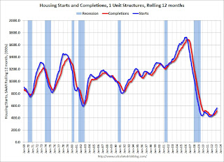
Here is an update to the graph comparing multi-family starts and completions. Since it usually takes over a year on average to complete a multi-family project, there is a lag between multi-family starts and completions. Completions are important because that is new supply added to the market, and starts are important because that is future new supply (units under construction is also important for employment).
These graphs use a 12 month rolling total for NSA starts and completions.
 Click on graph for larger image.
The blue line is for multifamily starts and the red line is for multifamily completions.
The rolling 12 month total for starts (blue line) has been increasing steadily, and completions (red line) is lagging behind - but completions will follow starts up (completions lag starts by about 12 months).
This means there will be an increase in multi-family deliveries this year. The level of multi-family starts over the last 12 months - almost to the level in late '90s and early 00's - suggests that future growth in starts will mostly come from single family starts.
 The second graph shows single family starts and completions. It usually only takes about 6 months between starting a single family home and completion - so the lines are much closer. The blue line is for single family starts and the red line is for single family completions.
Starts are moving up and completions are following. Usually single family starts bounce back quickly after a recession, but not this time because of the large overhang of existing housing units.
Note the low level of single family starts and completions. The "wide bottom" was what I was forecasting several years ago, and now I expect several years of increasing single family starts and completions.
Key Measures show low inflation in March
by Calculated Risk on 4/16/2013 11:18:00 AM
Note: Researchers at the Cleveland Fed recently wrote a post about the usefulness of median CPI: Forecasting Inflation? Target the Middle.
The Cleveland Fed released the median CPI and the trimmed-mean CPI this morning:
According to the Federal Reserve Bank of Cleveland, the median Consumer Price Index rose 0.1% (1.1% annualized rate) in March. The 16% trimmed-mean Consumer Price Index rose 0.1% (0.7% annualized rate) during the month. The median CPI and 16% trimmed-mean CPI are measures of core inflation calculated by the Federal Reserve Bank of Cleveland based on data released in the Bureau of Labor Statistics' (BLS) monthly CPI report.Note: The Cleveland Fed has the median CPI details for March here. Motor fuel declined at a 40% annualized rate in March following the huge increase in February.
Earlier today, the BLS reported that the seasonally adjusted CPI for all urban consumers fell 0.2% (-2.2% annualized rate) in March. The CPI less food and energy increased 0.1% (1.3% annualized rate) on a seasonally adjusted basis.
 Click on graph for larger image.
This graph shows the year-over-year change for these four key measures of inflation. On a year-over-year basis, the median CPI rose 2.1%, the trimmed-mean CPI rose 1.7%, and the CPI less food and energy rose 1.9%. Core PCE is for January and increased 1.3% year-over-year.
On a monthly basis, median CPI was at 1.1% annualized, trimmed-mean CPI was at 0.7% annualized, and core CPI increased 1.3% annualized. Also core PCE for February increased 0.7% annualized.
With this low level of inflation and the current high level of unemployment, I expect the Fed will continue the large scale asset purchases (QE) at the current level.
Fed: Industrial Production increased 0.4% in March
by Calculated Risk on 4/16/2013 09:32:00 AM
From the Fed: Industrial production and Capacity Utilization
Industrial production rose 0.4 percent in March after having increased 1.1 percent in February. For the first quarter as a whole, output moved up at an annual rate of 5.0 percent, its largest gain since the first quarter of 2012. Manufacturing output edged down 0.1 percent in March after having risen 0.9 percent in February; the index advanced at an annual rate of 5.3 percent in the first quarter. Production at mines decreased 0.2 percent in March and edged down in the first quarter. In March, the output of utilities jumped 5.3 percent, as unusually cold weather drove up heating demand. At 99.5 percent of its 2007 average, total industrial production in March was 3.5 percent above its year-earlier level. The rate of capacity utilization for total industry moved up in March to 78.5 percent, a rate that is 1.2 percentage points above its level of a year earlier but 1.7 percentage points below its long-run (1972--2012) average.
emphasis added
 Click on graph for larger image.
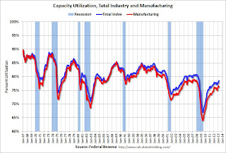
This graph shows Capacity Utilization. This series is up 11.5 percentage points from the record low set in June 2009 (the series starts in 1967).
Capacity utilization at 78.5% is still 1.7 percentage points below its average from 1972 to 2010 and below the pre-recession level of 80.8% in December 2007.
Note: y-axis doesn't start at zero to better show the change.
 The second graph shows industrial production since 1967.
Industrial production increased in March to 99.5. This is 18.8% above the recession low, but still 1.3% below the pre-recession peak.
The monthly change for both Industrial Production and Capacity Utilization were above expectations.
Housing Starts increase to 1.036 million SAAR in March
by Calculated Risk on 4/16/2013 08:43:00 AM
From the Census Bureau: Permits, Starts and Completions
Housing Starts:
Privately-owned housing starts in March were at a seasonally adjusted annual rate of 1,036,000. This is 7.0 percent above the revised February estimate of 968,000 and is 46.7 percent above the March 2012 rate of 706,000.
Single-family housing starts in March were at a rate of 619,000; this is 4.8 percent below the revised February figure of 650,000. The March rate for units in buildings with five units or more was 392,000.
Building Permits:
Privately-owned housing units authorized by building permits in March were at a seasonally adjusted annual rate of 902,000. This is 3.9 percent below the revised February rate of 939,000, but is 17.3 percent above the March 2012 estimate of 769,000.
Single-family authorizations in March were at a rate of 595,000; this is 0.5 percent below the revised February figure of 598,000. Authorizations of units in buildings with five units or more were at a rate of 283,000 in March.
 Click on graph for larger image.
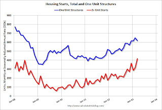
The first graph shows single and multi-family housing starts for the last several years.
Multi-family starts (red, 2+ units) increased sharply in March.
Single-family starts (blue) declined to 619,000 in March (Note: February was revised up sharply from 618 thousand to 650 thousand).
The second graph shows total and single unit starts since 1968.
 This shows the huge collapse following the housing bubble, and that housing starts have been increasing after moving sideways for about two years and a half years.
 This was well above expectations of 930 thousand starts in March, mostly due to the sharp increase in multi-family starts - and the highest level since June 2008. Starts in March were up 46.7% from March 2012; single family starts were up 28.7% year-over-year. Starts in February were revised up sharply. I'll have more later, but this was a strong report.
Monday, April 15, 2013
Tuesday: Housing Starts, CPI, Industrial Production
by Calculated Risk on 4/15/2013 09:01:00 PM
From Annie Lowery at the NY Times: Europe Split Over Austerity as a Path to Growth
Economic fortunes during the recovery from the Great Recession have diverged, with new estimates of growth by the monetary fund expected on Tuesday. But they will not change the basic picture, which Ms. Lagarde has taken to describing as a “three-speed” world. Developing and emerging economies are growing apace. Some advanced economies, including the United States, are gaining strength.At least people are questioning the current policies in Europe.
But a third category of countries remains mired in stagnation or recession. Japan has struggled with a stalled-out economy, but has recently engaged in an athletic campaign of fiscal and monetary stimulus. The true laggard is Europe, suffering from rising unemployment and another bout of economic contraction — seemingly without the political consensus or economic mechanisms to tackle those problems.
...
In light of that reality, the monetary fund and its European partners, the European Commission and the European Central Bank — the so-called troika — have come under continued criticism for the austerity measures imposed on countries including Spain, Portugal and Greece, where unemployment rates extend well into the double digits. The criticism has become louder since the fund said it had determined that austerity had a far worse impact on weak economies than it once thought.
Tuesday economic releases:
• At 8:30 AM ET, Housing Starts for March from the Census Bureau. The consensus is for total housing starts to increase to 930 thousand (SAAR) in March, up from 917 thousand in February.
• Also at 8:30 AM, the BLS will release the Consumer Price Index for March. The consensus is no change in CPI in March (due to lower gasoline prices) and for core CPI to increase 0.2%.
• At 9:15 AM, the Fed will release Industrial Production and Capacity Utilization for March. The consensus is for a 0.2% increase in Industrial Production in March, and for Capacity Utilization to decrease to 78.3%.
Gasoline Prices Continue Decline
by Calculated Risk on 4/15/2013 05:29:00 PM
A sad day ... my thoughts are with the victims and the people of Boston.
As part of the commodity sell-off, oil prices were down again today (the price of gold is irrelevant for the economy, but oil matters). According to Bloomberg, WTI was down to $87.62 per barrel, and Brent was down to $100.39 per barrel.
According to Gasbuddy.com (see graph at bottom), gasoline prices are down to a national average of $3.50 per gallon. Using the calculator from Professor Hamilton, and the current price of Brent crude oil, the national average should be around $3.35 per gallon. That is about 15 cents below the current level according to Gasbuddy.com, and I expect prices to fall further. The low for the year is in the $3.20s per gallon, and a year ago gasoline was at $3.90 per gallon.
Note: If you click on "show crude oil prices", the graph displays oil prices for WTI, not Brent; gasoline prices in most of the U.S. are impacted more by Brent prices.
| Orange County Historical Gas Price Charts Provided by GasBuddy.com |


