by Calculated Risk on 2/19/2013 09:12:00 AM
Tuesday, February 19, 2013
Residential Remodeling Index declines 6% in December
From BuildFax:
Residential remodels authorized by building permits in the United States in December were at a seasonally-adjusted annual rate of 2,725,000. This is 6 percent below the revised November rate of 2,895,000 and is 6 percent below the December 2011 estimate of 2,901,000.
Seasonally-adjusted annual rates of remodeling across the country in December 2012 are estimated as follows: Northeast, 636,000 (up 39% from November and up 37% from December 2011); South, 1,088,000 (down 13% from November and down 1% from December 2011); Midwest, 596,000 (down 8% from November and down 17% from December 2011); West, 777,000 (down 16% from November and down 8% from December 2011).
"Repairs from super-storm Sandy attributed to the influx of Northeastern residential remodeling in December," said Joe Emison, Chief Technology Officer at BuildFax. "The last time the Northeast broke 600,000 estimated residential remodels was five years ago. Unfortunately, the rest of the country saw both month-over-month and year-over-year declines in residential remodeling activity."
The BuildFax Remodeling Index (BFRI) is based on construction permits for residential remodeling projects filed with local building departments across the country. The index estimates the number of properties permitted.
 Click on graph for larger image.
This graph shows the Remodeling Index since January 2008 on a seasonally adjusted basis.
This index has generally been trending up, but was down in December even with all the repairs in the Northeast. Note: Permits are not adjusted by value, so this doesn't indicate the value of remodeling activity. Also some smaller remodeling projects are done without permits and the index will miss that activity.
Monday, February 18, 2013
Tuesday: Homebuilder Confidence Survey
by Calculated Risk on 2/18/2013 09:15:00 PM
A couple of interesting stories ...
First, the prices for West Texas Intermediate (WTI) and Brent crude oil have diverged in recent years due to pipeline capacity issues. Jim Hamilton discusses the plans to build more pipelines: Planned crude oil pipelines. A pretty impressive amount of capaticy will be built over the next couple of years (See Hamilton's post).
And on California from the WaPo: Will higher taxes on the rich derail California’s economic comeback?
The tax increases approved in November are a big reason the state isn’t staring down another huge budget shortfall or the prospect of issuing IOUs to fill it. They include bumping the sales tax up slightly and raising the top income tax rate to 13.3 percent, which is four percentage points higher than the District of Columbia’s and more than double the rate in Virginia or Maryland.Tuesday economic releases:
Yet many economists and some young executives in the state say they don’t worry about that high rate chilling growth. Other factors loom much larger for California’s business and economic health, they say, including whether the state can maintain deep pools of highly skilled talent and, in complicated but important ways, the renewed upward march of home prices in the Bay Area and beyond.
“I don’t think we should be surprised that the state is growing, nor that California is growing faster than the national economy,” said Christopher Thornberg, an economist and the founding partner of Beacon Economics.
...
“The evidence is, from past tax increases, that it makes very little difference,” said Jerry Nickelsburg, a senior economist at the UCLA Anderson Forecast, who predicts only a slight scrape to state growth from the new rate increases. Since 1967, he added, tax hikes and cuts in the state have had a “second-order effect” on growth.
The bigger threat, other economists say, might be another run-up of housing prices, especially where the innovators live.
Housing prices are a much bigger factor in most people’s budgets than state tax rates, said Jed Kolko, chief economist for the online real estate site Trulia. If home prices rise quickly, he said, they constrain growth more than taxes do: “The skilled workforce that California presents as an advantage,” Kolko said, “is also threatened by higher housing prices.”
• At 10:00 AM ET, the February NAHB homebuilder survey. The consensus is for a reading of 48, up from 47 in January. Although this index has been increasing sharply, any number below 50 still indicates that more builders view sales conditions as poor than good.
Lawler: Early Look At January Existing Home Sales
by Calculated Risk on 2/18/2013 06:17:00 PM
From economist Tom Lawler:
While several MLS that I follow have been unusually late in releasing their monthly reports, based on the reports that I have seen I estimate that US existing home sales as estimated by the National Association of Realtors ran at a seasonally adjusted annual rate of about 5.10 million in January, up about 3.2% from December’s seasonally-adjusted pace, and up 10.2% from last January’s seasonally-adjusted pace. January, of course, is seasonally by far the weakest month of the year for closed home sales, with the January “seasonal” factor (for total existing home sales) typically averaging about 67.5% (depending on the year’s calendar). The seasonal factor for a “neutral” month is, of course, 100%.
On the inventory front, my “best guess” is that the NAR’s existing home inventory estimate for January will be unchanged from December’s estimate.
CR Note: The NAR will report January existing home sales on Thursday, February 21st. The consensus is the NAR will report sales of 4.90 million on a seasonally adjusted annual rate (SAAR) basis.
Based on Lawler's estimates, the NAR will report inventory at around 1.82 million units for January (same as December), and months-of-supply around 4.3 months (down from 4.4 months in December). This would be the lowest months-of-supply since May 2005.
Existing Home Inventory up 2.3% year-to-date in mid-February
by Calculated Risk on 2/18/2013 04:21:00 PM
One of key questions for 2013 is Will Housing inventory bottom this year?. Since this is a very important question, I'll be tracking inventory weekly for the next few months.
If inventory does bottom, we probably will not know for sure until late in the year. In normal times, there is a clear seasonal pattern for inventory, with the low point for inventory in late December or early January, and then peaking in mid-to-late summer.
The NAR data is monthly and released with a lag. However Ben at Housing Tracker (Department of Numbers) kindly sent me some weekly inventory data for the last several years. This is displayed on the graph below as a percentage change from the first week of the year.
In 2010 (blue), inventory followed the normal seasonal pattern, however in 2011 and 2012, there was only a small increase in inventory early in the year, followed by a sharp decline for the rest of the year.
So far - through mid-February - it appears inventory is increasing at a sluggish rate.
 Click on graph for larger image.
Note: the data is a little weird for early 2011 (spikes down briefly).
The key will be to see how much inventory increases over the next few months. In 2010, inventory was up 8% by early March, and up 15% by the end of March.
For 2011 and 2012, inventory only increased about 5% at the peak.
So far in 2013, inventory is up 2.2%. If inventory doesn't increase soon, then the bottom for inventory might not be until 2014.
FNC: "Foreclosure price discounts drop to pre-crisis levels"
by Calculated Risk on 2/18/2013 12:23:00 PM
Some interesting data from FNC: Foreclosure price discounts drop to pre-crisis levels
Though home foreclosures continue to be a challenge in many hard-hit markets, a report released this week by mortgage technology company FNC indicates the ongoing housing recovery should continue for the long haul.
According to FNC’s Foreclosure Market Report, foreclosure prices have bottomed out in recent months and the foreclosure market has stabilized while underlying home values are rising. Foreclosure prices are at a 10-year low (when the sizes of foreclosed homes are factored in).
This trend of a rising underlying market accompanied by stabilizing foreclosure prices is the first encouraging development in the housing recession, according to FNC Senior Research Economist, Dr. Yanling Mayer.
“The fact that we are seeing a combination of rising home prices and a bottoming out of foreclosure prices is a very good sign the housing recovery is taking hold,” Mayer said. “This is the very first time in the long housing recession that the two are happening at the same time.”
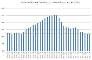 Click on graph for larger image.
More from FNC:
FNC’s report shows that foreclosure price discounts, which compare a foreclosed home’s estimated market value to its final sales price, have dropped to pre-mortgage crisis levels at about 12.2% in Q4 2012. At the height of the mortgage crisis in 2008 and 2009, foreclosed homes were typically sold at more than 25% below their estimated market value. Additionally, the report indicates that the typical size of foreclosed homes is also approaching pre-crisis levels.Another sign that the housing market is recovering (although the percent of distressed sales - foreclosures and short sales - is still very high).
“If you look at the period of short-lived recovery under the first-time homebuyer tax credits, the foreclosure market was still in the midst of rapid deterioration with the influx of delinquent mortgages,” Mayer said. “This time, we are witnessing an entirely different development in the foreclosure market.”
LA area Port Traffic in January
by Calculated Risk on 2/18/2013 09:42:00 AM
I've been following port traffic for some time. Container traffic gives us an idea about the volume of goods being exported and imported - and possibly some hints about the trade report for January. LA area ports handle about 40% of the nation's container port traffic.
The following graphs are for inbound and outbound traffic at the ports of Los Angeles and Long Beach in TEUs (TEUs: 20-foot equivalent units or 20-foot-long cargo container).
To remove the strong seasonal component for inbound traffic, the first graph shows the rolling 12 month average.
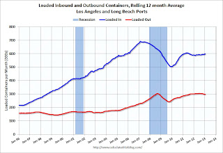 Click on graph for larger image.
On a rolling 12 month basis, inbound traffic was up slightly in January, and outbound traffic down slightly, compared to the rolling 12 months ending in December.
In general, inbound traffic has been increasing slightly recently, and outbound traffic has been mostly moving sideways.
The 2nd graph is the monthly data (with a strong seasonal pattern for imports).
 Usually imports peak in the July to October period as retailers import goods for the Christmas holiday, and then decline sharply and bottom in February or March.
For the month of January, loaded outbound traffic was up slightly compared to January 2012, and loaded inbound traffic was up 4% compared to January 2012.
This suggest a slight increase in the trade deficit with Asia for January.
Sunday, February 17, 2013
Update: Recovery Measures
by Calculated Risk on 2/17/2013 02:26:00 PM
By request, here is an update to four key indicators used by the NBER for business cycle dating: GDP, Employment, Industrial production and real personal income less transfer payments.
Note: The following graphs are all constructed as a percent of the peak in each indicator. This shows when the indicator has bottomed - and when the indicator has returned to the level of the previous peak. If the indicator is at a new peak, the value is 100%.
These graphs show that some major indicators are still significantly below the pre-recession peaks.
 Click on graph for larger image.
This graph is for real GDP through Q4 2012.
Real GDP returned to the pre-recession peak in Q4 2011, and hit new post-recession highs for four consecutive quarters until dipping slightly in Q4 2012 (Q4 GDP will probably be revised up).
At the worst point - in Q2 2009 - real GDP was off 4.7% from the 2007 peak.
 Real GDP has performed better than other indicators ...
This graph shows real personal income less transfer payments as a percent of the previous peak through the December report.
This measure was off 11.2% at the trough in October 2009.
Real personal income less transfer payments returned to the pre-recession peak in December, but that was due to a one time surge in income as some high income earners accelerated earnings to avoid higher taxes in 2013. Without that distortion, real personal income less transfer payments would probably still be 2.5% or so below the previous peak.
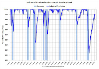 The third graph is for industrial production through January 2013.
Industrial production was off over 17% at the trough in June 2009, and has been one of the stronger performing sectors during the recovery.
However industrial production is still 2.1% below the pre-recession peak. This indicator will probably return to the pre-recession peak in 2013.
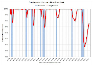 The final graph is for employment and is through January 2013. This is similar to the graph I post every month comparing percent payroll jobs lost in several recessions.
Payroll employment is still 2.3% below the pre-recession peak.
All of these indicators collapsed in 2008 and early 2009, and only real GDP is back to the pre-recession peak (personal income was due to a one time increase in income and will be back below the pre-recession peak in January). At the current pace of improvement, industrial production will be back to the pre-recession peak later this year, personal income less transfer payments late in 2013, and employment in late 2014.
Inland Empire: Starting to Recover
by Calculated Risk on 2/17/2013 10:28:00 AM
Southern California's "Inland Empire" was one of epicenters of the housing bust. Now the area is recovering ...
From Alejandro Lazo at the LA Times: Inland Empire housing is more affordable but still out of reach
Bill Sepe has gotten used to rejection.
The 28-year-old Rancho Cucamonga native has put in nearly 200 unsuccessful offers since August on Inland Empire homes, varying from typical suburban ranches to classic craftsman homes.
All this anguish comes in pursuit of a modest home in the exurb of San Bernardino County, the epicenter of the Southern California housing crash. Plummeting values here sparked a vicious wave of foreclosures.
...
The repeated rejections come despite Sepe's solid qualifications: a stable job as a cell tower technician and a pre-approved home loan. He watches as houses hit the market, then get scooped up within an hour. ...
The Inland Empire has gone from bust to boom with a vigor few could have predicted, mirroring Western regions such as Phoenix and Las Vegas. Surging demand has tightened inventory ... That's great for the real estate industry and helps the local economy. ...
In the Inland Empire's darkest hour, nearly one of five borrowers was behind on a home loan. Foreclosed properties made up more than two-thirds of sales. Work on half-built subdivisions stopped dead, with as construction jobs drying up and the unemployment rate soaring. Last year the city of San Bernardino declared bankruptcy.
...
But a turnaround is well underway, thanks in part to deep-pocketed investors snapping up bargains with cash. The housing supply is now so tight that it's common for home shoppers to put in 20 or 30 offers before securing a house, real estate agents say.
...
For real estate professionals, the turnaround is like a downpour after years of drought.
"There is optimism here for the first time in eight years," said Paul Herrera, government affairs director for the Inland Valleys Assn. of Realtors. "For the first time since 2005, we are thinking that next year will be better than this year."
 Click on graph for larger image.
This graph shows the unemployment rate for the Inland Empire (using MSA: Riverside, San Bernardino, Ontario), and also the number of construction jobs as a percent of total employment.
The unemployment rate is falling, but still very high 10.9% (down from 15.0% in 2010). And construction employment is still near the lows. But the area is recovering.
Saturday, February 16, 2013
Unofficial Problem Bank list declines to 812 Institutions
by Calculated Risk on 2/16/2013 04:30:00 PM
Here is the unofficial problem bank list for Feb 15, 2013.
Changes and comments from surferdude808:
Many changes were made to the Unofficial Problem Bank List this week with a failure and the OCC releasing its enforcement action through mid-January 2013. In all, there were 10 removals and three additions that leave the list at 812 institutions with assets of $303 billion. A year ago, the list held 956 institutions with assets of $389.6 billion.Earlier:
The three additions this week were Acacia Federal Savings Bank, Falls Church, VA ($911 million); The Baraboo National Bank, Baraboo, WI ($739 million); and Commonwealth Bank, FSB, Mount Sterling, KY ($21 million).
The OCC terminated actions against Inter National Bank, McAllen, TX ($2.2 billion); The Kishacoquillas Valley National Bank of Belleville, Belleville, PA ($564 million Ticker: KISB); The First National Bank of Elk River, Elk River, MN ($248 million); Noble Bank & Trust, N.A., Anniston, AL ($169 million); Frontier Bank, Rock Rapids, IA ($151 million); International City Bank, National Association, Long Beach, CA ($144 million); First National Bank of Decatur County, Bainbridge, GA ($111 million); Neighborhood National Bank, Alexandria, MN ($48 million); and The Farmers and Merchants National Bank of Hatton, Hatton, ND ($26 million).
The other removal was the failed Covenant Bank, Chicago, IL ($60 million), which was the third failure this year. Covenant Bank was quite costly to shutter as the FDIC cost estimate is $21.8 million or about 37 percent of the failed bank's assets. The last failure in Chicago, Second Federal Savings and Loan Association of Chicago, in July 2012, was also quite expensive with an estimated cost of 40.3 percent of assets. Excluding Washington Mutual, failure costs have averaged an estimated 24.8 percent of failed assets for the 467 closings since 2008. Prior to the crisis, resolution costs were around 12 percent. Thus, the losses in this crisis are well above historical experience, which suggests the banking regulators did not effectively curb risk taking before the bursting of the bubble and that insolvent institutions have not been closed in a timely manner.
Late in the day on Friday, eyes were focused on New Mexico to see if the state banking department would declare Sunrise Bank of Albuquerque, Albuquerque, NM ($52 million) insolvent as it needed a $1 million capital infusion by 5:30 p.m. According to a media report by SNL Securities, Sunrise's parent, Capitol Bancorp, asked a federal bankruptcy judge to approve a secured loan from unnamed investors that could be used to recapitalize the bank. Capitol Bancorp controls 11 banks on the Unofficial Problem Bank List, of which eight also operating under a Prompt Corrective Action order. In its filing, Capitol Bancorp intimated that a failure of its New Mexico unit would have dire consequences as it could trigger a cross guaranty liability of more than $10 million the FDIC could assess across the other controlled bank units, which could lead to a collapse of the entire company. Capitol Bancorp has agreed to sell its New Mexico bank to Westar Bancorp, but the buyer has not been able to secure the necessary regulatory approvals to consummate the transaction. The FDIC has provided Capitol Bancorp much latitude by issuing at least 16 cross guaranty liability waivers to previously controlled banking units the company has sold as part of its recapitalization efforts. As of 11 p.m. east coast, it has been radio silence as there is no update if the capital made it to the New Mexico unit or if the deadline has been extended. We will continue to monitor and provide updates on Capitol Bancorp. Should a unit fail and if the cross guaranty liability is applied, it could make for a busy night for the FDIC as it is unlikely the units would be purchased by a single buyer given their size and geographic dispersion.
• Summary for Week Ending Feb 15th
• Schedule for Week of Feb 17th
Summary for Week ending February 16th
by Calculated Risk on 2/16/2013 01:11:00 PM
The Industrial Production release was a reporting challenge this week. Expectations were for production to increase 0.1% in January, but the Federal Reserve reported a 0.1% decrease. At first glance, this appears to be disappointing, however production for November and December were revised up significantly, and total production in January was actually above expectations. Here are a few details ...
First, Industrial Production is an index that is set to 100 for a base year, currently 2007. Production in December was originally reported as 98.1 (98.1% of 2007 production). Production in January was reported at 98.6 (98.6% of 2007 levels - yes, production is still below the pre-recession levels). That would have been a 0.5% increase, well above expectations. However production in December was revised up to 98.7, so production in January showed a slight decline.
This is a reminder that we need to look at more than one month of data and that headlines can be a little misleading. Overall - with revisions - the industrial production report was solid.
The key report for the week was January retail sales. This showed an increase of only 0.1% in January indicating sluggish retail sales growth. Retail sales are probably being impacted by the payroll tax increase. Two internal WalMart memo leaked this week suggest the largest US retailer is seeing weak sales, see from Bloomberg: Wal-Mart Executives Sweat Slow February Start in E-Mails. A couple of emails:
"In case you haven’t seen a sales report these days, February MTD sales are a total disaster," Jerry Murray, Wal- Mart’s vice president of finance and logistics, said in a Feb. 12 e-mail to other executives, referring to month-to-date sales. "The worst start to a month I have seen in my ~7 years with the company."This is probably an impact of the payroll tax increase.
...
"Have you ever had one of those weeks where your best- prepared plans weren’t good enough to accomplish everything you set out to do?" [Cameron Geiger, senior vice president of Wal-Mart U.S. Replenishment] asked in a Feb. 1 e-mail to executives. "Well, we just had one of those weeks here at Walmart U.S. Where are all the customers? And where’s their money?"
And here is a summary of last week in graphs:
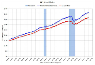
• Retail Sales increased 0.1% in January
 Click on graph for larger image.
On a monthly basis, retail sales increased 0.1% from December to January (seasonally adjusted), and sales were up 4.7% from January 2012. Sales for December were unrevised at a 0.5% gain.
This graph shows retail sales since 1992. This is monthly retail sales and food service, seasonally adjusted (total and ex-gasoline).
This was at the consensus forecast of a 0.1% increase, and might indicate some slowdown in retail spending growth related to the payroll tax increase.
• Fed: Industrial Production declined 0.1% in January
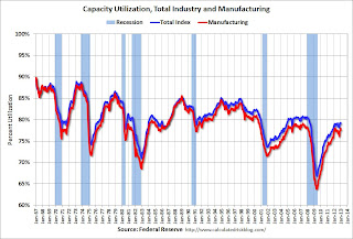 This graph shows Capacity Utilization. The capacity utilization rate for total industry decreased in January to 79.1 percent. This series is up 12.2 percentage points from the record low set in June 2009 (the series starts in 1967).
Capacity utilization at 79.1% is still 1.1 percentage points below its average from 1972 to 2010 and below the pre-recession level of 80.6% in December 2007. Note: December 2012 was revised up from 78.8%.
Note: y-axis doesn't start at zero to better show the change.
 The second graph shows industrial production since 1967.
Industrial production decreased in January to 98.6 (December 2012 was revised up from 98.1). This is 18.2% above the recession low, but still 2.1% below the pre-recession peak.
The monthly change for both Industrial Production and Capacity Utilization were slightly below expectations, however the previous months were revised up significantly.
• Weekly Initial Unemployment Claims decline to 341,000
 "In the week ending February 9, the advance figure for seasonally adjusted initial claims was 341,000, a decrease of 27,000 from the previous week's revised figure of 368,000."
The previous week was revised up from 366,000.
The dashed line on the graph is the current 4-week average. The four-week average of weekly unemployment claims increased to 352,500.
Weekly claims were below the 360,000 consensus forecast, and the 4-week average is close to the lowest level since early 2008.
• BLS: Job Openings "little changed" in December
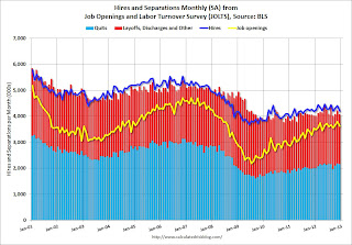 This graph shows job openings (yellow line), hires (dark blue), Layoff, Discharges and other (red column), and Quits (light blue column) from the JOLTS.
 Jobs openings decreased in December to 3.617 million, down from 3.790 million in November. The number of job openings (yellow) has generally been trending up, but openings are only up 2% year-over-year compared to December 2011.
Quits decreased slightly in December, and quits are up 7% year-over-year. These are voluntary separations. (see light blue columns at bottom of graph for trend for "quits").
Not much changes month-to-month in this report, but the trend suggests a gradually improving labor market.
• Preliminary February Consumer Sentiment increases to 76.3
 The preliminary Reuters / University of Michigan consumer sentiment index for February increased to 76.3 from the January reading of 73.8.
 This was slightly above the consensus forecast of 75.0, but still very low. There are a number of factors that impact sentiment including unemployment, gasoline prices and, for 2013, the payroll tax increase and the default threat from Congress. People will slowly adjust to the payroll tax increase, and the threat of default is now behind us ... and sentiment has improved a little.


