by Calculated Risk on 7/28/2012 08:02:00 AM
Saturday, July 28, 2012
Summary for Week ending July 27th
This was one of those weeks were Europe stole the headlines, especially comments from ECB President Mario Draghi. Of course Draghi has said before that the ECB would do “whatever it takes”, so this wasn’t really new news.
Here was Lou Barnes reaction:
Sentiment turned yesterday on ECB President Mario Draghi's "...The ECB is ready to do whatever it takes to preserve the euro. Believe me, it will be enough." He went on to announce his plans to date Jennifer Lopez tonight, Kim Bassinger tomorrow, and win the decathlon gold next week.Once again the economic data was weak. Real GDP for Q2 was reported at a 1.5% annualized rate. And even new home sales were below expectations, although with upward revisions to previous months – and an expected upward revision to the June sales rate – the report was actually fairly solid.
If a central bank has to promise to preserve something, odds are high that it is already dead. This is the talk of 0-10 football coaches. Imagine if an American Fed Chair said he would "preserve the dollar." Not defend its value versus other currencies; not prevent inflation or deflation, but preserve its existence? Elbow the women and children out of the lifeboats.
Manufacturing data was weak again, with the Richmond survey falling off a cliff, and the MarkIt Flash PMI declining in July. However the Kansas City manufacturing survey showed modest growth.
In other data, consumer sentiment was up slightly, weekly initial unemployment claims were down, and the trucking index increased. All of this data suggests more sluggish growth.
Here is a summary of last week in graphs:
• Real GDP increased 1.5% annual rate in Q2
The Q2 GDP report was weak, but slightly better than expected. Final demand weakened in Q2 as personal consumption expenditures increased at only a 1.5% annual rate, and residential investment increased at a 9.7% annual rate.
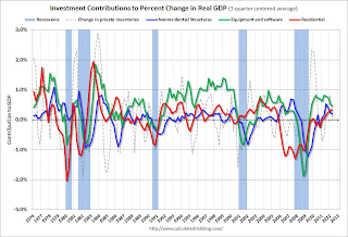 Click on graph for larger image.
This graph shows the contribution to GDP from residential investment, equipment and software, and nonresidential structures (3 quarter centered average). This is important to follow because residential investment tends to lead the economy, equipment and software is generally coincident, and nonresidential structure investment trails the economy.
For this graph, red is residential, green is equipment and software, and blue is investment in non-residential structures. So the usual pattern - both into and out of recessions is - red, green, blue.
The dashed gray line is the contribution from the change in private inventories.
Residential Investment (RI) made a positive contribution to GDP in Q2 for the fifth consecutive quarter. Usually residential investment leads the economy, but that didn't happen this time because of the huge overhang of existing inventory, but now RI is contributing. The good news: Residential investment has clearly bottomed.
 Residential Investment as a percent of GDP is still near record lows, but it is increasing. Usually RI bounces back quickly following a recession, but this time there is a wide bottom because of the excess supply of existing vacant housing units.
 Last year the increase in RI was mostly from multifamily and home improvement investment. Now the increase is from most categories including single family. I'll break down Residential Investment (RI) into components after the GDP details are released this coming week. Note: Residential investment (RI) includes new single family structures, multifamily structures, home improvement, broker's commissions, and a few minor categories.
 Overall the revisions to the last three years were pretty minor.
 This graph shows GDP per quarter as a percent change annualized.
There were some downward revisions in Q1 and Q2 2010, and some upward revisions in 2011.
This was slightly above expectations.
• New Home Sales declined in June to 350,000 Annual Rate
 The Census Bureau reports New Home Sales in June were at a seasonally adjusted annual rate (SAAR) of 350 thousand. This was down from a revised 382 thousand SAAR in May (revised up from 369 thousand). Sales in March and April were revised up too.
This graph shows New Home Sales vs. recessions since 1963. The dashed line is the current sales rate.
Even though sales are still very low, new home sales have clearly bottomed. New home sales have averaged 358 thousand SAAR over the first 6 months of 2012, after averaging under 300 thousand for the previous 18 months. All of the recent revisions have been up too.
So even though sales in June were below the consensus forecast of 370,000, this was still a fairly solid report given the upward revisions to previous months. Based on recent revisions, sales in June will probably be revised up too.
• Weekly Initial Unemployment Claims decline to 353,000
 The dashed line on the graph is the current 4-week average. The four-week average of weekly unemployment claims declined to 367,250.
The sharp swings over the last few weeks are apparently related to difficulty adjusting for auto plant shutdowns.
This was well below the consensus forecast of 380,000 and is the lowest level for the four week average since March.
• Final July Consumer Sentiment at 72.3
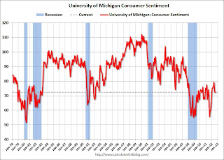 The final Reuters / University of Michigan consumer sentiment index for July increased to 72.3 from the preliminary reading of 72.0, and was down from the June reading of 73.2.
This was slightly above the consensus forecast of 72.0 and the lowest level this year. Overall sentiment is still weak - probably due to a combination of the high unemployment rate and the sluggish economy.
• ATA Trucking index increased in June
 From ATA: ATA Truck Tonnage Jumped 1.2% in June
Here is a long term graph that shows ATA's For-Hire Truck Tonnage index.
The dashed line is the current level of the index. The index is above the pre-recession level and still up 3.7% year-over-year - but has been moving mostly sideways in 2012.
• Other Economic Stories ...
• DataQuick: California Foreclosure Activity Lowest in Five Years
• Markit Flash PMI falls to 51.8
• NAR: Pending home sales index decreased 1.4% in June
• Kansas City Fed: "Modest" Growth in Regional Manufacturing Activity in July
• From the Richmond Fed: Manufacturing Activity Contracted in July; Manufacturers' Optimism Waned
Friday, July 27, 2012
Zillow forecasts 1% Year-over-year decline for May Case-Shiller House Price index
by Calculated Risk on 7/27/2012 08:17:00 PM
Note: The Case-Shiller report is for May (really an average of prices in March, April and May). This data is released with a significant lag, see: House Prices and Lagged Data
I think it is too early to look for a year-over-year increase in Case-Shiller prices, although some analysts think it is possible in the May report. We are definitely getting close - and it will make headlines when it happens.
Zillow Forecast: Zillow Forecast: May Case-Shiller Composite-20 Expected to Show 1% Decline from One Year Ago
On Tuesday, July 31st, the Case-Shiller Composite Home Price Indices for May will be released. Zillow predicts that the 20-City Composite Home Price Index (non-seasonally adjusted [NSA]) will decline by 1 percent on a year-over-year basis, while the 10-City Composite Home Price Index (NSA) will decline by 1.3 percent on a year-over-year basis. The seasonally adjusted (SA) month-over-month change from April to May will be 0.8 percent for the 20-City Composite and 0.9 percent for the 10-City Composite Home Price Index (SA). All forecasts are shown in the table below and are based on a model incorporating the previous data points of the Case-Shiller series and the May Zillow Home Value Index data, and national foreclosure re-sales.Zillow's forecasts for Case-Shiller have been pretty close.
May is the fourth consecutive month with monthly appreciation for the Case-Shiller indices, with May projected to be a bit stronger than the previous two months.
One of the keys this year is to watch the year-over-year change in the various house price indexes. The composite 10 and 20 indexes declined 2.2% and 1.9% YoY respectively in April, after declining 2.9% and 2.6% in March. Zillow is forecasting a significantly smaller year-over-year decline in May.
| Case Shiller Composite 10 | Case Shiller Composite 20 | ||||
|---|---|---|---|---|---|
| NSA | SA | NSA | SA | ||
| Case Shiller (year ago) | May 2011 | 153.33 | 154.58 | 139.88 | 141.03 |
| Case-Shiller (last month) | April 2012 | 148.40 | 151.28 | 135.80 | 138.55 |
| Zillow May Forecast | YoY | -1.3% | -1.3% | -1.0% | -1.0% |
| MoM | 2.0% | 0.9% | 2.0% | 0.8% | |
| Zillow Forecasts1 | 151.4 | 152.6 | 138.5 | 139.6 | |
| Current Post Bubble Low | 146.51 | 149.21 | 134.08 | 136.49 | |
| Date of Post Bubble Low | March 2012 | January 2012 | March 2012 | January 2012 | |
| Above Post Bubble Low | 3.3% | 2.3% | 3.3% | 2.3% | |
| 1Estimate based on Year-over-year and Month-over-month Zillow forecasts | |||||
Bank Failure #39 in 2012: Jasper Banking Company, Jasper, Georgia
by Calculated Risk on 7/27/2012 05:51:00 PM
It’s worth once compared to gold
Morphed to dull lead.
by Soylent Green is People
From the FDIC: Stearns Bank National Association St. Cloud, Minnesota, Assumes All of the Deposits of Jasper Banking Company, Jasper, Georgia
As of March 31, 2012, Jasper Banking Company had approximately $216.7 million in total assets and $213.1 million in total deposits. ... The FDIC estimates that the cost to the Deposit Insurance Fund (DIF) will be $58.1 million. ... Jasper Banking Company is the 39th FDIC-insured institution to fail in the nation this year, and the ninth in Georgia.Another bank in Georgia fails ... what a surprise!
Earlier on GDP:
• Real GDP increased 1.5% annual rate in Q2
• Q2 GDP: Comments and Investment
HVS: Q2 Homeownership and Vacancy Rates
by Calculated Risk on 7/27/2012 03:31:00 PM
The Census Bureau released the Housing Vacancies and Homeownership report for Q2 2012 this morning.
This report is frequently mentioned by analysts and the media to track the homeownership rate, and the homeowner and rental vacancy rates. However, based on the initial evaluation, it appears the vacancy rates are too high.
It might show the trend, but I wouldn't rely on the absolute numbers. My understanding is the Census Bureau is investigating the differences between the HVS, ACS and decennial Census, and analysts probably shouldn't use the HVS to estimate the excess vacant supply, or rely on the homeownership rate, except as a guide to the trend.
 Click on graph for larger image.
The Red dots are the decennial Census homeownership rates for April 1st 1990, 2000 and 2010. The HVS homeownership rate increased to 65.5%, up from 65.4% in Q1 2012. Last quarter was the lowest level for this survey since the mid-90s.
I'd put more weight on the decennial Census numbers and that suggests the actual homeownership rate is probably in the 64% to 65% range.
 The HVS homeowner vacancy rate declined to 2.1% from 2.2% in Q1. This is the lowest level since Q1 2006 for this report.
The homeowner vacancy rate has peaked and is now declining, although it isn't really clear what this means. Are these homes becoming rentals? Anyway - once again - this probably shows that the trend is down, but I wouldn't rely on the absolute numbers.
 The rental vacancy rate declined to 8.6% from 8.8% in Q1.
I think the Reis quarterly survey (large apartment owners only in selected cities) is a much better measure of the overall trend in the rental vacancy rate - and Reis reported that the rental vacancy rate has fallen to the lowest level since 2001.
The quarterly HVS is the most timely survey on households, but there are many questions about the accuracy of this survey. Unfortunately many analysts still use this survey to estimate the excess vacant supply. However this does suggest that the housing vacancy rates are falling.
Earlier on GDP:
• Real GDP increased 1.5% annual rate in Q2
• Q2 GDP: Comments and Investment
Bloomberg: Draghi to hold talks with Bundesbank on ECB Bond Purchases
by Calculated Risk on 7/27/2012 02:15:00 PM
From Bloomberg: Draghi Said to Hold Talks With Weidmann on ECB Bond Purchases
European Central Bank President Mario Draghi will hold talks with Bundesbank President Jens Weidmann in the coming days in an effort to overcome the biggest stumbling block to a new raft of measures including bond purchases, two central bank officials said.Maybe Draghi has found the panic button!
Having secured the backing of governments in Spain, France and Germany, Draghi is now seeking to win over ECB policy makers for a multi-pronged approach to reduce bond yields in countries such as Spain and Italy, the officials said on condition of anonymity because the talks are private.
Earlier on GDP:
• Real GDP increased 1.5% annual rate in Q2
• Q2 GDP: Comments and Investment
Q2 GDP: Comments and Investment
by Calculated Risk on 7/27/2012 12:10:00 PM
The Q2 GDP report was weak, but slightly better than expected. Final demand weakened in Q2 as personal consumption expenditures increased at only a 1.5% annual rate, and residential investment increased at a 9.7% annual rate.
Investment in equipment and software picked up slightly to a 7.2% annual rate in Q2, and investment in non-residential structures was only slightly positive. The details will be released next week, but most of the recent positive increases in non-residential structures has been from investment in energy and power structures. Based on the architecture billing index, I expect the drag from other non-residential categories (offices, malls, hotels) to continue all year.
And there was another negative contribution from government spending at all levels. However, it appears the drag from state and local governments will end soon (after declining for almost 3 years).
Overall this was another weak report indicating sluggish growth.
The following graph shows the contribution to GDP from residential investment, equipment and software, and nonresidential structures (3 quarter centered average). This is important to follow because residential investment tends to lead the economy, equipment and software is generally coincident, and nonresidential structure investment trails the economy.
For the following graph, red is residential, green is equipment and software, and blue is investment in non-residential structures. So the usual pattern - both into and out of recessions is - red, green, blue.
The dashed gray line is the contribution from the change in private inventories.
 Click on graph for larger image.
Residential Investment (RI) made a positive contribution to GDP in Q2 for the fifth consecutive quarter. Usually residential investment leads the economy, but that didn't happen this time because of the huge overhang of existing inventory, but now RI is contributing. The good news: Residential investment has clearly bottomed.
The contribution from RI will probably continue to be sluggish compared to previous recoveries, but the ongoing positive contribution to GDP is a significant story.
Equipment and software investment has made a positive contribution to GDP for twelve straight quarters (it is coincident).
The contribution from nonresidential investment in structures was slightly positive in Q2. Nonresidential investment in structures typically lags the recovery, however investment in energy and power has masked the ongoing weakness in office, mall and hotel investment (the underlying details will be released next week).
 Residential Investment as a percent of GDP is still near record lows, but it is increasing. Usually RI bounces back quickly following a recession, but this time there is a wide bottom because of the excess supply of existing vacant housing units.
Last year the increase in RI was mostly from multifamily and home improvement investment. Now the increase is from most categories including single family. I'll break down Residential Investment (RI) into components after the GDP details are released this coming week. Note: Residential investment (RI) includes new single family structures, multifamily structures, home improvement, broker's commissions, and a few minor categories.
 The last graph shows non-residential investment in structures and equipment and software.
I'll add details for investment in offices, malls and hotels next week.
The key story is that residential investment is continuing to increase, and I expect this to continue all year (although the recovery in RI will be sluggish compared to previous recoveries). Since RI is the best leading indicator for the economy, this suggests no recession this year.
Earlier with revision graphs:
• Real GDP increased 1.5% annual rate in Q2
Final July Consumer Sentiment at 72.3
by Calculated Risk on 7/27/2012 09:55:00 AM
Note: I'll have more on GDP soon.

Click on graph for larger image.
The final Reuters / University of Michigan consumer sentiment index for July increased to 72.3 from the preliminary reading of 72.0, and was down from the June reading of 73.2.
This was slightly above the consensus forecast of 72.0 and the lowest level this year. Overall sentiment is still weak - probably due to a combination of the high unemployment rate and the sluggish economy.
Real GDP increased 1.5% annual rate in Q2
by Calculated Risk on 7/27/2012 08:30:00 AM
Real gross domestic product -- the output of goods and services produced by labor and property located in the United States -- increased at an annual rate of 1.5 percent in the second quarter of 2012, (that is, from the first quarter to the second quarter), according to the "advance" estimate released by the Bureau of Economic Analysis. In the first quarter, real GDP increased 2.0 percent. [revised up from 1.9 percent]Overall the revisions to the last three years were pretty minor.
The increase in real GDP in the second quarter primarily reflected positive contributions from personal consumption expenditures (PCE), exports, nonresidential fixed investment, private inventory investment, and residential fixed investment that were partly offset by a negative contribution from state and local government spending. Imports, which are a subtraction in the calculation of GDP, increased.
The deceleration in real GDP in the second quarter primarily reflected a deceleration in PCE, an acceleration in imports, and decelerations in residential fixed investment and in nonresidential fixed investment that were partly offset by an upturn in private inventory investment, a smaller decrease in federal government spending, and an acceleration in exports.
 Click on graph for larger image.
This graph shows real GDP before (blue) and after (red) the revision. The recession was not quite as deep as previously reported, and the recovery in 2010 was slightly slower - and the recovery in 2011 slightly faster.
Real GDP in Q1 was slightly above the previously reported level indicating the output gap is about the same as previously estimated.
 The second graph shows the same data but as a percent change annualized.
There were some downward revisions in Q1 and Q2 2010, and some upward revisions in 2011.
A couple of comments:
• Real personal consumption expenditures increased 1.5 percent in the first quarter, compared with an increase of 2.4 percent in the first.
• Government spending continued to be a drag at all levels, but at a slower pace: The Federal government decreased 0.4 percent in Q2 compared to a 4.2 percent decrease in Q1, and state and local government decreased 2.1 percent compared to 2.2 percent in Q1.
This was above expectations. I'll have more on GDP later ...
Thursday, July 26, 2012
Friday: GDP, Consumer Sentiment
by Calculated Risk on 7/26/2012 10:02:00 PM
On Friday ...
• At 8:30 AM ET, the Q2 advance GDP will be released. The consensus is that real GDP increased 1.2% annualized in Q2. The BEA will also release the revised estimates for 2009 through First Quarter 2012. If GDP is revised significantly up or down, this might be part of the FOMC discussion next week.
The BEA put out an excellent note on revisions this week: Revising Economic Indicators: Here’s Why the Numbers Can Change
The public wants accurate data and wants it as soon as possible. To meet that need, BEA publishes early estimates that are based on partial data. Even though these data aren’t complete, they do provide an accurate general picture of economic activity. ...• At 9:55 AM, the final Reuter's/University of Michigan's Consumer sentiment index for July will be released. The consensus is for no change from the preliminary reading of 72.0.
BEA produces three estimates of gross domestic product (GDP) for a given quarter. Each includes updated, more complete, and more accurate information as it becomes available. The first, called the “advance” estimate, typically receives the most attention and is released roughly 4 weeks after the end of a quarter. ...
When BEA calculates the advance estimate, the Bureau doesn’t yet have complete source data, with the largest gaps in data related to the third month of the quarter. In particular, the advance estimate is lacking complete source data on inventories, trade, and consumer spending on services. Therefore, BEA must make assumptions for these missing pieces based in part on past trends. ...
As new and more complete data become available, that information is incorporated into the second and third GDP estimates. About 45 percent of the advance estimate is based on initial or early estimates from various monthly and quarterly surveys that are subject to revision for various reasons, including late respondents that are eventually incorporated into the survey results. Another roughly 14 percent of the advance estimate is based on historical trends.
For the monthly economic question contest:
• And at 10:00 AM, the Q2 Housing Vacancies and Homeownership report from the Census Bureau will be released. This data might indicate the trend, but there are serious questions about the accuracy of this survey.
Record Low Mortgage Rates and Increasing Refinance Activity
by Calculated Risk on 7/26/2012 06:33:00 PM
Another month, another record ...
Below is a graph comparing mortgage rates from the Freddie Mac Primary Mortgage Market Survey® (PMMS®) and the refinance index from the Mortgage Bankers Association (MBA).
The the MBA reported yesterday that refinance activity was at the highest level since 2009.
And from Freddie Mac today: 30-Year Fixed-Rate Mortgage Averages a Record-Breaking 3.49 Percent
Freddie Mac today released the results of its Primary Mortgage Market Survey® (PMMS®), showing fixed mortgages rates continuing their streak of record-breaking lows. The 30-year fixed rate mortgage averaged 3.49 percent, more than a full percentage point lower than a year ago when it averaged 4.55 percent. Meanwhile, the 15-year fixed-rate mortgage, a popular choice for those looking to refinance, also set another record low at 2.80 percent.
 Click on graph for larger image.
This graph shows the MBA's refinance index (monthly average) and the the 30 year fixed rate mortgage interest rate from the Freddie Mac Primary Mortgage Market Survey®.
The Freddie Mac survey started in 1971 and mortgage rates are currently at the record low for the last 40 years.
It usually takes around a 50 bps decline from the previous mortgage rate low to get a significant refinance boom, and rates have fallen about 75 bps from the 4.23% low in October 2010 - and refinance activity is picking up.
There has also been an increase in refinance activity due to HARP.
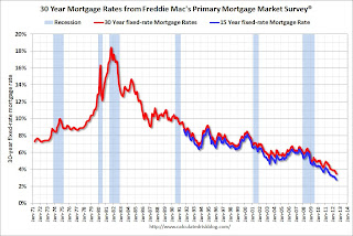 The second graph shows the 15 and 30 year fixed rates from the Freddie Mac survey. The Primary Mortgage Market Survey® started in 1971 (15 year in 1991). Both rates are at record lows for the Freddie Mac survey. Rates for 15 year fixed loans are now at 2.8%.
Note: The Ten Year treasury yield is just off the record low at 1.43% (the record low was earlier this week at 1.39%), so rates will probably fall a little more next week.


