by Calculated Risk on 5/04/2012 04:26:00 PM
Friday, May 04, 2012
Another Housing Bear leaves the Woods
The list of former housing bears arguing that house prices are now at or near the bottom is growing. Even Professor Robert Shiller - without making a prediction and suggesting prices could "overshoot" - said this week on CNBC that "[house prices] are back to normal levels".
Even your local Grizzly Bear left the woods earlier this year.
Now from Mark Kiesel at Pimco: Back In
I’m back in. Yes, I’ve finally purchased a house after renting for the past six years. I sold my previous house in May 2006 after nearly a decade of being a homeowner because I was convinced U.S. housing prices were set to fall, and I wrote about it in prior Credit Perspectives pieces, “For Sale” (June 2006) and “Still Renting” (May 2007). Many of my friends, family and colleagues have asked me over the past several years, “Are you still renting?” In fact, that is probably the question I’ve heard most often from clients, consultants and the media over the years.And from Bloomberg: Pimco Housing Bear Kiesel Says It’s Time to Start Buying
So, next weekend I’ll be moving into a house. My decision to buy was mainly driven by the improved relative value of U.S. housing. ...
Today, however, U.S. housing looks like a decent place to put money over the next several years. I’m not sure if U.S. housing prices have bottomed – only time will tell – but there are many more positives today than there were six years ago when I sold my house
...
For those of you renting or on the sidelines, I recommend you at least consider getting “back in” and buying a house in the U.S., particularly in an area of the country where supportive fundamentals and policies could cause inventories to fall and job growth to improve.
Earlier on the employment report:
• April Employment Report: 115,000 Jobs, 8.1% Unemployment Rate
• April Employment Summary and Discussion
• All Current Employment Graphs
Graph: U.S. Housing Market Summary
by Calculated Risk on 5/04/2012 02:14:00 PM
Wayne Yamano at John Burns Real Estate Consulting sent me the following graphic last night. This provides a summary of the U.S. housing market in one graph.
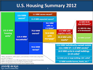
Posted with permission: Source: John Burns Real Estate Consulting
The sources are listed on the graph. Wayne noted in his email to me: "We had to make some simplifying assumptions to make the chart look readable. One of those assumptions is that all delinquent borrows have negative equity. That’s obviously not true, but showing the overlap would have been exceedingly complicated."
The numbers on the left (total, vacant and occupied housing units) are extrapolations from the 2010 Census (the Census was a snapshot as of April 1, 2010 - over 2 years ago).
As an example, Yamano estimates that the number of housing units has increased from 131.7 million on April 1, 2010 to 132.8 million today. That is an increase of only 1.1 million housing units over the last two years - and that is probably close with the record low number of housing completions over that period.
I think the estimate of excess vacant housing units is too high. Using the Census 2010 state data, I estimated that the number of excess vacant housing units was above 1.8 million on April 1, 2010 (the date of the Census). See: The Excess Vacant Housing Supply. The number of excess units is lower today, and I think it is now less than 1 million units nationwide. A key difference is that I used both the 1990 and 2000 Census data to estimate the excess supply, and Yamano only used the 2000 Census data.
As Yamano noted, he made a "simplifying assumption" on delinquencies to make the chart readable (I think the chart is great). However it is important to remember that not all delinquent borrowers have negative equity, especially those in the 30 to 90 day delinquent category. Even in good times, around 2 million borrowers are one to two payments delinquent, and that is probably happening now too. This probably means there are another 1 to 2 million borrowers with negative equity that are current than shown on the chart. That is a key category since these properties could become distressed sales in the future - and that is why these borrowers are the main target of the HARP refinance program.
Also on delinquencies: I think the total of 6.6 million delinquencies is too high. Yamano used data from the MBA and extrapolated to the entire market, but the recent LPS release suggests there are about 5.6 million total delinquent loans (The MBA will probably show a significant decrease in Q1 too).
I think this graph provides a nice quick overview of the U.S. housing market. My thanks to Wayne.
Earlier on the employment report:
• April Employment Report: 115,000 Jobs, 8.1% Unemployment Rate
• April Employment Summary and Discussion
• All Current Employment Graphs
April Employment Summary and Discussion
by Calculated Risk on 5/04/2012 10:29:00 AM
Another disappointing report indicating sluggish employment growth.
It is probably worth a mention that there are now more private sector jobs than when President Obama took office, but the public sector is continuing to hemorrhage jobs (see third and fourth graphs).
Some numbers: There were 115,000 payroll jobs added in April, with 130,000 private sector jobs added, and 15,000 government jobs lost. The unemployment rate declined to 8.1%. U-6, an alternate measure of labor underutilization that includes part time workers and marginally attached workers, was unchanged at 14.5%. This remains very high - U-6 was in the 8% range in 2007 - but this is the lowest level of U-6 since early 2009.
The participation rate decreased to 63.6% from 63.8% (a new cycle low) and the employment population ratio also decreased slightly to 58.4%.
The change in February payroll employment was revised up from +240,000 to +259,000, and February was revised up from +120,000 to +154,000.
The average workweek was unchanged at 34.5 hours, and average hourly earnings were essentially unchanged. "The average workweek for all employees on private nonfarm payrolls was unchanged at 34.5 hours in April. ... In April, average hourly earnings for all employees on private nonfarm payrolls rose by 1 cent to $23.38. Over the past 12 months, average hourly earnings have increased by 1.8 percent." This is sluggish earnings growth, and less than inflation. Earnings are still being impacted by the large number of unemployed and marginally employed workers.
There are a total of 12.5 million Americans unemployed and 5.1 million have been unemployed for more than 6 months. These numbers are declining, but still very high.
Through the first four months of 2012, the economy has added 803 thousand total nonfarm jobs - this is a better pace than in 2011, but still sluggish.
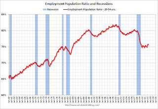
Employment-Population Ratio, 25 to 54 years old
 Click on graph for larger image.
Since the participation rate has declined recently due to cyclical (recession) and demographic (aging population) reasons, an important graph is the employment-population ratio for the key working age group: 25 to 54 years old.
In the earlier period the employment-population ratio for this group was trending up as women joined the labor force. The ratio has been mostly moving sideways since the early '90s, with ups and downs related to the business cycle.
This ratio should probably move back to or above 80% as the economy recovers. So far the ratio has only increased slightly from a low of 74.7% to 75.7% in April (this was down slightly in April from March.)
Percent Job Losses During Recessions

This graph shows the job losses from the start of the employment recession, in percentage terms - this time aligned at maximum job losses.
In the previous post, the graph showed the job losses aligned at the start of the employment recession.
Private Sector Jobs Added
These two graphs compare public and private sector job losses (or added) for President George W. Bush's first term (following the stock market bust), and for President Obama's current term (following the housing bust and financial crisis). The Bush term is added for comparison purposes.
There are many differences between the two periods. Both followed the bursting of a bubble (stock and housing), although the housing bust also led to a severe financial crisis. As Reinhart and Rogoff noted, recoveries from financial crisis are usually very sluggish. See: "The Aftermath of Financial Crises".
The employment recovery during Mr. Bush's first term was very sluggish, and private employment was down 913,000 jobs at the end of his first term. The recovery has been sluggish under Mr. Obama's presidency too, but there are now 35 thousand more private sector payroll jobs than when Mr. Obama's term started.
Public Sector Jobs Lost
 A big difference between Mr. Bush's first term and Mr. Obama's presidency has been public sector employment. The public sector grew during Mr. Bush's term (up 900,000 jobs), but the public sector has declined since Obama took office (down 607,000 jobs). These job losses are at the state and local level, although the Federal government has been losing jobs over the last year. There job losses are still a significant drag on overall employment.
It appears the state and local public sector job losses are slowing, and it is likely that the decline in state and local public payrolls will end mid-year 2012. However the Federal government jobs losses will probably continue.
Part Time for Economic Reasons
 From the BLS report:
The number of persons employed part time for economic reasons (sometimes referred to as involuntary part-time workers) was essentially unchanged in April at 7.9 million. These individuals were working part time because their hours had been cut back or because they were unable to find a full-time job.The number of part time workers increased slightly in April to 7.85 millon.
These workers are included in the alternate measure of labor underutilization (U-6) that was unchanged at 14.5% in April - still very high, but the lowest level since early 2009.
Unemployed over 26 Weeks
 This graph shows the number of workers unemployed for 27 weeks or more.
 According to the BLS, there are 5.1 million workers who have been unemployed for more than 26 weeks and still want a job. This was down from 5.308 million in March. This is very high, but this is the lowest number since mid-2009.
April Employment Report: 115,000 Jobs, 8.1% Unemployment Rate
by Calculated Risk on 5/04/2012 08:30:00 AM
From the BLS:
Nonfarm payroll employment rose by 115,000 in April, and the unemployment rate was little changed at 8.1 percent, the U.S. Bureau of Labor Statistics reported today.This was below expectations of 165,000 payroll jobs added.
...
The civilian labor force participation rate declined in April to 63.6 percent, while the employment-population ratio, at 58.4 percent, changed little.
...
The change in total nonfarm payroll employment for February was revised from +240,000 to +259,000, and the change for March was revised from +120,000 to +154,000.
 Click on graph for larger image.
Job growth started picking up early last year, but then the economy was hit by a series of shocks (oil price increase, tsunami in Japan, debt ceiling debate) - and then growth started picking up again. Now it appears job growth has slowed again. This was a weak month, but the upward revisions to prior months was a small positive.
The second graph shows the employment population ratio, the participation rate, and the unemployment rate. The unemployment rate was declined to 8.1% (red line).
 The Labor Force Participation Rate decreased to 63.6% in April (blue line). This is the percentage of the working age population in the labor force and the participation rate is at a new post bubble low. The participation rate is well below the 66% to 67% rate that was normal over the last 20 years, although some of the recent decline is due to demographics.
The Employment-Population ratio declined slightly to 58.4% in April (black line).
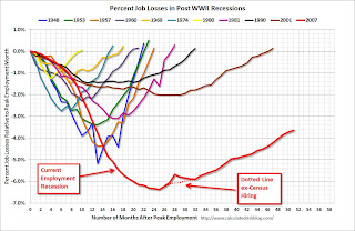 The third graph shows the job losses from the start of the employment recession, in percentage terms. The dotted line is ex-Census hiring.
This shows the depth of the recent employment recession - worse than any other post-war recession - and the relatively slow recovery due to the lingering effects of the housing bust and financial crisis.
This was weaker payroll growth than expected (expected was 165,000). More later ...
Thursday, May 03, 2012
Look Ahead: April Employment Report, European Elections
by Calculated Risk on 5/03/2012 09:00:00 PM
The focus Friday will be on the April employment report from the Bureau of Labor Statistics (BLS).
• The employment report will be released at 8:30 AM ET. The consensus is for an increase of 165,000 non-farm payroll jobs in April, up from the 120,000 jobs added in March.
The consensus is for the unemployment rate to remain unchanged at 8.2%.
Earlier today I posted a preview of the report.
From Patti Domm at CNBC: Wall Street Has Lowered the Bar for April's Jobs Report
Deutsche Bank chief U.S. economist Joseph LaVorgna ... expects to see 175,000 nonfarm payrolls were added in April.• European elections: On Sunday, France and Greece will hold elections. In France, François Hollande is expected to replace Nicolas Sarkozy as President of the French Republic. Hollande is expected to push for more of a growth agenda, as opposed to austerity only.
Goldman Sachs economists expect to see only 125,000 nonfarm payrolls added in April, and they also see weather as a factor. But Goldman Economist Andrew Tilton agrees that if there’s a surprise, it may be in retail. In the employment reports in February and March, retail showed total layoffs of about 80,000 workers in the general apparel category. About 50,000 of those were in March — a record level — according to Tilton.
No party will win a majority in Greece, and many of the minor parties are expected to get a boost from the anti-auserity vote. However New Democracy will probably receive the most votes, and Pasok will probably finish second. There are some weird rules in Greece - see Greek elections from the Financial Times Alphaville - but it sounds like New Democracy and Pasok will be able to form a government that supports the terms of the recent bailout - although I expect New Democracy will push for some sort of growth agenda.
Freddie Mac: Fixed Mortgage Rates Average New All-Time Record Lows
by Calculated Risk on 5/03/2012 07:12:00 PM
This was released earlier ... from Freddie Mac: Fixed Mortgage Rates Average New All-Time Record Lows
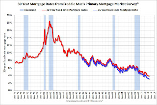
Freddie Mac (OTC: FMCC) today released the results of its Primary Mortgage Market Survey® (PMMS®), showing average fixed mortgage rates finding new all-time record lows ... The 30-year fixed averaged 3.84 percent, down from its previous all-time record low of 3.87 percent last registered on February 9, 2012. The 15-year fixed averaged 3.07 percent, also dropping below its previous all-time record low of 3.11 percent set April 12 of this year. The 1-year ARM also averaged a new all-time record low in the PMMS at 2.70 percent.
30-year fixed-rate mortgage (FRM) averaged 3.84 percent with an average 0.8 point for the week ending May 3, 2012, down from last week when it averaged 3.88 percent. Last year at this time, the 30-year FRM averaged 4.71 percent.
 Click on graph for larger image.
This graph shows the 15 and 30 year fixed rates from the Freddie Mac survey. The Primary Mortgage Market Survey® started in 1971 (15 year in 1991).
The Ten Year treasury yield is near a record low at 1.92%.
NFIB: Small Business hiring was weak in April, "Outlook improves"
by Calculated Risk on 5/03/2012 04:25:00 PM
From the National Federation of Independent Business (NFIB): Job Creation Weakens in April but Prospects Improve
April was another tenuous month for small businesses, sending mixed signals about what the future holds.Note: Small businesses have a larger percentage of real estate and retail related companies than the overall economy.
“On the job creation front, the news was only fair. The net change in employment per firm (seasonally adjusted) came in at 0.1; this is down from March but still positive.
...
“The percent of owners reporting hard to fill job openings rose 2 points to 17 percent, one point below the January 2012 reading which is the highest we’ve reported since June 2008. Hard-to-fill job openings are a strong predictor of the unemployment rate, making the gain in openings a welcome development. The net percent of owners planning to create new jobs is 5 percent, a 5 point increase after taking a plunge in March ...
“Overall, the April NFIB survey anticipates some strength in the job creation number with little change in the unemployment rate. With job creation plans rebounding, the outlook is a bit more optimistic for the second quarter ..."
 Click on graph for larger image.
This graph shows the small business hiring plans index since 1986. Hiring plans increased in April with the index at 5% compared to 0% in March.
According to NFIB: “Not seasonally adjusted, 18 percent plan to increase employment at their firm (up 3 points), and 5 percent plan reductions (unchanged from March)." This is still very low.
Employment Situation Preview
by Calculated Risk on 5/03/2012 01:44:00 PM
Tomorrow the BLS will release the April Employment Situation Summary at 8:30 AM ET. Bloomberg is showing the consensus is for an increase of 165,000 payroll jobs in April, and for the unemployment rate to remain unchanged at 8.2%.
Note on weather:
• The weather was mild in January and February, and it is possible that some hiring was pulled forward. I looked back at previous years with mild weather (using the BLS "not at work, bad weather" measurement), and employment gains in March and April didn't seem to exhibit much "payback" following the mild weather during January and February. However Goldman Sachs analysts think there will be some payback in the April report, they note: "[O]ur current best guess is that weather has boosted the level of payrolls by around 100,000 as of February, and may have shaved about 20,000 from the March report. Going forward, we currently expect payback of about 50,000 in April and the remaining 30,000 in May."
Here is a summary of recent data:
• The ADP employment report showed an increase of 119,000 private sector payroll jobs in April. Although ADP seems to track the BLS over time, the ADP report hasn't been very useful in predicting the BLS report. There has been some discussion about ADP reporting fewer payroll jobs added than the BLS report over the last two years (April 2010 and April 2011) - the argument being that that may happen again. However, in earlier years (2006 - 2009) ADP showed more jobs added (or fewer jobs lost) in April than the BLS, so I'm not sure there is a seasonal pattern.
• The ISM manufacturing employment index increased to 57.3% from 56.1% in March. A historical correlation between the ISM index and the BLS employment report for manufacturing, suggests that private sector BLS reported payroll jobs for manufacturing increased about 22,000 in April.
The ISM service employment index decreased to 54.2% from 56.7% in March. Based on a historical correlation between the ISM non-manufacturing employment index and the BLS employment report for service, this reading suggests the gain of around 170,000 private payroll jobs for services in April.
Combined the ISM surveys suggest an employment report somewhat above the consensus.
• Initial weekly unemployment claims averaged about 384,000 in April, up from 369,000 average in January , February and March.
For the BLS reference week (includes the 12th of the month), initial claims were at 389,000; the highest level this year and about the level of last November when the economy added 157,000 payroll jobs.
• The final April Reuters / University of Michigan consumer sentiment index increased to 76.4, up slightly from the March reading of 76.2. This is frequently coincident with changes in the labor market, but also strongly related to gasoline prices and other factors. This suggests a weak but slightly improving labor market.
• The small business index from Intuit showed 40,000 payroll jobs added, down from 65,000 in March.
• And on the unemployment rate from Gallup: Gallup Seasonally Adjusted U.S. Unemployment Rate Up in April
U.S. unemployment, as measured by Gallup without seasonal adjustment, showed a modest decline to 8.3% in April from 8.4% in March. However, applying the government's historical April adjustment to Gallup's unadjusted number yields a seasonally adjusted April estimate of 8.6%, up from 8.1% in March.Note: Gallup only recently has been providing a seasonally adjusted estimate for the unemployment rate, so use with caution (Gallup provides some caveats), but this does suggest an increase in the headline unemployment rate in April.
• Conclusion: There seems to be a growing sense that the employment report will disappoint tomorrow based on higher initial weekly unemployment claims during the reference period, the weaker than expected ADP employment report, and the weaker than expected ISM services index. Also there could be some "payback" from hiring during the winter due to the mild weather. However the combined ISM reports suggest the consensus is close. On the positive side, Goldman also noted that the retail sector was hit particularly hard over the last two months (possibly due to some large retailer layoffs), and that will probably not happen in April
There always seems to be some randomness to the employment report, but this month I'll take the under (under 165,000 payroll jobs), and I think an increase in the unemployment rate is possible (this depends on the participation rate and if discouraged workers return to the labor force).
Trulia on Houses: Asking Prices increase slightly Year-over-year in April
by Calculated Risk on 5/03/2012 10:28:00 AM
This is an interesting new asking price monitor from Trulia. Usually people report median asking prices, but unfortunately the median is impacted by the mix of homes. However Trulia adjusts the asking prices both for the mix of homes listed for sale and for seasonal factors. Of course this is just asking prices, not sales prices, but this might provide an early hint at changes in house prices.
This has the advantage of giving a much earlier look at prices than the repeat sales indexes. As an example, the recent Case-Shiller report was for "February". But that was really a three month average of December, January and February, and since the index is based on closing prices, some of this index was based on contracts signed last October. That is 6 or even 7 months ago.
From Trulia: Strong Housing Demand and Tightening Inventories Spark Nearly 2 Percent Rise in Asking Prices over Previous Quarter
Asking prices on for-sale homes–which lead sales prices by approximately two or more months–were 0.5 percent higher in April than in March, seasonally adjusted. Together with increases in March and February, asking prices in April rose nationally 1.9 percent quarter over quarter (Q-o-Q), seasonally adjusted. The price increase unadjusted for seasonality was even higher: 4.8 percent Q-o-Q, since prices typically jump in springtime. Year over year (Y-o-Y), asking prices rose 0.2 percent nationally.
...
“Housing prices have already bottomed with asking prices on the rise for three straight months. Aside from a stumble in December, asking prices have been stable or rising for the last eight months,” said Jed Kolko, Trulia’s Chief Economist. “Prices have joined the recovery, alongside sales and construction. But foreclosures threaten prices, especially in judicial-foreclosure states like Florida, New Jersey, Illinois and New York, where many more distressed sales are still to come.”
 Click on graph for larger image.
This graph from Trulia shows the month over month prices changes (seasonally adjusted) as reported by the monitor. This shows asking prices were falling for most of 2011, but have turned up in early 2012.
Here is a list of price and rent changes for the 100 largest metro areas.
This is a small year-over-year increase, up from a 0.7% year-over-year decrease in March. Since asking prices tend to lead the repeat sales indexes by two or more months, this suggests that the repeat sales indexes might turn positive year-over-year in June or July (of course the June index will not be released until the end of August).
ISM Non-Manufacturing Index indicates slower expansion in April
by Calculated Risk on 5/03/2012 10:00:00 AM
The April ISM Non-manufacturing index was at 53.5%, down from 56.0% in March. The employment index decreased in April to 54.2%, down from 56.7% in March. Note: Above 50 indicates expansion, below 50 contraction.
From the Institute for Supply Management: March 2012 Non-Manufacturing ISM Report On Business®
Economic activity in the non-manufacturing sector grew in April for the 28th consecutive month, say the nation's purchasing and supply executives in the latest Non-Manufacturing ISM Report On Business®.
The report was issued today by Anthony Nieves, C.P.M., CFPM, chair of the Institute for Supply Management™ Non-Manufacturing Business Survey Committee. "The NMI registered 53.5 percent in April, 2.5 percentage points lower than the 56 percent registered in March. This indicates continued growth this month, but at a slower rate in the non-manufacturing sector. The Non-Manufacturing Business Activity Index registered 54.6 percent, which is 4.3 percentage points lower than the 58.9 percent reported in March, reflecting growth for the 33rd consecutive month. The New Orders Index decreased by 5.3 percentage points to 53.5 percent, and the Employment Index decreased by 2.5 percentage points to 54.2 percent, indicating continued growth in employment at a slower rate. The Prices Index decreased 10.3 percentage points to 53.6 percent, indicating prices increased at a significantly slower rate in April when compared to March. According to the NMI, 15 non-manufacturing industries reported growth in April. Respondents' comments affirm the slowing rate of growth. In addition, they remain concerned about rising fuel costs and the impact on shipping, transportation and petroleum-based product costs."
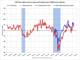 Click on graph for larger image.
This graph shows the ISM non-manufacturing index (started in January 2008) and the ISM non-manufacturing employment diffusion index.
This was below the consensus forecast of 55.9% and indicates slower expansion in April than in March.


