by Calculated Risk on 7/31/2011 08:15:00 AM
Sunday, July 31, 2011
Restaurant Performance Index increases in June
From the National Restaurant Association: Restaurant Industry Outlook Strengthened in June as Restaurant Performance Index Rose Above 100
Driven by stronger same-store sales and traffic levels and a more optimistic outlook among restaurant operators, the National Restaurant Association’s Restaurant Performance Index (RPI) rose above 100 in June. The RPI – a monthly composite index that tracks the health of and outlook for the U.S. restaurant industry – stood at 100.6 in June, up 0.8 percent from May’s level of 99.9. In addition, June represented the sixth time in the last seven months that the RPI stood above 100, which signifies expansion in the index of key industry indicators.
“The RPI’s solid improvement in June was due in large part to stronger same-store sales and customer traffic performances, which bounced back from their May declines,” said Hudson Riehle, senior vice president of the Research and Knowledge Group for the Association. “In addition, restaurant operators are optimistic that their sales environment will improve in the months ahead, while their outlook for capital spending also remains strong.”
...
Restaurant operators reported stronger same-store sales results in June. ... Restaurant operators also reported improving customer traffic levels in June.
 Click on graph for larger image in graph gallery.
The index increased to 100.6 in June (above 100 indicates expansion).
Unfortunately the data for this index only goes back to 2002.
This is a minor report (barely "D-List" data), but I'd expect discretionary spending to slow sharply if consumers become really worried - and that doesn't seem to be happening.
Next Senate Vote at 1 PM ET Sunday
by Calculated Risk on 7/31/2011 12:17:00 AM
From the NY Times: Amid New Talks, Some Optimism on Debt Crisis
Senator Harry Reid ... said he would convene the Senate at noon on Sunday for a vote an hour later.The vote will probably be delayed some more ... and then maybe fail in the House on the first vote. But eventually the debt ceiling will be raised.
Earlier:
• Summary for Week ending July 29th
• Schedule for Week of July 31st
Saturday, July 30, 2011
Random Thoughts
by Calculated Risk on 7/30/2011 09:14:00 PM
• I remain confident that Congress will raise the debt ceiling; however the circus in D.C. is clearly impacting the economy. This morning I spoke to a business owner who is negotiating a new lease to expand. His lawyer told him not to sign the lease until the debt ceiling issue is resolved. I believe similar caution has gripped business owners and consumers in many places - and impacting consumer and business confidence.
• Some people have asked why Q2 GDP growth was higher than Q1 GDP growth given the supply chain disruptions hit in Q2. The answer is both quarters were weak, but there was slightly more investment in Q2, less drag from government spending in Q2, and a positive contribution from trade. Inflation was lower in Q2 too, so the adjustment to real GDP was less.
The supply chain disruptions really showed up in Personal Consumption Expenditures (PCE) in Q2. PCE contributed almost nothing to Q2 growth; PCE increased at a 0.1% annualized real rate in Q2, after increasing at an anemic 2.1% in Q1. PCE should bounce back in Q3 - so real GDP growth will probably pick up. Well, if the politicians stop hurting the already fragile economy.
• I'm trying to ignore the debt ceiling nonsense, but it will probably be front page news for the next few days - so it will be difficult to avoid. Ezra Klein at the WaPo is providing excellent coverage, and the Capital Gains and Games blog has some great insights. (I expect Ezra will be working Sunday).
If you think Congress will fail to raise the debt ceiling, I'd suggest Tar and Feather futures!
Earlier:
• Summary for Week ending July 29th
• Schedule for Week of July 31st
Schedule for Week of July 31st
by Calculated Risk on 7/30/2011 04:58:00 PM
Earlier:
• Summary for Week ending July 29th
The key report for this week will be the July employment report to be released on Friday, August 5th. The ISM manufacturing report will be released on Monday, and the ISM non-manufacturing report on Wednesday. Also the automakers report July vehicle sales on Tuesday.
Note: It is unclear if the employment report will be delayed if Congress fails to raise the debt ceiling (government employees could continue working without pay).
10:00 AM ET: ISM Manufacturing Index for July. The consensus is for a decrease to 54.3 from 55.3 in June.
10:00 AM: Construction Spending for June. The consensus is for no change in construction spending.
8:30 AM: Personal Income and Outlays for June. The consensus is for a 0.2% increase in personal income in June, and a 0.1% increase in personal spending, and for the Core PCE price index to increase 0.2%. The revisions will show significantly lower consumption earlier this year.
All day: Light vehicle sales for July. Light vehicle sales are expected to increase to 11.9 million (Seasonally Adjusted Annual Rate), from 11.4 million in June.
 This graph shows light vehicle sales since the BEA started keeping data in 1967. The dashed line is the June sales rate.
 Edmunds is forecasting: "Toyota appears to be well on its way toward recovery following its new car sales and inventory struggles over the past few months, according to Edmunds.com’s July 2011 U.S. automotive sales forecast.
...
Edmunds.com estimates ... a Seasonally Adjusted Annualized Rate (SAAR) of 12.3 million light vehicles, nearly one million more than the 11.4 million SAAR reported in June."
7:00 AM: The Mortgage Bankers Association (MBA) will release the mortgage purchase applications index. This index has been very weak over the last couple months suggesting weak home sales through summer (not counting all cash purchases).
8:15 AM: The ADP Employment Report for July. This report is for private payrolls only (no government). The consensus is for +100,000 payroll jobs in July, down from the +157,000 reported in June.
 10:00 AM: ISM non-Manufacturing Index for July. The consensus is for a slight increase to 54.0 in July.
 This graph shows the ISM non-manufacturing index (started in January 2008) and the ISM non-manufacturing employment diffusion index. The June ISM Non-manufacturing index was at 53.3%, down from 54.6% in May. The employment index increased in June to 54.1%, up from 54.0% in May. Note: Above 50 indicates expansion, below 50 contraction.
10:00 AM: Manufacturers' Shipments, Inventories and Orders for June (Factory Orders). The consensus is for a 1.0% decrease in orders.
8:30 AM: The initial weekly unemployment claims report will be released. The consensus is for an increase to 403,000 from 398,000 last week.
8:30 AM: Employment Report for July.
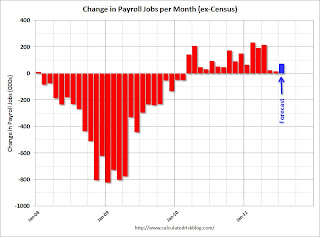 The consensus is for an increase of 75,000 non-farm payroll jobs in July, up from the 18,000 jobs added in June. I'll take the under.
This graph shows the net payroll jobs per month (excluding temporary Census jobs) since the beginning of the recession. The consensus forecast for July is in blue.
The consensus is for the unemployment rate to hold steady at 9.2% in July.
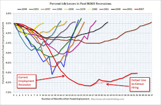 This second employment graph shows the percentage of payroll jobs lost during post WWII recessions. This shows the severe job losses during the recent recession.
 Through the first six months of 2011, the economy has added 757,000 total non-farm jobs or just 126 thousand per month. There have been 945,000 private sector jobs added, or about 158 thousand per month. This is a better pace of payroll job creation than last year, but the economy still has 6.98 million fewer payroll jobs than at the beginning of the 2007 recession.
3:00 PM: Consumer Credit for June. The consensus is for a $5.1 billion increase in consumer credit.
Summary for Week ending July 29th
by Calculated Risk on 7/30/2011 10:45:00 AM
The big economic story of the week was the Q2 GDP release. The Bureau of Economic Analysis (BEA) reported that real GDP growth increased a sluggish 1.3% annualized in Q2, and that growth was revised down to just 0.4% in Q1. Also the revisions indicated the recession was significantly worse than in earlier estimates.
On the political front, the U.S. government is still working towards raising the debt ceiling by this coming Tuesday. There are clear indications that the discussions in Washington have negatively impacted the economy over the last couple of weeks. Goldman Sachs economists write last night that their forecasts for ‘growth in Q4 and 2012 are under review for probably downgrade’. They argued the dysfunction in Washington is impacting confidence: “The inability of policymakers to agree on a measure to lift the federal debt ceiling has damaged consumer confidence, not to mention our own confidence ..."
In other news, sales of new homes are still moving sideways – and house prices, according to Case-Shiller, increased seasonally in May. The regional manufacturing surveys were slightly stronger in July than in June – but that isn’t saying much. Overall the economy remains very sluggish.
Here is a summary in graphs:
• New Home Sales in June at 312,000 Annual Rate
 Click on graph for larger image in graph gallery.
The Census Bureau reported New Home Sales in June were at a seasonally adjusted annual rate (SAAR) of 312 thousand. This was down from a revised 315 thousand in May (revised from 319 thousand).
The first graph shows New Home Sales vs. recessions since 1963. The dashed line is the current sales rate.
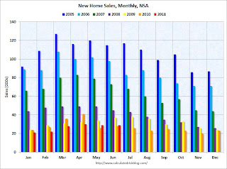 This graph shows sales NSA (monthly sales, not seasonally adjusted annual rate).
In June 2011 (red column), 29 thousand new homes were sold (NSA). The record low for June was 28 thousand in 2010 (following the expiration of the homebuyer tax credit). The high for June was 115 thousand in 2005.
This was below the consensus forecast of 321 thousand, and was just above the record low for the month of June - and new home sales have averaged only 300 thousand SAAR over the 14 months since the expiration of the tax credit ... moving sideways at a very low level.
• Case Shiller: Home Prices increase in May
 From S&P: Some More Seasonal Improvement in Home Prices
This graph shows the nominal seasonally adjusted Composite 10 and Composite 20 indices (the Composite 20 was started in January 2000).
The Composite 10 index is off 31.8% from the peak, and up slightly in May (SA). The Composite 10 is 1.7% above the May 2009 post-bubble bottom (Seasonally adjusted).
The Composite 20 index is off 31.8% from the peak, and down slightly in May (SA). The Composite 20 is slightly above the March 2011 post-bubble bottom seasonally adjusted.
 Here are the price declines from the peak for each city included in S&P/Case-Shiller indices.
Prices increased (SA) in 9 of the 20 Case-Shiller cities in May seasonally adjusted. Prices in Las Vegas are off 59% from the peak, and prices in Dallas only off 9.5% from the peak.
From S&P (NSA):
As of May 2011, 16 of the 20 MSAs and both Composites posted positive monthly changes. Phoenix was flat. Detroit, Las Vegas and Tampa were the markets where levels fell in May versus April, with Detroit down by 2.8% and Las Vegas posting its eighth consecutive monthly decline. These three cities also posted new index level lows in May 2011. They are now 51.2%, 59.3% and 47.5% below their 2005-6 peak levels, respectively.• Real House Prices and Price-to-Rent
Case-Shiller, CoreLogic and others report nominal house prices. However it is also useful to look at house prices in real terms (adjusted for inflation), as a price-to-rent ratio, and also price-to-income (not shown here).
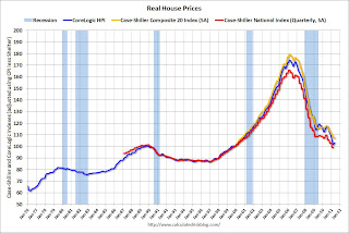 This graph shows the quarterly Case-Shiller National Index SA (through Q1 2011), and the monthly Case-Shiller Composite 20 SA (through May) and CoreLogic House Price Indexes (through May) in real terms (adjusted for inflation using CPI less Shelter). Note: some people use other inflation measures to adjust for real prices.
In real terms, the National index is back to Q4 1999 levels, the Composite 20 index is back to August 2000, and the CoreLogic index back to March 2000. In real terms, all appreciation in the last decade is gone.
 In October 2004, Fed economist John Krainer and researcher Chishen Wei wrote a Fed letter on price to rent ratios: House Prices and Fundamental Value. Kainer and Wei presented a price-to-rent ratio using the OFHEO house price index and the Owners' Equivalent Rent (OER) from the BLS.
Here is a similar graph using the Case-Shiller Composite 20 and CoreLogic House Price Index (through May). This graph shows the price to rent ratio (January 1998 = 1.0). On a price-to-rent basis, the Composite 20 index is back to October 2000 levels, and the CoreLogic index is back to March 2000.
For more on home sales and house prices, here are the previous posts:
On June Home Sales:
• New Home Sales in June at 312,000 Annual Rate
• Existing Home Sales in June: 4.77 million SAAR, 9.5 months of supply
• Home Sales: Distressing Gap
• Graph Galleries: New Home Sales and Existing Home Sales
On House Prices:
• Case Shiller: Home Prices increase in May
• Real House Prices and Price-to-Rent
• Graph Galleries: Home Prices
• Advance Estimate: Real Annualized GDP Grew at 1.3% in Q2
Note: This release contained a number of revisions. The recession was significantly worse than in earlier estimates. Last quarter (Q1) was revised down to just 0.4% real GDP growth.
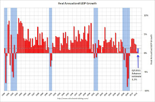 This graph shows the quarterly GDP growth (at an annual rate) for the last 30 years. The dashed line is the current growth rate. Growth in Q2 at 1.3% annualized was below trend growth (around 3.1%) - and very weak for a recovery, especially with all the slack in the system.
Not only has growth slowed, but the recession was significantly worse than earlier estimates suggested.
The following graph is constructed as a percent of the previous peak. This shows when GDP has bottomed - and when GDP has returned to the level of the previous peak. If the indicator is at a new peak, the value is 100%.
 This graph is for real GDP through Q2 2011 and shows real GDP is still 0.4% below the previous pre-recession peak. At the worst point, real GDP was off 5.1% from the 2007 peak. Since the most common definition of a depression is a 10%+ decline in real GDP, the 2007 recession was not a depression. Note: There is no formal definition of a depression. Some people use other definitions such as the duration below the previous peak. By that definition, using both GDP and employment, this seems like the "Lesser depression", but not by the common definition.
 This graph shows the rolling 4 quarter contribution to GDP from residential investment, equipment and software, and nonresidential structures. This is important to follow because residential investment tends to lead the economy, equipment and software is generally coincident, and nonresidential structure investment trails the economy.
 Note: red is residential, green is equipment and software, and blue is investment in non-residential structures. The usual pattern - both into and out of recessions is - red, green, blue.
The key leading sector - residential investment - has lagged this recovery because of the huge overhang of existing inventory. Usually RI is a strong contributor to GDP growth and employment in the early stages of a recovery, but not this time - and this is a key reason why the recovery has been sluggish so far.
For more on GDP, here are the posts:
• Advance Estimate: Real Annualized GDP Grew at 1.3% in Q2
• Real GDP still below Pre-Recession Peak, Chicago PMI declines, Consumer Sentiment Weak
• GDP: Investment Contributions (several graphs)
• ATA Trucking index increased 2.8% in June
 From ATA Trucking: ATA Truck Tonnage Index Jumped 2.8% in June
The American Trucking Associations’ advance seasonally adjusted (SA) For-Hire Truck Tonnage Index increased 2.8% in June after decreasing a revised 2.0% in May 2011. May’s drop was slightly less than the 2.3% ATA reported on June 27, 2011. The latest gain put the SA index at 115.8 (2000=100) in June, up from the May level of 112.6 and the highest since January 2011.Here is a long term graph that shows ATA's Fore-Hire Truck Tonnage index.
The dashed line is the current level of the index.
• Regional Manufacturing Surveys and the ISM index
This graph compares the regional manufacturing surveys and the ISM manufacturing index:
 The New York and Philly Fed surveys are averaged together (dashed green, through July), and five Fed surveys are averaged (blue, through July) including New York, Philly, Richmond, Dallas and Kansas City. The Institute for Supply Management (ISM) PMI (red) is through June (right axis).
The regional surveys were slightly better in July than in June. The ISM index for July will be released Monday, August 1st.
• Other Economic Stories ...
• From the Chicago Fed: Index shows economic growth again below average in June
• From the Dallas Fed: Texas Manufacturing Activity Picks Up
• From the Kansas City Fed: Manufacturing Sector Slows After Solid Rebound in June
• The Chicago Purchasing Managers reported activity stabilized in July
• Fed's Beige Book: "Pace of economic growth has moderated"
• Rumor: NAR Considering Introducing Repeat Sales Index
• From the NAR: Pending Home Sales Rise in June
• HVS: Q2 Homeownership and Vacancy Rates
Have a great weekend!
Unofficial Problem Bank list increases to 995 Institutions
by Calculated Risk on 7/30/2011 08:36:00 AM
Note: this is an unofficial list of Problem Banks compiled only from public sources.
Here is the unofficial problem bank list for July 29, 2011.
Changes and comments from surferdude808:
After eight additions and six removals this week, the Unofficial Problem Bank List includes 995 institutions with assets of $415.4 billion. Last week the list had 993 institutions with assets of $415.7 billion. For the month, the list experienced a net decline of six institutions and an asset drop of $3.9 billion.Yesterday ...
The removals this week include the three failures and three cures. The removals from failure were Integra Bank National Association, Evansville, IN ($2.2 billion Ticker: IBNK); BankMeridian, N.A., Columbia, SC ($240 million); and Virginia Business Bank, Richmond, VA ($96 million). The action terminations were Heartland Bank, Leawood, KS ($131 million); The Hicksville Bank, Hicksville, OH ($119 million); and State Bank of Paw Paw, Paw Paw, IL ($23 million).
Among the eight additions are U. S. Century Bank, Doral, FL ($1.7 billion); First Bank, Clewiston, FL ($249 million); Community Trust & Banking Company, Ooltewah, TN ($147 million); and Flagship Bank Minnesota, Wayzata, MN ($122 million).
• Advance Estimate: Real Annualized GDP Grew at 1.3% in Q2
• Real GDP still below Pre-Recession Peak, Chicago PMI declines, Consumer Sentiment Weak
• GDP: Investment Contributions (several graphs)
• HVS: Q2 Homeownership and Vacancy Rates
Friday, July 29, 2011
Fannie Mae and Freddie Mac Serious Delinquency Rates decline in June
by Calculated Risk on 7/29/2011 09:25:00 PM
Fannie Mae reported that the serious delinquency rate decreased to 4.08% in June, down from 4.14% in May. This is down from 4.99% in June of 2010. The Fannie Mae serious delinquency rate peaked in February 2010 at 5.59%.
Freddie Mac reported that the Single-Family serious delinquency rate decreased to 3.50% in June from 3.53% in May. This is down from 3.96% in May 2010. Freddie's serious delinquency rate peaked in February 2010 at 4.20%.
These are loans that are "three monthly payments or more past due or in foreclosure".
 Click on graph for larger image in graph gallery.
Some of the rapid increase in 2009 was probably because of foreclosure moratoriums, and also because loans in trial mods were considered delinquent until the modifications were made permanent.
Now the serious delinquency rate is falling as Fannie and Freddie work through the backlog of loans and either modify the loan, foreclose, short sale, or the loan cures. But there is a long way to go ...
The normal serious delinquency rate is under 1%. At the current rate of decline, Fannie will be back to "normal" in 2014, and Freddie will be back to "normal" in 2017 or so!
Bank Failure #61: Integra Bank, National Association, Evansville, Indiana
by Calculated Risk on 7/29/2011 07:16:00 PM
An integrity failure.
From low integers
by Soylent Green is People
From the FDIC: Old National Bank, Evansville, Indiana, Assumes All of the Deposits of Integra Bank, National Association, Evansville, Indiana
As of March 31, 2011, Integra Bank, National Association had approximately $2.2 billion in total assets and $1.9 billion in total deposits. ... The FDIC estimates that the cost to the Deposit Insurance Fund (DIF) will be $170.7 million. ... Integra Bank, National Association is the 61st FDIC-insured institution to fail in the nation this year, and the first in Indiana.A pretty big failure ...
Bank Failures #59 & 60 in 2011: Virginia and South Carolina
by Calculated Risk on 7/29/2011 05:39:00 PM
A Business Bank in retreat
Crumbled capital.
by Soylent Green is People
From the FDIC: Xenith Bank, Richmond, Virginia, Assumes All of the Deposits of Virginia Business Bank, Richmond, Virginia
As of March 31, 2011, Virginia Business Bank had approximately $95.8 million in total assets and $85.0 million in total deposits. ... The FDIC estimates that the cost to the Deposit Insurance Fund (DIF) will be $17.3 million. ... Virginia Business Bank is the 59th FDIC-insured institution to fail in the nation this year, and the first in Virginia.From the FDIC: SCBT, National Association, Orangeburg, South Carolina, Assumes All of the Deposits of BankMeridian, N.A., Columbia, South Carolina
As of March 31, 2011, BankMeridian, N.A. had approximately $239.8 million in total assets and $215.5 million in total deposits. ... The FDIC estimates that the cost to the Deposit Insurance Fund (DIF) will be $65.4 million. ... BankMeridian, N.A. is the 60th FDIC-insured institution to fail in the nation this year, and the third in South Carolina.
HVS: Q2 Homeownership and Vacancy Rates
by Calculated Risk on 7/29/2011 02:53:00 PM
The Census Bureau released the Housing Vacancies and Homeownership report for Q2 this morning.
As Tom Lawler has been discussing (see posts at bottom), this is from a fairly small sample, and the homeownership and vacancy rates are higher than estimated in other reports (like Census 2010). This report is commonly used by analysts to estimate the excess vacant supply for housing, but it doesn't appear to be useful for that purpose.
It does show the trend, but I wouldn't rely on the absolute numbers.
 Click on graph for larger image in graph gallery.
The Red dots are the decennial Census homeownership rates for April 1st 1990, 2000 and 2010. The HVS homeownership rate declined to 65.9%, down from 66.4% in Q1 2010.
From Tom Lawler:
The HVS has consistently overstated overall US housing vacancy rates, and consistently understated the number of US households – mainly “missing” millions of renter households – for over a decade. Census 2010 “found” 116,716,292 US households for April 1, 2010, 75,986,074 of which were owner-occupied households, and 40,730,218 of which were renter-occupied households.CR note: we will get the Census 2010 age group homeownership rates soon.
While the HVS numbers don’t “correlate” all that well, a decent “best guess” for the US homeownership rate last quarter would probably be around 64.2%, or about the same as in 1990. Given the substantial aging of the population over the last two decades, that would imply that homeownership rates for most age groups last quarter were the lowest since the 1980’s.
 The HVS homeowner vacancy rate declined to 2.5% from 2.6% in Q1.
From Lawler:
The “homeowner vacancy rate” from the HVS last quarter was 2.5%, down from 2.6% in the previous quarter but unchanged from a year ago. The HVS homeowner vacancy rate in the first half of 2010 was 2.55%, compared to the decennial Census estimate as of April 1, 2010 of 2.4%.
 Lawler:
 This survey also produced an estimated rental vacancy rate last quarter of 9.2%, down from 9.7% in the previous quarter and 10.6% in the second quarter of last year. The HVS estimate of the US rental vacancy rate for the first half of 2010 was 10.6%, compared to the decennial Census estimates as of Apri1 1, 2010 of 9.2%. Last quarter’s HVS rental vacancy rate was the lowest since the third quarter of 2002.This report does suggest that the homeownership rate and vacancy rates are falling.
Here are some previous posts about some of the HVS issues by economist Tom Lawler:
• Census Bureau on Homeownership Rate: We've got “Some 'Splainin' to Do”
• Be careful with the Housing Vacancies and Homeownership report
• Lawler: Census 2010 and the US Homeownership Rate
• Lawler: Census 2010 Demographic Profile: Highlights, Excess Housing Supply Estimate, and Comparison to HVS
• Lawler: The “Excess Supply of Housing” War
• Lawler: Census Releases Demographic Profile of 12 States and DC: Confirms Bias of HVS
• Lawler: Census 2010 and Excess Vacant Housing Units
• Lawler: On Census Housing Stock/Household Data
• Lawler: Housing Vacancy Survey appears to massively overstate number of vacant housing units
• Lawler: US Households: Why Researchers / Analysts are “Confused”


