by Calculated Risk on 6/09/2011 12:45:00 PM
Thursday, June 09, 2011
Q1 Flow of Funds: Household Real Estate assets off $6.6 trillion from peak
The Federal Reserve released the Q1 2011 Flow of Funds report this morning: Flow of Funds.
The Fed estimated that the value of household real estate fell $339 billion in Q1 to $16.1 trillion in Q1 2011, from just under $16.5 trillion in Q4 2010. The value of household real estate has fallen $6.6 trillion from the peak - and is still falling in 2011.
Household net worth peaked at $65.8 trillion in Q2 2007. Net worth fell to $49.4 trillion in Q1 2009 (a loss of over $16 trillion), and net worth was at $58.1 trillion in Q1 2011 (up $8.7 trillion from the trough).
 Click on graph for larger image in graph gallery.
This is the Households and Nonprofit net worth as a percent of GDP.
This includes real estate and financial assets (stocks, bonds, pension reserves, deposits, etc) net of liabilities (mostly mortgages). Note that this does NOT include public debt obligations.
Note that this ratio was relatively stable for almost 50 years, and then we saw the stock market and housing bubbles.
 This graph shows homeowner percent equity since 1952.
Household percent equity (as measured by the Fed) collapsed when house prices fell sharply in 2007 and 2008.
In Q1 2011, household percent equity (of household real estate) declined to 38.1% as the value of real estate assets fell by $339 billion.
Note: something less than one-third of households have no mortgage debt. So the approximately 50+ million households with mortgages have far less than 38.1% equity - and 10.9 million households have negative equity.
 The third graph shows household real estate assets and mortgage debt as a percent of GDP.
Mortgage debt declined by $85 billion in Q1. Mortgage debt has now declined by $634 billion from the peak. Studies suggest most of the decline in debt has been because of defaults, but some of the decline is from homeowners paying down debt (sometimes so they can refinance at better rates).
Assets prices, as a percent of GDP, have fallen significantly and are only slightly above historical levels. However household mortgage debt, as a percent of GDP, is still historically very high, suggesting more deleveraging ahead for households.
Trade Deficit decreased to $43.7 billion in April
by Calculated Risk on 6/09/2011 09:15:00 AM
The Department of Commerce reports:
[T]otal April exports of $175.6 billion and imports of $219.2 billion resulted in a goods and services deficit of $43.7 billion, down from $46.8 billion in March, revised. April exports were $2.2 billion more than March exports of $173.4 billion. April imports were $1.0 billion less than March imports of $220.2 billion.The first graph shows the monthly U.S. exports and imports in dollars through April 2011.
 Click on graph for larger image.
Exports increased in April and imports declined (seasonally adjusted). Exports are well above the pre-recession peak and up 19% compared to April 2010; imports are up about 16% compared to April 2010.
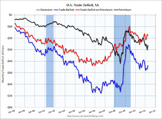
The second graph shows the U.S. trade deficit, with and without petroleum, through April.
 The blue line is the total deficit, and the black line is the petroleum deficit, and the red line is the trade deficit ex-petroleum products.
The petroleum deficit decreased in April as the quantity imported decreased sharply even as prices increased. Oil averaged $103.18 per barrel in April, up from $77.13 in April 2010. There is a bit of a lag with prices, but it is possible prices will be a little lower in May.
The trade deficit was smaller than the expected $48.9 billion.
Weekly Initial Unemployment Claims increase to 427,000
by Calculated Risk on 6/09/2011 08:30:00 AM
The DOL reports on weekly unemployment insurance claims:
In the week ending June 4, the advance figure for seasonally adjusted initial claims was 427,000, an increase of 1,000 from the previous week's revised figure of 426,000. The 4-week moving average was 424,000, a decrease of 2,750 from the previous week's revised average of 426,750.The following graph shows the 4-week moving average of weekly claims for the last 40 years.
 Click on graph for larger image in graph gallery.
The dashed line on the graph is the current 4-week average. The four-week average of weekly unemployment claims decreased this week to 424,000.
This is the ninth straight week with initial claims above 400,000, and the 4-week average is at about the same the level as in January. This suggests the labor market weakness in May is continuing into early June.
Wednesday, June 08, 2011
China: Another Year, Another Prediction of a Housing Bust
by Calculated Risk on 6/08/2011 08:54:00 PM
From the WSJ: The Great Property Bubble of China May Be Popping
Already, in nine major cities tracked by Rosealea Yao, an analyst at market-research firm Dragonomics, real-estate prices fell 4.9% in April from a year earlier. Last year, prices in those nine cities rose 21.5%; in 2009, the increase was about 10%, as China started to recover from the global economic crisis, with much steeper increases toward the end of that year.It is hard to tell what is happening in China - as I've mentioned over the years, at least from what we can tell, the amount of leverage in China is significant less than what we saw in the U.S. during the bubble (residential lending wasn't as crazy). So even if house prices dropped significantly, there wouldn't be as many homeowners with negative equity. Hopefully Professor Pettis will comment on this story!
...
If the Chinese housing market slows faster than people had expected, the impact would be felt in a number of markets that export heavily to China.
Earlier:
• CoreLogic House Price Graph, Real Prices, and Prices and Month-of-Supply
Hamilton on the OPEC Announcement
by Calculated Risk on 6/08/2011 06:30:00 PM
From Jim Hamilton: The significance of OPEC announcements. Professor Hamilton reviews the OPEC announcement today, and points out that quotas for OPEC have been routinely ignored. He concludes:
I think today's announcement that this "quota" will remain in effect is largely irrelevant. At best the statements issued from these meetings provide a noisy signal of the intentions of some OPEC members.The announcement might be "largely irrelevant" as far as actual production, but there was a market impact with WTI crude futures up over $100 per barrel (and Brent crude close to $118).
But if you're interested in what OPEC members really plan to produce, my view is that actions speak louder than words.
The good news is gasoline prices are down about 24 cents per gallon from the recent peak (down over 30 cents where I live). And it looks like gasoline prices will probably fall some more ... but oil prices at $100 per barrel is still a significant drag on the economy.
| Orange County Historical Gas Price Charts Provided by GasBuddy.com |
Earlier:
• CoreLogic House Price Graph, Real Prices, and Prices and Month-of-Supply
Fed's Beige Book: Economic activity continued to expand, "some deceleration"
by Calculated Risk on 6/08/2011 02:00:00 PM
Reports from the twelve Federal Reserve Districts indicated that economic activity generally continued to expand since the last report, though a few Districts indicated some deceleration. Some slowing in the pace of growth was noted in the New York, Philadelphia, Atlanta, and Chicago Districts. In contrast, Dallas characterized that region's economy as accelerating. Other Districts indicated that growth continued at a steady pace.And on real estate:
...
Consumer spending was mixed, with most Districts indicating steady to modestly increasing activity. Elevated food and energy prices, as well as unfavorable weather in some parts of the country, were said to be weighing on consumers' propensity to spend. ... Widespread supply disruptions--primarily related to the disaster in Japan--were reported to have substantially reduced the flow of new automobiles into dealers' inventories, which in turn held down sales in some Districts.
...
Manufacturing activity was reported as continuing to increase since the last report in all but two districts, although many noted that the pace of growth had slowed.
...
Labor market conditions continued to improve gradually across most of the nation, with a number of Districts noting a short supply of workers with specialized technical skills. Wage growth generally remained modest, though there were scattered reports of steeper increases for highly skilled workers in certain occupations.
Residential real estate sales markets showed continued weakness in most Districts, while rental markets strengthened. Most Districts indicate that home prices have declined since the last report: Boston, Philadelphia, Richmond, Atlanta, Kansas City, and San Francisco all report some downward drift in selling prices, while reports from the New York and Cleveland Districts indicate that prices have been steady, on balanceThis was based on data gathered before May 27th.
...
Commercial and industrial real estate markets have generally been steady since the last report, though there have been scattered signs of a pickup. Commercial leasing markets showed modest signs of improvement in the Richmond and San Francisco Districts. Boston and Dallas noted some firming in property sales markets, but Kansas City reported declines in prices for office buildings.
CoreLogic House Price Graph, Real Prices, and Prices and Month-of-Supply
by Calculated Risk on 6/08/2011 11:32:00 AM
Updating some graphs ...
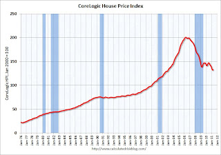
Last week CoreLogic their house price index for April: CoreLogic® Home Price Index Shows First Month-over-Month Increase since mid-2010. The CoreLogic HPI is a three month weighted average of February, March, and April (April weighted the most) and is not seasonally adjusted (NSA).
There was a change in how the data is released, so I didn't include a graph last week - here is the graph.
Note: Case-Shiller is the most followed house price index, but CoreLogic is used by the Federal Reserve and is followed by many analysts.
 Click on graph for larger image in graph gallery.
This graph shows the national CoreLogic HPI data since 1976. January 2000 = 100.
The index was up 0.7% in April, and is down 7.5% over the last year, and off 33.8% from the peak.
This is the ninth straight month of year-over-year declines, and the index is now 4.0% below the March 2009 low.
Real House Prices
 The second graph shows the quarterly Case-Shiller National Index SA (through Q1 2011), and the monthly Case-Shiller Composite 20 SA (through March) and CoreLogic House Price Indexes (through April) in real terms (adjusted for inflation using CPI less Shelter). Note: some people use other inflation measures to adjust for real prices.
In real terms, the National index is back to Q4 1999 levels, the Composite 20 index is back to October 2000, and the CoreLogic index is back to January 2000.
House Prices and months-of-supply
Here is a look at house prices and existing home months-of-supply.
 This graph shows existing home months-of-supply (left axis), and the annualized change in the Case-Shiller composite 20 house price index (right axis, inverted).
House prices are through March using the composite 20 index. Months-of-supply is through April. Based on this general relationship, I expect Case Shiller house prices to fall further - although there are some questions about the NAR inventory data.
It now appears that inventory is declining year-over-year (something to watch carefully), but of course sales have been declining too.
Note: there have been periods with high months-of-supply and rising house prices (see: Lawler: Again on Existing Home Months’ Supply: What’s “Normal?” ) so this is just a guide.
Ceridian-UCLA: Diesel Fuel index declines in May
by Calculated Risk on 6/08/2011 09:00:00 AM
This is the new UCLA Anderson Forecast and Ceridian Corporation index using real-time diesel fuel consumption data: Pulse of Commerce IndexTM
Press Release: Pulse of Commerce Index Falls 0.9 percent in May
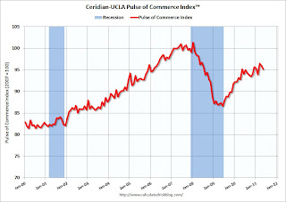
The Ceridian-UCLA Pulse of Commerce Index™ (PCI), issued today by the UCLA Anderson School of Management and Ceridian Corporation fell 0.9 percent on a seasonally and workday adjusted basis in May, after falling 0.5 percent in April.
“The index has now declined in four of the first five months of 2011, and in eight of the past twelve months,” said Ed Leamer, chief PCI economist and director of the UCLA Anderson Forecast. ... “On a year over year basis, the PCI was flat in May. This was disappointing in that it ended a string of seventeen straight months of year over year improvement in the index,” Leamer continued. “One small glimmer of good news is that May of last year was the strongest month of 2010, and this month’s result nearly cleared that hurdle. Nevertheless, the PCI showed no growth, and this is another indication that the economy is stuck in neutral.”
 Click on graph for larger image in graph gallery.
This graph shows the index since January 2000.
“Over time, the PCI has proven to be a leading and amplified indicator of both Industrial Production and GDP,” explained Craig Manson, senior vice president and Index expert for Ceridian. “The May result further reinforces our long-held cautious outlook for below consensus growth in GDP, and suggests that second quarter GDP growth will be less than 2 percent. Similarly, the PCI is anticipating Industrial Production to show modest growth of 0.05 percent for May when the number is released by the Government on June 15, 2011.”This index was useful in tracking the slowdown last summer.
...
The Ceridian-UCLA Pulse of Commerce Index™ is based on real-time diesel fuel consumption data for over the road trucking ...
Note: This index does appear to track Industrial Production over time (with plenty of noise).
MBA: Mortgage Purchase Application activity decreases
by Calculated Risk on 6/08/2011 07:22:00 AM
The MBA reports: Mortgage Applications Decrease in Latest MBA Weekly Survey
The seasonally adjusted Purchase Index decreased 4.4 percent from one week earlier. ... The adjusted Refinance Index increased 1.3 percent from the previous week.
...
The average contract interest rate for 30-year fixed-rate mortgages decreased to 4.54 percent from 4.58 percent, with points decreasing to 0.95 from 1.00 (including the origination fee) for 80 percent loan-to-value (LTV) ratio loans. This is the lowest 30-year contract rate since November 19, 2010.
 Click on graph for larger image in graph gallery.
This graph shows the MBA Purchase Index and four week moving average since 1990.
The four week average of purchase activity is moving sideways at about 1997 levels. Of course there is a very high percentage of cash buyers right now, but this suggests weak existing home sales through mid-year (not counting cash buyers). Note that mortgage rates have fallen to the lowest level since last November.
Tuesday, June 07, 2011
CoreLogic: Negative Equity by State and more
by Calculated Risk on 6/07/2011 08:12:00 PM
As I mentioned this morning, CoreLogic released the Q1 2011 negative equity report today.
CoreLogic ... today released negative equity data showing that 10.9 million, or 22.7 percent, of all residential properties with a mortgage were in negative equity at the end of the first quarter of 2011, down slightly from 11.1 million, or 23.1 percent, in the fourth quarter. An additional 2.4 million borrowers had less than five percent equity, referred to as near-negative equity, in the first quarter.Here are a couple of graphs from the report:
 Click on graph for larger image in graph gallery.
This graph shows the distribution of negative equity (and near negative equity). The more negative equity, the more at risk the homeowner is to losing their home.
Close to 10% of homeowners with mortgages have more than 25% negative equity. This is trending down slowly - the decline is apparently mostly due to homes lost in foreclosure.
 The second graph from CoreLogic shows the default rate by percent negative equity.
The default rate increases the more 'underwater' the property, and the default rate really increases with Loan-to-values (LTV) of 125% or more.
Note that most homes with LTVs of 125% are still current. Many of these people will be stuck in their homes for years - or eventually default.
 The third graph shows the break down of negative equity by state. Note: Data not available for Louisiana, Maine, Mississippi, South Dakota, Vermont, West Virginia and Wyoming.
"Nevada had the highest negative equity percentage with 63 percent of all mortgaged properties underwater, followed by Arizona (50 percent), Florida (46 percent), Michigan (36 percent) and California (31 percent). ... Las Vegas led the nation with a 66 percent negative equity share, followed by Stockton (56 percent), Phoenix (55 percent), Modesto (55 percent) and Reno (54 percent)."


