by Calculated Risk on 5/21/2011 02:11:00 PM
Saturday, May 21, 2011
Schedule for Week of May 22nd
Earlier:
• Summary for Week Ending May 20th
The key reports this week will be New Home Sales on Tuesday (more depression for homebuilders), the second estimate for Q1 GDP on Thursday (expect an upward revision), and the Personal Income and Outlays report for April on Friday (an early hint at consumer spending in Q2).
There are also a number of regional Fed speeches this week, and the FDIC will probably release the Q1 quarterly banking profile, although no release date is scheduled.
It will be interesting to see if lower gasoline prices show up in the final Reuter's/University of Michigan's Consumer sentiment report on Friday. Also the initial weekly unemployment claims on Thursday will be closely watched for signs of renewed labor market weakness.
8:30 AM ET: Chicago Fed National Activity Index (April). This is a composite index of other data.
8:25 AM: Speech, Fed Governor Elizabeth Duke on Financial Education,
At the Conference on "The Future of Life-Cycle Saving and Investing," Boston, Massachusetts
10:00 AM: New Home Sales for April from the Census Bureau.
 Click on graph for larger image in graph gallery.
This graph shows New Home Sales since 1963. The dashed line is the March sales rate.
The consensus is for sales at a 300 thousand Seasonally Adjusted Annual Rate (SAAR) in April, unchanged from the March sales rate.
10:00 AM: Richmond Fed Manufacturing Survey for May. The consensus is for the survey to show modest expansion with a reading of 10.
7:00 AM: The Mortgage Bankers Association (MBA) will release the mortgage purchase applications index. This index has been very weak over the last couple months suggesting weak home sales through mid-year (not counting all cash purchases).
8:30 AM: Durable Goods Orders for April from the Census Bureau. The consensus is for a 3.0% decrease in durable goods orders after increasing 4.1% in March.
10:00 AM: FHFA House Price Index for March. This is based on GSE repeat sales and is no longer as closely followed as Case-Shiller (or CoreLogic).
8:30 AM: The initial weekly unemployment claims report will be released. The number of claims increased over the last month, although claims appear to be trending down again.. The consensus is for a decrease to 404,000 from 409,000 last week.
8:30 AM: Q1 GDP (second estimate). This is the second estimate for Q1 GDP from the BEA.
 This graph shows the quarterly GDP growth (at an annual rate) for the last 30 years.
 The advance estimate was for 1.8% annualized growth in Q1. This was below trend growth (around 3.1%) - and very weak for a recovery, especially with all the slack in the system. The blue column is for Q1.
The consensus is for an upward revision to 2.1% annualized real GDP growth.
11:00 AM: Kansas City Fed regional Manufacturing Survey for May. The index was at 14 in April, down from a record 27 in March.
8:30 AM: Personal Income and Outlays for April. The following graph shows real Personal Consumption Expenditures (PCE) through March (2005 dollars).
 PCE increased 0.5% in March, but real PCE only increased 0.2% as the price index for PCE increased 0.4 percent in March.
The consensus is for a 0.4% increase in personal income in April, and a 0.4% increase in personal spending, and for the Core PCE price index to increase 0.2%.
9:55 AM: Reuter's/University of Michigan's Consumer sentiment index (final for May). The consensus is for a slight increase to 72.5 from the preliminary reading of 72.4.
10:00 AM: Pending Home Sales Index for April.
Best wishes to All!
Summary for Week Ending May 20th
by Calculated Risk on 5/21/2011 08:15:00 AM
The economic data was soft last week. The Empire State and Philly Fed manufacturing surveys showed much slower growth in May. And industrial production from the Fed (for April) showed no change, although this was probably related to supply chain issues and the earthquake in Japan.
For housing, the data was weak as usual. The NAHB survey showed builders are still depressed and the Census Bureau reported housing starts declined in April. Existing home sales also declined in April, although inventory declined year-over-year (for anyone looking for a small silver lining). But there is still 9.2 months of supply on the market - and that doesn't include the shadow inventory.
The MBA reported the percentage of delinquent first lien loans, including loans in the foreclosure process, was unchanged at the end of Q1 on a seasonally adjusted basis. This was disappointing because other indicators suggested a decline in overall delinquencies.
There was a little good news for the U.S. economy - gasoline prices are now down about 10 cents per gallon nationally from the recent peak, and initial weekly unemployment claims declined last week.
Below is a summary of economic data last week mostly in graphs:
• April Existing Home Sales: 5.05 million SAAR, 9.2 months of supply
The NAR reported: April Existing-Home Sales Ease
 Click on graph for larger image in graph gallery.
This graph shows existing home sales, on a Seasonally Adjusted Annual Rate (SAAR) basis since 1993.
Sales in April 2011 (5.05 million SAAR) were 0.8% lower than last month, and were 12.9% lower than in April 2010. According to the NAR, inventory increased to 3.87 million in April from 3.52 million in March.
Inventory is not seasonally adjusted and there is a clear seasonal pattern with inventory peaking in the summer and declining in the fall and winter. The next graph shows the year-over-year (YoY) change in reported existing home inventory and months-of-supply. Note: Months-of-supply is based on the seasonally adjusted sales and not seasonally adjusted inventory - so the increase in months-of-supply during the Spring is expected.
 Although inventory increased from March to April (as usual), inventory decreased 3.9% year-over-year in April from April 2010. This is the third consecutive month with a YoY decrease in inventory.
Inventory should increase over the next few months and peak in the summer (the normal seasonal pattern), and the YoY change is something to watch closely this year.
• Housing Starts declined in April
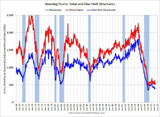 Total housing starts were at 523 thousand (SAAR) in April, down 10.6% from the revised March rate of 585 thousand. Single-family starts decreased 5.1% to 394 thousand in April.
This graph shows total and single unit starts since 1968. This shows the huge collapse following the housing bubble, and that housing starts have mostly been moving sideways for over two years - with slight ups and downs due to the home buyer tax credit. This was well below expectations of 570 thousand starts in April.
• MBA: Total Delinquencies essentially unchanged in Q1 Seasonally Adjusted
The MBA reported that 12.84 percent of mortgage loans were either one payment delinquent or in the foreclosure process in Q1 2011 (seasonally adjusted). This is essentially the same as in Q4. There was a significant decline in Not Seasonally Adjusted (NSA) delinquencies, but that is the usual seasonal pattern.
The following graph shows the percent of loans delinquent by days past due.
 Loans 30 days delinquent increased to 3.35% from 3.26% in Q4. This is below the average levels of the last 2 years, but still higher than normal.
Delinquent loans in the 60 day bucket were unchanged at 1.35%; this is the lowest since Q2 2008. There was a slight increase in the 90+ day delinquent bucket. This increased from 3.62% in Q4 to 3.65% in Q1 2011.
The percent of loans in the foreclosure process decreased to 4.52%.
The following graph is for each state and includes all delinquent loans (sorted by percent seriously delinquent).
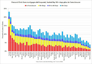 Florida and Nevada have the highest percentage of serious delinquent loans, followed by New Jersey, Illinois, New York, Arizona and California.
And the next graph shows the change in the percent delinquent based on Q1 2007, Q1 2010 (the peak of the crisis nationally), and Q1 2011. These are the 10 worst states sorted by the current percent seriously delinquent.
 For each state there are 3 columns (Q1 2007, 2010, and 2011). In Ohio and Indiana, delinquency rates were already elevated by Q1 2007.
Some states have made progress: Arizona, Nevada and California. For other states like New Jersey and New York, serious delinquencies were higher in Q1 2011 than in Q1 2010.
But even though there has been some progress, there is a long way to go to get back to the 2007 rates.
Here is a post for the remaining 40 states.
• Industrial Production unchanged in April, Capacity Utilization declines slightly
From the Fed: Industrial production and Capacity Utilization
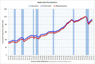 The next graph shows industrial production since 1967.
Industrial production was unchanged in April at 93.1; previous months were revised down, so this is a decline from the previously reported level in March.
Production is still 7.6% below the pre-recession levels at the end of 2007.
The consensus was for a 0.4% increase in Industrial Production in April, and an increase to 77.6% for Capacity Utilization. So this was well below expectations - partly because of the earthquake in Japan.
• AIA: Architecture Billings Index indicates declining demand in April
Note: This index is a leading indicator for new Commercial Real Estate (CRE) investment.
From Reuters: US architecture billings index falls in April-AIA
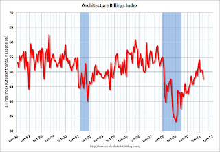 This graph shows the Architecture Billings Index since 1996. The index showed billings decreased in April (index at 47.6, anything below 50 indicates a decrease in billings).
Note: Nonresidential construction includes commercial and industrial facilities like hotels and office buildings, as well as schools, hospitals and other institutions.
According to the AIA, there is an "approximate nine to twelve month lag time between architecture billings and construction spending" on non-residential construction.
• Other Economic Stories ...
• Empire State Manufacturing Survey indicates slower growth in May
• Philly Fed Survey shows "regional manufacturing activity grew slightly in May"
• Residential Remodeling Index increases in March
• NAHB Builder Confidence index unchanged at low level in May
Best wishes to all!
Friday, May 20, 2011
Bank Failure #43: Summit Bank, Burlington, Washington
by Calculated Risk on 5/20/2011 09:11:00 PM
From apogee to abyss
Thy name is Summit
by Soylent Green is People
From the FDIC: Columbia State Bank, Tacoma, Washington, Assumes All of the Deposits of Summit Bank, Burlington, Washington
As of March 31, 2011, Summit Bank had approximately $142.7 million in total assets and $131.6 million in total deposits. ... The FDIC estimates that the cost to the Deposit Insurance Fund (DIF) will be $15.7 million. ... Summit Bank is the 43rd FDIC-insured institution to fail in the nation this year, and the first in Washington.That makes 3 today ...
Bank Failures #41 & 42 in 2011: Two more in Georgia
by Calculated Risk on 5/20/2011 05:45:00 PM
Hives of scum and villainy
We must be cautious.
by Soylent Green is People
From the FDIC: CertusBank, National Association, Easley, South Carolina, Acquires All the Deposits of Two Georgia Institutions
As of March 31, 2011, Atlantic Southern Bank had total assets of $741.9 million and total deposits of $707.6 million; and First Georgia Banking Company had total assets of $731.0 million and total deposits of $702.2 million. ... The FDIC estimates that the cost to the Deposit Insurance Fund (DIF) for Atlantic Southern Bank will be $273.5 million and for First Georgia Banking Company, $156.5 million. ... The closings are the 41st and 42nd FDIC-insured institutions to fail in the nation so far this year and the eleventh and twelfth in Georgia.Georgia again?
Mortgage Delinquencies by State: Before Crisis, Peak and Current (40 states)
by Calculated Risk on 5/20/2011 03:33:00 PM
As followup to the previous post (that showed the 10 highest state by serious delinquencies), here are graphs for the 40 remaining states.
The following graphs shows the percent delinquent by bucket of delinquency for the states in Q1 2007, Q1 2010 (the peak of the crisis nationally), and Q1 2011. The order is by the current percent of loans seriously delinquent.
 Click on graph for larger image in graph gallery.
For each state there are 3 columns (Q1 2007, 2010, and 2011).
Note that the y-axis scale change between the graphs. To use this graphs, find the state of interest - and compare 2007 to 2010 and 2011 (sorry there is so much data on each graph).
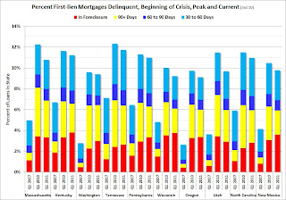
NOTE: when you use the graph gallery, you can scroll between graphs - and use the "print" button (below the image on the left) to see the full size image.
 Some states always have a high rate for 30 day delinquencies (mostly southern states). These borrowers usually catch up, and this generates late fees for the lenders.
An example is Alabama on this graph. For some reason Alabama always has a high level of 30 day delinquencies - and that is why I sorted the states by serious delinquency rates (90+ days and in foreclosure).
 Nebraska has seen the smallest increase in the serious delinquency rate - just over 60% from 2.0% in Q1 2007 to 3.3% now.
At the other extreme, the serious delinquency rate in Florida increased from 1.8% in Q1 2007 to 18.97% in Q1 2011. Ouch.
Mortgage Delinquencies by State: Before Crisis, Peak and Current
by Calculated Risk on 5/20/2011 01:05:00 PM
Yesterday I posted Mortgage Delinquencies by State: Percent and Number for Q1 2011. This raised the question of how this compares to before the crisis - and also a comparison to the peak of the delinquency crisis nationally (Q1 2011). (ht Cinco-X)
The following graph shows the percent delinquent by bucket of delinquency for the 10 worst states in Q1 2007, Q1 2010 (the peak of the crisis nationally), and Q1 2011. These are the 10 worst states sorted by the current percent seriously delinquent.
 Click on graph for larger image in graph gallery.
For each state there are 3 columns (Q1 2007, 2010, and 2011). In Ohio and Indiana, delinquency rates were already elevated by Q1 2007.
Some states have made progress: Arizona, Nevada and California. For other states like New Jersey and New York, serious delinquencies were higher in Q1 2011 than in Q1 2010.
But even though there has been some progress, there is a long way to go to get back to the 2007 rates.
Note: I'll post the other states soon. I'm grouping by percent of serious delinquencies so we can see the change on the scale for states with fewer delinquencies.
State Unemployment Rates "little changed or slightly lower": in April
by Calculated Risk on 5/20/2011 10:00:00 AM
From the BLS: Regional and State Employment and Unemployment Summary
Regional and state unemployment rates were generally little changed or slightly lower in April. Thirty-nine states recorded unemployment rate decreases, three states and the District of Columbia registered rate increases, and eight states had no rate change, the U.S. Bureau of Labor Statistics reported today.The following graph shows the current unemployment rate for each state (red), and the max during the recession (blue). If there is no blue, the state is currently at the maximum during the recession.
...
Nevada continued to register the highest unemployment rate among the states, 12.5 percent in April. California recorded the next highest rate, 11.9 percent. North Dakota reported the lowest jobless rate, 3.3 percent ...
 Click on graph for larger image in graph gallery.
The states are ranked by the highest current unemployment rate.
Nevada saw the most improvement in April, but still has the highest state unemployment rate.
One states is still at the recession maximum (no improvement): Louisiana. Every other state has seen some improvement and only seven states have double digit unemployment now (19 states had double digit unemployment during the great recession).
Greece Bond Yields increase as Policymakers Disagree on Restructuring
by Calculated Risk on 5/20/2011 08:40:00 AM
From the Financial Times: ECB’s political tensions flare over Greece
This week, the ECB’s fierce opposition to Greece’s delaying debt repayments has erupted into a full-blown and public dispute. ... Jean-Claude Juncker, the Luxembourg prime minister who also chairs meetings of eurozone finance ministers, floated the idea of a “soft” restructuring ...From the FT Alphaville: The ECB goes all-in
In response, ECB policymakers accused him of “using meaningless phrases”.
Kash Mansori wonders Is the ECB Pushing Greece Out of the Euro-Zone?
The yield on Greece ten year bonds increased to a record 16.5% today and the two year yield was up slightly to 25.1%.
Yields for other European countries are not increasing - yet. Here are the ten year yields for Ireland at 10.5%, Portugal at 9.3%, and Spain at 5.5%.
Thursday, May 19, 2011
Mortgage Delinquencies by State: Percent and Number
by Calculated Risk on 5/19/2011 07:38:00 PM
Here are two more graphs based on the MBA Q1 National Delinquency Survey released this morning.
Earlier the MBA released a graph of the percent of loans "in foreclosure" by state. The following graph is similar, but includes all delinquent loans (sorted by percent seriously delinquent).
 Click on graph for larger image in graph gallery.
Florida and Nevada have the highest percentage of serious delinquent loans, followed by New Jersey, Illinois, New York, Arizona and California.
Comment: It has always bothered me that several southern states always have an elevated percentage of mortgage loans 30+ day delinquent (Mississippi, Alabama, Texas, Georgia, and Louisiana all have a large percentage light blue). Most of these borrowers always seem to catch up - they just make their payments late. That means the lenders generate plenty of late fees in these states. This might be something for the Consumer Financial Protection Bureau to investigate.
 The second graph shows the number of loans delinquent in each state (as opposed to the percent). California is the largest state, so it is no surprise that the number of delinquent loans is very high (I'd expect California to always be #1). In that sense this graph is misleading - in reality California is in about the same shape as New York, Arizona, Ohio and Rhode Island (first graph).
There are plenty of problems in California, but nothing like Florida. Florida has 57% the number of mortgages as California, but more delinquent loans. In most ways, dividing this by states is arbitrary - except the foreclosure process matters. States with only judicial foreclosures tend to have many more loans in the foreclosure process (just because it takes longer).
Earlier:
• April Existing Home Sales: 5.05 million SAAR, 9.2 months of supply
• MBA: Total Delinquencies essentially unchanged in Q1 Seasonally Adjusted
• Philly Fed Survey shows "regional manufacturing activity grew slightly in May"
• Weekly Initial Unemployment Claims declines to 409,000, 4-Week average highest since November
• Existing Home Sales graphs
Existing Home Sales: Investors, Distressed Sales and First Time Buyers
by Calculated Risk on 5/19/2011 03:48:00 PM
The following graph shows existing home sales Not Seasonally Adjusted (NSA).
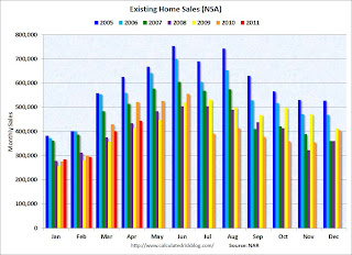 Click on graph for larger image in graph gallery.
The red columns are for 2011.
Sales NSA are below the tax credit boosted level of sales in April 2010, but slightly above the level of March sales in 2008 and 2009.
The level of sales is elevated due to all the investor buying. The NAR noted:
All-cash transactions stood at 31 percent in April, down from a record level of 35 percent in March; they were 26 percent in March 2010; investors account for the bulk of cash purchases.Another survey, the Campbell/Inside Mortgage Finance HousingPulse Tracking Survey "showed the proportion of first-time homebuyers in the housing market fell to 35.7% in April compared to 43.4% a year earlier.
...
First-time buyers purchased 36 percent of homes in April, up from 33 percent in March; they were 49 percent in April 2010 when the tax credit was in place. Investors slipped to 20 percent in April from 22 percent of purchase activity in March; they were 15 percent in April 2010. The balance of sales was to repeat buyers, which were 44 percent in April.
...
[The] Distressed Property Index, a key measure of the health of the U.S. housing market, fell slightly to 47.7% in April, although sales of distressed properties continued to account for nearly half of the market."
 This graph shows from Campbell/Inside Mortgage Finance HousingPulse Tracking Survey shows both distressed sales and first time buyers. From the survey:
 First-time homebuyers absorb housing supply, while move-up and move-down buyers produce no net take-up in inventory. When the supply of distressed properties exceeds the demand from first-time homebuyers, investors must step into the market to buy these properties, often at bargain-basement prices.Clearly investors are picking up the slack, and this has kept overall existing home sales elevated.
Investors accounted for 23.0% of the housing market in the month of April, up from 18.0% a year earlier, according to the HousingPulse Survey. A common business model for investors has been to buy damaged properties, renovate, and sell the properties to first-time homebuyers. But increasingly, investors are being forced to put renovated properties out as rental units as demand from first-time buyers drops.
Update for clarity: The Campbell press release suggets some investors are being "forced" to rent because they can't flip. I've spoken with several cash buyer investors who have told me they are buying for cash flow (to rent, not flip), so the word "forced" is probably inaccurate in many cases (not that it makes any difference). These buyers are helping clear out the excess inventory - although many of these properties are probably future supply.


