 RSS Feed
 by Calculated Risk on 7/14/2010 02:00:00 PM
Wednesday, July 14, 2010
FOMC Minutes: Forecast revised down
From the June 22-23, 2010 (and May 9th) FOMC meeting.
The Fed revised down their forecasts:
| Economic projections of Federal Reserve Governors and Reserve Bank presidents | |||
|---|---|---|---|
| 2010 | 2011 | 2012 | |
| Change in Real GDP | 3.0% to 3.5% | 3.5% to 4.2% | 3.5% to 4.5% |
| April projection | 3.2% to 3.7% | 3.4% to 4.5% | 3.5% to 4.5% |
| Unemployment Rate | 9.2% to 9.5% | 8.3% to 8.7% | 7.1% to 7.5% |
| April projection | 9.1% to 9.5% | 8.1% to 8.5% | 6.6% to 7.5% |
| PCE Inflation | 1.0% to 1.1% | 1.1% to 1.6% | 1.0% to 1.7% |
| April projection | 1.2% to 1.5% | 1.1% to 1.9% | 1.2% to 2.0% |
Unfortunately, I'll take the under on GDP growth and inflation, and the over on the unemployment rate.
On further stimulus:
[M]embers noted that in addition to continuing to develop and test instruments to exit from the period of unusually accommodative monetary policy, the Committee would need to consider whether further policy stimulus might become appropriate if the outlook were to worsen appreciably.That is it.
AIA Forecast: Nonresidential Construction Spending to fall 20% in 2010
by Calculated Risk on 7/14/2010 12:11:00 PM
From Reuters: US nonresidential building seen down 20 pct in '10
Spending on U.S. nonresidential construction is likely to fall more than 20 percent this year before recovering slightly in 2011, according to a semiannual survey by an architects' trade group.Nonresidential construction investment has been a drag on GDP for six consecutive quarters (through Q1 2010), and will remain a drag throughout 2010 and probably into 2011.
...
Construction spending on hotels will drop more than 43 percent this year, construction of office buildings will decline almost 30 percent, and retail and industrial categories will be down more than 20 percent, the [American Institute of Architects] said.
Here is a repeat of a graph shows the rolling 4 quarter contribution to GDP from residential investment, equipment and software, and nonresidential structures. This is important to follow because residential investment tends to lead the economy, equipment and software is generally coincident, and nonresidential structure investment trails the economy.
For the following graph, red is residential, green is equipment and software, and blue is investment in non-residential structures. The usual pattern - both into and out of recessions is - red, green, blue.
 Click on graph for larger image in new window.
Equipment and software investment has made a positive contribution to GDP for three straight quarters (it is coincident). Tech has done better than most other sectors.
Residential Investment (RI) made a small positive contribution to GDP in the second half of 2009, but was a drag in Q1 2010. It will be positive again in Q2 2010 (tax credit related), and be negative again later this year. The rolling four quarter change is moving up, but as expected there has been no strong boost to GDP from RI.
Nonresidential investment in structures continues to be a drag on the economy, and as usual the economy is recovering long before nonresidential investment in structures recovers.
Manufacturing and Trade Inventory-to-Sales Ratio
by Calculated Risk on 7/14/2010 10:00:00 AM
The Manufacturing and Trade Inventories and Sales report from the Census Bureau today showed that the inventory adjustment is over:
Inventories. Manufacturers’ and trade inventories, adjusted for seasonal variations but not for price changes, were estimated at an end-of-month level of $1,355.7 billion, up 0.1 percent (±0.1%)* from April 2010, but down 1.5 percent (±0.3%) from May 2009.
Inventories/Sales Ratio. The total business inventories/sales ratio based on seasonally adjusted data at the end of May was 1.24. The May 2009 ratio was 1.41.
 Click on graph for larger image in new window.
This graph shows the inventory to sales ratio. This increased slightly in May to 1.24 (SA), after declining sharply from the peak of 1.48 back in Jan 2009. This could decline further - the trend is definitely down over time - but clearly the inventory adjustment is over.
This is important because the change in inventory added significantly to Q4 GDP growth and some to Q1 GDP. See BEA line 13: the contribution to GDP in Q4 2009 from 'Change in private inventories' was 3.79 of the 5.9 percent annualized increase in Q4 GDP. In Q1 2010. the 'change in private inventories' was 1.88 of the 2.7 percent annualized increase.
Any contributions to Q2 GDP from inventory changes will be minor or possibly even negative. This is one of the reasons I expect the change in real GDP growth to slow in the 2nd half.
Retail Sales fall 0.5% in June
by Calculated Risk on 7/14/2010 08:30:00 AM
On a monthly basis, retail sales decreased 0.5% from May to June (seasonally adjusted, after revisions), and sales were up 4.8% from June 2009.  Click on graph for larger image in new window.
This graph shows retail sales since 1992.
This is monthly retail sales, seasonally adjusted (total and ex-gasoline).
Retail sales are up 7.3% from the bottom, but still off 5.2% from the pre-recession peak. The second graph shows the year-over-year change in retail sales (ex-gasoline) since 1993.
Retail sales ex-gasoline increased by 4.5% on a YoY basis (4.8% for all retail sales). The year-over-year comparisons are easy now since retail sales collapsed in late 2008.
Here is the Census Bureau report:
The U.S. Census Bureau announced today that advance estimates of U.S. retail and food services sales for June, adjusted for seasonal variation and holiday and trading-day differences, but not for price changes, were $360.2 billion, a decrease of 0.5 percent (±0.5%)* from the previous month, but 4.8 percent (±0.7%) above June 2009. Total sales for the April through June 2010 period were up 6.8 percent (±0.3%) from the same period a year ago. The April to May 2010 percent change was revised from -1.2 percent (±0.5%) to -1.1 percent (±0.2%).Retail sales have declined for two consecutive months. This is another weak report, and the decline in sales was worse than expected.
MBA: Mortgage Purchase Applications lowest since December 1996
by Calculated Risk on 7/14/2010 07:46:00 AM
The MBA reports: Mortgage Applications Decrease in Latest MBA Weekly Survey
The Refinance Index decreased 2.9 percent from the previous week and the seasonally adjusted Purchase Index decreased 3.1 percent from one week earlier. This was the lowest Purchase Index observed in the survey since December 1996.
...
The average contract interest rate for 30-year fixed-rate mortgages increased to 4.69 percent from 4.68 percent, with points increasing to 0.96 from 0.86 (including the origination fee) for 80 percent loan-to-value (LTV) ratio loans.
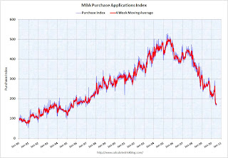 Click on graph for larger image in new window.
This graph shows the MBA Purchase Index and four week moving average since 1990.
Mortgage applications have fallen off a cliff. The weekly applications index is at the lowest level since December 1996, and and the four week average is at the lowest level since September 1995 - almost 15 years ago. The four week average is off 35% since the mini-peak in April (the weekly index is off 44% since the end of April).
This collapse in the mortgage application index has already shown up as a decline in new home sales, and will show up in the July existing home sales report (counted at close of escrow).
Tuesday, July 13, 2010
Fed Minutes Preview
by Calculated Risk on 7/13/2010 10:29:00 PM
Usually the Fed minutes are pretty boring, but the minutes for the two day meeting held on June 22nd and 23rd, to be released on Wednesday, might be a little more interesting.
This release will include a revised forecast. Look for the Fed to revise down estimates for GDP and for inflation. And revise up estimates for unemployment.
The Fed April forecast for 2010 (most recent) was:
Also the Fed might have discussed possible additional easing measures at the June meeting, and if so, it will be interesting to see the options discussed.
Jon Hilsenrath at the WSJ has a preview: Fed Sees Slower Growth
From Steve Matthews and Carol Massar at Bloomberg: Blinder Cuts U.S. Forecast, Says Fed Must Plan for More Easing (ht jb)
Some European Stress Test Results may be delayed
by Calculated Risk on 7/13/2010 07:02:00 PM
From James Kanter at the NY Times: European Bank Stress Test Results May Be Delayed
Top European finance officials said Tuesday that results of banking stress tests would be released on July 23, but that some national regulators could take longer to release more detailed information on certain national lenders ... national regulators will retain the leeway to choose whether to publish additional information about the nationally based subsidiaries of large banking groups within two weeks from July 23.Sounds confusing ...
Rail Traffic softens further in June
by Calculated Risk on 7/13/2010 03:20:00 PM
From the Association of American Railroads: Rail Time Indicators. The AAR reports traffic in June 2010 was up 10.6% compared to June 2009 - but traffic was still 10.2% lower than in June 2008. Click on graph for larger image in new window.
This graph shows U.S. average weekly rail carloads. Traffic increased in 16 of 19 major commodity categories year-over-year.
From AAR:
• U.S. freight railroads originated 1,415,630 carloads in June 2010, an average of 283,126 carloads per week — up 10.6% from June 2009 (see chart) but down 10.2% from June 2008 on a non-seasonally adjusted basis.As the graph above shows, rail traffic collapsed in November 2008, and now, a year into the recovery, traffic has only recovered about half way. This is more evidence of a sluggish recovery ... also the declines in May and June are concerning although the declines were small.
• On a seasonally adjusted basis, U.S. rail carloads fell 1.3% in June 2010 from May 2010, following a 1.1% decline in May 2010 from April 2010. After bottoming out in May 2009, seasonally adjusted rail carloads trended upward, with some fits and starts along the way, through April 2010. They’ve now declined for two consecutive months.
• The declines in rail carloads over the past couple months have not been huge, and they certainly don’t prove that the wheels are coming off the economy’s bus.
• That said, an economy several months into a recovery from the worst recession in decades should be yielding rail traffic levels heading north, not south. (Remember, demand for rail service occurs as a result of demand elsewhere in the economy for the products that railroads haul.) Thus, rail traffic in June 2010 is consistent with an economy that is in far better shape than it was nine months or a year ago, but is, in the words of former Federal Reserve Chairman Alan Greenspan, “more than likely” undergoing a “pause.
excerpts with permission
CoreLogic: House Prices increase 0.9% in May
by Calculated Risk on 7/13/2010 01:10:00 PM
From CoreLogic (formerly First American LoanPerformance): CoreLogic® Home Price Index Shows Continued Increases in Home Prices for both Year-Over-Year and Month-Over-Month Figures In May
National home prices in the U.S. increased in May, the fourth-consecutive month showing a year-over-year increase. According to the CoreLogic HPI, national home prices, including distressed sales, increased by 2.9 percent in May 2010 compared to May 2009 and increased by 3.5 percent in April 2010 compared to April 2009. Excluding distressed sales, year-over-year prices only increased by 0.9 percent in May, and April’s non-distressed HPI increased by 0.4 percent.
On a month-over-month basis, May’s HPI was 0.9 percent higher than the April 2010 HPI, but the rate of increase was lower than the 1.3 percent gain from March 2010 to April 2010.
...
“Home price appreciation stabilized as homebuyer tax credit driven sales peaked in late spring,” said Mark Fleming, chief economist for CoreLogic. “But given that the labor market and income growth remain tepid we expect prices to moderate and possibly decline the rest of the year.”
 Click on graph for larger image in new window.
 This graph shows the national LoanPerformance data since 1976. January 2000 = 100.
The index is up 2.9% over the last year, and off 28.5% from the peak.
CoreLogic expects prices to "moderate and possibly decline". I expect that we will see lower prices on this index later this year.
 The second graph is an update on the price-to-rent ratio similar to the approach used by Fed economist John Krainer and researcher Chishen Wei in 2004: House Prices and Fundamental Value. Kainer and Wei presented a price-to-rent ratio using the OFHEO house price index and the Owners' Equivalent Rent (OER) from the BLS.
This graph shows the price to rent ratio using the CoreLogic data (January 2000 = 1.0).
This suggests that house prices are much closer to the bottom than the top, but that prices still have a ways to fall on a national basis.
I think this index will show a further price increase in June, as tax credit related existing home sales close. But I expect the index will show declines by the end of summer and into the fall.
BLS: Low Labor Turnover in May
by Calculated Risk on 7/13/2010 10:41:00 AM
From the BLS: Job Openings and Labor Turnover Summary
There were 3.2 million job openings on the last business day of May 2010, the U.S. Bureau of Labor Statistics reported today. The job openings rate was little changed over the month at 2.4 percent. TheNote: The difference between JOLTS hires and separations is similar to the CES (payroll survey) net jobs headline numbers. The CES (Current Employment Statistics, payroll survey) is for positions, the CPS (Current Population Survey, commonly called the household survey) is for people.
hires rate (3.4 percent) was little changed and the separations rate (3.1 percent) was unchanged.
...
[T]he number of job openings has risen by 868,000 (37 percent) since the most recent trough of 2.3 million in July 2009. Even with the gains since July 2009, the number of job openings in May 2010 remained below those in place at the start of the recession in every industry except government, and in each region except the Northeast.
The following graph shows job openings (purple), hires (blue), Total separations (include layoffs, discharges and quits) (red) and Layoff, Discharges and other (yellow) from the JOLTS.
Unfortunately this is a new series and only started in December 2000.
 Click on graph for larger image in new window.
Notice that hires (blue) and separations (red) are pretty close each month. In May, about 4.1 million people lost (or left) their jobs, and 4.5 million were hired (this is the labor turnover in the economy).
When the hires (blue line) is above total separations (as in May), the economy is adding net jobs, when the blue line is below total separations, the economy is losing net jobs.
The hires in May included the 411 thousand temporary Census 2010 hires. Without those hires, the JOLTS report shows only 8 thousand hires in May.
Layoffs and discharges have declined sharply since early 2009 - and are near a series low - and that is a good sign. And the number of job openings has moved up recently (although down slightly in May). But the overall turnover, especially after removing the impact of the Census hiring, is still low.


