 RSS Feed
 by Calculated Risk on 4/16/2010 10:05:00 AM
Friday, April 16, 2010
March State Unemployment Rates: New Record Highs in California, Florida, Georgia and Nevada
From the BLS: Regional and State Employment and Unemployment Summary
Regional and state unemployment rates were little changed in March. Twenty-four states recorded over-the-month unemployment rate increases, 17 states and the District of Columbia registered rate decreases, and 9 states had no rate change, the U.S. Bureau of Labor Statistics reported today. Forty-four states and the District of Columbia recorded jobless rate increases from a year earlier, 5 states had decreases, and 1 state had no change.
...
Michigan again recorded the highest unemployment rate among the states, 14.1 percent in March. The states with the next highest rates were Nevada, 13.4 percent; California and Rhode Island, 12.6 percent each; Florida, 12.3 percent; and South Carolina, 12.2 percent. North Dakota continued to register the lowest jobless rate, 4.0 percent in March, followed by South Dakota and Nebraska, 4.8 and 5.0 percent, respectively. The rates in California, Florida, and Nevada set new series highs, as did the rate in Georgia (10.6 percent).
emphasis added
 Click on graph for larger image in new window.
This graph shows the high and low unemployment rates for each state (and D.C.) since 1976. The red bar is the current unemployment rate (sorted by the current unemployment rate).
Fifteen states and D.C. now have double digit unemployment rates. New Jersey and Indiana are close.
Four states and set new series record highs: California, Florida, Nevada and Georgia.
Housing Starts mixed in March
by Calculated Risk on 4/16/2010 08:30:00 AM
 Click on graph for larger image in new window.
Total housing starts were at 626 thousand (SAAR) in March, up 1.6% from the revised February rate, and up 30% from the all time record low in April 2009 of 479 thousand (the lowest level since the Census Bureau began tracking housing starts in 1959).
Single-family starts were at 531 thousand (SAAR) in March, down 0.9% from the revised February rate, and 49% above the record low in January and February 2009 (357 thousand).  The second graph shows total and single unit starts since 1968. This shows the huge collapse following the housing bubble, and the slow and sluggish recovery in housing starts.
Here is the Census Bureau report on housing Permits, Starts and Completions.
Housing Starts:
Privately-owned housing starts in March were at a seasonally adjusted annual rate of 626,000. This is 1.6 percent (±15.2%)* above the revised February estimate of 616,000 and is 20.2 percent (±15.3%) above the March 2009 rate of 521,000.
Single-family housing starts in March were at a rate of 531,000; this is 0.9 percent (±12.1%)* below the revised February figure of 536,000. The March rate for units in buildings with five units or more was 88,000.
Housing Completions:
Privately-owned housing completions in March were at a seasonally adjusted annual rate of 656,000. This is 3.1 percent (±16.7%)* below the revised February estimate of 677,000 and is 21.2 percent (±8.9%) below the March 2009 rate of 833,000.
Single-family housing completions in March were at a rate of 486,000; this is 5.9 percent (±14.6%)* above the revised February rate of 459,000. The March rate for units in buildings with five units or more was 161,000.
Thursday, April 15, 2010
LA Area Port Traffic Increases in March
by Calculated Risk on 4/15/2010 09:49:00 PM
Notes: this data is not seasonally adjusted. There is a very distinct seasonal pattern for imports, but not for exports. LA area ports handle about 40% of the nation's container port traffic.
Sometimes port traffic gives us an early hint of changes in the trade deficit. The following graph shows the loaded inbound and outbound traffic at the ports of Los Angeles and Long Beach in TEUs (TEUs: 20-foot equivalent units or 20-foot-long cargo container). Although containers tell us nothing about value, container traffic does give us an idea of the volume of goods being exported and imported. Click on graph for larger image in new window.
Loaded inbound traffic was up 2.6% compared to March 2009. (up 9.6% compared to last year using three month average). Inbound traffic was still down 9.2% vs. two years ago (Mar08).
Loaded outbound traffic was up 13.6% from March 2009. (+24.9% using three months average) Just as with imports, exports are still off from 2 years ago (off 8.0%).
Looking at the graph (red line), exports recovered in the first half of 2009, but then export traffic only increased gradually since last summer. Export traffic picked up again in March.
It is harder to tell about imports (blue line) because of the large seasonal swings. Usually there is a large dip in either February or March - depending on the timing of the Chinese New Year - and that didn't happen this year. The lack of a large seasonal dip might suggest a significant increase in imports too.
WaMu Examiner Ridiculed, Called "Housing 'bubble' boy"
by Calculated Risk on 4/15/2010 06:30:00 PM
From Jim Puzzanghera at the LA Times: Regulators did little to halt reckless practices at WaMu
Federal banking examiners found serious problems at Washington Mutual Bank at least five years before its 2008 collapse, but their supervisors showed little concern ... During those five years, examiners constantly warned of "less than satisfactory" loan underwriting, the "horrible performance" of its subprime-backed mortgage securities and the failure of WaMu executives and federal regulatory supervisors to do much about it.Once again the field examiners did their job, but their efforts were ridiculed. I was asked by a reporter a couple of years ago who was to blame for the housing bubble, and I said the list is long, but it starts with the regulators ...
One examiner said he was derided by colleagues as "the housing 'bubble' boy" for his "gloom and doom" predictions for some risky loans, and another complained that critics of subprime loans were called "chicken little."
...
Former OTS Director John Reich, who served from 2005 to 2009, referred to WaMu Chief Executive Kerry Killinger as "my largest constituent" in a 2007 e-mail.
That attitude pervaded the upper levels of the agency ...
 | This photo from 2003 shows two regulators: John Reich (then Vice Chairman of the FDIC and later at the OTS) and James Gilleran of the Office of Thrift Supervision (with the chainsaw) and representatives of three banker trade associations: James McLaughlin of the American Bankers Association, Harry Doherty of America's Community Bankers, and Ken Guenther of the Independent Community Bankers of America. |
Greece, Market and More
by Calculated Risk on 4/15/2010 03:55:00 PM
A few links ...
This graph is from Doug Short of dshort.com (financial planner): "Four Bad Bears".
Note that the Great Depression crash is based on the DOW; the three others are for the S&P 500.
Measured using our favorite valuation technique, Professor Shiller's cyclically adjusted PE analysis, the S&P 500 has a PE of 22X. The long-term average (1880-2010) is about 16X. The current level is actually close to the big bull market peaks of the past--with the exception of the gigantic one that peaked in 2000.
Greece capitulated ... took an important step towards a bail-out from its eurozone partners and the International Monetary Fund as it formally sought “consultations” over a €30bn-plus ($40bn, £26bn) loan package to stave off default.
... Greece’s finance minister, George Papaconstantinou, said Athens wanted to discuss “a multi-year economic policy programme with the Commission, the European Central Bank and the International Monetary Fund”.
excerpt with permission
Historically, recoveries have been proportional to the recessions -- severe recessions have strong recoveries and mild recessions have weak recoveries. So far the recovery in industrial production this cycle looks about average. But given the depth and severity of the recessions an average rebound is disappointing.
NAHB Builder Confidence increases in April
by Calculated Risk on 4/15/2010 01:00:00 PM
The increase this month was driven by traffic of prospective buyers and current sales - and this was the last month that buyers can take advantage of the housing tax credit - so this increase was no surprise.
Note: any number under 50 indicates that more builders view sales conditions as poor than good. Click on graph for larger image in new window.
This graph shows the builder confidence index from the National Association of Home Builders (NAHB).
The housing market index (HMI) was at 19 in April. This is an increase from 15 in March.
The record low was 8 set in January 2009. This is very low - and this is what I've expected - a long period of builder depression. The HMI has been in the 15 to 19 range since May 2009.  This second graph compares the NAHB HMI (left scale) with single family housing starts (right scale). This includes the April release for the HMI and the February data for starts (March starts will be released tomorrow).
This shows that the HMI and single family starts mostly move generally in the same direction - although there is plenty of noise month-to-month.
And right now they are moving sideways - at best.
Press release from the NAHB: (TBA)
Hotel Occupancy increases during Easter Week
by Calculated Risk on 4/15/2010 12:06:00 PM
From HotelNewsNow.com: STR: Upscale segment tops occ. increases
Overall the industry’s occupancy increased 12.6 percent to 59.2 percent; ADR ended the week virtually flat with a 0.4-percent decrease to US$96.31; and RevPAR was up 12.1 percent to US$57.00.The following graph shows the occupancy rate by week and the 52 week rolling average since 2000.
“We saw strong RevPAR growth this week because of a favorable Easter comparison,” said Chad Church, industry research manager at STR.
 Click on graph for larger image in new window.
Notes: the scale doesn't start at zero to better show the change.
The graph shows the distinct seasonal pattern for the occupancy rate; higher in the summer because of leisure/vacation travel, and lower on certain holidays.
The occupancy rate was boosted by the Easter holiday, and even still the occupancy rate was below the average for this week of around 63% (usually without Easter). The 52 week average is moving up - and that is a good sign for hotels.
Data Source: Smith Travel Research, Courtesy of HotelNewsNow.com
Industrial Production, Capacity Utilization increase in March
by Calculated Risk on 4/15/2010 09:39:00 AM
From the Fed: Industrial production and Capacity Utilization
Industrial production edged up 0.1 percent in March and increased at an annual rate of 7.8 percent in the first quarter. Manufacturing output rose 0.9 percent in March, led by widespread gains among durable goods industries. Factory production was likely held down in February by the winter storms but nonetheless rose at an annual rate of 6.6 percent for the first quarter as a whole. The output of mines increased 2.3 percent in March. Utilities output dropped 6.4 percent; after a relatively cold February, demand for heating fell in March as temperatures climbed to above-normal levels. At 101.6 percent of its 2002 average, industrial output in March was 4.0 percent above its year-earlier level. Capacity utilization for total industry advanced 0.2 percentage point to 73.2 percent, a rate 7.4 percentage points below its average from 1972 to 2009, but 3.7 percentage points above the rate from a year earlier.
 Click on graph for larger image in new window.
This graph shows Capacity Utilization. This series is up 7.2% from the record low set in June 2009 (the series starts in 1967).
Capacity utilization at 73.2% is still far below normal - and 9.1% below the the pre-recession levels of 80.5% in November 2007.
Note: y-axis doesn't start at zero to better show the change.
Also - this is the highest level for industrial production since Dec 2008, but production is still 9.6% below the pre-recession levels at the end of 2007.
RealtyTrac: March Foreclosure Activity Highest on Record
by Calculated Risk on 4/15/2010 08:54:00 AM
From RealtyTrac: Foreclosure Activity Increases 7 Percent in First Quarter
RealtyTrac® ... today released its U.S. Foreclosure Market Report™ for Q1 2010, which shows that foreclosure filings — default notices, scheduled auctions and bank repossessions — were reported on 932,234 properties in the first quarter, a 7 percent increase from the previous quarter and a 16 percent increase from the first quarter of 2009. One in every 138 U.S. housing units received a foreclosure filing during the quarter.This is the highest monthly total - and highest quarterly total - since RealtyTrac started tracking foreclosures in 2005 (and that probably means this is the highest ever). Note that the initial stage filings (Notice of Default and Lis Pendens depending on the state) were flat with Q1 2009, but that later stage filings (of Trustee Sale and Notice of Foreclosure Sale and repossessions) surged:
Foreclosure filings were reported on 367,056 properties in March, an increase of nearly 19 percent from the previous month, an increase of nearly 8 percent from March 2009 and the highest monthly total since RealtyTrac began issuing its report in January 2005.
“Foreclosure activity in the first quarter of 2010 followed a very similar pattern to what we saw in the first quarter of 2009: a shallow trough in January and February followed by a substantial spike in March,” said James J. Saccacio, chief executive officer of RealtyTrac. “One difference, however, is that the increases were more tilted toward the final stage of foreclosure, with REOs increasing 9 percent on a quarterly basis in the first quarter of 2010 compared to a 13 percent quarterly decrease in REOs in the first quarter of 2009.
“This subtle shift in the numbers pushed REOs to the highest quarterly total we’ve ever seen in our report and may be further evidence that lenders are starting to make a dent in the backlog of distressed inventory that has built up over the last year as foreclosure prevention programs and processing delays slowed down the normal foreclosure timeline.”
Foreclosure auctions were scheduled for the first time on a total of 369,491 properties during the quarter, the highest quarterly total for scheduled auctions in the history of the report. Scheduled auctions increased 12 percent from the previous quarter and were up 21 percent from the first quarter of 2009.It appears that the banks are starting to clear out the foreclosure backlog.
Bank repossessions (REOs) also hit a record high for the report in the first quarter, with a total of 257,944 properties repossessed by the lender during the quarter — an increase of 9 percent from the previous quarter and an increase of 35 percent from the first quarter of 2009.
Weekly Initial Unemployment Claims Increase to 484,000
by Calculated Risk on 4/15/2010 08:34:00 AM
The DOL reports on weekly unemployment insurance claims:
In the week ending April 10, the advance figure for seasonally adjusted initial claims was 484,000, an increase of 24,000 from the previous week's unrevised figure of 460,000. The 4-week moving average was 457,750, an increase of 7,500 from the previous week's unrevised average of 450,250.
...
The advance number for seasonally adjusted insured unemployment during the week ending April 3 was 4,639,000, an increase of 73,000 from the preceding week's revised level of 4,566,000.
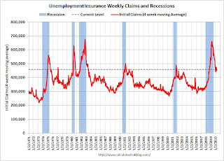 Click on graph for larger image in new window.
This graph shows the 4-week moving average of weekly claims since 1971.
The four-week average of weekly unemployment claims increased this week by 7,500 to 457,750.
The dashed line on the graph is the current 4-week average. The current level of 484,000 (and 4-week average of 457,750) is still high, and suggests continuing weakness in the jobs market. This is much worse than expected.


