 RSS Feed
 by Calculated Risk on 4/09/2010 02:15:00 PM
Friday, April 09, 2010
The Housing Bust and Construction Employment
Back in 2006 some analysts argued that strong local economies (because of construction) would keep certain areas from being impacted by the housing bust. I disagreed and wrote:
As the housing bubble unwinds, housing related employment will fall; and fall dramatically in areas like the Inland Empire. The more an area is dependent on housing, the larger the negative impact on the local economy will be.Here is an update to one of the graphs I posted in 2006 (data is not seasonally adjusted):
So I think some pundits have it backwards: Instead of a strong local economy keeping housing afloat, I think the bursting housing bubble will significantly impact housing dependent local economies.
 Click on graph for larger image in new window.
This graph shows the percentage of construction payroll jobs in three areas of California: San Diego, Riverside (Inland Empire), and Sacramento. The California percentages exclude the three metropolitan areas.
Sure enough, generally the areas with the largest price declines and total lost jobs, were the areas with the highest percentage of construction employment during the boom. As an example, total employment in the Inland Empire is off 14.3% compared to 10.4% for all of California.
I also took a look at some of the Case-Shiller cities. The next graph shows the price declines from the peak for each city included in S&P/Case-Shiller indices (NSA).
 Unfortunately the BLS doesn't break out construction employment for Denver, Dallas or Charlotte (the cities with the smallest Case-Shiller house price declines).
 So I compared Boston (4th smallest price decline) with Las Vegas and Phoenix with the largest price declines. I added Texas because of the minimal housing bust in that state.
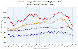 Sure enough - the cities with the highest level of construction employment were hit the hardest. Boston has a fairly low percentage of construction jobs and a fairly mild bust. In Texas there are a fair number of construction jobs, but there wasn't a huge surge in construction (construction in Texas is probably heavily commercial).
In Las Vegas total employment is down 14.6%, and in Phoenix employment is off 12.9%, but in Boston total employment only declined 7% - and only 4.9% in Texas.
This was all part of the cycle. Rising prices meant more home construction - and more construction meant more construction employment and that meant more homebuyers. When the bust came, many of these workers lost their jobs, and then their homes, and that put additional pressure on the local housing markets. So it was pretty easy to tell in 2006 which areas would get crushed.
Fannie Mae Official: Hoocoodanode?
by Calculated Risk on 4/09/2010 11:03:00 AM
From Ron Orol (updated) at MarketWatch: Fannie Mae official: We were surprised by extent of crisis. First the obligatory "no one saw it coming" comment:
"Few if any predicted the unusual and rapid destruction of real estate values that occurred," Robert Levin, former Executive Vice President and Chief Business Officer of Fannie Mae told a financial crisis inquiry panel.And the real argument:
"In hindsight, if we and the industry as a whole had been able to appreciate the nature and extent of the crisis, it is clear we all would have conducted our business differently during this period, but we like everyone else were surprised by the unprecedented extent of the economic crisis."
During the build up to the financial crisis the two entities were hybrid public private entities - so-called government-sponsored entities -- that had goals of increasing their stock price and competing with Wall Street at the same time as they met low-income housing goals set by the Department of Housing and Urban DevelopmentYes, the worst loans - by far - were in the private label MBS issued by Wall Street. But the Fannie and Freddie structure - that privatized profits and socialized losses - incentivized executives at Fannie and Freddie to compete with Wall Street.
Levin and Mudd argued that in a key period, in 2005 and early 2006, the dollar volume of private label mortgage securities issued by Wall Street outpaced mortgages securities issued by Fannie Mae, Freddie Mac and Ginnie Mae combined.
Note: It is the one year anniversary of the comment section called "Hoocoodanode?" - (Who could of known?) - a running joke on this blog for several years. Thanks to Ken for the awesome site - and to all the great contributors in the comments. Try it out!
Bank Failures and Puerto Rico
by Calculated Risk on 4/09/2010 08:49:00 AM
It appears the FDIC is getting closer to taking action in Puerto Rico.
Back in February, José Carmona and John Marino at caribbeanbusinesspr.com wrote: Feds expected to take action against island banks next month and last month from Dow Jones: FDIC Seeks Buyers for Three Puerto Rican Banks
Joe Adler explains some of the complications in Puerto Rico writing in American Banker: Puerto Rico Forces FDIC to Scramble
Three banks on the island holding more than $20 billion of assets are in trouble ... The banks — $12 billion-asset Westernbank Puerto Rico, $6 billion-asset R-G Premier Bank of Puerto Rico and $2.6 billion-asset Eurobank — account for nearly a quarter of the assets on the island ...It appears the remaining healthy banks in Puerto Rico don't have the capacity to acquire these troubled banks - and most banks not in Puerto Rico just aren't interested.
Many observers said the FDIC cannot afford to deal with each failure individually. ... if the FDIC needs to resolve all three institutions at the same time, it may face a shortage of buyers. ...
Moreover, the large mainland banking companies ... have all but abandoned Puerto Rico. ... "There hasn't been a lot of interest from banks who aren't already in Puerto Rico," said Joe Gladue, an analyst with B. Riley & Co. Inc.
Thursday, April 08, 2010
Bernanke: Economic Policy: Lessons from History
by Calculated Risk on 4/08/2010 08:46:00 PM
From Fed Chairman Ben Bernanke: Economic Policy: Lessons from History
I thought that I would speak to you about the parallels--and differences--between [the Great Depression] and the [great recession], particularly regarding the responses of policymakers. I draw four relevant lessons from the financial collapse of the 1930s ...CR Note: Bernanke goes on to argue the first "lesson has been learned". Maybe. I think financial stability means being proactive, not reactive. And I think NY Fed President William Dudley was on the right track when he discussed identifying bubbles, and the possible tools available to policymakers to pop bubbles early.
The first lesson--economic prosperity depends on financial stability--seems obvious, but this connection was not always well understood. After the stock market crash of 1929, many thought a financial and economic crisis was necessary--even desirable--to wring out speculative excesses that had built up in the 1920s. Remarkably, despite the fact that the Federal Reserve had been founded to mitigate financial panics, the central bank made essentially no effort to prevent the wave of bank failures that paralyzed the financial system at the start of 1930s. ...
Economists themselves have not always fully appreciated the importance of a healthy financial system for economic growth or the role of financial conditions in short-term economic dynamics. ... In contrast, more recent work on the subject, to which I contributed, showed that the health of the financial system and the performance of the broader economy are closely interrelated, both in the short run and in the long run.
[T]he second [lesson]--policymakers must respond forcefully, creatively, and decisively to severe financial crises. Early in the Depression, policymakers' responses ran the gamut from passivity to timidity. They were insufficiently willing to challenge the orthodoxies of their day--such as the liquidationist doctrine of Mellon and others, or the rigid adherence to the variant of the gold standard adopted after World War I. ...CR: Bernanke deserves praise for his creative and aggressive response - once he finally understood what was happening.
In the Depression, effective policy responses came only after three to four years of financial crisis and economic contraction. In our own time, policymakers acted sooner and with greater force than in the 1930s. For example, in October 2008, just weeks after the sharp intensification of the crisis, the Congress authorized the Troubled Asset Relief Program (TARP) to support stabilization of the financial system. It was far from perfect legislation, but it was essential for preventing an imminent financial collapse. For its part, the Federal Open Market Committee, the monetary policymaking arm of the Federal Reserve, sharply and proactively cut its target for short-term interest rates from the fall of 2007 through 2008. After the target could go no lower, the Committee embarked on an unprecedented (for the United States) program of long-term securities purchases, recently completed, to support private credit markets, including the mortgage market.
[T]he third lesson: International crises require an international response. ... In the recent episode, policymakers, bankers, and business people recognized that the world's economies and financial systems would sink or swim together.Excuse my snark, but it is refreshing to hear Bernanke speaks about monetary policy issues.
...
I'll conclude with the cautionary fourth lesson--history is never a perfect guide. ... [O]ur traditional tools, developed in an earlier era, were of little use in addressing panic in the shadow banking system or in the money market mutual fund industry. So, we engaged in what I call "blue sky thinking"--generating many ideas. Most were discarded, but, crucially, some led to the development of new ways for the Federal Reserve to fulfill the traditional stabilization function of central banks. Using emergency authority last employed during the Depression, we created an array of new facilities to provide backstop liquidity to the financial system (and, as a byproduct, coined many new acronyms). Thus, we were able to help restore the flow of credit to American families and businesses by shoring up important financial markets, such as those for commercial paper and securities backed by consumer loans.
Euro Bonds Spreads: Greece at Record
by Calculated Risk on 4/08/2010 05:20:00 PM
Here is a graph from the Atlanta Fed weekly Financial Highlights released today (graph as of April 6):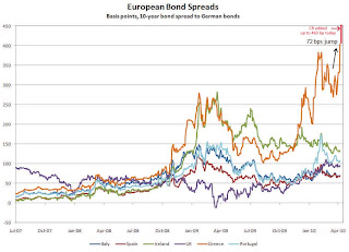 Click on graph for larger image in new window.
From the Atlanta Fed:
European bond spreads (over German bonds) reflectAccording to The Times: Greece on the brink as bond rates surge to record highs the Greek Bond spread increased to an all time record 463 bps today (shown on graph in red).
investors’ worries about Greece’s sovereign credit risk.
On April 6, the spread of the 10-year Greek bond over its German counterpart widened by 72bps to 404.5 bps, the widest since 1998, according to the Wall Street Journal.
There is very little change for the other PIIGS (Portugal, Italy, Ireland, and Spain), although the UK spreads suggest we might need to add a "U" to "PIIGS".
Report: Distressed Home Sales Increasing
by Calculated Risk on 4/08/2010 02:33:00 PM
First American Corelogic released their first distressed sales report this morning: Distressed Sales Again on the Rise, Reaching 29% in January
First American CoreLogic today released its first monthly report on distressed sales activity. The report below indicates that distressed home sales – such as short sales and real estate owned (REO) sales – accounted for 29 percent of all sales in the U.S. in January: the highest level since April 2009. The peak occurred in January 2009 when distressed sales accounted for 32 percent of all sales transactions (Figure 1). After the peak in early 2009, the distressed sale share fell to 23 percent in July, before rising again in late 2009 and continuing into 2010.Here are a couple of graphs from the report:
 Click on graph for larger image in new window.
Credit: First American Corelogic.
This graph shows the total percent of distressed sales broken down by REO and Short Sales. Notice that the percent short sales has increased significantly over the last year - that trend will probably continue.
 The second graph shows the breakdown by certain metropolitan areas.
 Among the largest 25 markets, Riverside, CA, had the largest percentage of distressed sales in January (62 percent), followed closely by Las Vegas (59 percent) and Sacramento (58 percent) (Figure 2). The top REO market was Detroit where the REO share was 48 percent, followed closely by Riverside (47 percent) and Las Vegas (45 percent). San Diego’s short sale share was 19 percent in January, making it the highest ranked short sale market, followed by Sacramento (18 percent) and Oakland (16 percent). Although the top 10 markets for foreclosures are all located in Florida, only two Florida markets, Orlando and Cape Coral, made the top 10 distressed sale list. The most likely reason: Florida is a judicial state where foreclosures process through the courts and take quite a bit longer than in California, Arizona or Nevada, where non‐judicial foreclosures are the norm.I've been following the Sacramento market as an example of a distressed market - and the Sacramento Association of REALTORS® reported that almost 69% of sales were distressed in January, with 24% short sales, and 45% REOs. The FACL data shows about 58% as distressed. The difference is probably in the methodology.
The exact numbers probably aren't as important as the trend - and this will be an interesting trend to follow in 2010.
Hotel Occupancy declines compared to same week in 2009
by Calculated Risk on 4/08/2010 11:32:00 AM
From HotelNewsNow.com: STR: Luxury leads weekly performance
Overall, the U.S. industry’s occupancy ended the week with a 3.6-percent decrease to 54.1 percent, ADR dropped 4.4 percent to US$94.45, and RevPAR was down 7.9 percent to US$51.05.The following graph shows the occupancy rate by week for 2009 and 2010, and the median for 2005 through 2007.
 Click on graph for larger image in new window.
Notes: the scale doesn't start at zero to better show the change, and the holidays don't always line up.
The graph shows the distinct seasonal pattern for the occupancy rate; higher in the summer because of leisure/vacation travel, and lower on certain holidays.
The decline in occupancy this week breaks a streak of six consecutive weeks with higher year-over-year occupancy rates. Remember that last year (2009) was the lowest occupancy rate since the Great Depression - the average for this week is around 66%, so the current 54.1% is far below normal.
Data Source: Smith Travel Research, Courtesy of HotelNewsNow.com
Weekly Initial Unemployment Claims increase 18,000
by Calculated Risk on 4/08/2010 08:35:00 AM
The DOL reports on weekly unemployment insurance claims:
In the week ending April 3, the advance figure for seasonally adjusted initial claims was 460,000, an increase of 18,000 from the previous week's revised figure of 442,000. The 4-week moving average was 450,250, an increase of 2,250 from the previous week's revised average of 448,000.
...
The advance number for seasonally adjusted insured unemployment during the week ending March 27 was 4,550,000, a decrease of 131,000 from the preceding week's revised level of 4,681,000.
 Click on graph for larger image in new window.
This graph shows the 4-week moving average of weekly claims since 1971.
The four-week average of weekly unemployment claims increased this week by 2,250 to 450,250.
The dashed line on the graph is the current 4-week average. The current level of 460,000 (and 4-week average of 450,250) is still high, and suggests continuing weakness in the jobs market. Note: There is no way to compare directly between weekly claims, and net payrolls jobs.
Wednesday, April 07, 2010
Report: BofA to increase Foreclosures significantly in 2010
by Calculated Risk on 4/07/2010 09:42:00 PM
Irvine Renter at the Irvine Housing Blog writes: Bank of America to Increase Foreclosure Rate by 600% in 2010
[Irvine Renter] attended a local Building Industry Association conference on Friday 26 March 2010. The west coast manager of real estate owned, Senior Vice President Ken Gaitan, stated that Bank of America, which currently forecloses on 7,500 homes a month nationally, will increase that number to 45,000 homes per month by December of 2010.CR Note: I tried to verify these numbers with BofA without success. Irvine Renter clarified this for me today. Apparently Gaitan said that Bank of America anticipates the peak of foreclosure activity will occur in December 2010 and will top out at 45,000 units that month. Apparently BofA believes foreclosure activity will trend down in 2011. According to Irvine Renter, Gaitan said BofA expects about 300,000 total foreclosures in 2010. That is a significant increase from the current 7,500 per month pace.
After his surprising statement, two questioners from the audience asked questions to verify the numbers.
Bank of America is projecting a 600% increase in its already large number of monthly foreclosures.
This isn't unsubstantiated rumor; this comes straight from one of the most powerful men in Bank of America's OREO department (yes, that really is what they call it). It appears they have too many properties already.
Once again, BofA's media department told me they'd get back to me - but no word so far - so there numbers have not been verified.
CR note: OREO stands for "Other Real Estate Owned"
U.S. Births per Year
by Calculated Risk on 4/07/2010 07:02:00 PM
There is a new report1 from researchers at the CDC, released yesterday, showing that U.S. births declined about 2% in 2008 from 2007.
The preliminary number of 2008 US births was 4,251,095, down nearly 2 percent from the 2007 peak; the 2008 general fertility rate (68.7 per 1,000) also declined.Apparently some people are blaming the decline in births on the recession.
From Professor Krugman: Birds And Bees Blogging
There have been many stories about the decline of the birth rate in 2008, with almost all attributing it to the recession. But James Trussell [2] raises an interesting point: doesn’t it take nine months from conception to birth?That calls for a graph ...
 Click on graph for larger image in new window.
First, I think the decline in 2008 was relatively small from the record year in 2007.
Second, I wouldn't be surprised if certain segments of the population were under stress before the recession started (like construction workers).
Third, notice that the number of births started declining sharply a number of years before the Great Depression started. Many families in the 1920s were under severe stress long before the economy collapsed.
So my guess is the decline in births is related to the recession (the segment of the population that was hit first), and I'd expect further declines in 2009 and probably in 2010. But I don't think the declines in births will be anything like what happened during the 1920s.
1 Hamilton BE, Martin JA, Ventura SJ. Births: Preliminary data for 2008. National vital statistics reports web release; vol 58 no 16. Hyattsville, Maryland: National Center for Health Statistics. Released April, 2010.
2 James Trussell, Professor of Economics and Public Affairs and Director of the Office of Population Research at Princeton University


