by Calculated Risk on 4/17/2015 10:03:00 AM
Friday, April 17, 2015
Preliminary April Consumer Sentiment increases to 95.9
BLS: CPI increased 0.2% in March, Core CPI increased 0.2%
by Calculated Risk on 4/17/2015 08:32:00 AM
The Consumer Price Index for All Urban Consumers (CPI-U) increased 0.2 percent in March on a seasonally adjusted basis, the U.S. Bureau of Labor Statistics reported today. Over the last 12 months, the all items index declined 0.1 percent before seasonal adjustment.I'll post a graph later today after the Cleveland Fed releases the median and trimmed-mean CPI. This was lower than the consensus forecast of a 0.2% increase for CPI, and at the forecast of a 0.2% increase in core CPI.
The index for all items less food and energy rose 0.2 percent in March, the same increase as in January and February.
emphasis added
Thursday, April 16, 2015
Lawler: Updated Table of Distressed Sales and Cash buyers for Selected Cities in March
by Calculated Risk on 4/16/2015 08:59:00 PM
Friday:
• At 8:30 AM ET, the Consumer Price Index for March from the BLS. The consensus is for a 0.3% increase in prices, and a 0.2% increase in core CPI.
• At 10:00 AM, University of Michigan's Consumer sentiment index (preliminary for April). The consensus is for a reading of 93.7, up from 93.0 in March.
Economist Tom Lawler sent me the updated table below of short sales, foreclosures and cash buyers for a few selected cities in March.
On distressed: Total "distressed" share is down in most of these markets mostly due to a decline in short sales (Mid-Atlantic is up year-over-year because of an increase foreclosure as lenders work through the backlog).
Short sales are down in these areas.
The All Cash Share (last two columns) is declining year-over-year. As investors pull back, the share of all cash buyers will probably continue to decline.
| Short Sales Share | Foreclosure Sales Share | Total "Distressed" Share | All Cash Share | |||||
|---|---|---|---|---|---|---|---|---|
| Mar-15 | Mar-14 | Mar-15 | Mar-14 | Mar-15 | Mar-14 | Mar-15 | Mar-14 | |
| Las Vegas | 8.3% | 12.9% | 9.3% | 11.7% | 17.6% | 24.6% | 32.4% | 43.1% |
| Reno** | 5.0% | 14.0% | 8.0% | 7.0% | 13.0% | 21.0% | ||
| Phoenix | 3.2% | 5.1% | 4.2% | 6.9% | 7.4% | 11.9% | 27.5% | 33.1% |
| Sacramento | 5.4% | 8.2% | 6.9% | 7.9% | 12.3% | 16.1% | 19.3% | 22.5% |
| Minneapolis | 2.9% | 4.9% | 12.2% | 21.9% | 15.1% | 26.8% | ||
| Mid-Atlantic | 4.7% | 7.7% | 14.0% | 10.9% | 18.8% | 18.5% | 18.2% | 19.9% |
| Orlando | 4.2% | 7.9% | 26.9% | 23.7% | 31.1% | 31.6% | 38.2% | 44.6% |
| Chicago (city) | 21.9% | 28.8% | ||||||
| Hampton Roads | 22.7% | 24.5% | ||||||
| Northeast Florida | 31.0% | 39.1% | ||||||
| Richmond VA | 11.9% | 18.1% | 18.0% | 21.1% | ||||
| Tucson | 32.0% | 33.5% | ||||||
| Toledo | 32.7% | 40.7% | ||||||
| Des Moines | 16.3% | 20.8% | ||||||
| Omaha | 16.1% | 20.3% | ||||||
| Wichita | 23.2% | 32.0% | ||||||
| Pensacola | 33.4% | 35.7% | ||||||
| Memphis* | 15.5% | 18.5% | ||||||
| Springfield IL** | 11.8% | 14.4% | ||||||
| *share of existing home sales, based on property records **Single Family Only ***GAMLS | ||||||||
NMHC: Apartment Market Conditions Tighter in April Survey
by Calculated Risk on 4/16/2015 05:50:00 PM
From the National Multi Housing Council (NMHC): Apartment Markets Expand in April NMHC Quarterly Survey
All four indexes landed above the breakeven level of 50 in the April National Multifamily Housing Council (NMHC) Quarterly Survey of Apartment Market Conditions.
“The song remains the same—the apartment markets are not only strong but getting stronger,” said Mark Obrinsky, NMHC’s SVP of Research and Chief Economist. “Despite occasional predictions to the contrary, markets keep getting tighter. As new construction increases, so do absorptions, indicating the demand for apartments is not yet close to being sated.”
The Market Tightness Index increased by 7 points from last quarter (and by 2 points from a year earlier) to 58. Thirty-one percent of respondents reported tighter conditions than three months ago. This now marks the fifth consecutive quarter where the index indicates overall improving conditions.
emphasis added

Click on graph for larger image.
This graph shows the quarterly Apartment Tightness Index. Any reading above 50 indicates tighter conditions from the previous quarter. This indicates market conditions were tighter over the last quarter.
As I've mentioned before, this index helped me call the bottom for effective rents (and the top for the vacancy rate) early in 2010.
Comments on March Housing Starts
by Calculated Risk on 4/16/2015 02:54:00 PM
March was another disappointing month for housing start.
In February, it was easy to blame the weather, especially in the Northeast where starts plunged and then bounced back in March. However, in March, the weakness was more in the South and West (maybe related to oil prices in Texas and the drought in California).
Note: It is also possible that the West Coast port slowdown impacted starts a little in March. The labor situation was resolved in February, and any impact should disappear quickly.

This graph shows the month to month comparison between 2014 (blue) and 2015 (red).
Even with two weak months, starts are still running about 5% ahead of 2014 through March.
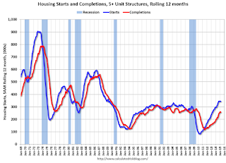
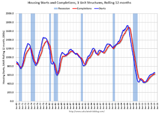
Below is an update to the graph comparing multi-family starts and completions. Since it usually takes over a year on average to complete a multi-family project, there is a lag between multi-family starts and completions. Completions are important because that is new supply added to the market, and starts are important because that is future new supply (units under construction is also important for employment).
These graphs use a 12 month rolling total for NSA starts and completions.

The rolling 12 month total for starts (blue line) increased steadily over the last few years, and completions (red line) have lagged behind - but completions have been catching up (more deliveries), and will continue to follow starts up (completions lag starts by about 12 months).
Note that the blue line (multi-family starts) might be starting to move more sideways.
I think most of the growth in multi-family starts is probably behind us - although I expect solid multi-family starts for a few more years (based on demographics).

Note the exceptionally low level of single family starts and completions. The "wide bottom" was what I was forecasting several years ago, and now I expect several years of increasing single family starts and completions.


