 RSS Feed
 by Calculated Risk on 6/22/2020 08:35:00 AM
Monday, June 22, 2020
Six High Frequency Indicators for a Recovery
These indicators are mostly for travel and entertainment - some of the sectors that will probably recover very slowly.
The TSA is providing daily travel numbers.
 Click on graph for larger image.
This data shows the daily total traveler throughput from the TSA for 2019 (Blue) and 2020 (Red).
On June 21st there were 590,456 travelers compared to 2,719,643 a year ago.
That is a decline of 78.3%. There has been a slow steady increase from the bottom, but air travel is still down significantly.
The second graph shows the year-over-year change in diners as tabulated by OpenTable for the US and several selected cities.
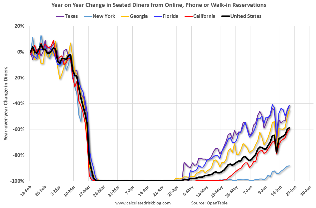 Thanks to OpenTable for providing this restaurant data:
This data is updated through June 20, 2020.
This data is "a sample of restaurants on the OpenTable network across all channels: online reservations, phone reservations, and walk-ins. For year-over-year comparisons by day, we compare to the same day of the week from the same week in the previous year."
Note that this data is for "only the restaurants that have chosen to reopen in a given market".
New York is still off 88%.
Florida is only down 41% YoY.
 This data shows domestic box office for each week (red) and the maximum and minimum for the previous four years. Data is from BoxOfficeMojo through June 18th.
Note that the data is noisy and depends on when blockbusters are released.
Movie ticket sales have picked up a little, but are still under $1 million per week (compared to usually around $300 million per week), and ticket sales have essentially been at zero for three months.
Most movie theaters are closed all across the country, and will probably reopen slowly (probably with limited seating at first).
The following graph shows the seasonal pattern for the hotel occupancy rate using the four week average.
 The red line is for 2020, dash light blue is 2019, blue is the median, and black is for 2009 (the worst year probably since the Great Depression for hotels).
2020 was off to a solid start, however, COVID-19 has crushed hotel occupancy.
Notes: Y-axis doesn't start at zero to better show the seasonal change.
Usually hotel occupancy starts to pick up seasonally in early June. So even though the occupancy rate was up slightly compared to last week, the year-over-year decline was about the same this week as the previous two weeks (43.4% decline vs. 45.3% last week, and 43.2% decline two weeks ago).
 This graph, based on weekly data from the U.S. Energy Information Administration (EIA), shows the year-over-year change in gasoline consumption.
At one point, gasoline consumption was off almost 50% YoY.
As of June 12th, gasoline consumption was off about 21% YoY (about 79% of normal). After rebounding from the low in early April, gasoline consumption has remained down about 20% YoY since early May.
The final graph is from Apple mobility. From Apple: "This data is generated by counting the number of requests made to Apple Maps for directions in select countries/regions, sub-regions, and cities." This is just a general guide - people that regularly commute probably don't ask for directions.
 This data is through June 20th for the United States and several selected cities.
IMPORTANT: All data is relative to January 13, 2020. This data is NOT Seasonally Adjusted. People walk and drive more when the weather is nice, so I'm just using the transit data.
According to the Apple data directions requests, public transit in the US is still only about 46% of the January level. It is at 33% in New York, and 61% in Houston.


