by Calculated Risk on 4/05/2014 01:34:00 PM
Saturday, April 05, 2014
WSJ Employment Graph ignores Demographics, Needs Correction
I've been reading several articles on the March employment report this morning, and I have to comment on the graph below.
From the WSJ: U.S. Reaches a Milestone on Lost Jobs
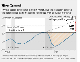
Private-sector payrolls hit a record 116.09 million, passing the peak set in January 2008, but they are far below where they would be if the labor market's trajectory weren't interrupted. And government jobs remain well short of their high point.And the article had the following graph for private employment:
 To create this graph, the WSJ used the ratio of private employment in January 2008 (115.977 million) to the total civilian noninstitutional population. The dashed line assumes that this ratio stayed constant since January 2008 - and seems to suggest that there should be 7.2 million more private sector jobs today.
This is nonsense. This ignores the decline in the participation rate due to demographics. I've been discussing the decline in the participation rate for several years, and this has attracted significant attention recently.
To review: the participation rate has declined for both demographic and cyclical reasons. There are several key demographics trends, the two most obvious being the large cohort (baby boomers) moving into lower participation age (over 55), and the long term trend of more younger people (16 to 24) staying in school. The cyclical decline is due to the lingering effects of the housing bust and financial crisis on the labor market. There is an ongoing discussion about how much of the decline has been due to demographics, and how due to the effects of the great recession. I think more than half is demographics (other research suggests about half, some suggests less).
If we just looked at demographics, the civilian noninstitutional population for the prime working age group (25 to 54) has declined by 1.5 million people since Jan 2008! So ignoring the young and the old, we'd expect fewer workers today - not more. That would be incorrect too since many people continue to work past 55 (and many young Americans still work).
Here is a table of some of the demographic changes over the last 6 years:
| Changing Demographics, Civilian noninstitutional population, Jan 2008 to Mar 2014 (000s) | |||
|---|---|---|---|
| 16 to 24 | 25 to 54 | 55+ | |
| Jan-08 | 37,480 | 125,916 | 69,320 |
| Mar-14 | 38,858 | 124,406 | 82,287 |
| Change | 1,378 | -1,510 | 12,967 |
1) There are now more people in the 16 to 24 age group (with a declining participation rate because more people are staying in school). This pulls down the overall participation rate.
2) There are fewer people in the prime working age group.
3) There are many more people in the older age group. Note: Demographics gets complicated. The participation rate is increasing for older age groups, but the participation rate for each cohort is declining as they move into older age groups.
The bottom line is this WSJ graph is nonsense - and bad enough that the WSJ should remove it from the article.


