by Calculated Risk on 3/30/2013 08:54:00 AM
Saturday, March 30, 2013
Summary for Week ending March 29th
This was another week of solid economic data, although we might be seeing some impact of the sequestration budget cuts on initial unemployment claims. It looks like GDP growth in Q1 will be solid, with personal consumption expenditures on track to increase in the 3.0% to 3.5% range.
Although the February new home sales report was a little below expectations, this was still solid growth from 2012. According to the Census Bureau, there have been 63 thousand new homes sold so far in 2013 (NSA), up about 19% from the 53 thousand sold in January and February of 2012.
Here is a summary of last week in graphs:
• New Home Sales at 411,000 SAAR in February
 The Census Bureau reports New Home Sales in February were at a seasonally adjusted annual rate (SAAR) of 411 thousand. This was down from a revised 431 thousand SAAR in January (revised down from 437 thousand).
This graph shows New Home Sales vs. recessions since 1963. The dashed line is the current sales rate.
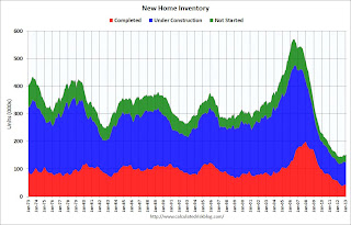
On inventory, according to the Census Bureau:
"A house is considered for sale when a permit to build has been issued in permit-issuing places or work has begun on the footings or foundation in nonpermit areas and a sales contract has not been signed nor a deposit accepted."Starting in 1973 the Census Bureau broke this down into three categories: Not Started, Under Construction, and Completed.
 This graph shows the three categories of inventory starting in 1973.
The inventory of completed homes for sale is just above the record low. The combined total of completed and under construction is also just above the record low.
This was below expectations of 425,000 sales in February, but still a fairly solid report.
• Case-Shiller: Comp 20 House Prices increased 8.1% year-over-year in January
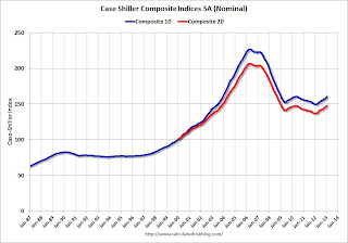
 This graph shows the nominal seasonally adjusted Composite 10 and Composite 20 indices (the Composite 20 was started in January 2000).
The Composite 10 index is off 29.3% from the peak, and up 1.0% in January (SA). The Composite 10 is up 7.3% from the post bubble low set in Feb 2012 (SA).
The Composite 20 index is off 28.4% from the peak, and up 1.0% (SA) in January. The Composite 20 is up 8.1% from the post-bubble low set in Jan 2012 (SA).
 The second graph shows the Year over year change in both indices.
The Composite 10 SA is up 7.3% compared to January 2012.
The Composite 20 SA is up 8.1% compared to January 2012. This was the eight consecutive month with a year-over-year gain since 2010 (when the tax credit boosted prices temporarily). This was the largest year-over-year gain for the Composite 20 index since 2006.
Prices increased (SA) in 20 of the 20 Case-Shiller cities in January seasonally adjusted (prices increased in 9 of 20 cities NSA). Prices in Las Vegas are off 55.9% from the peak, and prices in Denver only off 2.0% from the peak.
This was close to the consensus forecast for a 8.2% YoY increase.
• Personal Income increased 1.1% in February, Spending increased 0.7%
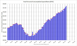
 This graph shows real Personal Consumption Expenditures (PCE) through February (2005 dollars). Note that the y-axis doesn't start at zero to better show the change.
The dashed red lines are the quarterly levels for real PCE. Both income and spending were above expectations in February, although some of the increase in spending was related to higher gasoline prices.
Using the two-month method to estimate Q1 PCE growth (first two months of the quarter), PCE was increasing at a 3.5% annual rate in Q1 2013 (using mid-month method, PCE was increasing at 3.2% rate). This suggests upward revisions to Q1 GDP forecasts.
• Real House Prices, Price-to-Rent Ratio, City Prices relative to 2000
 Case-Shiller, CoreLogic and others report nominal house prices, and it is also useful to look at house prices in real terms (adjusted for inflation) and as a price-to-rent ratio.
 This graph shows the Case-Shiller National and Composite-20, and the CoreLogic index, in real terms (adjusted for inflation using CPI less Shelter). Note: some people use other inflation measures to adjust for real prices.
In real terms, the National index is back to October 1999 levels, the Composite 20 index is back to December 2000, and the CoreLogic index back to February 2001.
In real terms, most of the appreciation in the last decade is gone.
In October 2004, Fed economist John Krainer and researcher Chishen Wei wrote a Fed letter on price to rent ratios: House Prices and Fundamental Value. Kainer and Wei presented a price-to-rent ratio using the OFHEO house price index and the Owners' Equivalent Rent (OER) from the BLS.
 Here is a similar graph using the Case-Shiller National, Composite 20 and CoreLogic House Price Indexes.
This graph shows the price to rent ratio (January 1998 = 1.0).
On a price-to-rent basis, the Case-Shiller National index is back to Q4 1999 levels, the Composite 20 index is back to December 2000 levels, and the CoreLogic index is back to February 2001.
In real terms - and as a price-to-rent ratio - prices are mostly back to early 2000 levels.
Nominal Prices: Cities relative to Jan 2000
 The last graph shows the bubble peak, the post bubble minimum, and current nominal prices relative to January 2000 prices for all the Case-Shiller cities in nominal terms.
As an example, at the peak, prices in Phoenix were 127% above the January 2000 level. Then prices in Phoenix fell slightly below the January 2000 level, and are now up 27% above January 2000 (I'll look at this in real terms later). Some cities - like Denver - are close to the peak level. Other cities, like Atlanta and Detroit, are below the January 2000 level.
• Weekly Initial Unemployment Claims increase to 357,000
 From the DOL: "In the week ending March 23, the advance figure for seasonally adjusted initial claims was 357,000, an increase of 16,000 from the previous week's revised figure of 341,000."
This graph shows the 4-week moving average of weekly claims since January 2000.
The dashed line on the graph is the current 4-week average. The four-week average of weekly unemployment claims increased to 343,000 - still near the post-recession low.
Weekly claims were above the 340,000 consensus forecast. Note: This might be the beginning of unemployment claims being impacted by the "sequestration" budget cuts.
• March Consumer Sentiment increases to 78.6
 The final Reuters / University of Michigan consumer sentiment index for March increased to 78.6 from the preliminary reading of 71.8, and up from the February reading of 77.6.
 This was well above the consensus forecast of 72.5, but still fairly low. There are a number of factors that impact sentiment including unemployment, gasoline prices and, for 2013, the payroll tax increase and even politics (sequestration, default threats, etc).
The preliminary decline was probably related to both high gasoline prices and policy concerns. According to Reuters, concerns about policy have abated, and consumers expect "employment will accelerate through the rest of 2013".


