by Calculated Risk on 11/11/2010 01:58:00 PM
Thursday, November 11, 2010
Labor Force Participation Rate: What will happen?
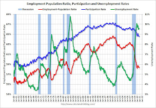
The collapse in the labor force participation rate has been one of the key stories of the great recession. The participation rate is the percentage of the working age population in the labor force.
As the economy slowly recovers, an important question is what will happen to the participation rate over the next few years? If the participation rate increases to 66% - from the current 64.5% - then the U.S. economy will need an additional 3.3 million jobs just to hold the unemployment rate steady (not counting population growth).
 Click on graph for larger image.
This graph shows the recent sharp decline in the participation rate (blue), and also the unemployment rate and the employment-population ratio. The participation rate had mostly been above 66% since the late '80s, and had been over 67% in the late '90s.
One of the key factors impacting the participation rate (other than a severe recession) is the age of the labor force. The following graph shows the participation rate by age group in 2007 (I selected 2007 because it is recent, but before the recession started).
 This graph is for 2007, but the general pattern holds for all years. The participation rate is low for those in the '16 to 19' age group. The rate increases sharply for those in the '20 to 24' age group, and the rate is at its peak from 25 to 49 - and drops off a little for the '50 to 54' age group.
After 55 workers start leaving the labor force, and the participation rate falls off with age.
Even if the participation rates per age group were static (they aren't), the overall participation rate would change with the demographics of the population.
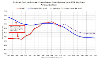
 We can use the above participation rates by age group for 2007, and historical data and age group population projections from the Census Bureau, to calculate a participation rate based on demographics.
This graph shows the calculated participation rate (blue) through 2050, and the actual participation rate since 1950 (red). The calculated participation rate, using 2007 data, is far too high for the earlier periods. This is mostly because of women joining the labor force (next graph).
Without other shifts in the labor force (last graph), the blue line would indicate the participation rate over the next 40 years. The participation rate declines as the population ages. This simple analysis suggests the participation rate will be at about the same level in 2015 as today.
Note: the dashed purple line indicates the participation rate with a 5 percentage point increase in the 'over 55' labor force participation rate.
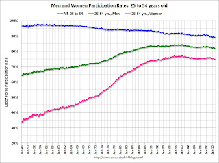
 The early gap in the previous graph was due to women joining the labor force (I used 2007 data to do the projections).
This graph shows the changes in the participation rates for men and women since 1960 (in the 25 to 54 age group - the prime working years).
The participation rate for women increased significantly from the mid 30s to the mid 70s. The participation rate for men has decreased from the high 90s to just about 90%.
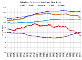
 And the final graph shows that participation rates for age groups are not static (as was assumed for the projection).
There are a few key trends happening:
1) the participation rate for the '16 to 19' age group has been falling for some time (red).
2) the participation rate for the 'over 55' age group has been rising since the mid '90s (purple).
3) the participation rate for the '20 to 24' age group appears to be falling too (perhaps more education before joining the labor force). Also note the sharp decline over the last couple of years - that will probably turn around quickly as the job market improves.
This is why I added the dashed purple line to the projection graph above. If the trend continues for the 'over 55' group - perhaps because of necessity, perhaps because of fewer "back breaking" jobs - then the overall participation rate will not fall as quickly as the blue line indicates. With just a 5 percentage point increase in participation for the 'over 55', the participation rate will be back to 66% in 2015.


