by Calculated Risk on 9/18/2014 03:11:00 PM
Thursday, September 18, 2014
A few comments on August Housing Starts
This was a disappointing report for housing starts in August.
Starts were only up 8.0% year-over-year in August.
There were 670 thousand total housing starts during the first eight months of 2014 (not seasonally adjusted, NSA), up 8.6% from the 617 thousand during the same period of 2013. Single family starts are up 3%, and multi-family starts up 23%. The key weakness has been in single family starts.
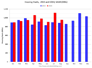
This graph shows the month to month comparison between 2013 (blue) and 2014 (red). Starts in 2014 have been above the same month in 2013 for five consecutive months.

Starts in Q1 averaged 925 thousand SAAR, and starts in Q2 averaged 985 thousand SAAR, up 7% from Q1.
Even with the weakness in August, Q3 is averaging 1.037 million SAAR, up 5% from Q2.
This year, I expect starts to mostly increase throughout the year (Q1 will probably be the weakest quarter, and Q2 the second weakest). The comparisons will be easy for the next couple of months, and starts should finish the year up from 2013.
Below is an update to the graph comparing multi-family starts and completions. Since it usually takes over a year on average to complete a multi-family project, there is a lag between multi-family starts and completions. Completions are important because that is new supply added to the market, and starts are important because that is future new supply (units under construction is also important for employment).
These graphs use a 12 month rolling total for NSA starts and completions.

The rolling 12 month total for starts (blue line) has been increasing steadily, and completions (red line) are lagging behind - but completions will continue to follow starts up (completions lag starts by about 12 months).
This means there will be an increase in multi-family completions later this year and in 2015.

Single family starts had been moving up, but recently starts have been moving more sideways on a rolling 12 months basis.
Note the exceptionally low level of single family starts and completions. The "wide bottom" was what I was forecasting several years ago, and now I expect several years of increasing single family starts and completions.
Earlier: Philly Fed Manufacturing Survey at 22.5 in September
by Calculated Risk on 9/18/2014 12:31:00 PM
Earlier from the Philly Fed: September Manufacturing Survey
The diffusion index for current activity fell from a reading of 28.0, its highest reading since March 2011, to 22.5 this month. The current new orders [to 15.5] and shipments indexes edged higher this month, however, increasing 1 point and 5 points, respectively.This at the consensus forecast of a reading of 22.0 for September.
...
The employment index increased 12 points to its highest reading since May 2011. [to 21.2] ...
Most of the survey’s indicators of future growth declined from their 22-year high readings reached last month.
emphasis added
 Click on graph for larger image.
Here is a graph comparing the regional Fed surveys and the ISM manufacturing index. The dashed green line is an average of the NY Fed (Empire State) and Philly Fed surveys through September. The ISM and total Fed surveys are through August.
The average of the Empire State and Philly Fed surveys was solid in September (highest since 2004), and this suggests another strong ISM report for September.
Employment: Preliminary annual benchmark revision shows upward adjustment of 7,000 jobs
by Calculated Risk on 9/18/2014 10:14:00 AM
This morning the BLS released the preliminary annual benchmark revision showing an additional 7,000 payroll jobs as of March 2014. The final revision will be published next February when the January 2015 employment report is released in February 2015. Usually the preliminary estimate is pretty close to the final benchmark estimate.
The annual revision is benchmarked to state tax records. From the BLS:
In accordance with usual practice, the Bureau of Labor Statistics (BLS) is announcing the preliminary estimate of the upcoming annual benchmark revision to the establishment survey employment series. The final benchmark revision will be issued in February 2015, with the publication of the January 2015 Employment Situation news release.Using the preliminary benchmark estimate, this means that payroll employment in March 2014 was 7,000 higher than originally estimated. In February 2015, the payroll numbers will be revised up to reflect this estimate. The number is then "wedged back" to the previous revision (March 2013).
Each year, the Current Employment Statistics (CES) survey employment estimates are benchmarked to comprehensive counts of employment for the month of March. These counts are derived primarily from state unemployment insurance (UI) tax records that nearly all employers are required to file. For national CES employment series, the annual benchmark revisions over the last 10 years have averaged plus or minus three-tenths of one percent of total nonfarm employment. The preliminary estimate of the benchmark revision indicates an upward adjustment to March 2014 total nonfarm employment of 7,000 (less than 0.05 percent). ...
There are 89,000 more construction jobs than originally estimated.
This preliminary estimate showed an additional 47,000 private sector jobs, and 40,000 fewer government jobs (as of March 2014).
Earlier: Weekly Initial Unemployment Claims decrease to 280,000
by Calculated Risk on 9/18/2014 09:35:00 AM
The DOL reports:
In the week ending September 13, the advance figure for seasonally adjusted initial claims was 280,000, a decrease of 36,000 from the previous week's revised level. The previous week's level was revised up by 1,000 from 315,000 to 316,000. The 4-week moving average was 299,500, a decrease of 4,750 from the previous week's revised average. The previous week's average was revised up by 250 from 304,000 to 304,250.The previous week was revised up to 316,000.
There were no special factors impacting this week's initial claims.
The following graph shows the 4-week moving average of weekly claims since January 1971.
 Click on graph for larger image.
The dashed line on the graph is the current 4-week average. The four-week average of weekly unemployment claims decreased to 299,500.
This was below the consensus forecast of 305,000 and in the normal range for an economic expansion.
Housing Starts decrease to 956 Thousand Annual Rate in August
by Calculated Risk on 9/18/2014 08:30:00 AM
From the Census Bureau: Permits, Starts and Completions
Housing Starts:
Privately-owned housing starts in August were at a seasonally adjusted annual rate of 956,000. This is 14.4 percent below the revised July estimate of 1,117,000, but is 8.0 percent above the August 2013 rate of 885,000.
Single-family housing starts in August were at a rate of 643,000; this is 2.4 percent below the revised July figure of 659,000. The August rate for units in buildings with five units or more was 304,000.
emphasis added
Building Permits:
Privately-owned housing units authorized by building permits in August were at a seasonally adjusted annual rate of 998,000. This is 5.6 percent below the revised July rate of 1,057,000, but is 5.3 percent above the August 2013 estimate of 948,000.
Single-family authorizations in August were at a rate of 626,000; this is 0.8 percent below the revised July figure of 631,000. Authorizations of units in buildings with five units or more were at a rate of 343,000 in August.
 Click on graph for larger image.
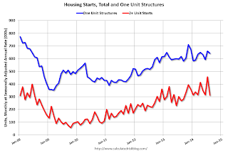
The first graph shows single and multi-family housing starts for the last several years.
Multi-family starts (red, 2+ units) decreased sharply in August (Multi-family is volatile month-to-month).
Single-family starts (blue) decreased slightly in August.
The second graph shows total and single unit starts since 1968.
 The second graph shows the huge collapse following the housing bubble, and that housing starts have been increasing after moving sideways for about two years and a half years.
 This was well below expectations of 1.04 million starts in August. Note: Starts for July were revised higher, but starts for June were revised lower.
This was a disappointing report - however most of the decline was due to the volatile multi-family sector. I'll have more later ...


