For new readers: I was very bearish on the economy when I started this blog in 2005 - back then I wrote mostly about housing (see: LA Times article and more here for comments about the blog). I started looking for the sun in early 2009, and recently I've been more optimistic.
Here are some updates to the graphs I posted 3+ years ago. Several of these graphs have changed direction since that original post. As example, state and local government employment is now increasing, and household deleveraging is over (as predicted).
 Click on graph for larger image.
This graph shows total and single family housing starts. Even though starts are up about 150% from the bottom, starts are still below the average level of 1.5 million per year from 1959 through 2000.
Demographics and household formation suggests starts will increase to around 1.5 million over the next few years. That means starts will probably increase another 25% or so from the June 2016 level of 1.19 million starts (SAAR).
Residential investment and housing starts are usually the best leading indicator for the economy, so this suggests the economy will continue to grow.
 This graph shows total state and government payroll employment since January 2007. State and local governments lost 129,000 jobs in 2009, 262,000 in 2010, 217,000 in 2011, and 40,000 in 2012.
 Since January 2013, state and local employment has increased 259,000.
So, in the aggregate, state and local government layoffs are over - and the economic drag on the economy is over. However state and local government employment is still 464,000 below the pre-recession peak.
 And here is a graph on the US deficit. This graph, based on the CBO's recent projections, shows the actual (purple) budget deficit each year as a percent of GDP, and an estimate for the next ten years based on estimates from the CBO.
As we've been discussing, the US deficit as a percent of GDP declined significantly over the last few years, and will probably remain under 3% for several years.
Here are a couple of graph on household debt (and debt service):
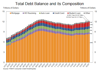
 This graph from the the NY Fed shows aggregate household debt has increased over the last 3 years.
From the NY Fed: Household Debt Steps Up, Delinquencies Drop
Household indebtedness continued to advance during the first three months of 2016 according to the Federal Reserve Bank of New York’s Quarterly Report on Household Debt and Credit, ...There will be a little more deleveraging ahead for certain households (mostly from foreclosures and distressed sales), but in the aggregate, household deleveraging ended almost 3 years ago.
...
"Delinquency rates and the overall quality of outstanding debt continue to improve," said Wilbert van der Klaauw, senior vice president at the New York Fed. "The proportion of overall debt that becomes newly delinquent has been on a steady downward trend and is at its lowest level since our series began in 1999. This improvement is in large part driven by mortgages."
emphasis added
 This graph is from the Fed's Household Debt Service and Financial Obligations Ratios. These ratios show the percent of disposable personal income (DPI) dedicated to debt service (DSR) and financial obligations (FOR) for households.
The overall Debt Service Ratio has been moving sideways and is near the record low. Note: The financial obligation ratio (FOR) is also near a record low (not shown)
Also the DSR for mortgages (blue) are near the low for the last 30 years. This ratio increased rapidly during the housing bubble, and continued to increase until 2007. With falling interest rates, and less mortgage debt (mostly due to foreclosures), the mortgage ratio has declined significantly.
This data suggests household cash flow is in much better shape than several years ago.
 And for commercial real estate, here is the AIA Architecture Billings Index. This is usually a leading indicator for commercial real estate, and the readings over the last year suggest more increases in CRE investment at least through mid-2017 (except oil and power with the recent decline in oil prices).
Overall it appears the economy is poised for more growth.
And in the longer term I remain very optimistic.
In 2014, I posted some demographic data for the U.S., see: Census Bureau: Largest 5-year Population Cohort is now the "20 to 24" Age Group.
I pointed out that "even without the financial crisis we would have expected some slowdown in growth this decade (just based on demographics). The good news is that will change soon."
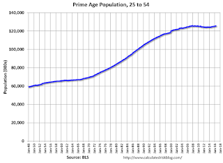
Changes in demographics are an important determinant of economic growth, and although most people focus on the aging of the "baby boomer" generation, the movement of younger cohorts into the prime working age is another key story in coming years. Here is a graph of the prime working age population (this is population, not the labor force) from 1948 through June 2016.
 There was a huge surge in the prime working age population in the '70s, '80s and '90s. The prime working age population peaked in 2007, and bottomed at the end of 2012, and is almost back to the previous peak (this has nothing to do with the recession - just demographics).
The good news is the prime working age group has started to grow again, and should be growing solidly by 2020 - and this should boost economic activity in the years ahead.
These young workers are well educated and tech savvy. And they will have babies and buy homes soon. For more, see from Joe Weisenthal: The Analyst Who Nailed The Housing Crash Is Quietly Revealing The Next Big Thing
And a couple of graphs from The Projected Improvement in Life Expectancy
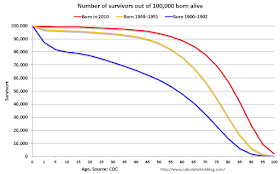
Instead of look at life expectancy, here is a graph of survivors out of 100,000 born alive, by age for three groups: those born in 1900-1902, born in 1949-1951 (baby boomers), and born in 2010.
 There was a dramatic change between those born in 1900 (blue) and those born mid-century (orange). The risk of infant and early childhood deaths dropped sharply, and the risk of death in the prime working years also declined significantly.
The CDC is projecting further improvement for childhood and prime working age for those born in 2010, but they are also projecting that people will live longer.
 The second graph uses the same data but looks at the number of people who die before a certain age, but after the previous age. As an example, for those born in 1900 (blue), 12,448 of the 100,000 born alive died before age 1, and another 5,748 died between age 1 and age 5. That is 18.2% of those born in 1900 died before age 5.
In 1950, only 3.5% died before age 5. In 2010, it was 0.7%.
The peak age for deaths didn't change much for those born in 1900 and 1950 (between 76 and 80, but many more people born in 1950 will make it).
Now the CDC is projection the peak age for deaths - for those born in 2010 - will increase to 86 to 90!
Also the number of deaths for those younger than 20 will be very small (down to mostly accidents, guns, and drugs). Self-driving cars might reduce the accident components of young deaths.
In 1900, 25,2% died before age 20. And another 26.8% died before 55.
In 1950, 5.3% died before age 20. And another 18.7% died before 55. A dramatic decline in early deaths.
In 2010, 1.5% are projected to die before age 20. And only 9.7% before 55. A dramatic decline in prime working age deaths.
An amazing statistic: for those born in 1900, about 13 out of 100,000 made it to 100. For those born in 1950, 199 are projected to make to 100 - an significant increase. Now the CDC is projecting that 1,968 out of 100,000 born in 2010 will make it to 100. Stunning!
Some people look at this data and worry about supporting all the old people. To me, this is all great news - the vast majority of people can look forward to a long life - with fewer people dying in childhood or during their prime working years. Awesome!
Three and a half years ago I said that looking forward I was the most optimistic since the '90s. And things are only getting better. The future's so bright, I gotta wear shades.
Yes, the song was about nuclear holocaust ... but it was originally intended the way I'm using it.