by Calculated Risk on 9/29/2015 11:42:00 AM
Tuesday, September 29, 2015
Real Prices and Price-to-Rent Ratio in July
Yesterday, San Francisco Fed President John Williams said:
I am starting to see signs of imbalances emerge in the form of high asset prices, especially in real estate, and that trips the alert system. One lesson I have taken from past episodes is that, once the imbalances have grown large, the options to deal with them are limited. I think back to the mid-2000s, when we faced the question of whether the Fed should raise rates and risk pricking the bubble or let things run full steam ahead and deal with the consequences later. What stayed with me were not the relative merits of either case, but the fact that by then, with the housing boom in full swing, it was already too late to avoid bad outcomes. Stopping the fallout would’ve required acting much earlier, when the problems were still manageable. I’m not assigning blame by any means, and economic hindsight is always 20/20. But I am conscious that today, the house price-to-rent ratio is where it was in 2003, and house prices are rapidly rising. I don’t think we’re at a tipping point yet—but I am looking at the path we’re on and looking out for potential potholes.Williams is looking at something like the third graph below. This shows the price-to-rent ratio is elevated, but nothing like during the housing bubble (and there are few signs of speculations).
emphasis added
Here is the earlier post: Case-Shiller: National House Price Index increased 4.7% year-over-year in July
The year-over-year increase in prices is mostly moving sideways now at between 4% and 5%.. In October 2013, the National index was up 10.9% year-over-year (YoY). In July 2015, the index was up 4.7% YoY.
Here is the YoY change since January 2014 for the National Index:
| Month | YoY Change |
|---|---|
| Jan-14 | 10.5% |
| Feb-14 | 10.2% |
| Mar-14 | 8.9% |
| Apr-14 | 7.9% |
| May-14 | 7.0% |
| Jun-14 | 6.3% |
| Jul-14 | 5.6% |
| Aug-14 | 5.1% |
| Sep-14 | 4.8% |
| Oct-14 | 4.6% |
| Nov-14 | 4.6% |
| Dec-14 | 4.6% |
| Jan-15 | 4.4% |
| Feb-15 | 4.3% |
| Mar-15 | 4.3% |
| Apr-15 | 4.4% |
| May-15 | 4.5% |
| Jun-15 | 4.5% |
| Jul-15 | 4.7% |
Most of the slowdown on a YoY basis is now behind us. This slowdown in price increases was expected by several key analysts, and I think it is good news for housing and the economy.
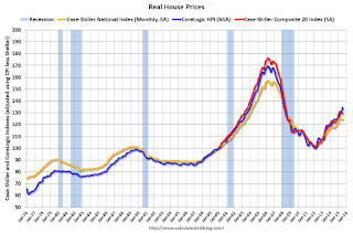
In the earlier post, I graphed nominal house prices, but it is also important to look at prices in real terms (inflation adjusted). Case-Shiller, CoreLogic and others report nominal house prices. As an example, if a house price was $200,000 in January 2000, the price would be close to $276,000 today adjusted for inflation (38%). That is why the second graph below is important - this shows "real" prices (adjusted for inflation).
It has been almost ten years since the bubble peak. In the Case-Shiller release this morning, the National Index was reported as being 7.0% below the bubble peak. However, in real terms, the National index is still about 21% below the bubble peak.
Nominal House Prices
 The first graph shows the monthly Case-Shiller National Index SA, the monthly Case-Shiller Composite 20 SA, and the CoreLogic House Price Indexes (through July) in nominal terms as reported.
In nominal terms, the Case-Shiller National index (SA) is back to June 2005 levels, and the Case-Shiller Composite 20 Index (SA) is back to February 2005 levels, and the CoreLogic index (NSA) is back to June 2005.
Real House Prices
 The second graph shows the same three indexes in real terms (adjusted for inflation using CPI less Shelter). Note: some people use other inflation measures to adjust for real prices.
In real terms, the National index is back to June 2003 levels, the Composite 20 index is back to April 2003, and the CoreLogic index back to December 2003.
In real terms, house prices are back to 2003 levels.
Note: CPI less Shelter is down 1.2% year-over-year, so this is pushing up real prices.
Price-to-Rent
In October 2004, Fed economist John Krainer and researcher Chishen Wei wrote a Fed letter on price to rent ratios: House Prices and Fundamental Value. Kainer and Wei presented a price-to-rent ratio using the OFHEO house price index and the Owners' Equivalent Rent (OER) from the BLS.
 Here is a similar graph using the Case-Shiller National, Composite 20 and CoreLogic House Price Indexes.
This graph shows the price to rent ratio (January 1998 = 1.0).
On a price-to-rent basis, the Case-Shiller National index is back to April 2003 levels, the Composite 20 index is back to December 2002 levels, and the CoreLogic index is back to November 2003.
This is the graph SF President John Williams mentioned yesterday.
In real terms, and as a price-to-rent ratio, prices are back to 2003 levels - and the price-to-rent ratio maybe moving a little sideways now.


