 RSS Feed
 by Calculated Risk on 12/07/2012 08:30:00 AM
Friday, December 07, 2012
November Employment Report: 146,000 Jobs, 7.7% Unemployment Rate
From the BLS:
Total nonfarm payroll employment rose by 146,000 in November, and the unemployment rate edged down to 7.7 percent, the U.S. Bureau of Labor Statistics reported today.
...
Hurricane Sandy made landfall on the Northeast coast on October 29th, causing severe damage in some states. Nevertheless, our survey response rates in the affected states were within normal ranges. Our analysis suggests that Hurricane Sandy did not substantively impact the national employment and unemployment estimates for November.
...
The change in total nonfarm payroll employment for September was revised from +148,000 to +132,000, and the change for October was revised from +171,000 to +138,000.
 Click on graph for larger image.
There was uncertainty about this report because of Hurricane Sandy.
The headline number was above expectations of 80,000, but both September and October payroll growth was revised down.
The second graph shows the unemployment rate. The unemployment rate declined to 7.7%.
 The unemployment rate is from the household report.
The unemployment rate declined because of lower participation (a decline in the civilian labor force).
The third graph shows the employment population ratio and the participation rate.
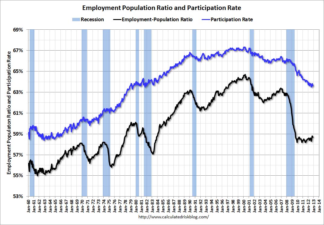 The Labor Force Participation Rate decreased to 63.6% in November (blue line. This is the percentage of the working age population in the labor force.
The participation rate is well below the 66% to 67% rate that was normal over the last 20 years, although most of the recent decline is due to demographics.
The Employment-Population ratio decreased to 58.7% in November (black line). I'll post the 25 to 54 age group employment-population ratio graph later.
 The fourth graph shows the job losses from the start of the employment recession, in percentage terms, compared to previous post WWII recessions. The dotted line is ex-Census hiring.
This shows the depth of the recent employment recession - worse than any other post-war recession - and the relatively slow recovery due to the lingering effects of the housing bust and financial crisis.
With all the uncertainty about the impact of Hurricane Sandy, this was a decent report, especially with the decline in the unemployment rate. However, negatives include the downward revisions to prior months, and the decline in the participation rate. I'll have much more later ...


