 RSS Feed
 by Calculated Risk on 11/15/2021 02:42:00 PM
Monday, November 15, 2021
November 15th COVID-19: New Cases Increasing, Above 80K per Day
The CDC is the source for all data.
According to the CDC, on Vaccinations. Total doses administered: 442,005,260, as of a week ago 430,927,624, or 1.58 million doses per day.
| COVID Metrics | ||||
|---|---|---|---|---|
| Today | Week Ago | Goal | ||
| Percent fully Vaccinated | 58.8% | 58.4% | ≥70.0%1 | |
| Fully Vaccinated (millions) | 195.3 | 193.8 | ≥2321 | |
| New Cases per Day3🚩 | 80,823 | 72,204 | ≤5,0002 | |
| Hospitalized3 | 38,332 | 40,676 | ≤3,0002 | |
| Deaths per Day3 | 1,043 | 1,071 | ≤502 | |
| 1 Minimum to achieve "herd immunity" (estimated between 70% and 85%). 2my goals to stop daily posts, 37 day average for Cases, Currently Hospitalized, and Deaths 🚩 Increasing 7 day average week-over-week for Cases, Hospitalized, and Deaths ✅ Goal met. | ||||
IMPORTANT: For "herd immunity" most experts believe we need 70% to 85% of the total population fully vaccinated (or already had COVID). Note: COVID will probably stay endemic (at least for some time).
KUDOS to the residents of the 5 states that have achieved 70% of total population fully vaccinated: Vermont at 72.1%, Rhode Island, Connecticut, Maine, and Massachusetts at 70.4% .
KUDOS also to the residents of the 16 states and D.C. that have achieved 60% of total population fully vaccinated: New York at 67.7%, , New Jersey, Maryland, Washington, Virginia, New Hampshire, Oregon, District of Columbia, New Mexico, Colorado, California, Minnesota, Pennsylvania, Illinois, Delaware, Florida, and Hawaii at 60.4%.
The following 19 states have between 50% and 59.9% fully vaccinated: Wisconsin at 59.0%, Nebraska, Iowa, Utah, Michigan, Texas, Kansas, Arizona, Nevada, South Dakota, North Carolina, Alaska, Ohio, Kentucky, Montana, Oklahoma, South Carolina, Missouri and Indiana at 50.3%.
Next up (total population, fully vaccinated according to CDC) are Georgia at 48.8%, Tennessee at 48.8%, Arkansas at 48.8%, Louisiana at 48.3% and North Dakota at 48.2%.
 Click on graph for larger image.
This graph shows the daily (columns) and 7 day average (line) of positive tests reported.
4th Look at Local Housing Markets in October
by Calculated Risk on 11/15/2021 01:26:00 PM
Today, in the Real Estate Newsletter: 4th Look at Local Housing Markets in October
Excerpt:
This is the fourth look at local markets in October. This update adds Des Moines, Maryland, South Carolina, and Washington, D.C..You can subscribe at https://calculatedrisk.substack.com/ (Currently all content is available for free, but please subscribe).
...
Here is a summary of active listings for the housing markets that have reported so far in October. For these markets, inventory was down 6.9% in October MoM from September, and down 25.2% YoY.
Of the markets that have reported so far, inventories in Jacksonville and San Diego are at record lows. Sacramento and Washington, D.C. are the only markets so far with inventory up YoY in October.
nventory almost always declines seasonally in October, so the MoM decline is not a surprise. Last month, these markets were down 23.1% YoY, so the YoY decline in October is slightly larger than in September. This is not indicating a slowing market.

Housing Inventory Nov 15th Update: Inventory Down 1.7% Week-over-week
by Calculated Risk on 11/15/2021 10:38:00 AM
Tracking existing home inventory will be very important this year.
 Click on graph for larger image in graph gallery.
This inventory graph is courtesy of Altos Research.
As of November 12th, inventory was at 394 thousand (7 day average), compared to 525 thousand for the same week a year ago. That is a decline of 25.0%.
Compared to the same week in 2019, inventory is down 55.9% from 892 thousand. A week ago, inventory was at 401 thousand, and was down 24.3% YoY.
Seasonally, inventory bottomed in April (usually inventory bottoms in January or February). Inventory was about 28% above the record low in early April.
Inventory peaked for the year in early September. Ten weeks ago inventory was at 437 thousand (the peak for the year), so inventory is currently off about 10.0% from the peak for the year.
Mike Simonsen discusses this data regularly on Youtube.
Altos Research has also seen a significant pickup in price decreases - now well above the level of a year ago - but still below a normal rate for November.
Seven High Frequency Indicators for the Economy
by Calculated Risk on 11/15/2021 08:26:00 AM
These indicators are mostly for travel and entertainment. It is interesting to watch these sectors recover as the pandemic subsides.
The TSA is providing daily travel numbers.
This data is as of November 14th.
 Click on graph for larger image.
This data shows the 7-day average of daily total traveler throughput from the TSA for 2019 (Light Blue), 2020 (Blue) and 2021 (Red).
The dashed line is the percent of 2019 for the seven day average.
The 7-day average is down 17.9% from the same day in 2019 (82.1% of 2019). (Dashed line)
Overall, air travel has been off about 20% relative to 2019 for the last four months (with some ups and downs).
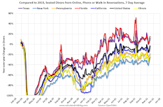
The second graph shows the 7-day average of the year-over-year change in diners as tabulated by OpenTable for the US and several selected cities.
IMPORTANT: OpenTable notes: "we’ve updated the data including downloadable dataset from January 1, 2021 onward to compare seated diners from 2021 to 2019, as opposed to year over year." Thanks!
 Thanks to OpenTable for providing this restaurant data:
This data is updated through November 13, 2021.
This data is "a sample of restaurants on the OpenTable network across all channels: online reservations, phone reservations, and walk-ins. For year-over-year comparisons by day, we compare to the same day of the week from the same week in the previous year."
Note that this data is for "only the restaurants that have chosen to reopen in a given market". Since some restaurants have not reopened, the actual year-over-year decline is worse than shown.
Dining picked up for the Labor Day weekend, but declined after the holiday - and appears to be declining again. The 7-day average for the US is down 3% compared to 2019.
 This data shows domestic box office for each week and the median for the years 2016 through 2019 (dashed light blue).
 Blue is 2020 and Red is 2021.
The data is from BoxOfficeMojo through November 11th.
Note that the data is usually noisy week-to-week and depends on when blockbusters are released.
Movie ticket sales were at $151 million last week, down about 29% from the median for the week.
Note that the data is usually noisy week-to-week and depends on when blockbusters are released.
Movie ticket sales were at $151 million last week, down about 29% from the median for the week.
 This graph shows the seasonal pattern for the hotel occupancy rate using the four week average.
 The red line is for 2021, black is 2020, blue is the median, dashed purple is 2019, and dashed light blue is for 2009 (the worst year on record for hotels prior to 2020).
This data is through November 6th. The occupancy rate was down 13.0% compared to the same week in 2019.
Notes: Y-axis doesn't start at zero to better show the seasonal change.
The occupancy rate will now decline seasonally into the new year.
 This graph, based on weekly data from the U.S. Energy Information Administration (EIA), shows gasoline supplied compared to the same week of 2019.
Blue is for 2020. Red is for 2021.
As of November 5th, gasoline supplied was down 0.7% compared to the same week in 2019.
There have been eight weeks so far this year when gasoline supplied was up compared to the same week in 2019 - and consumption is running close to 2019 levels now.
This graph is from Apple mobility. From Apple: "This data is generated by counting the number of requests made to Apple Maps for directions in select countries/regions, sub-regions, and cities." This is just a general guide - people that regularly commute probably don't ask for directions.
There is also some great data on mobility from the Dallas Fed Mobility and Engagement Index. However the index is set "relative to its weekday-specific average over January–February", and is not seasonally adjusted, so we can't tell if an increase in mobility is due to recovery or just the normal increase in the Spring and Summer.
 This data is through November 13th
 for the United States and several selected cities.
The graph is the running 7-day average to remove the impact of weekends.
IMPORTANT: All data is relative to January 13, 2020. This data is NOT Seasonally Adjusted. People walk and drive more when the weather is nice, so I'm just using the transit data.
According to the Apple data directions requests, public transit in the 7 day average for the US is at 112% of the January 2020 level.
New York City is doing well by this metric, but subway usage in NYC is down sharply (next graph).
----- New York City Subway Usage -----
Here is some interesting data on New York subway usage (HT BR).
 This graph is from Todd W Schneider.
Here is some interesting data on New York subway usage (HT BR).
 This graph is from Todd W Schneider.
 This graph shows how much MTA traffic has recovered in each borough (Graph starts at first week in January 2020 and 100 = 2019 average).
Manhattan is at about 41% of normal.
This data is through Friday, November 12th.
He notes: "Data updates weekly from the MTA’s public turnstile data, usually on Saturday mornings".
This data is through Friday, November 12th.
He notes: "Data updates weekly from the MTA’s public turnstile data, usually on Saturday mornings".
Sunday, November 14, 2021
Sunday Night Futures
by Calculated Risk on 11/14/2021 07:01:00 PM
Weekend:
• Schedule for Week of November 14, 2021
Monday:
• At 8:30 AM ET, The New York Fed Empire State manufacturing survey for November. The consensus is for a reading of 20.1, up from 10.5.
From CNBC: Pre-Market Data and Bloomberg futures S&P 500 are up 10 and DOW futures are up 67 (fair value).
Oil prices were down over the last week with WTI futures at $81.17 per barrel and Brent at $82.45 per barrel. A year ago, WTI was at $40, and Brent was at $42 - so WTI oil prices are up double year-over-year.
Here is a graph from Gasbuddy.com for nationwide gasoline prices. Nationally prices are at $3.40 per gallon. A year ago prices were at $2.12 per gallon, so gasoline prices are up $1.28 per gallon year-over-year.
The Labor Force Participation Rate
by Calculated Risk on 11/14/2021 02:13:00 PM
On Friday, Goldman Sachs economists put out a research note on the labor force participation rate: Why Isn’t Labor Force Participation Recovering?
Here are few excerpts from the note:
 Click on graph for larger image.
The Labor Force Participation Rate was unchanged at 61.6% in October, from 61.6% in September. This is the percentage of the working age population in the labor force.
The Employment-Population ratio increased to 58.8% from 58.7% (black line).
While the unemployment rate continues to fall quickly, labor force participation has made no progress since August 2020. ... Most of the 5.0mn persons who have exited the labor force since the start of the pandemic are over age 55 (3.4mn), largely reflecting early (1.5mn) and natural (1mn) retirements that likely won’t reverse. The outlook for prime-age persons who have exited the labor force (1.7mn) is more positive, since very few are discouraged and most still view their exits as temporary.
First, there are two important monthly surveys from the BLS. The participation rate (and unemployment rate) comes from the Current Population Survey (CPS: commonly called the household survey), a monthly survey of about 60,000 households.
The jobs number comes from Current Employment Statistics (CES: payroll survey), a sample of approximately 634,000 business establishments nationwide.
These are very different surveys: the CPS gives the total number of employed (and unemployed including the alternative measures), and the CES gives the total number of positions (excluding some categories like the self-employed, and a person working two jobs counts as two positions).
Currently the payroll survey shows there are 4.2 million fewer jobs than in February 2020 (pre-pandemic).
The household survey shows there are 2.99 million fewer people in the labor force than in February 2020. The 5 million number probably assumes some normal labor force growth, however, overall population growth has been dismal over the last 2 years (little immigration and large number of deaths). I'm not confident in Goldman's 5 million person estimate.
Here is a graph that shows the employment population ratio and the participation rate through the October 2021 employment report.
 Click on graph for larger image.
The Labor Force Participation Rate was unchanged at 61.6% in October, from 61.6% in September. This is the percentage of the working age population in the labor force.
The Employment-Population ratio increased to 58.8% from 58.7% (black line).
Both are far below the pre-pandemic levels, however the overall participation rate was expected to decline due to demographics.
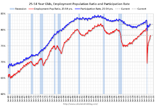 Since the overall participation rate has declined due to the pandemic and demographic (aging population, younger people staying in school) reasons, here is the employment-population ratio for the key working age group: 25 to 54 years old.
The 25 to 54 participation rate increased in October to 81.7% from 81.6% in September, and the 25 to 54 employment population ratio increased to 78.3% from 78.0% in September.
Both are still low and indicate that many prime workers have still not returned to the labor force.
In the note, Goldman argues "Most of the 5.0mn persons who have exited the labor force since the start of the pandemic are over age 55 (3.4mn), largely reflecting early (1.5mn) and natural (1mn) retirements that likely won’t reverse." There probably have been a large number of people retiring over the last 2 years, but I think more at least half of the people missing from the labor force are prime age.
 Here is a graph of the change in the participation rate by age cohort (October 2019, October 2020, and October 2021 NSA).
 Here is a graph of the change in the participation rate by age cohort (October 2019, October 2020, and October 2021 NSA).
If more older people were retiring than expected, we'd see a decline from Blue (pre-pandemic) to Red (pandemic) to Black (October 2021). We do see this for the "70 to 74" and "75+" age groups. And this does suggest more retirements than expected in the 70+ age groups.
However the "55 to 59", "60 to 64" and "65 to 69" age groups are recovering similar to the prime age groups.
If we calculate the expected labor force by cohort, using the pre-pandemic participation rates, about 50% of the people missing from the labor force are in the prime working age (25 to 54). About 75% of the people missing are in the 20 to 65 age group.
This suggests to me that there is more slack in the labor market than Goldman estimates.
Saturday, November 13, 2021
Real Estate Newsletter Articles this Week
by Calculated Risk on 11/13/2021 02:11:00 PM
At the Calculated Risk Real Estate Newsletter this week:
• A Zillow Flip that Flopped
• Homebuilder Comments in October: “Builders are lifting sales caps" "Lack of lots & land development will hold back growth in 2022"
• 2nd Look at Local Housing Markets in October Inventory in San Diego is at an all time low
• Inventory will Tell the Tale
• "The deal of the Century ..." Best to all Veterans
• 3rd Look at Local Housing Markets in October Albuquerque, Atlanta, Colorado, Georgia, Houston, Jacksonville, Minnesota, Portland, Sacramento and Santa Clara
This will usually be published several times a week, and will provide more in-depth analysis of the housing market.
The blog will continue as always!
You can subscribe at https://calculatedrisk.substack.com/ Currently all content is available for free - and some will always be free - but please subscribe!.
You can subscribe at https://calculatedrisk.substack.com/ Currently all content is available for free - and some will always be free - but please subscribe!.
Schedule for Week of November 14, 2021
by Calculated Risk on 11/13/2021 08:11:00 AM
The key economic reports this week are October Retail Sales and Housing Starts.
For manufacturing, October industrial production, and the November New York, Philly and Kansas City Fed surveys, will be released this week.
8:30 AM: The New York Fed Empire State manufacturing survey for November. The consensus is for a reading of 20.1, up from 10.5.
 8:30 AM ET: Retail sales for October will be released.
The consensus is for a 1.1% increase in retail sales.
This graph shows retail sales since 1992. This is monthly retail sales and food service, seasonally adjusted (total and ex-gasoline).
 9:15 AM: The Fed will release Industrial Production and Capacity Utilization for October.
This graph shows industrial production since 1967.
The consensus is for a 0.7% increase in Industrial Production, and for Capacity Utilization to increase to 75.7%.
10:00 AM: The November NAHB homebuilder survey. The consensus is for a reading of 80, unchanged from 80. Any number above 50 indicates that more builders view sales conditions as good than poor.
7:00 AM ET: The Mortgage Bankers Association (MBA) will release the results for the mortgage purchase applications index.
 8:30 AM: Housing Starts for October.
 This graph shows single and total housing starts since 1968.
The consensus is for 1.580 million SAAR, up from 1.555 million SAAR.
During the day: The AIA's Architecture Billings Index for October (a leading indicator for commercial real estate).
8:30 AM: The initial weekly unemployment claims report will be released. The consensus is for 260 thousand initial claims, down from 267 thousand last week.
8:30 AM: the Philly Fed manufacturing survey for November. The consensus is for a reading of 24.0, up from 23.8.
11:00 AM: the Kansas City Fed manufacturing survey for November.
10:00 AM: State Employment and Unemployment (Monthly) for October 2021 (And State Job Openings)
Friday, November 12, 2021
Mortgage Rates Increased This Week
by Calculated Risk on 11/12/2021 05:29:00 PM
From Matthew Graham at MortgageNewsDaily: Mortgage Rates Are Actually Much Higher This Week
 Click on graph for larger image.
This is a graph from Mortgage News Daily (MND) showing 30 year fixed rates from three sources (MND, MBA, Freddie Mac) since 2010.
The 30 year fixed rate for top tier scenarios was 3.23% today, up from 3.02% last Friday. This is still historically very low.
Go to MND and you can adjust the graph for different time periods.
November 12th COVID-19: New Cases Stuck Above 70,000 per Day
by Calculated Risk on 11/12/2021 04:20:00 PM
The CDC is the source for all data.
According to the CDC, on Vaccinations. Total doses administered: 437,352,000, as of a week ago 426,728,092, or 1.52 million doses per day.
| COVID Metrics | ||||
|---|---|---|---|---|
| Today | Week Ago | Goal | ||
| Percent fully Vaccinated | 58.7% | 58.2% | ≥70.0%1 | |
| Fully Vaccinated (millions) | 194.7 | 193.2 | ≥2321 | |
| New Cases per Day3🚩 | 73,218 | 71,249 | ≤5,0002 | |
| Hospitalized3 | 39,359 | 41,692 | ≤3,0002 | |
| Deaths per Day3 | 999 | 1,101 | ≤502 | |
| 1 Minimum to achieve "herd immunity" (estimated between 70% and 85%). 2my goals to stop daily posts, 37 day average for Cases, Currently Hospitalized, and Deaths 🚩 Increasing 7 day average week-over-week for Cases, Hospitalized, and Deaths ✅ Goal met. | ||||
IMPORTANT: For "herd immunity" most experts believe we need 70% to 85% of the total population fully vaccinated (or already had COVID). Note: COVID will probably stay endemic (at least for some time).
KUDOS to the residents of the 5 states that have achieved 70% of total population fully vaccinated: Vermont at 71.9%, Rhode Island, Connecticut, Maine, and Massachusetts at 70.3% .
KUDOS also to the residents of the 16 states and D.C. that have achieved 60% of total population fully vaccinated: New York at 67.5%, , New Jersey, Maryland, Washington, Virginia, New Hampshire, Oregon, District of Columbia, New Mexico, Colorado, California, Minnesota, Pennsylvania, Illinois, Delaware, Florida, and Hawaii at 60.3%.
The following 19 states have between 50% and 59.9% fully vaccinated: Wisconsin at 58.9%, Nebraska, Iowa, Utah, Michigan, Texas, Kansas, Arizona, Nevada, South Dakota, North Carolina, Alaska, Ohio, Kentucky, Montana, Oklahoma, South Carolina, Missouri and Indiana at 50.2%.
Next up (total population, fully vaccinated according to CDC) are Georgia at 48.8%, Tennessee at 48.8%, Arkansas at 48.6%, Louisiana at 48.2% and North Dakota at 48.1%.
 Click on graph for larger image.
This graph shows the daily (columns) and 7 day average (line) of positive tests reported.


