 RSS Feed
 by Calculated Risk on 10/19/2021 11:46:00 AM
Tuesday, October 19, 2021
Most Housing Units Under Construction Since 1974
Today, in the Newsletter: Most Housing Units Under Construction Since 1974
Excerpt:
Census will release data next year on the length of time from start to completion, and that will probably show long delays in 2021. In 2020, it took an average of 6.8 months from start to completion for single family homes, and 15.4 months for buildings with 2 or more units.
Combined, there are 1.426 million units under construction. This is the most since 1974.

Housing Starts Decreased to 1.555 Million Annual Rate in September
by Calculated Risk on 10/19/2021 08:41:00 AM
From the Census Bureau: Permits, Starts and Completions
Housing Starts:
Privately‐owned housing starts in September were at a seasonally adjusted annual rate of 1,555,000. This is 1.6 percent below the revised August estimate of 1,580,000, but is 7.4 percent above the September 2020 rate of 1,448,000. Single‐family housing starts in September were at a rate of 1,080,000; this is virtually unchanged from the revised August figure of 1,080,000. The September rate for units in buildings with five units or more was 467,000.
Building Permits:
Privately‐owned housing units authorized by building permits in September were at a seasonally adjusted annual rate of 1,589,000. This is 7.7 percent below the revised August rate of 1,721,000, but is virtually unchanged from the September 2020 rate of 1,589,000. Single‐family authorizations in September were at a rate of 1,041,000; this is 0.9 percent below the revised August figure of 1,050,000. Authorizations of units in buildings with five units or more were at a rate of 498,000 in September
emphasis added
 Click on graph for larger image.
The first graph shows single and multi-family housing starts for the last several years.
Multi-family starts (blue, 2+ units) decreased in September compared to August. Multi-family starts were up 38% year-over-year in September.
Single-family starts (red) were unchanged in September, and were down 2% year-over-year.
 The second graph shows single and multi-family housing starts since 1968.
 This shows the huge collapse following the housing bubble, and then the eventual recovery (but still not historically high).
Total housing starts in September were below expectations, and starts in July and August were revised down, combined.
I'll have more later …
Monday, October 18, 2021
Tuesday: Housing Starts
by Calculated Risk on 10/18/2021 07:47:00 PM
From Matthew Graham at Mortgage News Daily: Highest Rates in Months
Mortgage rates had a mixed showing last week. They started out high before improving through Thursday. Finally, they took a step back up on Friday. Now at the start of the new week, the upward momentum is continuing. [30 year fixed 3.21%]Tuesday:
emphasis added
• At 8:30 AM ET, Housing Starts for September. The consensus is for 1.620 million SAAR, up from 1.615 million SAAR.
4th Look at Local Housing Markets in September; Adding Austin, California, Des Moines, Houston and Maryland
by Calculated Risk on 10/18/2021 05:22:00 PM
Today, in the Newsletter: 4th Look at Local Housing Markets in September
Excerpt:
Inventory in San Diego is at an all time low, whereas inventory in Denver and Sacramento is up more than double from the all time low earlier this year.
Austin and Sacramento are two of the few areas with inventory up YoY. The C.A.R. reported today that inventory in 40% of the markets in California are either unchanged or up year-over-year. This is a change.
MBA Survey: "Share of Mortgage Loans in Forbearance Decreases to 2.28%"
by Calculated Risk on 10/18/2021 04:00:00 PM
Note: This is as of October 10th.
From the MBA: Share of Mortgage Loans in Forbearance Decreases to 2.28%
The Mortgage Bankers Association’s (MBA) latest Forbearance and Call Volume Survey revealed that the total number of loans now in forbearance decreased by 34 basis points from 2.62% of servicers’ portfolio volume in the prior week to 2.28% as of October 10, 2021. According to MBA’s estimate, 1.1 million homeowners are in forbearance plans.
The share of Fannie Mae and Freddie Mac loans in forbearance decreased 16 basis points to 1.05%. Ginnie Mae loans in forbearance decreased 17 basis points to 2.77%, and the forbearance share for portfolio loans and private-label securities (PLS) declined 108 basis points to 5.34%. The percentage of loans in forbearance for independent mortgage bank (IMB) servicers decreased 25 basis points relative to the prior week to 2.57%, and the percentage of loans in forbearance for depository servicers decreased 53 basis points to 2.16%.
“Forbearance exits continued at an even more robust pace, resulting in a 34 basis-point decline in the overall forbearance rate. The decline was apparent across all servicer types and investor types,” said Mike Fratantoni, MBA’s Senior Vice President and Chief Economist. “There was a substantial drop of over 1 percentage point in the forbearance rate for portfolio and PLS loans, which includes loans held for investment purposes, loans serviced for private investors, and government loans that were bought out of Ginnie Mae pools for the purposes of modifying them and then re-securitizing them into Ginnie Mae pools.”
Added Fratantoni, “We are now down to 1.1 million homeowners in forbearance from a peak of 4.3 million homeowners in June 2020. Positive employment and wage prospects, continued home-price appreciation, and the availability of multiple loan workout options are factors that will smooth many homeowners’ transition out of forbearance.”
emphasis added
 Click on graph for larger image.
This graph shows the percent of portfolio in forbearance by investor type over time. Most of the increase was in late March and early April 2020, and has trended down since then.
The MBA notes: "Total weekly forbearance requests as a percent of servicing portfolio volume (#) decreased relative to the prior week: from 0.05% to 0.04%."
October 18th COVID-19: Data Released On Monday is Always Low and Revised Up
by Calculated Risk on 10/18/2021 03:20:00 PM
The CDC is the source for all data.
According to the CDC, on Vaccinations. Total doses administered: 408,265,959, as of six days ago 403,576,826, or 0.78 million doses per day.
| COVID Metrics | ||||
|---|---|---|---|---|
| Today | Week Ago | Goal | ||
| Percent fully Vaccinated | 57.0% | 56.4% | ≥70.0%1 | |
| Fully Vaccinated (millions) | 189.1 | 187.4 | ≥2321 | |
| New Cases per Day3 | 67,763 | 91,262 | ≤5,0002 | |
| Hospitalized3 | 50,750 | 60,078 | ≤3,0002 | |
| Deaths per Day3 | 1,093 | 1,350 | ≤502 | |
| 1 Minimum to achieve "herd immunity" (estimated between 70% and 85%). 2my goals to stop daily posts, 37 day average for Cases, Currently Hospitalized, and Deaths 🚩 Increasing 7 day average week-over-week for Cases, Hospitalized, and Deaths ✅ Goal met. | ||||
IMPORTANT: For "herd immunity" most experts believe we need 70% to 85% of the total population fully vaccinated (or already had COVID).
KUDOS to the residents of Vermont that have achieved 70% of total population fully vaccinated: Vermont at 70.5%.
KUDOS also to the residents of the 14 states and D.C. that have achieved 60% of total population fully vaccinated: Connecticut at 69.9%, Maine, Rhode Island, Massachusetts, New Jersey, Maryland, New York, New Mexico, New Hampshire, Washington, Oregon, Virginia, District of Columbia, Colorado, and California at 60.3%.
The following 20 states have between 50% and 59.9% fully vaccinated: Pennsylvania at 59.5%, Minnesota, Hawaii, Delaware, Florida, Wisconsin, Nebraska, Iowa, Illinois, Michigan, Kentucky, South Dakota, Texas, Arizona, Kansas, Nevada, Alaska, Utah, North Carolina and Ohio at 51.2%.
Next up (total population, fully vaccinated according to CDC) are Montana at 49.6%, Indiana at 49.3%, Missouri at 49.1%, Oklahoma at 49.0% and South Carolina at 49.0%.
 Click on graph for larger image.
This graph shows the daily (columns) and 7 day average (line) of positive tests reported.
Housing Inventory Oct 18th Update: Inventory Down Slightly Week-over-week
by Calculated Risk on 10/18/2021 11:58:00 AM
Tracking existing home inventory will be very important this year.
 Click on graph for larger image in graph gallery.
This inventory graph is courtesy of Altos Research.
As of October 15th, inventory was at 424 thousand (7 day average), compared to 554 thousand for the same week a year ago. That is a decline of 23.6%.
Compared to the same week in 2019, inventory is down 55% from 936 thousand. A week ago, inventory was at 426 thousand, and was down 23.3% YoY.
Seasonally, inventory bottomed in April (usually inventory bottoms in January or February). Inventory was about 38% above the record low in early April.
Now inventory may have peaked for the year in early September. Six weeks ago inventory was at 437 thousand (the peak for the year so far), so inventory is currently off about 3.1% from the peak for the year.
Mike Simonsen discusses this data regularly on Youtube.
Altos Research has also seen a significant pickup in price decreases - now well above the level of a year ago - but still below a normal rate for October.
NAHB: Builder Confidence Increased to 80 in October
by Calculated Risk on 10/18/2021 11:07:00 AM
The National Association of Home Builders (NAHB) reported the housing market index (HMI) was at 80, up from 76 in September. Any number above 50 indicates that more builders view sales conditions as good than poor.
From the NAHB: Strong Demand Boosts Builder Confidence Despite Supply Chain Disruptions
Strong consumer demand helped push builder confidence higher in October despite growing affordability challenges stemming from rising material prices and shortages. Builder sentiment in the market for newly built single-family homes moved four points higher to 80 in October, according to the NAHB/Wells Fargo Housing Market Index (HMI) released today.
“Although demand and home sales remain strong, builders continue to grapple with ongoing supply chain disruptions and labor shortages that are delaying completion times and putting upward pressure on building material and home prices,” said NAHB Chairman Chuck Fowke.
“Builders are getting increasingly concerned about affordability hurdles ahead for most buyers,” said NAHB Chief Economist Robert Dietz. “Building material price increases and bottlenecks persist and interest rates are expected to rise in coming months as the Fed begins to taper its purchase of U.S. Treasuries and mortgage-backed debt. Policymakers must focus on fixing the broken supply chain. This will spur more construction and help ease upward pressure on home prices.”
...
All three major HMI indices posted gains in October. The index gauging current sales conditions rose five points to 87, the component measuring sales expectations in the next six months posted a three-point gain to 84 and the gauge charting traffic of prospective buyers moved four points higher to 65.
Looking at the three-month moving averages for regional HMI scores, the Midwest rose one point to 69, the Northeast held steady at 72, the South and West each remained unchanged at 80 and 83, respectively.
 Click on graph for larger image.
This graph show the NAHB index since Jan 1985.
This was above the consensus forecast, and a strong reading.
Industrial Production Decreased 1.3 Percent in September
by Calculated Risk on 10/18/2021 09:23:00 AM
From the Fed: Industrial Production and Capacity Utilization
Industrial production fell 1.3 percent in September after moving down 0.1 percent in August; output was previously reported to have risen 0.4 percent in August. In September, manufacturing output decreased 0.7 percent: The production of motor vehicles and parts fell 7.2 percent, as shortages of semiconductors continued to hobble operations, while factory output elsewhere declined 0.3 percent. The output of utilities dropped 3.6 percent, as demand for cooling subsided after a warmer-than-usual August. Mining production fell 2.3 percent.
The lingering effects of Hurricane Ida more than accounted for the drop in mining in September; they also contributed 0.3 percentage point to the drop in manufacturing. Overall, about 0.6 percentage point of the drop in total industrial production resulted from the impact of the hurricane.
Despite the decrease in September, total industrial production rose 4.3 percent at an annual rate for the third quarter as a whole, its fifth consecutive quarter with a gain of at least 4 percent.
At 100.0 percent of its 2017 average, total industrial production in September was 4.6 percent above its year-earlier level. Capacity utilization for the industrial sector fell 1.0 percentage point in September to 75.2 percent, a rate that is 4.4 percentage points below its long-run (1972–2020) average.
emphasis added
 Click on graph for larger image.
This graph shows Capacity Utilization. This series is up from the record low set in April 2020, but below the level in February 2020 (pre-pandemic).
Capacity utilization at 75.2% is 4.4% below the average from 1972 to 2020. This was well below consensus expectations.
Note: y-axis doesn't start at zero to better show the change.
 The second graph shows industrial production since 1967.
Industrial production decreased in September to 100.0. This is 1.3% below the February 2020 level.
The change in industrial production was well below consensus expectations.
Seven High Frequency Indicators for the Economy
by Calculated Risk on 10/18/2021 08:39:00 AM
These indicators are mostly for travel and entertainment. It will interesting to watch these sectors recover as the pandemic subsides.
The TSA is providing daily travel numbers.
This data is as of October 17th.
 Click on graph for larger image.
This data shows the 7-day average of daily total traveler throughput from the TSA for 2019 (Light Blue), 2020 (Blue) and 2021 (Red).
The dashed line is the percent of 2019 for the seven day average.
The 7-day average is down 21.4% from the same day in 2019 (78.6% of 2019). (Dashed line)
Note that the dashed line hit a pandemic high over the Labor Day weekend - probably due to leisure travel, but is now at pre-holiday levels.
Travel usually increases seasonally after Labor Day due to business travel.
The second graph shows the 7-day average of the year-over-year change in diners as tabulated by OpenTable for the US and several selected cities.
IMPORTANT: OpenTable notes: "we’ve updated the data including downloadable dataset from January 1, 2021 onward to compare seated diners from 2021 to 2019, as opposed to year over year." Thanks!
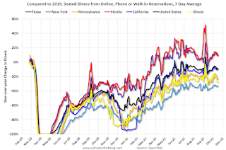 Thanks to OpenTable for providing this restaurant data:
This data is updated through October 16, 2021.
This data is "a sample of restaurants on the OpenTable network across all channels: online reservations, phone reservations, and walk-ins. For year-over-year comparisons by day, we compare to the same day of the week from the same week in the previous year."
Note that this data is for "only the restaurants that have chosen to reopen in a given market". Since some restaurants have not reopened, the actual year-over-year decline is worse than shown.
Dining picked up for the Labor Day weekend, but declined after the holiday - but might be picking up a little again. The 7-day average for the US is down 8% compared to 2019.
 This data shows domestic box office for each week and the median for the years 2016 through 2019 (dashed light blue).
 Blue is 2020 and Red is 2021.
The data is from BoxOfficeMojo through October 14th.
Note that the data is usually noisy week-to-week and depends on when blockbusters are released.
Movie ticket sales were at $147 million last week, down about 12% from the median for the week.
Note that the data is usually noisy week-to-week and depends on when blockbusters are released.
Movie ticket sales were at $147 million last week, down about 12% from the median for the week.
 This graph shows the seasonal pattern for the hotel occupancy rate using the four week average.
 The red line is for 2021, black is 2020, blue is the median, dashed purple is 2019, and dashed light blue is for 2009 (the worst year on record for hotels prior to 2020).
This data is through October 2nd. The occupancy rate was down 9.6% compared to the same week in 2019.
Notes: Y-axis doesn't start at zero to better show the seasonal change.
The Summer months had decent occupancy with solid leisure travel, and occupancy was only off about 7% in July and August compared to 2019. Usually weekly occupancy increases to around 70% in the weeks following Labor Day due to renewed business travel. However, this year, so far, business travel has been lighter than leisure travel in 2021.
 This graph, based on weekly data from the U.S. Energy Information Administration (EIA), shows gasoline supplied compared to the same week of 2019.
Blue is for 2020. Red is for 2021.
As of October 8th, gasoline supplied was down 1.8% compared to the same week in 2019.
There have been six weeks so far this year when gasoline supplied was up compared to the same week in 2019 - and consumption is running close to 2019 levels now.
This graph is from Apple mobility. From Apple: "This data is generated by counting the number of requests made to Apple Maps for directions in select countries/regions, sub-regions, and cities." This is just a general guide - people that regularly commute probably don't ask for directions.
There is also some great data on mobility from the Dallas Fed Mobility and Engagement Index. However the index is set "relative to its weekday-specific average over January–February", and is not seasonally adjusted, so we can't tell if an increase in mobility is due to recovery or just the normal increase in the Spring and Summer.
 This data is through October 15th for the United States and several selected cities.
The graph is the running 7-day average to remove the impact of weekends.
IMPORTANT: All data is relative to January 13, 2020. This data is NOT Seasonally Adjusted. People walk and drive more when the weather is nice, so I'm just using the transit data.
According to the Apple data directions requests, public transit in the 7 day average for the US is at 117% of the January 2020 level.
New York City is doing well by this metric, but subway usage in NYC is down sharply (next graph).
----- New York City Subway Usage -----
Here is some interesting data on New York subway usage (HT BR).
 This graph is from Todd W Schneider. This is weekly data since 2015.
Here is some interesting data on New York subway usage (HT BR).
 This graph is from Todd W Schneider. This is weekly data since 2015.
 Most weeks are between 30 and 35 million entries, and currently there are under 15 million subway turnstile entries per week, but mostly moving up recently.
This data is through Friday, October 15th.
Schneider has graphs for each borough, and links to all the data sources.
He notes: "Data updates weekly from the MTA’s public turnstile data, usually on Saturday mornings".
This data is through Friday, October 15th.
Schneider has graphs for each borough, and links to all the data sources.
He notes: "Data updates weekly from the MTA’s public turnstile data, usually on Saturday mornings".


