 RSS Feed
 by Calculated Risk on 9/07/2021 09:00:00 PM
Tuesday, September 07, 2021
Wednesday: Job Openings, Beige Book
From Matthew Graham at Mortgage News Daily: Mortgage Rates Begin The Week Slightly Higher
Mortgage rates moved slightly higher to begin the holiday-shortened week. ... The damage is minimal in the bigger picture. On average, lenders are quoting the same rates seen last week, but with slightly higher closing costs today. Most of the weakness in the underlying bond market is centered on US Treasuries as opposed to the mortgage-backed securities (MBS) that serve as the foundation for mortgage rates. The Treasury-specific weakness is likely due to the presence of several big Treasury auctions this week in addition to heavy corporate bond issuance (which tends to hurt Treasuries more than MBS). [30 year fixed 2.97%]Tuesday:
emphasis added
• At 7:00 AM ET, The Mortgage Bankers Association (MBA) will release the results for the mortgage purchase applications index.
• At 10:00 AM, Job Openings and Labor Turnover Survey for July from the BLS.
• At 2:00 PM, the Federal Reserve Beige Book, an informal review by the Federal Reserve Banks of current economic conditions in their Districts.
Northwest Real Estate in August: Sales up 7% YoY, Inventory down 23% YoY
by Calculated Risk on 9/07/2021 05:49:00 PM
The Northwest Multiple Listing Service reported Northwest MLS brokers say August housing activity follows patterns of seasonal slowing
August typically brings a dip in housing activity and this year was no different, according to representatives from Northwest Multiple Listing Service when commenting on newly-released statistics. Figures comparing July to August show month-to-month drops in new listings, total inventory, pending sales, close sales, and median prices.The press release is for the Northwest MLS area. There were 10,571 closed sales in August 2021, up 7.4% from 9,847 sales in August 2020. Active inventory for the Northwest was down 22.6%.
"August showed a more traditional seasonal pattern with decreased activity as families took end-of-summer vacations and made back-to-school preparations," remarked Frank Wilson, Kitsap regional manager and branch managing broker at John L. Scott Real Estate.
...
NWMLS statistics show the volume of new listings added during August, including single family homes and condominiums, declined from both July (down 11.5%) and twelve months ago (down 4.2%). Total inventory for the 26 counties in the report also fell, shrinking about 6.6% from July and nearly 22.6% from a year ago. At month end, there were 7,425 active listings, down from the year-ago total of 9,591.
emphasis added
In Seattle, sales were up 10.1% year-over-year, and inventory was down 43.9% year-over-year. This puts the months-of-supply in Seattle at just 0.40 months.
MBA Survey: "Share of Mortgage Loans in Forbearance Decreases to 3.23%"
by Calculated Risk on 9/07/2021 04:00:00 PM
Note: This is as of August 29th.
From the MBA: Share of Mortgage Loans in Forbearance Decreases to 3.23%
The Mortgage Bankers Association’s (MBA) latest Forbearance and Call Volume Survey revealed that the total number of loans now in forbearance decreased by 2 basis points from 3.25% of servicers’ portfolio volume in the prior week to 3.23% as of August 29, 2021. According to MBA’s estimate, 1.6 million homeowners are in forbearance plans.
The share of Fannie Mae and Freddie Mac loans in forbearance decreased 3 basis points to 1.63%. Ginnie Mae loans in forbearance decreased 29 basis points to 3.63%, while the forbearance share for portfolio loans and private-label securities (PLS) increased 34 basis points to 7.52%. The percentage of loans in forbearance for independent mortgage bank (IMB) servicers decreased 1 basis point to 3.49%, and the percentage of loans in forbearance for depository servicers decreased 2 basis points to 3.33%.
“The share of loans in forbearance decreased by two basis points last week, with both new requests and exits remaining at a slow pace as we reached the end of August,” said Mike Fratantoni, MBA’s Senior Vice President and Chief Economist. “There was another large shift in the location of many FHA and VA loans, which have been bought out of Ginnie Mae pools and moved onto servicer balance sheets. As a result, there was a sharp drop in the share of Ginnie Mae loans in forbearance, and an offsetting increase in the share of portfolio loans in forbearance. These buyouts enable servicers to stop advancing principal and interest payments, and work with borrowers to begin paying again before they are resecuritized into Ginnie Mae pools.”
emphasis added
 Click on graph for larger image.
This graph shows the percent of portfolio in forbearance by investor type over time. Most of the increase was in late March and early April 2020, and has trended down since then.
The MBA notes: "Total weekly forbearance requests as a percent of servicing portfolio volume (#) decreased relative to the prior week: from 0.05% to 0.04%."
September 7th COVID-19: Data reported after Holidays is always low and will be revised up
by Calculated Risk on 9/07/2021 03:19:00 PM
The CDC is the source for all data.
According to the CDC, on Vaccinations. Total doses administered: 374,488,924, as of a week ago 370,212,027. Average doses last week: 0.61 million per day.
| COVID Metrics (POST-HOLIDAY DATA IS LOW) | ||||
|---|---|---|---|---|
| Today | Week Ago | Goal | ||
| Percent fully Vaccinated | 53.0% | 52.4% | ≥70.0%1 | |
| Fully Vaccinated (millions) | 176.0 | 174.1 | ≥2321 | |
| New Cases per Day3 | 127,100 | 155,534 | ≤5,0002 | |
| Hospitalized3 | 87,220 | 91,958 | ≤3,0002 | |
| Deaths per Day3 | 962 | 1,129 | ≤502 | |
| 1 Minimum to achieve "herd immunity" (estimated between 70% and 85%). 2my goals to stop daily posts, 37 day average for Cases, Currently Hospitalized, and Deaths 🚩 Increasing 7 day average week-over-week for Cases, Hospitalized, and Deaths ✅ Goal met. | ||||
IMPORTANT: For "herd immunity" most experts believe we need 70% to 85% of the total population fully vaccinated (or already had COVID).
KUDOS to the residents of the 11 states that have achieved 60% of total population fully vaccinated: Vermont at 68.1%, Massachusetts, Maine, Connecticut, Rhode Island, Maryland. New Jersey, Washington, New York, New Mexico, New Hampshire at 60.1%.
The following 13 states and D.C. have between 50% and 59.9% fully vaccinated: Oregon at 58.5%, District of Columbia, Virginia, Colorado, Minnesota, California, Hawaii, Delaware, Pennsylvania, Wisconsin, Florida, Nebraska, Iowa, Illinois, and Michigan at 50.8%.
Next up (total population, fully vaccinated according to CDC) are South Dakota at 49.6%, Kentucky at 49.1%, Arizona at 49.0%, Kansas at 48.8%, Ohio at 48.8%, Nevada at 48.3%, Utah at 48.1%, Texas at 48.1% and Alaska at 47.5%.
 Click on graph for larger image.
This graph shows the daily (columns) and 7 day average (line) of positive tests reported.
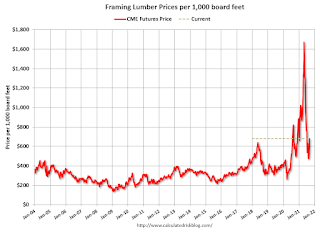
Update: Framing Lumber Prices Up Year-over-year
by Calculated Risk on 9/07/2021 10:51:00 AM
Here is another monthly update on framing lumber prices.
This graph shows CME random length framing futures through September 7th.
Lumber was at $680 per 1000 board feet this morning.
This is down from a peak of $1,733, and up from $640 a year ago.
 Click on graph for larger image in graph gallery.
There were supply constraints over the last year, for example, sawmills cut production and inventory at the beginning of the pandemic, and the West Coast fires in 2020 damaged privately-owned timberland (and maybe again in 2021).
 Click on graph for larger image in graph gallery.
Lumber price are up 6% year-over-year.
There were supply constraints over the last year, for example, sawmills cut production and inventory at the beginning of the pandemic, and the West Coast fires in 2020 damaged privately-owned timberland (and maybe again in 2021).
The supply constraints have eased somewhat.
And there was a huge surge in demand for lumber (demand remains strong).
Seven High Frequency Indicators for the Economy
by Calculated Risk on 9/07/2021 09:59:00 AM
These indicators are mostly for travel and entertainment. It will interesting to watch these sectors recover as the pandemic subsides.
The TSA is providing daily travel numbers.
This data is as of September 6th.
 Click on graph for larger image.
This data shows the 7-day average of daily total traveler throughput from the TSA for 2019 (Light Blue), 2020 (Blue) and 2021 (Red).
The dashed line is the percent of 2019 for the seven day average.
The 7-day average is down 17.8% from the same day in 2019 (82.2% of 2019). (Dashed line)
Focus on the dashed line (percent of 2019). Note that the dashed line hit a pandemic high over the Labor Day weekend - probably due to leisure travel.
The red line had turned down seasonally, but should start increasing seasonally.
The second graph shows the 7-day average of the year-over-year change in diners as tabulated by OpenTable for the US and several selected cities.
IMPORTANT: OpenTable notes: "we’ve updated the data including downloadable dataset from January 1, 2021 onward to compare seated diners from 2021 to 2019, as opposed to year over year." Thanks!
 Thanks to OpenTable for providing this restaurant data:
This data is updated through September 5, 2021.
This data is "a sample of restaurants on the OpenTable network across all channels: online reservations, phone reservations, and walk-ins. For year-over-year comparisons by day, we compare to the same day of the week from the same week in the previous year."
Note that this data is for "only the restaurants that have chosen to reopen in a given market". Since some restaurants have not reopened, the actual year-over-year decline is worse than shown.
Dining picked up during the holidays, then slumped with the huge winter surge in cases. Dining was generally picking up, but has moved down recently - and now picked up again for the Holiday weekend. The 7-day average for the US is up 1% compared to 2019.
----- Movie Tickets: Box Office Mojo -----
 This data shows domestic box office for each week and the median for the years 2016 through 2019 (dashed light blue).
 Thanks to OpenTable for providing this restaurant data:
This data is updated through September 5, 2021.
This data is "a sample of restaurants on the OpenTable network across all channels: online reservations, phone reservations, and walk-ins. For year-over-year comparisons by day, we compare to the same day of the week from the same week in the previous year."
Note that this data is for "only the restaurants that have chosen to reopen in a given market". Since some restaurants have not reopened, the actual year-over-year decline is worse than shown.
Dining picked up during the holidays, then slumped with the huge winter surge in cases. Dining was generally picking up, but has moved down recently - and now picked up again for the Holiday weekend. The 7-day average for the US is up 1% compared to 2019.
 This data shows domestic box office for each week and the median for the years 2016 through 2019 (dashed light blue).
 Blue is 2020 and Red is 2021.
The data is from BoxOfficeMojo through September 2nd.
Note that the data is usually noisy week-to-week and depends on when blockbusters are released.
Movie ticket sales were at $82 million last week, down about 44% from the median for the week.
Note that the data is usually noisy week-to-week and depends on when blockbusters are released.
Movie ticket sales were at $82 million last week, down about 44% from the median for the week.
 This graph shows the seasonal pattern for the hotel occupancy rate using the four week average.
 The red line is for 2021, black is 2020, blue is the median, dashed purple is 2019, and dashed light blue is for 2009 (the worst year on record for hotels prior to 2020).
Occupancy is above the horrible 2009 levels, but, according to STR, occupancy is declining due to both seasonal factors and "concerns around the pandemic". With solid leisure travel, the Summer months had decent occupancy - but it is uncertain what will happen in the Fall with business travel - especially with the sharp increase in COVID pandemic cases and hospitalizations.
This data is through August 28th. The occupancy rate is down 8.4% compared to the same week in 2019. Note: Occupancy was up year-over-year, since occupancy declined sharply at the onset of the pandemic.
Notes: Y-axis doesn't start at zero to better show the seasonal change.
 This graph, based on weekly data from the U.S. Energy Information Administration (EIA), shows gasoline supplied compared to the same week of 2019.
Blue is for 2020. Red is for 2021.
As of August 27th, gasoline supplied was up 1.1% compared to the same week in 2019.
This was the fifth week so far this year when gasoline supplied was up compared to the same week in 2019.
This graph is from Apple mobility. From Apple: "This data is generated by counting the number of requests made to Apple Maps for directions in select countries/regions, sub-regions, and cities." This is just a general guide - people that regularly commute probably don't ask for directions.
There is also some great data on mobility from the Dallas Fed Mobility and Engagement Index. However the index is set "relative to its weekday-specific average over January–February", and is not seasonally adjusted, so we can't tell if an increase in mobility is due to recovery or just the normal increase in the Spring and Summer.
 This data is through September 5th for the United States and several selected cities.
The graph is the running 7-day average to remove the impact of weekends.
IMPORTANT: All data is relative to January 13, 2020. This data is NOT Seasonally Adjusted. People walk and drive more when the weather is nice, so I'm just using the transit data.
According to the Apple data directions requests, public transit in the 7 day average for the US is at 116% of the January 2020 level.
New York City is doing well by this metric, but subway usage in NYC is down sharply (next graph).
----- New York City Subway Usage -----
Here is some interesting data on New York subway usage (HT BR).
 This graph is from Todd W Schneider. This is weekly data since 2015.
Here is some interesting data on New York subway usage (HT BR).
 This graph is from Todd W Schneider. This is weekly data since 2015.
 Most weeks are between 30 and 35 million entries, and currently there are over 11 million subway turnstile entries per week - and moving mostly sideways recently.
This data is through Friday, September 3rd.
Schneider has graphs for each borough, and links to all the data sources.
He notes: "Data updates weekly from the MTA’s public turnstile data, usually on Saturday mornings".
This data is through Friday, September 3rd.
Schneider has graphs for each borough, and links to all the data sources.
He notes: "Data updates weekly from the MTA’s public turnstile data, usually on Saturday mornings".
CoreLogic: House Prices up 18.0% YoY in July, All-Time High YoY Increase
by Calculated Risk on 9/07/2021 08:00:00 AM
Notes: This CoreLogic House Price Index report is for July. The recent Case-Shiller index release was for June. The CoreLogic HPI is a three month weighted average and is not seasonally adjusted (NSA).
From CoreLogic: U.S. Home Price Index Annual Growth Reaches All-Time High in July, CoreLogic Reports
CoreLogic® ... released the CoreLogic Home Price Index (HPI™) and HPI Forecast™ for July 2021.
With mortgage rates remaining near record lows, the ongoing challenges of persistent demand and constricted supply continue to put upward pressure on home prices. A recent CoreLogic survey of consumers looking to buy homes shows that, on average, 65.8% of respondents across all age cohorts strongly prefer standalone properties compared to other property types. Given the widespread demand, and considering the number of standalone homes built during the past decade, the single-family market is estimated to be undersupplied by 4.35 million units by 2022.
“Home price appreciation continues to escalate as millennials entering their prime home buying years, renters looking to escape skyrocketing rents and deep pocketed investors drive demand,” said Frank Martell, president and CEO of CoreLogic. “On the supply side, it is also the result of chronic under building, especially of affordable stock. This lack of supply is unlikely to be resolved over the next 5 to 10 years without more aggressive incentives for builders to add new units.”
...
Nationally, home prices increased 18% in July 2021, compared to July 2020. This is the largest 12-month growth in the U.S. index since the series began (January 1976 – January 1977). On a month-over-month basis, home prices increased by 1.8% compared to June 2021.
...
“July’s annual home price growth was the most that we have ever seen in the 45-year history of the CoreLogic Home Price Index,” said Dr. Frank Nothaft, chief economist at CoreLogic. “This price gain has far exceeded income growth and eroded affordability. In the coming months this will temper demand and lead to a slowing in price growth.”
emphasis added
Monday, September 06, 2021
Monday Night Futures
by Calculated Risk on 9/06/2021 08:55:00 PM
Weekend:
• Schedule for Week of September 5, 2021
Monday:
• At 8:00 AM ET, Corelogic House Price index for July
From CNBC: Pre-Market Data and Bloomberg futures S&P 500 are up 7 and DOW futures are up 49 (fair value).
Oil prices were up over the last week with WTI futures at $68.89 per barrel and Brent at $72.22 per barrel. A year ago, WTI was at $40, and Brent was at $41 - so WTI oil prices are UP about 70% year-over-year.
Here is a graph from Gasbuddy.com for nationwide gasoline prices. Nationally prices are at $3.17 per gallon. A year ago prices were at $2.20 per gallon, so gasoline prices are up $0.97 per gallon year-over-year.
Housing: A Look at "Affordability" Indexes
by Calculated Risk on 9/06/2021 01:07:00 PM
At the Calculated Risk Newsletter: Housing: A Look at "Affordability" Indexes
Note: I've started a newsletter focused solely on real estate. This newsletter is ad free.
• Real House Prices, Price-to-Rent Ratio and Price-to-Median Income in June
• Expect House Prices to be up 20% YoY in July Report
• House Prices Increase Sharply in June
• Housing: Inventory is the Key Metric in 2021
• Forbearance, Delinquencies and Foreclosure: Will the end of the foreclosure moratorium, combined with the expiration of a large number of forbearance plans, lead to a surge in foreclosures and impact house prices, as happened following the housing bubble?
• How Much will the Fannie & Freddie Conforming Loan Limit Increase for 2022?
• New Home Sales Increase to 708,000 Annual Rate in July
• Existing-Home Sales Increased to 5.99 million in July
• Housing Starts decreased to 1.534 Million Annual Rate in July
• Housing and Demographics: The Next Big Shift
This will usually be published several times a week, and will provide more in-depth analysis of the housing market.
The blog will continue as always!
You can subscribe at https://calculatedrisk.substack.com/ (Currently all content is available for free, but please subscribe).
You can subscribe at https://calculatedrisk.substack.com/ (Currently all content is available for free, but please subscribe).
Housing Inventory Sept 6th Update: Inventory Up 1.4% Week-over-week, Up 43% from Low in early April
by Calculated Risk on 9/06/2021 08:51:00 AM
Tracking existing home inventory will be very important this year.
 Click on graph for larger image in graph gallery.
This inventory graph is courtesy of Altos Research.
As of September 3rd, inventory was at 437 thousand (7 day average), compared to 584 thousand for the same week a year ago. That is a decline of 25.1%.
Compared to the same week in 2019, inventory is down 54%.
A week ago, inventory was at 431 thousand, and was down 27.1% YoY.
Seasonally, inventory has bottomed. Inventory was about 42.7% above the record low in early April.
A couple of interesting points from 2019: In 2019, inventory bottomed at 814 thousand in February (so inventory is still very low compared to normal levels). And, in 2019, inventory peaked at 972 thousand in early August (an increase of 158 thousand, or about 19% from the low). So inventory is less than half of what we'd normally expect, however inventory has increased 131 thousand (close to normal).
Key question: Usually inventory peaks in the Summer, and then declines into the Fall. Will inventory follow the normal seasonal pattern, or will inventory continue to increase over the coming months? This will be important to watch for house prices and housing activity.
Mike Simonsen discusses this data regularly on Youtube.
Altos Research has also seen a significant pickup in price decreases - now well above the level of a year ago - but still well below a normal rate for August.


