 RSS Feed
 by Calculated Risk on 4/20/2021 08:47:00 AM
Tuesday, April 20, 2021
Trends in Educational Attainment in the U.S. Labor Force
The first graph shows the unemployment rate by four levels of education (all groups are 25 years and older) through March 2021. Note: This is an update to a post from a few years ago.
Unfortunately this data only goes back to 1992 and includes only three recessions (the stock / tech bust in 2001, and the housing bust/financial crisis, and the 2020 pandemic). Clearly education matters with regards to the unemployment rate, with the lowest rate for college graduates at 3.7% in March, and highest for those without a high school degree at 8.2% in March.
All four groups were generally trending down prior to the pandemic. And all are trending down now.
 Click on graph for larger image.
Note: This says nothing about the quality of jobs - as an example, a college graduate working at minimum wage would be considered "employed".
This brings up an interesting question: What is the composition of the labor force by educational attainment, and how has that been changing over time?
Here is some data on the U.S. labor force by educational attainment since 1992.
 Currently, almost 61 million people in the U.S. labor force have a Bachelor's degree or higher. This is almost 44% of the labor force, up from 26.2% in 1992.
This is the only category trending up. "Some college" has been steady (and trending down lately), and both "high school" and "less than high school" have been trending down.
Based on current trends, probably more than half the labor force will have at least a bachelor's degree by the end of this decade (2020s).
Some thoughts: Since workers with bachelor's degrees typically have a lower unemployment rate, rising educational attainment is probably a factor in pushing down the overall unemployment rate over time.
Also, I'd guess more education would mean less labor turnover, and that education is a factor in lower weekly claims (prior to the pandemic).
A more educated labor force is a positive for the future.
Monday, April 19, 2021
April 19th COVID-19 Vaccinations, New Cases, Hospitalizations; Spring Wave May Have Peaked
by Calculated Risk on 4/19/2021 05:15:00 PM
Note: I'm looking forward to not posting this daily! I've been posting this data daily for over a year, and I'll stop once all three of these criteria are met:
1) 70% of the population over 18 has had at least one dose of vaccine,
2) new cases are under 5,000 per day, and
3) hospitalizations are below 3,000.
According to the CDC, 211.6 million doses have been administered. 33.0% of the population over 18 is fully vaccinated, and 50.7% of the population over 18 has had at least one dose (131.0 million people over 18 have had at least one dose).
And check out COVID Act Now to see how each state is doing.
Over 12,000 US deaths were reported so far in April due to COVID.
 Click on graph for larger image.
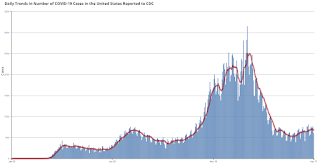
This graph shows the daily (columns) 7 day average (line) of positive tests reported.
Note: The ups and downs during the Winter surge were related to reporting delays due to the Thanksgiving and Christmas holidays.
This data is from the CDC.
 Click on graph for larger image.
This graph shows the daily (columns) 7 day average (line) of positive tests reported.
Note: The ups and downs during the Winter surge were related to reporting delays due to the Thanksgiving and Christmas holidays.
This data is from the CDC.
The 7-day average is 66,747, down from 67,964 yesterday, and close to the summer surge peak of 67,337 on July 23, 2020.
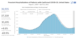
The second graph shows the number of people hospitalized.
 This data is also from the CDC.
The CDC cautions that due to reporting delays, the area in grey will probably increase.
The second graph shows the number of people hospitalized.
 This data is also from the CDC.
The CDC cautions that due to reporting delays, the area in grey will probably increase.
The current 7-day average is 36,118, down from 36,976, reported yesterday, and well above the post-summer surge low of 23,000.
MBA Survey: "Share of Mortgage Loans in Forbearance Decreases to 4.50%"
by Calculated Risk on 4/19/2021 04:00:00 PM
Note: This is as of April 11th.
From the MBA: Share of Mortgage Loans in Forbearance Decreases to 4.50%
The Mortgage Bankers Association’s (MBA) latest Forbearance and Call Volume Survey revealed that the total number of loans now in forbearance decreased by 16 basis points from 4.66% of servicers’ portfolio volume in the prior week to 4.50% as of April 11, 2021. According to MBA’s estimate, 2.3 million homeowners are in forbearance plans.
...
“The share of loans in forbearance decreased for the seventh straight week and has now dropped 40 basis points in the last two weeks. The forbearance share decreased for all three investor categories, with the rate for portfolio and PLS loans decreasing by 31 basis points this past week – the largest drop across investor categories,” said Mike Fratantoni, MBA’s Senior Vice President and Chief Economist. “Forbearance exits increased for portfolio and PLS loans but decreased for GSE and Ginnie Mae loans. More than 36 percent of borrowers in forbearance extensions have now exceeded the 12-month mark.”
Fratantoni added, “Economic data on home construction and consumer spending in March show a strong housing market and a quickened pace of economic activity. Combined with the homeowner assistance and stimulus payments that many households are receiving, we expect that the forbearance numbers will continue to decline in the months ahead as more individuals regain employment. Homeowners who are still facing hardships and need to extend their forbearance term should contact their servicers.”
emphasis added
 Click on graph for larger image.
This graph shows the percent of portfolio in forbearance by investor type over time. Most of the increase was in late March and early April, and has trended down since then.
The MBA notes: "Total weekly forbearance requests as a percent of servicing portfolio volume (#) remained flat relative to the prior week at 0.05%."
Recession Measures and NBER
by Calculated Risk on 4/19/2021 01:30:00 PM
Calling the beginning or end of a recession usually takes time. However, the economic decline in March 2020 was so severe that the National Bureau of Economic Research (NBER) quickly called the end of the expansion in February.
The committee has determined that a peak in monthly economic activity occurred in the U.S. economy in February 2020. The peak marks the end of the expansion that began in June 2009 and the beginning of a recession. The expansion lasted 128 months, the longest in the history of U.S. business cycles dating back to 1854. The previous record was held by the business expansion that lasted for 120 months from March 1991 to March 2001.The NBER will probably wait some time before calling the end of the recession, this process can take from 18 months to two years or longer. It is likely the NBER will date the beginning of the expansion in Q2 2020.
...
The usual definition of a recession involves a decline in economic activity that lasts more than a few months. However, in deciding whether to identify a recession, the committee weighs the depth of the contraction, its duration, and whether economic activity declined broadly across the economy (the diffusion of the downturn). The committee recognizes that the pandemic and the public health response have resulted in a downturn with different characteristics and dynamics than prior recessions. Nonetheless, it concluded that the unprecedented magnitude of the decline in employment and production, and its broad reach across the entire economy, warrants the designation of this episode as a recession, even if it turns out to be briefer than earlier contractions.
It will take some time for all major indicators to be above their previous high after the pandemic recession because of the severe contraction as the graphs below show.
GDP is the key measure, as the NBER committee notes in their business cycle dating procedure:
The committee views real GDP as the single best measure of aggregate economic activity.
 Click on graph for larger image.
This graph is for real GDP through Q4 2020.
This is the key measure, and the NBER will probably use GDP and GDI to determine the trough of the recession (likely in April and in Q2 2020).
As of Q4, real GDP was 2.5% below the pre-recession peak.
Most forecasters expect GDP to increase strongly in Q1 2021, but even with a 7% annualized increase, real GDP will be down about 0.8% from Q4 2019.
Real GDP will likely be above Q4 2019 levels in Q2 2021.
 The second graph is for monthly industrial production based on data from the Federal Reserve through Mar 2021.
Industrial production is off over 4.5% from the pre-recession peak.
Note that industrial production was weak prior to the onset of the pandemic.
Industrial production usually takes a long time to recover after a significant decline.
 The third graph is for employment through March 2021.
Historically employment was a coincident indicator for the end of recessions, but that hasn't been true for the previous three recessions (1990-1991, 2001, 2007-2009).
Employment is currently off about 5.5% from the pre-recession peak (dashed line). This is a significant improvement from off 14.6% in April 2020.
There is still a long way to go for employment to recover to pre-pandemic levels.
 And the last graph is for real personal income excluding transfer payments through Feb 2021.
Real personal income less transfer payments was still off 2.5% in February.
These graphs are useful in trying to identify peaks and troughs in economic activity.
Economic activity bottomed in Q2 (in April).
Housing Inventory April 19th Update: A Slight Increase from Record Low
by Calculated Risk on 4/19/2021 10:42:00 AM
One of the key questions for 2021 is: Will inventory increase as the pandemic subsides, or will inventory decrease further in 2021?
Tracking inventory will be very important this year.
 Click on graph for larger image in graph gallery.
This inventory graph is courtesy of Altos Research.
As of April 16th, inventory was at 312 thousand (7 day average), compared to 749 thousand the same week a year ago. That is a decline of 58%.
A week ago, inventory was at 307 thousand, and was down 59% YoY. Seasonally, inventory might have bottomed.
Mike Simonsen discusses this data regularly on Youtube.
Mike Simonsen discusses this data regularly on Youtube.
Seven High Frequency Indicators for the Economy
by Calculated Risk on 4/19/2021 08:11:00 AM
These indicators are mostly for travel and entertainment. It will interesting to watch these sectors recover as the vaccine is distributed.
IMPORTANT: Be safe now - if all goes well, we could all be vaccinated by June.
----- Airlines: Transportation Security Administration -----
The TSA is providing daily travel numbers.
 Click on graph for larger image.
This data shows the seven day average of daily total traveler throughput from the TSA for 2019 (Light Blue), 2020 (Blue) and 2021 (Red).
The dashed line is the percent of 2019 for the seven day average.
This data is as of April 18th.
The seven day average is down 42.1% from the same day in 2019 (57.9% of last year). (Dashed line)
There was a slow increase from the bottom, with ups and downs due to the holidays - and TSA data has picked up in 2021, but down over the last week.
----- Restaurants: OpenTable -----
The second graph shows the 7 day average of the year-over-year change in diners as tabulated by OpenTable for the US and several selected cities.
----- Hotel Occupancy: STR -----
 This graph shows the seasonal pattern for the hotel occupancy rate using the four week average.
The red line is for 2021, black is 2020, blue is the median, and dashed light blue is for 2009 (the worst year since the Great Depression for hotels - before 2020).
Occupancy is now above the horrible 2009 levels.
This data is through April 10th. Hotel occupancy is currently down 15% compared to same week in 2019). Note: Occupancy was up year-over-year, since occupancy declined sharply at the onset of the pandemic. However, occupancy is still down significantly from normal levels.
Notes: Y-axis doesn't start at zero to better show the seasonal change.
----- Gasoline Supplied: Energy Information Administration -----
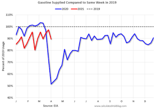 This graph, based on weekly data from the U.S. Energy Information Administration (EIA), shows gasoline supplied compared to the same week of 2019.
Blue is for 2020. Red is for 2021.
As of April 9th, gasoline supplied was off about 5.1% (about 94.9% of the same week in 2019).
Gasoline supplied was up year-over-year, since at one point, gasoline supplied was off almost 50% YoY in 2020.
----- Transit: Apple Mobility -----
This graph is from Apple mobility. From Apple: "This data is generated by counting the number of requests made to Apple Maps for directions in select countries/regions, sub-regions, and cities." This is just a general guide - people that regularly commute probably don't ask for directions.
There is also some great data on mobility from the Dallas Fed Mobility and Engagement Index. However the index is set "relative to its weekday-specific average over January–February", and is not seasonally adjusted, so we can't tell if an increase in mobility is due to recovery or just the normal increase in the Spring and Summer.
 This data is through April 17th for the United States and several selected cities.
The graph is the running 7 day average to remove the impact of weekends.
IMPORTANT: All data is relative to January 13, 2020. This data is NOT Seasonally Adjusted. People walk and drive more when the weather is nice, so I'm just using the transit data.
According to the Apple data directions requests, public transit in the 7 day average for the US is at 66% of the January 2020 level. It is at 62% in Chicago, and 61% in Houston (the Houston dip was a weather related decline) - and moving up recently.
----- New York City Subway Usage -----
Here is some interesting data on New York subway usage (HT BR).
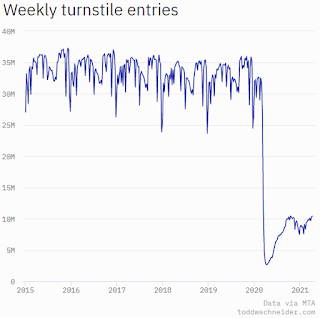 This graph is from Todd W Schneider. This is weekly data since 2015.
The TSA is providing daily travel numbers.
 Click on graph for larger image.
This data shows the seven day average of daily total traveler throughput from the TSA for 2019 (Light Blue), 2020 (Blue) and 2021 (Red).
The dashed line is the percent of 2019 for the seven day average.
This data is as of April 18th.
The seven day average is down 42.1% from the same day in 2019 (57.9% of last year). (Dashed line)
There was a slow increase from the bottom, with ups and downs due to the holidays - and TSA data has picked up in 2021, but down over the last week.
The second graph shows the 7 day average of the year-over-year change in diners as tabulated by OpenTable for the US and several selected cities.
IMPORTANT: OpenTable notes: "we’ve updated the data including downloadable dataset from January 1, 2021 onward to compare seated diners from 2021 to 2019, as opposed to year over year." Thanks!
 Thanks to OpenTable for providing this restaurant data:
This data is updated through April 17, 2021.
This data is "a sample of restaurants on the OpenTable network across all channels: online reservations, phone reservations, and walk-ins. For year-over-year comparisons by day, we compare to the same day of the week from the same week in the previous year."
Note that this data is for "only the restaurants that have chosen to reopen in a given market". Since some restaurants have not reopened, the actual year-over-year decline is worse than shown.
Dining picked up during the holidays, then slumped with the huge winter surge in cases. Dining was picking up again, but turned down last week.
----- Movie Tickets: Box Office Mojo -----
 This data shows domestic box office for each week and the median for the years 2016 through 2019 (dashed light blue).
 Thanks to OpenTable for providing this restaurant data:
This data is updated through April 17, 2021.
This data is "a sample of restaurants on the OpenTable network across all channels: online reservations, phone reservations, and walk-ins. For year-over-year comparisons by day, we compare to the same day of the week from the same week in the previous year."
Note that this data is for "only the restaurants that have chosen to reopen in a given market". Since some restaurants have not reopened, the actual year-over-year decline is worse than shown.
Dining picked up during the holidays, then slumped with the huge winter surge in cases. Dining was picking up again, but turned down last week.
 This data shows domestic box office for each week and the median for the years 2016 through 2019 (dashed light blue).
 Blue is 2020 and Red is 2021.
The data is from BoxOfficeMojo through Apr 15th.
Note that the data is usually noisy week-to-week and depends on when blockbusters are released.
Movie ticket sales were at $33 million last week, down about 75% from the median for the week.
Note that the data is usually noisy week-to-week and depends on when blockbusters are released.
Movie ticket sales were at $33 million last week, down about 75% from the median for the week.
 This graph shows the seasonal pattern for the hotel occupancy rate using the four week average.
 The red line is for 2021, black is 2020, blue is the median, and dashed light blue is for 2009 (the worst year since the Great Depression for hotels - before 2020).
Occupancy is now above the horrible 2009 levels.
This data is through April 10th. Hotel occupancy is currently down 15% compared to same week in 2019). Note: Occupancy was up year-over-year, since occupancy declined sharply at the onset of the pandemic. However, occupancy is still down significantly from normal levels.
Notes: Y-axis doesn't start at zero to better show the seasonal change.
 This graph, based on weekly data from the U.S. Energy Information Administration (EIA), shows gasoline supplied compared to the same week of 2019.
Blue is for 2020. Red is for 2021.
As of April 9th, gasoline supplied was off about 5.1% (about 94.9% of the same week in 2019).
Gasoline supplied was up year-over-year, since at one point, gasoline supplied was off almost 50% YoY in 2020.
This graph is from Apple mobility. From Apple: "This data is generated by counting the number of requests made to Apple Maps for directions in select countries/regions, sub-regions, and cities." This is just a general guide - people that regularly commute probably don't ask for directions.
There is also some great data on mobility from the Dallas Fed Mobility and Engagement Index. However the index is set "relative to its weekday-specific average over January–February", and is not seasonally adjusted, so we can't tell if an increase in mobility is due to recovery or just the normal increase in the Spring and Summer.
 This data is through April 17th for the United States and several selected cities.
The graph is the running 7 day average to remove the impact of weekends.
IMPORTANT: All data is relative to January 13, 2020. This data is NOT Seasonally Adjusted. People walk and drive more when the weather is nice, so I'm just using the transit data.
According to the Apple data directions requests, public transit in the 7 day average for the US is at 66% of the January 2020 level. It is at 62% in Chicago, and 61% in Houston (the Houston dip was a weather related decline) - and moving up recently.
Here is some interesting data on New York subway usage (HT BR).
 This graph is from Todd W Schneider. This is weekly data since 2015.
 Most weeks are between 30 and 35 million entries, and currently there just above 10 million subway turnstile entries per week.
This data is through Friday, April 16th.
Schneider has graphs for each borough, and links to all the data sources.
He notes: "Data updates weekly from the MTA’s public turnstile data, usually on Saturday mornings".
This data is through Friday, April 16th.
Schneider has graphs for each borough, and links to all the data sources.
He notes: "Data updates weekly from the MTA’s public turnstile data, usually on Saturday mornings".
Sunday, April 18, 2021
Sunday Night Futures
by Calculated Risk on 4/18/2021 07:38:00 PM
Weekend:
• Schedule for Week of April 18, 2021
Monday:
• No major economic releases scheduled.
From CNBC: Pre-Market Data and Bloomberg futures S&P 500 futures are down 10 and DOW futures are down 75 (fair value).
Oil prices were up over the last week with WTI futures at $62.88 per barrel and Brent at $66.49 per barrel. A year ago, WTI were below zero, and Brent was at $17 - so WTI oil prices are UP sharply year-over-year (oil prices collapsed at the beginning of the pandemic).
Here is a graph from Gasbuddy.com for nationwide gasoline prices. Nationally prices are at $2.85 per gallon. A year ago prices were at $1.77 per gallon, so gasoline prices are up $1.08 per gallon year-over-year.
April 18th COVID-19 Vaccinations, New Cases, Hospitalizations; Over Half of People Over 18 Have Had at Least One Dose
by Calculated Risk on 4/18/2021 04:26:00 PM
Note: I'm looking forward to not posting this daily! I've been posting this data daily for over a year, and I'll stop once all three of these criteria are met:
1) 70% of the population over 18 has had at least one dose of vaccine,
2) new cases are under 5,000 per day, and
3) hospitalizations are below 3,000.
According to the CDC, 209.4 million doses have been administered. 32.5% of the population over 18 is fully vaccinated, and 50.4% of the population over 18 has had at least one dose (130.0 million people over 18 have had at least one dose).
And check out COVID Act Now to see how each state is doing.
Almost 12,000 US deaths were reported so far in April due to COVID.
 Click on graph for larger image.
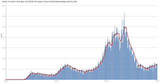
This graph shows the daily (columns) 7 day average (line) of positive tests reported.
Note: The ups and downs during the Winter surge were related to reporting delays due to the Thanksgiving and Christmas holidays.
This data is from the CDC.
 Click on graph for larger image.
This graph shows the daily (columns) 7 day average (line) of positive tests reported.
Note: The ups and downs during the Winter surge were related to reporting delays due to the Thanksgiving and Christmas holidays.
This data is from the CDC.
The 7-day average is 67,442, down from 68,509 yesterday, but above the summer surge peak of 67,337 on July 23, 2020.
The second graph shows the number of people hospitalized.
 This data is also from the CDC.
The CDC cautions that due to reporting delays, the area in grey will probably increase.
The second graph shows the number of people hospitalized.
 This data is also from the CDC.
The CDC cautions that due to reporting delays, the area in grey will probably increase.
The current 7-day average is 36,976, down from 37,339 reported yesterday, and well above the post-summer surge low of 23,000.
Existing Home Sales: Lawler vs. the Consensus
by Calculated Risk on 4/18/2021 01:36:00 PM
Housing economist Tom Lawler has been sending me his predictions of what the NAR will report for 11 years. And he has graciously allowed me to share his predictions with the readers of this blog.
The table below shows the consensus for each month, Lawler's predictions, and the NAR's initially reported level of sales.
Lawler hasn't always been closer than the consensus, but usually when there has been a fairly large spread between Lawler's estimate and the "consensus", Lawler has been closer.
For example, last month Lawler estimated the NAR would report sales of 6.29 million SAAR, the consensus was 6.51 million SAAR, and the NAR reported 6.22 million SAAR.
The NAR is scheduled to release Existing Home Sales for March at 10:00 AM, Thursday, April 22nd.
The consensus is for 6.17 million SAAR in March, down from 6.22 million in Febuary. Tom Lawler estimates the NAR will report sales of 6.02 million SAAR. Based on Lawler's estimate, I expect existing home sales to be below the consensus in March.
NOTE: There have been times when Lawler "missed", but then he pointed out an apparent error in the NAR data - and the subsequent revision corrected that error. As an example, see: The “Curious Case” of Existing Home Sales in the South in April
Over the last 11 years, the consensus average miss was 147 thousand, and Lawler's average miss was 73 thousand.
| Existing Home Sales, Forecasts and NAR Report millions, seasonally adjusted annual rate basis (SAAR) | |||
|---|---|---|---|
| Month | Consensus | Lawler | NAR reported1 |
| May-10 | 6.20 | 5.83 | 5.66 |
| Jun-10 | 5.30 | 5.30 | 5.37 |
| Jul-10 | 4.66 | 3.95 | 3.83 |
| Aug-10 | 4.10 | 4.10 | 4.13 |
| Sep-10 | 4.30 | 4.50 | 4.53 |
| Oct-10 | 4.50 | 4.46 | 4.43 |
| Nov-10 | 4.85 | 4.61 | 4.68 |
| Dec-10 | 4.90 | 5.13 | 5.28 |
| Jan-11 | 5.20 | 5.17 | 5.36 |
| Feb-11 | 5.15 | 5.00 | 4.88 |
| Mar-11 | 5.00 | 5.08 | 5.10 |
| Apr-11 | 5.20 | 5.15 | 5.05 |
| May-11 | 4.75 | 4.80 | 4.81 |
| Jun-11 | 4.90 | 4.71 | 4.77 |
| Jul-11 | 4.92 | 4.69 | 4.67 |
| Aug-11 | 4.75 | 4.92 | 5.03 |
| Sep-11 | 4.93 | 4.83 | 4.91 |
| Oct-11 | 4.80 | 4.86 | 4.97 |
| Nov-11 | 5.08 | 4.40 | 4.42 |
| Dec-11 | 4.60 | 4.64 | 4.61 |
| Jan-12 | 4.69 | 4.66 | 4.57 |
| Feb-12 | 4.61 | 4.63 | 4.59 |
| Mar-12 | 4.62 | 4.59 | 4.48 |
| Apr-12 | 4.66 | 4.53 | 4.62 |
| May-12 | 4.57 | 4.66 | 4.55 |
| Jun-12 | 4.65 | 4.56 | 4.37 |
| Jul-12 | 4.50 | 4.47 | 4.47 |
| Aug-12 | 4.55 | 4.87 | 4.82 |
| Sep-12 | 4.75 | 4.70 | 4.75 |
| Oct-12 | 4.74 | 4.84 | 4.79 |
| Nov-12 | 4.90 | 5.10 | 5.04 |
| Dec-12 | 5.10 | 4.97 | 4.94 |
| Jan-13 | 4.90 | 4.94 | 4.92 |
| Feb-13 | 5.01 | 4.87 | 4.98 |
| Mar-13 | 5.03 | 4.89 | 4.92 |
| Apr-13 | 4.92 | 5.03 | 4.97 |
| May-13 | 5.00 | 5.20 | 5.18 |
| Jun-13 | 5.27 | 4.99 | 5.08 |
| Jul-13 | 5.13 | 5.33 | 5.39 |
| Aug-13 | 5.25 | 5.35 | 5.48 |
| Sep-13 | 5.30 | 5.26 | 5.29 |
| Oct-13 | 5.13 | 5.08 | 5.12 |
| Nov-13 | 5.02 | 4.98 | 4.90 |
| Dec-13 | 4.90 | 4.96 | 4.87 |
| Jan-14 | 4.70 | 4.67 | 4.62 |
| Feb-14 | 4.64 | 4.60 | 4.60 |
| Mar-14 | 4.56 | 4.64 | 4.59 |
| Apr-14 | 4.67 | 4.70 | 4.65 |
| May-14 | 4.75 | 4.81 | 4.89 |
| Jun-14 | 4.99 | 4.96 | 5.04 |
| Jul-14 | 5.00 | 5.09 | 5.15 |
| Aug-14 | 5.18 | 5.12 | 5.05 |
| Sep-14 | 5.09 | 5.14 | 5.17 |
| Oct-14 | 5.15 | 5.28 | 5.26 |
| Nov-14 | 5.20 | 4.90 | 4.93 |
| Dec-14 | 5.05 | 5.15 | 5.04 |
| Jan-15 | 5.00 | 4.90 | 4.82 |
| Feb-15 | 4.94 | 4.87 | 4.88 |
| Mar-15 | 5.04 | 5.18 | 5.19 |
| Apr-15 | 5.22 | 5.20 | 5.04 |
| May-15 | 5.25 | 5.29 | 5.35 |
| Jun-15 | 5.40 | 5.45 | 5.49 |
| Jul-15 | 5.41 | 5.64 | 5.59 |
| Aug-15 | 5.50 | 5.54 | 5.31 |
| Sep-15 | 5.35 | 5.56 | 5.55 |
| Oct-15 | 5.41 | 5.33 | 5.36 |
| Nov-15 | 5.32 | 4.97 | 4.76 |
| Dec-15 | 5.19 | 5.36 | 5.46 |
| Jan-16 | 5.32 | 5.36 | 5.47 |
| Feb-16 | 5.30 | 5.20 | 5.08 |
| Mar-16 | 5.27 | 5.27 | 5.33 |
| Apr-16 | 5.40 | 5.44 | 5.45 |
| May-16 | 5.64 | 5.55 | 5.53 |
| Jun-16 | 5.48 | 5.62 | 5.57 |
| Jul-16 | 5.52 | 5.41 | 5.39 |
| Aug-16 | 5.44 | 5.49 | 5.33 |
| Sep-16 | 5.35 | 5.55 | 5.47 |
| Oct-16 | 5.44 | 5.47 | 5.60 |
| Nov-16 | 5.54 | 5.60 | 5.61 |
| Dec-16 | 5.54 | 5.55 | 5.49 |
| Jan-17 | 5.55 | 5.60 | 5.69 |
| Feb-17 | 5.55 | 5.41 | 5.48 |
| Mar-17 | 5.61 | 5.74 | 5.71 |
| Apr-17 | 5.67 | 5.56 | 5.57 |
| May-17 | 5.55 | 5.65 | 5.62 |
| Jun-17 | 5.58 | 5.59 | 5.52 |
| Jul-17 | 5.57 | 5.38 | 5.44 |
| Aug-17 | 5.48 | 5.39 | 5.35 |
| Sep-17 | 5.30 | 5.38 | 5.39 |
| Oct-17 | 5.30 | 5.60 | 5.48 |
| Nov-17 | 5.52 | 5.77 | 5.81 |
| Dec-17 | 5.75 | 5.66 | 5.57 |
| Jan-18 | 5.65 | 5.48 | 5.38 |
| Feb-18 | 5.42 | 5.44 | 5.54 |
| Mar-18 | 5.28 | 5.51 | 5.60 |
| Apr-18 | 5.60 | 5.48 | 5.46 |
| May-18 | 5.56 | 5.47 | 5.43 |
| Jun-18 | 5.45 | 5.35 | 5.38 |
| Jul-18 | 5.43 | 5.40 | 5.34 |
| Aug-18 | 5.36 | 5.36 | 5.34 |
| Sep-18 | 5.30 | 5.20 | 5.15 |
| Oct-18 | 5.20 | 5.31 | 5.22 |
| Nov-18 | 5.19 | 5.23 | 5.32 |
| Dec-18 | 5.24 | 4.97 | 4.99 |
| Jan-19 | 5.05 | 4.92 | 4.94 |
| Feb-19 | 5.08 | 5.46 | 5.51 |
| Mar-19 | 5.30 | 5.40 | 5.21 |
| Apr-19 | 5.36 | 5.31 | 5.19 |
| May-19 | 5.29 | 5.40 | 5.34 |
| Jun-19 | 5.34 | 5.25 | 5.27 |
| Jul-19 | 5.39 | 5.40 | 5.42 |
| Aug-19 | 5.38 | 5.42 | 5.49 |
| Sep-19 | 5.45 | 5.36 | 5.38 |
| Oct-19 | 5.49 | 5.36 | 5.46 |
| Nov-19 | 5.45 | 5.43 | 5.35 |
| Dec-19 | 5.43 | 5.40 | 5.54 |
| Jan-20 | 5.45 | 5.42 | 5.46 |
| Feb-20 | 5.50 | 5.58 | 5.77 |
| Mar-20 | 5.30 | 5.25 | 5.27 |
| Apr-20 | 4.30 | 4.17 | 4.33 |
| May-20 | 4.38 | 3.80 | 3.91 |
| Jun-20 | 4.86 | 4.65 | 4.72 |
| Jul-20 | 5.39 | 5.85 | 5.86 |
| Aug-20 | 6.00 | 5.92 | 6.00 |
| Sep-20 | 6.25 | 6.38 | 6.54 |
| Oct-20 | 6.45 | 6.63 | 6.85 |
| Nov-20 | 6.70 | 6.50 | 6.69 |
| Dec-20 | 6.55 | 6.62 | 6.76 |
| Jan-20 | 6.60 | 6.48 | 6.69 |
| Feb-20 | 6.51 | 6.29 | 6.22 |
| Mar-20 | 6.17 | 6.02 | NA |
| 1NAR initially reported before revisions. | |||
Saturday, April 17, 2021
April 17th COVID-19 Vaccinations, New Cases, Hospitalizations
by Calculated Risk on 4/17/2021 07:29:00 PM
Note: I'm looking forward to not posting this daily! I've been posting this data daily for over a year, and I'll stop once all three of these criteria are met:
1) 70% of the population over 18 has had at least one dose of vaccine,
2) new cases are under 5,000 per day, and
3) hospitalizations are below 3,000.
According to the CDC, 205.9 million doses have been administered. 31.8% of the population over 18 is fully vaccinated, and 49.7% of the population over 18 has had at least one dose (128.3 million people over 18 have had at least one dose).
And check out COVID Act Now to see how each state is doing.
Over 11,000 US deaths were reported so far in April due to COVID.
 Click on graph for larger image.
This graph shows the daily (columns) 7 day average (line) of positive tests reported.
Note: The ups and downs during the Winter surge were related to reporting delays due to the Thanksgiving and Christmas holidays.
This data is from the CDC.
 Click on graph for larger image.
This graph shows the daily (columns) 7 day average (line) of positive tests reported.
Note: The ups and downs during the Winter surge were related to reporting delays due to the Thanksgiving and Christmas holidays.
This data is from the CDC.
The 7-day average is 68509, down from 69182 yesterday, but above the summer surge peak of 67,337 on July 23, 2020.
The second graph shows the number of people hospitalized.
 This data is also from the CDC.
The CDC cautions that due to reporting delays, the area in grey will probably increase.
The second graph shows the number of people hospitalized.
 This data is also from the CDC.
The CDC cautions that due to reporting delays, the area in grey will probably increase.
The current 7-day average is 37,339, up from 37,246 reported yesterday, and well above the post-summer surge low of 23,000.


