 RSS Feed
 by Calculated Risk on 4/12/2021 09:00:00 PM
Monday, April 12, 2021
Tuesday: CPI
From Matthew Graham at Mortgage News Daily: MBS RECAP: Bonds Look Past Weaker Treasury Auction
Today's relatively calm reaction to a fairly weak 10yr auction continues the recent tradition of bonds NOT freaking out every chance they get. ... [30 year fixed 3.28%]Tuesday:
emphasis added
• At 6:00 AM ET, NFIB Small Business Optimism Index for March.
• At 8:30 AM, The Consumer Price Index for March from the BLS. The consensus is for 0.5% increase in CPI, and a 0.2% increase in core CPI.
April 12th COVID-19 Vaccinations, New Cases, Hospitalizations
by Calculated Risk on 4/12/2021 05:39:00 PM
Note: I'm looking forward to not posting this daily! I've been posting this data daily for over a year, and I'll stop once all three of these criteria are met:
1) 70% of the population over 18 has had at least one dose of vaccine,
2) new cases are under 5,000 per day, and
3) hospitalizations are below 3,000.
According to the CDC, 189.7 million doses have been administered. 28.6% of the population over 18 is fully vaccinated, and 46.5% of the population over 18 has had at least one dose (120.0 million people have had at least one dose).
And check out COVID Act Now to see how each state is doing.
Almost 7,500 US deaths were reported so far in April due to COVID.
 Click on graph for larger image.
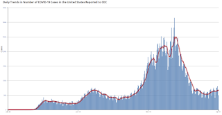
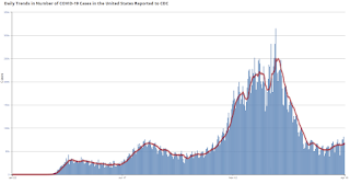
This graph shows the daily (columns) 7 day average (line) of positive tests reported.
Note: The ups and downs during the Winter surge were related to reporting delays due to the Thanksgiving and Christmas holidays.
This data is from the CDC.
 Click on graph for larger image.
This graph shows the daily (columns) 7 day average (line) of positive tests reported.
Note: The ups and downs during the Winter surge were related to reporting delays due to the Thanksgiving and Christmas holidays.
This data is from the CDC.
The 7-day average is 67,653, up from 66,485 yesterday, and above the summer surge peak of 67,337 on July 23, 2020.
The second graph shows the number of people hospitalized.
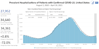 This data is also from the CDC.
The CDC cautions that due to reporting delays, the area in grey will probably increase.
The second graph shows the number of people hospitalized.
 This data is also from the CDC.
The CDC cautions that due to reporting delays, the area in grey will probably increase.
The current 7-day average is 34,640, down from 35,504 reported yesterday, and well above the post-summer surge low of 23,000.
MBA Survey: "Share of Mortgage Loans in Forbearance Decreases to 4.66%"
by Calculated Risk on 4/12/2021 04:00:00 PM
Note: This is as of April 4th.
From the MBA: Share of Mortgage Loans in Forbearance Decreases to 4.66%
The Mortgage Bankers Association’s (MBA) latest Forbearance and Call Volume Survey revealed that the total number of loans now in forbearance decreased by 24 basis points from 4.90% of servicers’ portfolio volume in the prior week to 4.66% as of April 4, 2021. According to MBA’s estimate, 2.3 million homeowners are in forbearance plans.
...
“The share of loans in forbearance decreased for the sixth straight week, dropping by 24 basis points – one of the largest decreases in the history of the series. The forbearance share also decreased significantly for all three investor categories, with the rate for Ginnie Mae loans down an impressive 45 basis points. Overall, forbearance exits increased to their fastest pace since early November,” said Mike Fratantoni, MBA’s Senior Vice President and Chief Economist. “Almost 32 percent of borrowers in forbearance extensions have now exceeded the 12-month mark. In terms of performance, more than 88% of homeowners who have exited into deferral plans, modifications, or repayment plans were current on their loans at the end of March, compared to 92% of all homeowners.”
Fratantoni added, “The accelerating economic recovery in March helped more homeowners recover and become current on their mortgages, in addition to helping other homeowners with more stable financial situations exit forbearance. Homeowners who are still facing hardships and need to extend their forbearance term should contact their servicers.”
emphasis added
 Click on graph for larger image.
This graph shows the percent of portfolio in forbearance by investor type over time. Most of the increase was in late March and early April, and has trended down since then.
The MBA notes: "Total weekly forbearance requests as a percent of servicing portfolio volume (#) increased relative to the prior week: from 0.04% to 0.05%."
Colorado Real Estate in March: Sales Up 13% YoY, Inventory Down 69% YoY
by Calculated Risk on 4/12/2021 01:12:00 PM
From the Colorado Association of REALTORS® for the entire state:
Closed sales for Single Family and Townhouse-Condo in March 2021 were 10,558, up 13.2% from 9,324 in March 2020.
Active Listings for Single Family and Townhouse-Condo in March 2021 were 6,732, down 69.0% from 21,729 in March 2020.
Months of Supply was 0.6 Months in March 2021, compared to 2.2 Months in March 2020.
Housing Inventory April 12th Update: At Record Lows
by Calculated Risk on 4/12/2021 10:45:00 AM
One of the key questions for 2021 is: Will inventory increase as the pandemic subsides, or will inventory decrease further in 2021?
Tracking inventory will be very important this year.
 Click on graph for larger image in graph gallery.
This inventory graph is courtesy of Altos Research.
As of April 9th, inventory was at 307 thousand (7 day average), compared to 749 thousand the same week a year ago. That is a decline of 59%.
A week ago, inventory was at 310 thousand, and was down 59% YoY. Seasonally, inventory should bottom soon.
Mike Simonsen discusses this data regularly on Youtube.
Mike Simonsen discusses this data regularly on Youtube.
Minnesota Real Estate in March: Sales Up 3% YoY, Inventory Down 55% YoY
by Calculated Risk on 4/12/2021 10:11:00 AM
Note: I'm tracking data for many local markets around the U.S. I think it is especially important to watch inventory this year.
From the Minnesota Realtors®:
Total Residential Units Sold in March 2021 were 5,917, up 3.1% from 5,741 in March 2020.
Active Residential Listings in March 2021 were 7,738, down 54.8% from 17,124 in March 2020.
Months of Supply was 1.0 Months in March 2021, compared to 2.4 Months in March 2020.
 Click on graph for larger image.
This graph from the Minnesota Realtors® shows inventory in Minnesota since 2012. Inventory had been trending down, and then was flat over the last couple of years, and then declined significantly during the pandemic.
Seven High Frequency Indicators for the Economy
by Calculated Risk on 4/12/2021 08:17:00 AM
These indicators are mostly for travel and entertainment. It will interesting to watch these sectors recover as the vaccine is distributed.
IMPORTANT: Be safe now - if all goes well, we could all be vaccinated by June.
----- Airlines: Transportation Security Administration -----
The TSA is providing daily travel numbers.
 Click on graph for larger image.
This data shows the seven day average of daily total traveler throughput from the TSA for 2019 (Light Blue), 2020 (Blue) and 2021 (Red).
The dashed line is the percent of 2019 for the seven day average.
This data is as of April 11th.
The seven day average is down 38.7% from the same day in 2019 (61.3% of last year). (Dashed line)
There was a slow increase from the bottom, with ups and downs due to the holidays - and TSA data has picked up in 2021.
----- Restaurants: OpenTable -----
The second graph shows the 7 day average of the year-over-year change in diners as tabulated by OpenTable for the US and several selected cities.
----- Hotel Occupancy: STR -----
 This graph shows the seasonal pattern for the hotel occupancy rate using the four week average.
The red line is for 2021, black is 2020, blue is the median, and dashed light blue is for 2009 (the worst year since the Great Depression for hotels - before 2020).
Occupancy has increased to 2009 levels - and 2009 was horrible for hotels.
This data is through April 3rd. Hotel occupancy is currently down 16% compared to same week in 2019). Note: Occupancy was up year-over-year, since occupancy declined sharply at the onset of the pandemic. However, occupancy is still down significantly from normal levels.
Notes: Y-axis doesn't start at zero to better show the seasonal change.
----- Gasoline Supplied: Energy Information Administration -----
 This graph, based on weekly data from the U.S. Energy Information Administration (EIA), shows gasoline supplied compared to the same week of 2019.
Blue is for 2020. Red is for 2021.
As of April 2nd, gasoline supplied was off about 10.5% (about 89.5% of the same week in 2019).
Gasoline supplied was up year-over-year, since at one point, gasoline supplied was off almost 50% YoY in 2020.
----- Transit: Apple Mobility -----
This graph is from Apple mobility. From Apple: "This data is generated by counting the number of requests made to Apple Maps for directions in select countries/regions, sub-regions, and cities." This is just a general guide - people that regularly commute probably don't ask for directions.
There is also some great data on mobility from the Dallas Fed Mobility and Engagement Index. However the index is set "relative to its weekday-specific average over January–February", and is not seasonally adjusted, so we can't tell if an increase in mobility is due to recovery or just the normal increase in the Spring and Summer.
 This data is through April 10th for the United States and several selected cities.
The graph is the running 7 day average to remove the impact of weekends.
IMPORTANT: All data is relative to January 13, 2020. This data is NOT Seasonally Adjusted. People walk and drive more when the weather is nice, so I'm just using the transit data.
According to the Apple data directions requests, public transit in the 7 day average for the US is at 67% of the January 2020 level. It is at 59% in Chicago, and 62% in Houston (the Houston dip was a weather related decline) - and moving up recently.
----- New York City Subway Usage -----
Here is some interesting data on New York subway usage (HT BR).
 This graph is from Todd W Schneider. This is weekly data since 2015.
The TSA is providing daily travel numbers.
 Click on graph for larger image.
This data shows the seven day average of daily total traveler throughput from the TSA for 2019 (Light Blue), 2020 (Blue) and 2021 (Red).
The dashed line is the percent of 2019 for the seven day average.
This data is as of April 11th.
The seven day average is down 38.7% from the same day in 2019 (61.3% of last year). (Dashed line)
There was a slow increase from the bottom, with ups and downs due to the holidays - and TSA data has picked up in 2021.
The second graph shows the 7 day average of the year-over-year change in diners as tabulated by OpenTable for the US and several selected cities.
IMPORTANT: OpenTable notes: "we’ve updated the data including downloadable dataset from January 1, 2021 onward to compare seated diners from 2021 to 2019, as opposed to year over year." Thanks!
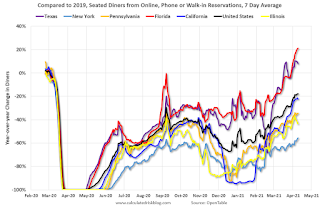 Thanks to OpenTable for providing this restaurant data:
This data is updated through April 9, 2021.
This data is "a sample of restaurants on the OpenTable network across all channels: online reservations, phone reservations, and walk-ins. For year-over-year comparisons by day, we compare to the same day of the week from the same week in the previous year."
Note that this data is for "only the restaurants that have chosen to reopen in a given market". Since some restaurants have not reopened, the actual year-over-year decline is worse than shown.
Dining picked up during the holidays, then slumped with the huge winter surge in cases. Dining is picking up again - and is above 2019 in Texas and Florida.
----- Movie Tickets: Box Office Mojo -----
 This data shows domestic box office for each week and the median for the years 2016 through 2019 (dashed light blue).
 Thanks to OpenTable for providing this restaurant data:
This data is updated through April 9, 2021.
This data is "a sample of restaurants on the OpenTable network across all channels: online reservations, phone reservations, and walk-ins. For year-over-year comparisons by day, we compare to the same day of the week from the same week in the previous year."
Note that this data is for "only the restaurants that have chosen to reopen in a given market". Since some restaurants have not reopened, the actual year-over-year decline is worse than shown.
Dining picked up during the holidays, then slumped with the huge winter surge in cases. Dining is picking up again - and is above 2019 in Texas and Florida.
 This data shows domestic box office for each week and the median for the years 2016 through 2019 (dashed light blue).
 Blue is 2020 and Red is 2021.
The data is from BoxOfficeMojo through Apr 8th.
Note that the data is usually noisy week-to-week and depends on when blockbusters are released.
Movie ticket sales were at $49 million last week, down about 71% from the median for the week.
Note that the data is usually noisy week-to-week and depends on when blockbusters are released.
Movie ticket sales were at $49 million last week, down about 71% from the median for the week.
 This graph shows the seasonal pattern for the hotel occupancy rate using the four week average.
 The red line is for 2021, black is 2020, blue is the median, and dashed light blue is for 2009 (the worst year since the Great Depression for hotels - before 2020).
Occupancy has increased to 2009 levels - and 2009 was horrible for hotels.
This data is through April 3rd. Hotel occupancy is currently down 16% compared to same week in 2019). Note: Occupancy was up year-over-year, since occupancy declined sharply at the onset of the pandemic. However, occupancy is still down significantly from normal levels.
Notes: Y-axis doesn't start at zero to better show the seasonal change.
 This graph, based on weekly data from the U.S. Energy Information Administration (EIA), shows gasoline supplied compared to the same week of 2019.
Blue is for 2020. Red is for 2021.
As of April 2nd, gasoline supplied was off about 10.5% (about 89.5% of the same week in 2019).
Gasoline supplied was up year-over-year, since at one point, gasoline supplied was off almost 50% YoY in 2020.
This graph is from Apple mobility. From Apple: "This data is generated by counting the number of requests made to Apple Maps for directions in select countries/regions, sub-regions, and cities." This is just a general guide - people that regularly commute probably don't ask for directions.
There is also some great data on mobility from the Dallas Fed Mobility and Engagement Index. However the index is set "relative to its weekday-specific average over January–February", and is not seasonally adjusted, so we can't tell if an increase in mobility is due to recovery or just the normal increase in the Spring and Summer.
 This data is through April 10th for the United States and several selected cities.
The graph is the running 7 day average to remove the impact of weekends.
IMPORTANT: All data is relative to January 13, 2020. This data is NOT Seasonally Adjusted. People walk and drive more when the weather is nice, so I'm just using the transit data.
According to the Apple data directions requests, public transit in the 7 day average for the US is at 67% of the January 2020 level. It is at 59% in Chicago, and 62% in Houston (the Houston dip was a weather related decline) - and moving up recently.
Here is some interesting data on New York subway usage (HT BR).
 This graph is from Todd W Schneider. This is weekly data since 2015.
 Most weeks are between 30 and 35 million entries, and currently there close to 10 million subway turnstile entries per week.
This data is through Friday, April 9th.
Schneider has graphs for each borough, and links to all the data sources.
He notes: "Data updates weekly from the MTA’s public turnstile data, usually on Saturday mornings".
This data is through Friday, April 9th.
Schneider has graphs for each borough, and links to all the data sources.
He notes: "Data updates weekly from the MTA’s public turnstile data, usually on Saturday mornings".
Sunday, April 11, 2021
Sunday Night Futures
by Calculated Risk on 4/11/2021 07:27:00 PM
Weekend:
• Schedule for Week of April 11, 2021
Monday:
• No major economic releases scheduled.
From CNBC: Pre-Market Data and Bloomberg futures S&P 500 futures are down 5 and DOW futures are down 20 (fair value).
Oil prices were down over the last week with WTI futures at $59.32 per barrel and Brent at $62.95 per barrel. A year ago, WTI was at $22, and Brent was at $20 - so WTI oil prices are UP sharply year-over-year (oil prices collapsed at the beginning of the pandemic).
Here is a graph from Gasbuddy.com for nationwide gasoline prices. Nationally prices are at $2.84 per gallon. A year ago prices were at $1.84 per gallon, so gasoline prices are up $1.00 per gallon year-over-year.
April 11th COVID-19 Vaccinations, New Cases, Hospitalizations
by Calculated Risk on 4/11/2021 07:25:00 PM
Note: I'm looking forward to not posting this daily! I've been posting this data daily for over a year, and I'll stop once all three of these criteria are met:
1) 70% of the population over 18 has had at least one dose of vaccine,
2) new cases are under 5,000 per day, and
3) hospitalizations are below 3,000.
According to the CDC, 187.0 million doses have been administered. 28.1% of the population over 18 is fully vaccinated, and 45.9% of the population over 18 has had at least one dose (118.4 million people have had at least one dose).
And check out COVID Act Now to see how each state is doing.
Over 7,000 US deaths were reported so far in April due to COVID.
 Click on graph for larger image.
This graph shows the daily (columns) 7 day average (line) of positive tests reported.
Note: The ups and downs during the Winter surge were related to reporting delays due to the Thanksgiving and Christmas holidays.
This data is from the CDC.
 Click on graph for larger image.
This graph shows the daily (columns) 7 day average (line) of positive tests reported.
Note: The ups and downs during the Winter surge were related to reporting delays due to the Thanksgiving and Christmas holidays.
This data is from the CDC.
The 7-day average is 66,570, down slightly
from 66,633 yesterday, and close to the summer surge peak of 67,337 on July 23, 2020.
The second graph shows the number of people hospitalized.
 This data is also from the CDC.
The CDC cautions that due to reporting delays, the area in grey will probably increase.
The second graph shows the number of people hospitalized.
 This data is also from the CDC.
The CDC cautions that due to reporting delays, the area in grey will probably increase.
The current 7-day average is 35,504, down from 35,559 reported yesterday, and well above the post-summer surge low of 23,000.
Boston Real Estate in March: Sales Up 21% YoY, Inventory Down 3% YoY
by Calculated Risk on 4/11/2021 02:19:00 PM
Note: I'm tracking data for many local markets around the U.S. I think it is especially important to watch inventory this year.
For Boston (single family and condos):
Closed sales in March 2021 were 1,872, up 21.0% from 1,547 in March 2020.
Active Listings in March 2021 were 3,201, down 3.0% from 3,299 in March 2020.


