 RSS Feed
 by Calculated Risk on 4/05/2021 04:00:00 PM
Monday, April 05, 2021
MBA Survey: "Share of Mortgage Loans in Forbearance Decreases to 4.90%"
Note: This is as of March 28th.
From the MBA: Share of Mortgage Loans in Forbearance Decreases to 4.90%
The Mortgage Bankers Association’s (MBA) latest Forbearance and Call Volume Survey revealed that the total number of loans now in forbearance decreased by 6 basis points from 4.96% of servicers’ portfolio volume in the prior week to 4.90% as of March 28, 2021. According to MBA’s estimate, 2.5 million homeowners are in forbearance plans.
...
“The share of loans in forbearance decreased for the fifth straight week, and new forbearance requests dropped to their lowest level since March 2020. The share of loans in forbearance also decreased for all three investor categories,” said Mike Fratantoni, MBA’s Senior Vice President and Chief Economist. “More than 21 percent of borrowers in forbearance extensions have now exceeded the 12-month mark. Of those that exited forbearance in March, more than 21 percent received a modification, indicating that their income had declined and they could not afford their original mortgage payment.”
Fratantoni added, “March was a turning point for the economy, with hiring shifting into a higher gear and the unemployment rate continuing to decline. However, there are still more than 4.2 million people who have been actively looking for work for more than six months. Homeowners who are still facing hardships and need to extend their forbearance term should contact their servicer.”
emphasis added
 Click on graph for larger image.
This graph shows the percent of portfolio in forbearance by investor type over time. Most of the increase was in late March and early April, and has trended down since then.
The MBA notes: "Total weekly forbearance requests as a percent of servicing portfolio volume (#) decreased relative to the prior week: from 0.05% to 0.04%, the lowest level since the week ending March 15, 2020."
Denver Real Estate in March: Sales Up 1% YoY, Active Inventory Down 67%
by Calculated Risk on 4/05/2021 03:43:00 PM
Note: I'm posting data for many local markets around the U.S. The story is the same everywhere ... inventory is at record lows.
From the DMAR: Monthly Indicators, March 2021
Total Residential Units Sold in March 2021 were 4,889, up 1.2% from 4,831 in March 2020.
Active Residential Listings in March 2021 were 1,921, down 66.7% from 5,776 in March 2020.
Inventory in Denver had been fairly steady over the last 6 or 7 years, but declined sharply in 2020.
Black Knight Mortgage Monitor for February
by Calculated Risk on 4/05/2021 12:21:00 PM
Black Knight released their Mortgage Monitor report for February today. According to Black Knight, 6.00% of mortgages were delinquent in February, up from 5.85% of mortgages in January, and up from 3.28% in February 2020. Black Knight also reported that 0.32% of mortgages were in the foreclosure process, down from 0.45% a year ago.
This gives a total of 6.32% delinquent or in foreclosure.
Press Release: White-Hot Housing Market and Rising Rates Push Affordability Back to 5-Year Average; Low New Listing Volumes Further Constraining Inventory
Today, the Data & Analytics division of Black Knight, Inc. released its latest Mortgage Monitor Report, based upon the company’s industry-leading mortgage, real estate and public records datasets. This month, with the U.S. housing market remaining extremely hot by any historical measure, the report looks at home price appreciation over the past year and how that’s impacted affordability. According to Black Knight Data & Analytics President Ben Graboske, incredibly low levels of for-sale inventory, coupled with still historically low interest rates, continue to put upward pressure on home prices and tighten affordability.
“Our repeat sales-based Black Knight Home Price Index shows February’s annual price appreciation at 11.6%, the fastest growth rate in more than 15 years,” said Graboske. “Likewise, the daily home sales data tracked by our Collateral Analytics group found a nearly 16% year-over-year increase in the median sales price in February. Multiple years of constrained housing inventory and historically low interest rates have helped fuel this fire to the point where nearly 75% of the 100 largest U.S. markets have seen annual home price growth of 10% or higher. What’s more, Collateral Analytics’ Market Conditions Report shows the housing markets in 75% of ZIP codes rated either ‘Strong’ or ‘Hot’ based on underlying market metrics. Only 7% are characterized as ‘Normal.’
“Of course, upward pressure on home prices has also served to tighten affordability, and with rates on the rise, affordability concerns are coming into sharper relief. It now takes 20% of the median income to make the monthly payment on the purchase of an average-priced home, back up to the five-year average after several years of low interest rates mitigating the impact of rising prices on affordability. Housing is now the least affordable it’s been – factoring in interest rates, home prices and income – since mid-2019. Any hopes of 2021 bringing an influx of homes to the market and lessening pressure on prices appear to be dashed for now, as new for-sale listings were down 16% and 21% year-over-year in January and February, respectively. Rather than an influx of homes on the market, we’re now 125,000 fewer new listings in the hole compared to the first two months of 2020 and trending in the wrong direction. With higher interest rates and a continuing shortage of inventory, it will be important to keep a careful eye on both home prices and affordability metrics in the coming months.”
emphasis added
 Click on graph for larger image.
Here is a graph from the Mortgage Monitor that shows Active Inventory and New Listings.
From Black Knight:
• Entering 2021, the number of homes listed for sale was down 32% year-over-year and had fallen to its lowest level on record, according to Black Knight’s Collateral Analytics division
• The hopes that early 2021 would bring much-needed inflow of inventory to a market starved for supply have been dashed so far, with new listing volumes coming in well below pre-pandemic levels
• In fact, the number of homes listed for sale in January was down 16% from the year prior, while new listings in February were down 21%
• Rather than an influx, we now have 125K fewer listings than over the first two months of 2020 and are trending in the wrong direction with inventory down 40% year-over-year
 And on delinquencies from Black Knight:
 • After eight consecutive months of improvement, the national mortgage delinquency rate rose in February from 5.85% to 6.0%There is much more in the mortgage monitor.
• Delinquency rate increases were seen broadly across portfolios, geographies and asset classes
• Despite the rise, 30-day delinquencies remain 19% below pre-pandemic levels, while there are still 5X (+1.7M) as many 90-day delinquencies as there were in February 2020
Housing Inventory April 5th Update: At Record Lows
by Calculated Risk on 4/05/2021 10:47:00 AM
One of the key questions for 2021 is: Will inventory increase as the pandemic subsides, or will inventory decrease further in 2021?
Tracking inventory will be very important this year.
 Click on graph for larger image in graph gallery.
This inventory graph is courtesy of Altos Research.
As of April 2nd, inventory was at 310 thousand (7 day average), compared to 751 thousand the same week a year ago. That is a decline of 59%.
A week ago, inventory was at 313 thousand, and was down 58% YoY. Seasonally, inventory should bottom soon.
Mike Simonsen discusses this data regularly on Youtube.
Mike Simonsen discusses this data regularly on Youtube.
ISM® Services Index increased to "all-time high of 63.7%" in March
by Calculated Risk on 4/05/2021 10:05:00 AM
(Posted with permission). The March ISM® Services index was at 55.3%, up from 55.3% last month. The employment index increased to 57.2%, from 52.7%. Note: Above 50 indicates expansion, below 50 contraction.
From the Institute for Supply Management: March 2021 Services ISM® Report On Business®
Economic activity in the services sector grew in March for the 10th month in a row, say the nation’s purchasing and supply executives in the latest Services ISM® Report On Business®.The employment index increased to 57.2% from 52.7% in February.
The report was issued today by Anthony Nieves, CPSM, C.P.M., A.P.P., CFPM, Chair of the Institute for Supply Management® (ISM®) Services Business Survey Committee: “The Services PMI® registered an all-time high of 63.7 percent, 8.4 percentage points higher than the February reading of 55.3 percent. The previous high was in October 2018, when the Services PMI® registered 60.9 percent. The March reading indicates the 10th straight month of growth for the services sector, which has expanded for all but two of the last 134 months.”
Nieves continues, “For further historical context, the Services PMI® debuted as the Non-Manufacturing NMI® in 2008, although subindex data was collected for years in advance. In August 1997, the four subindexes — Business Activity, New Orders, Employment and Supplier Deliveries — that make up the Services PMI® would have calculated a composite-index reading of 62 percent.
“The Supplier Deliveries Index registered 61 percent, up 0.2 percentage point from February’s reading of 60.8 percent. (Supplier Deliveries is the only ISM® Report On Business® index that is inversed; a reading of above 50 percent indicates slower deliveries, which is typical as the economy improves and customer demand increases.)
“The Prices Index figure of 74 percent is 2.2 percentage points higher than the February reading of 71.8 percent, indicating that prices increased in March, and at a faster rate. According to the Services PMI®, all 18 services industries reported growth. The composite index indicated growth for the 10th consecutive month after a two-month contraction in April and May. There was a substantial increase in the rate of growth in the services sector in March. Respondents’ comments indicate that the lifting of coronavirus (COVID-19) pandemic-related restrictions has released pent-up demand for many of their respective companies’ services. Production-capacity constraints, material shortages, weather and challenges in logistics and human resources continue to cause supply chain disruption,” says Nieves.
emphasis added
Seven High Frequency Indicators for the Economy
by Calculated Risk on 4/05/2021 08:28:00 AM
These indicators are mostly for travel and entertainment. It will interesting to watch these sectors recover as the vaccine is distributed.
IMPORTANT: Be safe now - if all goes well, we could all be vaccinated by the end of Q2 2021.
----- Airlines: Transportation Security Administration -----
The TSA is providing daily travel numbers.
 Click on graph for larger image.
This data shows the seven day average of daily total traveler throughput from the TSA for 2019 (Light Blue), 2020 (Blue) and 2021 (Red).
The dashed line is the percent of 2019 for the seven day average.
This data is as of April 4th.
The seven day average is down 37.7% from the same week in 2019 (62.3% of last year). (Dashed line)
There was a slow increase from the bottom, with ups and downs due to the holidays - and TSA data has picked up in 2021.
----- Restaurants: OpenTable -----
The second graph shows the 7 day average of the year-over-year change in diners as tabulated by OpenTable for the US and several selected cities.
----- Hotel Occupancy: STR -----
 This graph shows the seasonal pattern for the hotel occupancy rate using the four week average.
The red line is for 2021, black is 2020, blue is the median, and dashed light blue is for 2009 (the worst year since the Great Depression for hotels - before 2020).
Even when occupancy increases to 2009 levels, hotels will still be hurting.
This data is through March 27th. Hotel occupancy is currently down 16.7% compared to same week in 2019). Note: Occupancy was up year-over-year, since occupancy declined sharply at the onset of the pandemic. However, occupancy is still down significantly from normal levels.
Notes: Y-axis doesn't start at zero to better show the seasonal change.
----- Gasoline Supplied: Energy Information Administration -----
 This graph, based on weekly data from the U.S. Energy Information Administration (EIA), shows gasoline supplied compared to the same week of 2019.
Blue is for 2020. Red is for 2021.
As of March 26th, gasoline supplied was off about 2.6% (about 974.4% of the same week in 2019).
Gasoline supplied was up year-over-year, since at one point, gasoline supplied was off almost 50% YoY in 2020.
----- Transit: Apple Mobility -----
This graph is from Apple mobility. From Apple: "This data is generated by counting the number of requests made to Apple Maps for directions in select countries/regions, sub-regions, and cities." This is just a general guide - people that regularly commute probably don't ask for directions.
There is also some great data on mobility from the Dallas Fed Mobility and Engagement Index. However the index is set "relative to its weekday-specific average over January–February", and is not seasonally adjusted, so we can't tell if an increase in mobility is due to recovery or just the normal increase in the Spring and Summer.
 This data is through April 3rd for the United States and several selected cities.
The graph is the running 7 day average to remove the impact of weekends.
IMPORTANT: All data is relative to January 13, 2020. This data is NOT Seasonally Adjusted. People walk and drive more when the weather is nice, so I'm just using the transit data.
According to the Apple data directions requests, public transit in the 7 day average for the US is at 63% of the January 2020 level. It is at 59% in Chicago, and 58% in Houston (the Houston dip was a weather related decline) - and moving up recently.
----- New York City Subway Usage -----
Here is some interesting data on New York subway usage (HT BR).
 This graph is from Todd W Schneider. This is weekly data since 2015.
The TSA is providing daily travel numbers.
 Click on graph for larger image.
This data shows the seven day average of daily total traveler throughput from the TSA for 2019 (Light Blue), 2020 (Blue) and 2021 (Red).
The dashed line is the percent of 2019 for the seven day average.
This data is as of April 4th.
The seven day average is down 37.7% from the same week in 2019 (62.3% of last year). (Dashed line)
There was a slow increase from the bottom, with ups and downs due to the holidays - and TSA data has picked up in 2021.
The second graph shows the 7 day average of the year-over-year change in diners as tabulated by OpenTable for the US and several selected cities.
IMPORTANT: OpenTable notes: "we’ve updated the data including downloadable dataset from January 1, 2021 onward to compare seated diners from 2021 to 2019, as opposed to year over year." Thanks!
 Thanks to OpenTable for providing this restaurant data:
This data is updated through April 3, 2021.
This data is "a sample of restaurants on the OpenTable network across all channels: online reservations, phone reservations, and walk-ins. For year-over-year comparisons by day, we compare to the same day of the week from the same week in the previous year."
Note that this data is for "only the restaurants that have chosen to reopen in a given market". Since some restaurants have not reopened, the actual year-over-year decline is worse than shown.
Dining picked up during the holidays, then slumped with the huge winter surge in cases. Dining is picking up again - and is above 2019 in Texas and Florida.
----- Movie Tickets: Box Office Mojo -----
 This data shows domestic box office for each week and the median for the years 2016 through 2019 (dashed light blue).
 Thanks to OpenTable for providing this restaurant data:
This data is updated through April 3, 2021.
This data is "a sample of restaurants on the OpenTable network across all channels: online reservations, phone reservations, and walk-ins. For year-over-year comparisons by day, we compare to the same day of the week from the same week in the previous year."
Note that this data is for "only the restaurants that have chosen to reopen in a given market". Since some restaurants have not reopened, the actual year-over-year decline is worse than shown.
Dining picked up during the holidays, then slumped with the huge winter surge in cases. Dining is picking up again - and is above 2019 in Texas and Florida.
 This data shows domestic box office for each week and the median for the years 2016 through 2019 (dashed light blue).
 Blue is 2020 and Red is 2021.
The data is from BoxOfficeMojo through Apr 2nd.
Note that the data is usually noisy week-to-week and depends on when blockbusters are released.
Movie ticket sales were at $40 million last week, down about 78% from the median for the week.
Note that the data is usually noisy week-to-week and depends on when blockbusters are released.
Movie ticket sales were at $40 million last week, down about 78% from the median for the week.
 This graph shows the seasonal pattern for the hotel occupancy rate using the four week average.
 The red line is for 2021, black is 2020, blue is the median, and dashed light blue is for 2009 (the worst year since the Great Depression for hotels - before 2020).
Even when occupancy increases to 2009 levels, hotels will still be hurting.
This data is through March 27th. Hotel occupancy is currently down 16.7% compared to same week in 2019). Note: Occupancy was up year-over-year, since occupancy declined sharply at the onset of the pandemic. However, occupancy is still down significantly from normal levels.
Notes: Y-axis doesn't start at zero to better show the seasonal change.
 This graph, based on weekly data from the U.S. Energy Information Administration (EIA), shows gasoline supplied compared to the same week of 2019.
Blue is for 2020. Red is for 2021.
As of March 26th, gasoline supplied was off about 2.6% (about 974.4% of the same week in 2019).
Gasoline supplied was up year-over-year, since at one point, gasoline supplied was off almost 50% YoY in 2020.
This graph is from Apple mobility. From Apple: "This data is generated by counting the number of requests made to Apple Maps for directions in select countries/regions, sub-regions, and cities." This is just a general guide - people that regularly commute probably don't ask for directions.
There is also some great data on mobility from the Dallas Fed Mobility and Engagement Index. However the index is set "relative to its weekday-specific average over January–February", and is not seasonally adjusted, so we can't tell if an increase in mobility is due to recovery or just the normal increase in the Spring and Summer.
 This data is through April 3rd for the United States and several selected cities.
The graph is the running 7 day average to remove the impact of weekends.
IMPORTANT: All data is relative to January 13, 2020. This data is NOT Seasonally Adjusted. People walk and drive more when the weather is nice, so I'm just using the transit data.
According to the Apple data directions requests, public transit in the 7 day average for the US is at 63% of the January 2020 level. It is at 59% in Chicago, and 58% in Houston (the Houston dip was a weather related decline) - and moving up recently.
Here is some interesting data on New York subway usage (HT BR).
 This graph is from Todd W Schneider. This is weekly data since 2015.
 Most weeks are between 30 and 35 million entries, and currently there close to 10 million subway turnstile entries per week.
This data is through Friday, April 2nd.
Schneider has graphs for each borough, and links to all the data sources.
He notes: "Data updates weekly from the MTA’s public turnstile data, usually on Saturday mornings".
This data is through Friday, April 2nd.
Schneider has graphs for each borough, and links to all the data sources.
He notes: "Data updates weekly from the MTA’s public turnstile data, usually on Saturday mornings".
Sunday, April 04, 2021
Sunday Night Futures
by Calculated Risk on 4/04/2021 06:17:00 PM
Weekend:
• Schedule for Week of April 4, 2021
Monday:
• At 10:00 AM ET, the ISM Services Index for March.
• During the Day, NY Fed, SCE Housing Survey: Data update
From CNBC: Pre-Market Data and Bloomberg futures S&P 500 futures are up 15 and DOW futures are up 150 (fair value).
Oil prices were up over the last week with WTI futures at $61.45 per barrel and Brent at $64.86 per barrel. A year ago, WTI was at $28, and Brent was at $24 - so WTI oil prices are UP sharply year-over-year (oil prices collapsed at the beginning of the pandemic).
Here is a graph from Gasbuddy.com for nationwide gasoline prices. Nationally prices are at $2.86 per gallon. A year ago prices were at $1.87 per gallon, so gasoline prices are up $0.99 per gallon year-over-year.
April 4th COVID-19 Vaccinations, New Cases, Hospitalizations
by Calculated Risk on 4/04/2021 04:11:00 PM
Note: I've been posting this data daily for over a year. I'll stop once all three of these criteria are met:
1) 70% of the population over 18 has had at least one dose of vaccine,
2) new cases are under 5,000 per day, and
3) hospitalizations are below 3,000.
According to the CDC, 165.1 million doses have been administered. 23.2% of the population over 18 is fully vaccinated, and 40.2% of the population over 18 has had at least one dose (103.7 million people have had at least one dose).
And check out COVID Act Now to see how each state is doing.
Almost 2,500 US deaths were reported so far in April due to COVID.
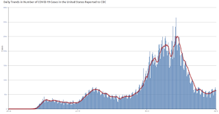
 Click on graph for larger image.
This graph shows the daily (columns) 7 day average (line) of positive tests reported.
Note: The ups and downs during the Winter surge were related to reporting delays due to the Thanksgiving and Christmas holidays.
This data is from the CDC.
 Click on graph for larger image.
This graph shows the daily (columns) 7 day average (line) of positive tests reported.
Note: The ups and downs during the Winter surge were related to reporting delays due to the Thanksgiving and Christmas holidays.
This data is from the CDC.
The 7-day average is 64,001, up from 63,283 yesterday, and close to the summer surge peak of 67,337 on July 23, 2020.
The second graph shows the number of people hospitalized.
 This data is also from the CDC.
The CDC cautions that due to reporting delays, the area in grey will probably increase.
The second graph shows the number of people hospitalized.
 This data is also from the CDC.
The CDC cautions that due to reporting delays, the area in grey will probably increase.
The current 7-day average is 33,726, down slightly from 33,895 yesterday, but well above the post-summer surge low of 23,000.
Brief Discussion: The Impact of Rising Mortgage Rates on Home Sales and House Prices
by Calculated Risk on 4/04/2021 09:36:00 AM
CR Note: There is quite a bit of information (and charts) in this article by Matthew Graham at MortgageNewsDaily: Who's Lying About The Housing Market?. Here are a few excerpts on the impact of mortgage rates on home sales and house prices.
CR Note: There is much more in the article. As Graham notes, inventory is the key,Click on graph for larger image.
The inventory situation may mean that prices remain more resilient in the current housing cycle despite the recent surge in interest rates. Even then, past examples of rate spikes have only had moderate impacts on housing.
Using the same home sales data from above, let's highlight previous rate spikes so we can see the impact...
There was a big rate spike at the end of 2016 that had no discernible effect on prices. This is notable because that rate spike was fueled by economic optimism as opposed to 2013's rate spike which happened after the Fed said they would begin decreasing their rate-friendly bond buying program. 2018 was somewhat similar as the Fed was continuing to tighten monetary policy and raise short term interest rates.
A case could be made that the current rate spike shares some similarities with 2016. The path of 10yr Treasury yields (a benchmark for longer term rates like mortgages) has largely traced pandemic progress and economic recovery hopes. Yields (aka rates) began rising late last summer as vaccine trials showed promising results and economic data began to improve.
Bottom line, it is a rising rate environment until further notice. If we don't see a negative turn of events for the economy, rates will eventually run out of steam for other reasons. But that could take time, and the overall rate spike could rival the worst past examples by the time it fully runs its course.


Saturday, April 03, 2021
April 3rd COVID-19 Vaccinations, New Cases, Hospitalizations
by Calculated Risk on 4/03/2021 03:39:00 PM
Note: I've been posting this data daily for over a year. I'll stop once all three of these criteria are met:
1) 70% of the population over 18 has had at least one dose of vaccine,
2) new cases are under 5,000 per day, and
3) hospitalizations are below 3,000.
According to the CDC, 161.7 million doses have been administered. 23.1% of the population over 18 is fully vaccinated, and 40.1% of the population over 18 has had at least one dose (103.5 million people have had at least one dose).
And check out COVID Act Now to see how each state is doing.
Almost 2,000 US deaths were reported so far in April due to COVID.
 Click on graph for larger image.
This graph shows the daily (columns) 7 day average (line) of positive tests reported.
This data is from the CDC.
 Click on graph for larger image.
This graph shows the daily (columns) 7 day average (line) of positive tests reported.
This data is from the CDC.
The 7-day average is 63,283, down slightly from 63.727 yesterday, and close to the summer surge peak of 67,337 on July 23, 2020.
The second graph shows the number of people hospitalized.
 This data is also from the CDC.
The CDC cautions that due to reporting delays, the area in grey will probably increase.
The second graph shows the number of people hospitalized.
 This data is also from the CDC.
The CDC cautions that due to reporting delays, the area in grey will probably increase.
The current 7-day average is 33,895, up from 33,698 yesterday, and well above the post-summer surge low of 23,000.


