 RSS Feed
 by Calculated Risk on 2/16/2021 04:00:00 PM
Tuesday, February 16, 2021
MBA Survey: "Share of Mortgage Loans in Forbearance Declines to 5.29%"
Note: This is as of February 7th.
From the MBA: Share of Mortgage Loans in Forbearance Declines to 5.29%
The Mortgage Bankers Association’s (MBA) latest Forbearance and Call Volume Survey revealed that the total number of loans now in forbearance decreased by 6 basis points from 5.35% of servicers’ portfolio volume in the prior week to 5.29% as of February 7, 2021. According to MBA’s estimate, 2.6 million homeowners are in forbearance plans.
...
“The share of loans in forbearance declined to the lowest level since April 5th of last year, due to decreases in both the GSE and Ginnie Mae portfolios,” said Mike Fratantoni, MBA’s Senior Vice President and Chief Economist. “Similar to the trend in recent months, the first week of February showed a faster pace of exits from forbearance compared to recent weeks, while new forbearance requests were unchanged.”
Fratantoni added, “2.6 million homeowners remain in forbearance plans. MBA expects the rollout of the vaccines to boost economic growth through the course of the year, leading to a stronger job market and a greater ability for more struggling homeowners to get back on their feet. We do believe that additional support is needed until they have regained their jobs and incomes.”
...
• Total loans in forbearance decreased by 6 basis points relative to the prior week: from 5.35% to 5.29%.• By investor type, the share of Ginnie Mae loans in forbearance decreased relative to the prior week: from 7.46% to 7.34%.emphasis added
• The share of Fannie Mae and Freddie Mac loans in forbearance decreased relative to the prior week: from 3.07% to 3.01%.
• The share of other loans (e.g., portfolio and PLS loans) in forbearance remained unchanged relative to the prior week at 9.14%.
 Click on graph for larger image.
This graph shows the percent of portfolio in forbearance by investor type over time. Most of the increase was in late March and early April, then trended down - and has mostly moved slowly down recently.
The MBA notes: "Total weekly forbearance requests as a percent of servicing portfolio volume (#) remained unchanged relative to the prior week at 0.07%"
Maryland Real Estate in January: Sales Up 14% YoY, Inventory Down 63% YoY
by Calculated Risk on 2/16/2021 02:23:00 PM
Note: I'm posting data for many local markets around the U.S. The story is the same everywhere ... inventory is at record lows.
From the Maryland Realtors for the entire state:
Closed sales in January 2021 were 6,198, up 14.2% from 5,426 in January 2020.
Active Listings in January 2021 were 6,763, down 63.2% from 18,367 in January 2020.
Months of Supply was 0.8 Months in January 2021, compared to 2.5 Months in January 2020.
The Housing Bubble and Mortgage Debt as Percent of GDP
by Calculated Risk on 2/16/2021 12:29:00 PM
In a 2005 post, I included a graph of household mortgage debt as a percent of GDP. Several readers asked if I could update the graph.
First, from February 2005 (16 years ago!):
The following chart shows household mortgage debt as a % of GDP. Although mortgage debt has been increasing for years, the last four years have seen a tremendous increase in debt. Last year alone mortgage debt increased close to $800 Billion - almost 7% of GDP. ...CR Note: And a serious problem is what happened!
Many homeowners have refinanced their homes, in essence using their homes as an ATM.
It wouldn't take a RE bust to impact the general economy. Just a slowdown in both volume (to impact employment) and in prices (to slow down borrowing) might push the general economy into recession. An actual bust, especially with all of the extensive sub-prime lending, might cause a serious problem.
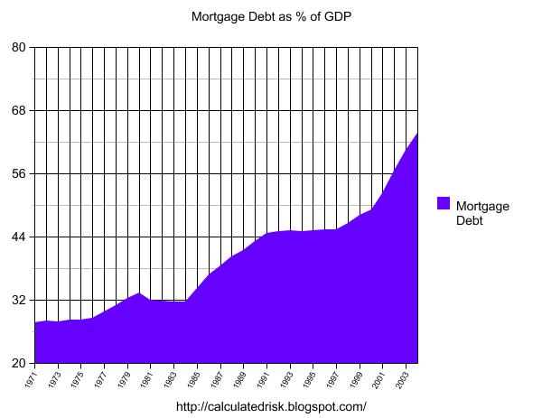
 The second graph shows household mortgage debt as a percent of GDP through Q3 2020.
 The "bubble" is pretty obvious on this graph, and the sharp increase in mortgage debt was one of the warning signs.
The blip up in Q2 2020 was related to the collapse in GDP more than an increase in mortgage debt. With the recent house price increases, some people are worried about a new housing bubble - but mortgage debt isn't a concern (and lending standards are much better now then during the bubble).
Fannie and Freddie: REO inventory declined in Q4, Down 57% Year-over-year
by Calculated Risk on 2/16/2021 09:42:00 AM
Fannie and Freddie earlier reported results last week for Q4 2020. Here is some information on Real Estate Owned (REOs).
Note that COVID is impacting foreclosure activity, from Freddie: "We have also established a foreclosure and eviction moratorium for homeowners with Freddie Mac-owned single-family mortgages, which FHFA recently instructed us to extend until at least March 31, 2021." emphasis added
Freddie Mac reported the number of REO declined to 1,766 at the end of Q4 2020 compared to 4,989 at the end of Q4 2019.
For Freddie, this is down 98% from the 74,897 peak number of REOs in Q3 2010.
Fannie Mae reported the number of REO declined to 7,973 at the end of Q4 2020 compared to 17,501 at the end of Q4 2019.
For Fannie, this is down 95% from the 166,787 peak number of REOs in Q3 2010.
 Click on graph for larger image.
Here is a graph of Fannie and Freddie Real Estate Owned (REO).
REO inventory decreased in Q4 2020, and combined inventory is down 57% year-over-year.
This is well below a normal level of REOs for Fannie and Freddie.
NY Fed: Manufacturing: Business activity "grew modestly" in New York State in February
by Calculated Risk on 2/16/2021 08:35:00 AM
From the NY Fed: Empire State Manufacturing Survey
Business activity grew modestly in New York State, according to The index for number of employees was little changed at 12.1, indicating ongoing modest gains in employment, and the average workweek index edged up to 9.0, signaling an increase in hours worked. firms responding to the February 2021 Empire State Manufacturing Survey. The headline general business conditions index climbed nine points to 12.1, its highest level in several months. New orders increased, and shipments edged higher. Delivery times lengthened, and inventories grew. Employment levels and the average workweek both increased. Input prices rose at the fastest clip in nearly a decade, and selling prices increased significantly. Looking ahead, firms remained optimistic that conditions would improve over the next six months, and capital spending plans expanded noticeablyThis was above expectations, and showed activity "grew modestly" in December.
...
The general business conditions index rose nine points to 12.1, its highest level since July of last year. ... The index for number of employees was little changed at 12.1, indicating ongoing modest gains in employment, and the average workweek index edged up to 9.0, signaling an increase in hours worked.
emphasis added
Monday, February 15, 2021
February 15 COVID-19 Test Results and Vaccinations
by Calculated Risk on 2/15/2021 06:48:00 PM
SPECIAL NOTE: The Covid Tracking Project will end daily updates on March 7th. Heroes that filled a critical void! Quality government data will likely be available soon.
From Bloomberg on vaccinations as of Feb 15th.
"In the U.S., more Americans have now received at least one dose than have tested positive for the virus since the pandemic began. So far, 54.6 million doses have been given, according to a state-by-state tally. In the last week, an average of 1.64 million doses per day were administered."Here is the CDC COVID Data Tracker. This site has data on vaccinations, cases and more.
The US is averaged 1.5 million tests per day over the last week. Based on the experience of other countries, for adequate test-and-trace (and isolation) to reduce infections, the percent positive needs to be under 5% (probably close to 1%), so the US has far too many daily cases - and percent positive - to do effective test-and-trace.
There were 1,133,232 test results reported over the last 24 hours.
There were 55,077 positive tests.
About 45,000 US deaths have been reported in February. See the graph on US Daily Deaths here.
This data is from the COVID Tracking Project.
And check out COVID Act Now to see how each state is doing. (updated link to new site)
 Click on graph for larger image.
This graph shows the 7 day average of positive tests reported and daily hospitalizations.
The dashed line is the previous peak for hospitalizations (almost back to the summer peak level).
The percent positive over the last 24 hours was 4.9%. The percent positive is calculated by dividing positive results by total tests (including pending).
Both cases and hospitalizations have peaked, but are still above the previous peaks.
The percent positive over the last 24 hours was 4.9%. The percent positive is calculated by dividing positive results by total tests (including pending).
Both cases and hospitalizations have peaked, but are still above the previous peaks.
New Hampshire Real Estate in January: Sales Up 14% YoY, Inventory Down 61% YoY
by Calculated Risk on 2/15/2021 12:39:00 PM
Note: I'm posting data for many local markets around the U.S. The story is the same everywhere ... inventory is at record lows.
From the New Hampshire Realtors for the entire state:
Closed sales Single family and Condos in January 2021 were 1,355, up 13.9% from 1,190 in January 2020.
Active Listings Single family and Condos in January 2021 were 1,566, down 61.1% from 4,025 in January 2020.
Months of Supply for single family was 0.7 Months in January 2021, compared to 2.2 Months in January 2020.
Months of Supply for condos was 0.8 Months in January 2021, compared to 1.8 Months in January 2020.
Housing Inventory Feb 15th Update: At Record Lows
by Calculated Risk on 2/15/2021 10:51:00 AM
One of the key questions for 2021 is: Will inventory increase as the pandemic subsides, or will inventory decrease further in 2021?
Tracking inventory will be very important this year.
 Click on graph for larger image in graph gallery.
This inventory graph is courtesy of Altos Research.
As of February 12th, inventory was at 344 thousand (7 day average), compared to 727 thousand the same week a year ago. That is a decline of almost 53%.
A week ago, inventory was at 355 thousand, and was down 51% YoY. Seasonally inventory should bottom by early March.
Mike Simonsen discusses this data regularly on Youtube.
Mike Simonsen discusses this data regularly on Youtube.
Seven High Frequency Indicators for the Economy
by Calculated Risk on 2/15/2021 08:11:00 AM
These indicators are mostly for travel and entertainment. It will interesting to watch these sectors recover as the vaccine is distributed.
IMPORTANT: Be safe now - if all goes well, we could all be vaccinated by Q2 2021.
----- Airlines: Transportation Security Administration -----
The TSA is providing daily travel numbers.
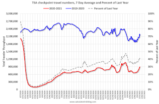 Click on graph for larger image.
This data shows the seven day average of daily total traveler throughput from the TSA for 2019-2020 (Blue) and 2020-2021 (Red).
The dashed line is the percent of last year for the seven day average.
This data is as of February 14th.
The seven day average is down 58.5% from last year (41.5% of last year). (Dashed line)
There was a slow increase from the bottom, with ups and downs due to the holidays - but TSA data has mostly moved sideways.
----- Restaurants: OpenTable -----
The second graph shows the 7 day average of the year-over-year change in diners as tabulated by OpenTable for the US and several selected cities.
 Thanks to OpenTable for providing this restaurant data:
This data is updated through February 13, 2021.
This data is "a sample of restaurants on the OpenTable network across all channels: online reservations, phone reservations, and walk-ins. For year-over-year comparisons by day, we compare to the same day of the week from the same week in the previous year."
Note that this data is for "only the restaurants that have chosen to reopen in a given market". Since some restaurants have not reopened, the actual year-over-year decline is worse than shown.
Dining picked up during the holidays. Note that dining is generally lower in the northern states - Illinois, Pennsylvania, and New York. Note that California dining picked up now after the orders to close was lifted.
----- Movie Tickets: Box Office Mojo -----
 This data shows domestic box office for each week (red) and the maximum and minimum for the years 2016 through 2019. Blue is 2020 and Red is 2021.
The TSA is providing daily travel numbers.
 Click on graph for larger image.
This data shows the seven day average of daily total traveler throughput from the TSA for 2019-2020 (Blue) and 2020-2021 (Red).
The dashed line is the percent of last year for the seven day average.
This data is as of February 14th.
The seven day average is down 58.5% from last year (41.5% of last year). (Dashed line)
There was a slow increase from the bottom, with ups and downs due to the holidays - but TSA data has mostly moved sideways.
The second graph shows the 7 day average of the year-over-year change in diners as tabulated by OpenTable for the US and several selected cities.
 Thanks to OpenTable for providing this restaurant data:
This data is updated through February 13, 2021.
This data is "a sample of restaurants on the OpenTable network across all channels: online reservations, phone reservations, and walk-ins. For year-over-year comparisons by day, we compare to the same day of the week from the same week in the previous year."
Note that this data is for "only the restaurants that have chosen to reopen in a given market". Since some restaurants have not reopened, the actual year-over-year decline is worse than shown.
Dining picked up during the holidays. Note that dining is generally lower in the northern states - Illinois, Pennsylvania, and New York. Note that California dining picked up now after the orders to close was lifted.
 This data shows domestic box office for each week (red) and the maximum and minimum for the years 2016 through 2019. Blue is 2020 and Red is 2021.
 The data is from BoxOfficeMojo through February 11th.
Note that the data is usually noisy week-to-week and depends on when blockbusters are released.
Movie ticket sales were at $6 million last week (compared to usually around $200 million per week at this time of year).
----- Hotel Occupancy: STR -----
 This graph shows the seasonal pattern for the hotel occupancy rate using the four week average.
The red line is for 2021, black is 2020, blue is the median, and dashed light blue is for 2009 (the worst year since the Great Depression for hotels - before 2020).
This data is through February 6th. Hotel occupancy is currently down 30.5% year-over-year. Seasonally we'd expect that business travel would start to pick up in the new year, but there will probably not be much pickup early in 2021.
Notes: Y-axis doesn't start at zero to better show the seasonal change.
----- Gasoline Supplied: Energy Information Administration -----
 This graph, based on weekly data from the U.S. Energy Information Administration (EIA), shows gasoline supplied compared to the same week of 2019.
Blue is for 2020. At one point, gasoline supplied was off almost 50% YoY. Red is for 2021.
As of February 5th, gasoline supplied was off about 9.1% (about 90.9% of the same week in 2019).
Note: People driving instead of flying might have boosted gasoline consumption.
----- Transit: Apple Mobility -----
This graph is from Apple mobility. From Apple: "This data is generated by counting the number of requests made to Apple Maps for directions in select countries/regions, sub-regions, and cities." This is just a general guide - people that regularly commute probably don't ask for directions.
There is also some great data on mobility from the Dallas Fed Mobility and Engagement Index. However the index is set "relative to its weekday-specific average over January–February", and is not seasonally adjusted, so we can't tell if an increase in mobility is due to recovery or just the normal increase in the Spring and Summer.
 This data is through February 13th for the United States and several selected cities.
The graph is the running 7 day average to remove the impact of weekends.
IMPORTANT: All data is relative to January 13, 2020. This data is NOT Seasonally Adjusted. People walk and drive more when the weather is nice, so I'm just using the transit data.
According to the Apple data directions requests, public transit in the 7 day average for the US is at 50% of the January 2020 level. It is at 40% in Chicago, and 51% in Houston - and mostly moving sideways, and moving up a little recently.
----- New York City Subway Usage -----
Here is some interesting data on New York subway usage (HT BR).
 This graph is from Todd W Schneider. This is daily data since early 2020.
This data is through Friday, February 12th.
Schneider has graphs for each borough, and links to all the data sources.
He notes: "Data updates weekly from the MTA’s public turnstile data, usually on Saturday mornings".
Note that the data is usually noisy week-to-week and depends on when blockbusters are released.
Movie ticket sales were at $6 million last week (compared to usually around $200 million per week at this time of year).
 This graph shows the seasonal pattern for the hotel occupancy rate using the four week average.
 The red line is for 2021, black is 2020, blue is the median, and dashed light blue is for 2009 (the worst year since the Great Depression for hotels - before 2020).
This data is through February 6th. Hotel occupancy is currently down 30.5% year-over-year. Seasonally we'd expect that business travel would start to pick up in the new year, but there will probably not be much pickup early in 2021.
Notes: Y-axis doesn't start at zero to better show the seasonal change.
 This graph, based on weekly data from the U.S. Energy Information Administration (EIA), shows gasoline supplied compared to the same week of 2019.
Blue is for 2020. At one point, gasoline supplied was off almost 50% YoY. Red is for 2021.
As of February 5th, gasoline supplied was off about 9.1% (about 90.9% of the same week in 2019).
Note: People driving instead of flying might have boosted gasoline consumption.
This graph is from Apple mobility. From Apple: "This data is generated by counting the number of requests made to Apple Maps for directions in select countries/regions, sub-regions, and cities." This is just a general guide - people that regularly commute probably don't ask for directions.
There is also some great data on mobility from the Dallas Fed Mobility and Engagement Index. However the index is set "relative to its weekday-specific average over January–February", and is not seasonally adjusted, so we can't tell if an increase in mobility is due to recovery or just the normal increase in the Spring and Summer.
 This data is through February 13th for the United States and several selected cities.
The graph is the running 7 day average to remove the impact of weekends.
IMPORTANT: All data is relative to January 13, 2020. This data is NOT Seasonally Adjusted. People walk and drive more when the weather is nice, so I'm just using the transit data.
According to the Apple data directions requests, public transit in the 7 day average for the US is at 50% of the January 2020 level. It is at 40% in Chicago, and 51% in Houston - and mostly moving sideways, and moving up a little recently.
Here is some interesting data on New York subway usage (HT BR).
 This graph is from Todd W Schneider. This is daily data since early 2020.
This data is through Friday, February 12th.
Schneider has graphs for each borough, and links to all the data sources.
He notes: "Data updates weekly from the MTA’s public turnstile data, usually on Saturday mornings".
Sunday, February 14, 2021
February 14 COVID-19 Test Results and Vaccinations
by Calculated Risk on 2/14/2021 07:46:00 PM
SPECIAL NOTE: The Covid Tracking Project will end daily updates on March 7th. Heroes that filled a critical void! Quality government data will likely be available soon.
From Bloomberg on vaccinations as of Feb 14th.
"In the U.S., more Americans have now received at least one dose than have tested positive for the virus since the pandemic began. So far, 53.8 million doses have been given, according to a state-by-state tally. In the last week, an average of 1.68 million doses per day were administered."Here is the CDC COVID Data Tracker. This site has data on vaccinations, cases and more.
The US is now averaging close to 2.0 million tests per day. Based on the experience of other countries, for adequate test-and-trace (and isolation) to reduce infections, the percent positive needs to be under 5% (probably close to 1%), so the US has far too many daily cases - and percent positive - to do effective test-and-trace.
There were 1.4 million test results reported over the last 24 hours.
There were 72 thousand positive tests.
Almost 44,000 US deaths have been reported in February. See the graph on US Daily Deaths here.
This data is from the COVID Tracking Project.
And check out COVID Act Now to see how each state is doing. (updated link to new site)
 Click on graph for larger image.
This graph shows the 7 day average of positive tests reported and daily hospitalizations.
The dashed line is the previous peak for hospitalizations (almost back to the summer peak level).
The percent positive over the last 24 hours was 5.1%. The percent positive is calculated by dividing positive results by total tests (including pending).
Both cases and hospitalizations have peaked, but are still above the previous peaks.
The percent positive over the last 24 hours was 5.1%. The percent positive is calculated by dividing positive results by total tests (including pending).
Both cases and hospitalizations have peaked, but are still above the previous peaks.


