 RSS Feed
 by Calculated Risk on 1/11/2021 12:59:00 PM
Monday, January 11, 2021
Housing Inventory Weekly Update: Starting the Year at Record Lows
One of the key questions for 2021 is: Will inventory increase as the pandemic subsides, or will inventory decrease further in 2021?
Tracking inventory will be very important this year, and I'll be using some weekly sources.
 Click on graph for larger image in graph gallery.
This inventory graph is courtesy of Altos Research.
As of January 8th, inventory is at 397 thousand (7 day average), compared to 738 thousand the same week a year ago. That is a decline of 46%.
Mike Simonsen discusses this data regularly on Youtube.
Mike Simonsen discusses this data regularly on Youtube.
Seattle Real Estate in December: Sales up 31% YoY, Inventory UP 39% YoY
by Calculated Risk on 1/11/2021 10:55:00 AM
Note: Inventory is down sharply in the Northwest almost everywhere except Seattle. And inventory is low in Seattle too, but was even lower a year ago.
The Northwest Multiple Listing Service reported “Extraordinary market conditions” sustain strong home sales
around Washington state during holidays
“Insatiable buyer demand” is keeping inventory scarce as house hunters try to outmaneuver and outbid each other, according to reports from Northwest Multiple Listing Service (NWMLS). Its statistical summary for December showed strong activity throughout the holiday season with double-digit increases in new listings, pending sales, closed sales, and prices.The press release is for the Northwest MLS area. There were 9,008 closed sales in December 2020, up 27.0% from 7,093 sales in December 2019.
...
“As more people are working from home, they are also purchasing properties further afield from Seattle,” observed James Young, director of the Washington Center for Real Estate Research at the University of Washington. He singled out Chelan, Clallam, Grays Harbor, Kittitas, and Mason as counties that had year-over-year price growth of 20% or more. The MLS report also shows Pacific and Whatcom counties with 20% or higher price gains.
“The velocity of the December market is a harbinger of the 2021 market as tight listing inventory, low interest rates, and high buyer demand continue to drive momentum,” remarked NWMLS director John Deely, executive vice president, operations at Coldwell Banker Bain. “Every market serviced by NWMLS was trending below December 2019 for total active inventory,” he noted. “In King County, despite a nearly 62% increase in new listings compared to a year ago, the insatiable buyer demand quickly absorbed available properties,” he added.
emphasis added
In King County, sales were up 28% year-over-year, and active inventory was down 14% year-over-year.
In Seattle, sales were up 30.7% year-over-year, and inventory was up 39.5% year-over-year.. This puts the months-of-supply in Seattle at just 1.2 months.
Seven High Frequency Indicators for the Economy
by Calculated Risk on 1/11/2021 08:17:00 AM
These indicators are mostly for travel and entertainment. It will interesting to watch these sectors recover as the vaccine is distributed.
IMPORTANT: Be safe now - if all goes well, we could all be vaccinated by Q2 2021.
----- Airlines: Transportation Security Administration -----
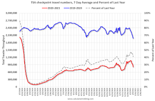
The TSA is providing daily travel numbers.
 Click on graph for larger image.
This data shows the seven day average of daily total traveler throughput from the TSA for 2019-2020 (Blue) and 2020-2021 (Red).
The dashed line is the percent of last year for the seven day average.
This data is as of January 10th.
The seven day average is down 59.0% from last year (41.0% of last year). (Dashed line)
There has been a slow increase from the bottom, with ups and downs due to the Thanksgiving and Christmas holidays.
----- Restaurants: OpenTable -----
The second graph shows the 7 day average of the year-over-year change in diners as tabulated by OpenTable for the US and several selected cities.
 Thanks to OpenTable for providing this restaurant data:
This data is updated through January 9, 2020.
This data is "a sample of restaurants on the OpenTable network across all channels: online reservations, phone reservations, and walk-ins. For year-over-year comparisons by day, we compare to the same day of the week from the same week in the previous year."
Note that this data is for "only the restaurants that have chosen to reopen in a given market". Since some restaurants have not reopened, the actual year-over-year decline is worse than shown.
Dining picked up during the holidays. Note that dining is generally lower in the northern states - Illinois, Pennsylvania, and New York. Note that California dining is off sharply with the orders to close.
----- Movie Tickets: Box Office Mojo -----
 This data shows domestic box office for each week (red) and the maximum and minimum for the previous four years. Blue is 2020 and red is 2021. Data is from BoxOfficeMojo through January 7th.
Note that the data is usually noisy week-to-week and depends on when blockbusters are released.
Movie ticket sales were at $9 million last week (compared to usually around $200 million per week at this time of year).
----- Hotel Occupancy: STR -----
 This graph shows the seasonal pattern for the hotel occupancy rate using the four week average.
The red line is for 2021, black is 2020, blue is the median, and dashed light blue is for 2009 (the worst year since the Great Depression for hotels - before 2020).
This data is through January 2nd. Hotel occupancy is currently down 17.2% year-over-year. Seasonally we'd expect business travel would start to pick up in the new year, but there will probably not be much pickup early this year.
Notes: Y-axis doesn't start at zero to better show the seasonal change.
----- Gasoline Supplied: Energy Information Administration -----
 This graph, based on weekly data from the U.S. Energy Information Administration (EIA), shows gasoline supplied compared to the same week of 2019.
At one point, gasoline supplied was off almost 50% YoY.
As of January 1st, gasoline supplied was off about 14.8% (about 85.2% of the same week in 2019).
Note: People driving instead of flying might have boosted gasoline consumption over the summer.
----- Transit: Apple Mobility -----
This graph is from Apple mobility. From Apple: "This data is generated by counting the number of requests made to Apple Maps for directions in select countries/regions, sub-regions, and cities." This is just a general guide - people that regularly commute probably don't ask for directions.
There is also some great data on mobility from the Dallas Fed Mobility and Engagement Index. However the index is set "relative to its weekday-specific average over January–February", and is not seasonally adjusted, so we can't tell if an increase in mobility is due to recovery or just the normal increase in the Spring and Summer.
 This data is through January 9th for the United States and several selected cities.
The graph is the running 7 day average to remove the impact of weekends.
IMPORTANT: All data is relative to January 13, 2020. This data is NOT Seasonally Adjusted. People walk and drive more when the weather is nice, so I'm just using the transit data.
According to the Apple data directions requests, public transit in the 7 day average for the US is at 45% of the January level. It is at 34% in Chicago, and 53% in Houston - and mostly trending up over the last couple of week.
----- New York City Subway Usage -----
Here is some interesting data on New York subway usage (HT BR).
 This graph is from Todd W Schneider. This is daily data since early 2020.
This data is through Friday, January 8th.
Schneider has graphs for each borough, and links to all the data sources.
He notes: "Data updates weekly from the MTA’s public turnstile data, usually on Saturday mornings".
The TSA is providing daily travel numbers.
 Click on graph for larger image.
This data shows the seven day average of daily total traveler throughput from the TSA for 2019-2020 (Blue) and 2020-2021 (Red).
The dashed line is the percent of last year for the seven day average.
This data is as of January 10th.
The seven day average is down 59.0% from last year (41.0% of last year). (Dashed line)
There has been a slow increase from the bottom, with ups and downs due to the Thanksgiving and Christmas holidays.
The second graph shows the 7 day average of the year-over-year change in diners as tabulated by OpenTable for the US and several selected cities.
 Thanks to OpenTable for providing this restaurant data:
This data is updated through January 9, 2020.
This data is "a sample of restaurants on the OpenTable network across all channels: online reservations, phone reservations, and walk-ins. For year-over-year comparisons by day, we compare to the same day of the week from the same week in the previous year."
Note that this data is for "only the restaurants that have chosen to reopen in a given market". Since some restaurants have not reopened, the actual year-over-year decline is worse than shown.
Dining picked up during the holidays. Note that dining is generally lower in the northern states - Illinois, Pennsylvania, and New York. Note that California dining is off sharply with the orders to close.
 This data shows domestic box office for each week (red) and the maximum and minimum for the previous four years. Blue is 2020 and red is 2021. Data is from BoxOfficeMojo through January 7th.
Note that the data is usually noisy week-to-week and depends on when blockbusters are released.
Movie ticket sales were at $9 million last week (compared to usually around $200 million per week at this time of year).
 This graph shows the seasonal pattern for the hotel occupancy rate using the four week average.
 The red line is for 2021, black is 2020, blue is the median, and dashed light blue is for 2009 (the worst year since the Great Depression for hotels - before 2020).
This data is through January 2nd. Hotel occupancy is currently down 17.2% year-over-year. Seasonally we'd expect business travel would start to pick up in the new year, but there will probably not be much pickup early this year.
Notes: Y-axis doesn't start at zero to better show the seasonal change.
 This graph, based on weekly data from the U.S. Energy Information Administration (EIA), shows gasoline supplied compared to the same week of 2019.
At one point, gasoline supplied was off almost 50% YoY.
As of January 1st, gasoline supplied was off about 14.8% (about 85.2% of the same week in 2019).
Note: People driving instead of flying might have boosted gasoline consumption over the summer.
This graph is from Apple mobility. From Apple: "This data is generated by counting the number of requests made to Apple Maps for directions in select countries/regions, sub-regions, and cities." This is just a general guide - people that regularly commute probably don't ask for directions.
There is also some great data on mobility from the Dallas Fed Mobility and Engagement Index. However the index is set "relative to its weekday-specific average over January–February", and is not seasonally adjusted, so we can't tell if an increase in mobility is due to recovery or just the normal increase in the Spring and Summer.
 This data is through January 9th for the United States and several selected cities.
The graph is the running 7 day average to remove the impact of weekends.
IMPORTANT: All data is relative to January 13, 2020. This data is NOT Seasonally Adjusted. People walk and drive more when the weather is nice, so I'm just using the transit data.
According to the Apple data directions requests, public transit in the 7 day average for the US is at 45% of the January level. It is at 34% in Chicago, and 53% in Houston - and mostly trending up over the last couple of week.
Here is some interesting data on New York subway usage (HT BR).
 This graph is from Todd W Schneider. This is daily data since early 2020.
This data is through Friday, January 8th.
Schneider has graphs for each borough, and links to all the data sources.
He notes: "Data updates weekly from the MTA’s public turnstile data, usually on Saturday mornings".
Sunday, January 10, 2021
Sunday Night Futures
by Calculated Risk on 1/10/2021 08:44:00 PM
Weekend:
• Schedule for Week of January 10, 2021
Monday:
• No major economic releases scheduled.
From CNBC: Pre-Market Data and Bloomberg futures S&P 500 are down 11 and DOW futures are down 80 (fair value).
Oil prices were up over the last week with WTI futures at $52.26 per barrel and Brent at $55.81 barrel. A year ago, WTI was at $59, and Brent was at $67 - so WTI oil prices are down about 15% year-over-year.
Here is a graph from Gasbuddy.com for nationwide gasoline prices. Nationally prices are at $2.32 per gallon. A year ago prices were at $2.59 per gallon, so gasoline prices are down $0.27 per gallon year-over-year.
January 10 COVID-19 Test Results; Record 7-Day Cases and Deaths
by Calculated Risk on 1/10/2021 07:10:00 PM
Note: I'm looking forward to not posting this data in a few months.
The US is now averaging close to 2 million tests per day. Based on the experience of other countries, for adequate test-and-trace (and isolation) to reduce infections, the percent positive needs to be under 5% (probably close to 1%), so the US has far too many daily cases - and percent positive - to do effective test-and-trace.
There were 1,935,115 test results reported over the last 24 hours.
There were 222,918 positive tests.
Almost 29,000 US deaths have been reported so far in January. See the graph on US Daily Deaths here.
 Click on graph for larger image.
This data is from the COVID Tracking Project.
The percent positive over the last 24 hours was 11.5% (red line is 7 day average). The percent positive is calculated by dividing positive results by total tests (including pending).
And check out COVID Act Now to see how each state is doing. (updated link to new site)
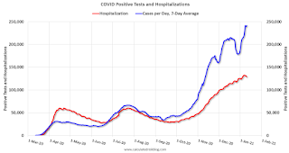 The second graph shows the 7 day average of positive tests reported and daily hospitalizations.
• Record 7-Day Cases
• Record 7-Day Deaths
By Request: Public and Private Sector Payroll Jobs During Presidential Terms
by Calculated Risk on 1/10/2021 11:25:00 AM
Note: I usually post this monthly, but I hesitated recently due to the COVID-19 pandemic. But I've received a number of requests lately - the recent numbers are ugly.
Here is another update of tracking employment during Presidential terms. We frequently use Presidential terms as time markers - we could use Speaker of the House, Fed Chair, or any other marker.
NOTE: Several readers have asked if I could add a lag to these graphs (obviously a new President has zero impact on employment for the month they are elected). But that would open a debate on the proper length of the lag, so I'll just stick to the beginning of each term.
Important: There are many differences between these periods. Overall employment was smaller in the '80s, however the participation rate was increasing in the '80s (younger population and women joining the labor force), and the participation rate is generally declining now. But these graphs give an overview of employment changes.
The first graph shows the change in private sector payroll jobs from when each president took office until the end of their term(s). Presidents Carter and George H.W. Bush only served one term.
Mr. G.W. Bush (red) took office following the bursting of the stock market bubble, and left during the bursting of the housing bubble. Mr. Obama (dark blue) took office during the financial crisis and great recession. There was also a significant recession in the early '80s right after Mr. Reagan (dark red) took office.
There was a recession towards the end of President G.H.W. Bush (light purple) term, and Mr. Clinton (light blue) served for eight years without a recession.
 Click on graph for larger image.
The first graph is for private employment only.
Trump is in Orange (47 months).
The employment recovery during Mr. G.W. Bush's (red) first term was sluggish, and private employment was down 824,000 jobs at the end of his first term. At the end of Mr. Bush's second term, private employment was collapsing, and there were net 387,000 private sector jobs lost during Mr. Bush's two terms.
Private sector employment increased by 20,970,000 under President Clinton (light blue), by 14,714,000 under President Reagan (dark red), 9,039,000 under President Carter (dashed green), 1,511,000 under President G.H.W. Bush (light purple), and 11,849,000 under President Obama (dark blue).
During the 47 months of Trump's term, the economy has lost 2,102,000 private sector jobs.
 A big difference between the presidencies has been public sector employment. Note: the bumps in public sector employment due to the decennial Census in 1980, 1990, 2000, 2010 and 2020.
The public sector grew during Mr. Carter's term (up 1,304,000), during Mr. Reagan's terms (up 1,414,000), during Mr. G.H.W. Bush's term (up 1,127,000), during Mr. Clinton's terms (up 1,934,000), and during Mr. G.W. Bush's terms (up 1,744,000 jobs). However the public sector declined significantly while Mr. Obama was in office (down 277,000 jobs).
During the 47 months of Trump's term, the economy has lost 901,000 public sector jobs.
 The third graph shows the progress towards the Trump goal of adding 10 million jobs over his 4 year term.
After 47 months of Trump's presidency, the economy has lost 3,003,000 jobs, about 12.8 million behind the projection.
A Brief Comment on the events of January 6, 2021
by Calculated Risk on 1/10/2021 11:08:00 AM
Like all Americans, I was horrified by what happened on January 6th.
From former Secretary of Defense James Mattis:
"Today's violent assault on our Capitol, an effort to subjugate American democracy by mob rule, was fomented by Mr. Trump. His use of the Presidency to destroy trust in our election and to poison our respect for fellow citizens has been enabled by pseudo political leaders whose names will live in infamy as profiles in cowardice. Our Constitution and our Republic will overcome this stain and We the People will come together again in our never-ending effort to form a more perfect Union, while Mr. Trump will deservedly be left a man without a country."And a video today from former California Governor Arnold Schwarzenegger: Governor Schwarzenegger's Message Following this Week's Attack on the Capitol
Saturday, January 09, 2021
January 9 COVID-19 Test Results; Record 7-Day Deaths
by Calculated Risk on 1/09/2021 07:23:00 PM
Note: I'm looking forward to not posting this data in a few months.
The US is now averaging close to 2 million tests per day. Based on the experience of other countries, for adequate test-and-trace (and isolation) to reduce infections, the percent positive needs to be under 5% (probably close to 1%), so the US has far too many daily cases - and percent positive - to do effective test-and-trace.
There were 2,000,196 test results reported over the last 24 hours.
There were 261,993 positive tests.
Almost 27,000 US deaths have been reported so far in January. See the graph on US Daily Deaths here.
 Click on graph for larger image.
This data is from the COVID Tracking Project.
The percent positive over the last 24 hours was 13.1% (red line is 7 day average). The percent positive is calculated by dividing positive results by total tests (including pending).
And check out COVID Act Now to see how each state is doing. (updated link to new site)
 The second graph shows the 7 day average of positive tests reported and daily hospitalizations.
• Record 7-Day Deaths
Schedule for Week of January 10, 2021
by Calculated Risk on 1/09/2021 08:11:00 AM
The key reports this week are December CPI and retail sales.
For manufacturing, the December Industrial Production report and the January NY Fed manufacturing survey will be released.
No major economic releases scheduled.
6:00 AM: NFIB Small Business Optimism Index for December.
 10:00 AM ET: Job Openings and Labor Turnover Survey for November from the BLS.
 This graph shows job openings (yellow line), hires (purple), Layoff, Discharges and other (red column), and Quits (light blue column) from the JOLTS.
Jobs openings increased in October to 6.652 million from 6.494 million in September.
The number of job openings (yellow) were down 9% year-over-year, and Quits were up 10% year-over-year.
7:00 AM ET: The Mortgage Bankers Association (MBA) will release the results for the mortgage purchase applications index.
8:30 AM: The Consumer Price Index for December from the BLS. The consensus is for 0.4% increase in CPI, and a 0.1% increase in core CPI.
2:00 PM: the Federal Reserve Beige Book, an informal review by the Federal Reserve Banks of current economic conditions in their Districts.
8:30 AM: The initial weekly unemployment claims report will be released. The consensus is for an increase to 850 thousand from 787 thousand last week.
12:30 PM: Discussion, Fed Chair Jerome Powell, "A Conversation with Federal Reserve Chair Jerome Powell", At a livestream event hosted by Markus Brunnermerier, Director, Princeton University Bendheim Center for Finance
 8:30 AM: Retail sales for December is scheduled to be released. The consensus is for a 0.2% decrease in retail sales.
This graph shows the year-over-year change in retail sales and food service (ex-gasoline) since 1993. In November, Retail and Food service sales, ex-gasoline, increased by 5.9% on a YoY basis.
8:30 AM ET: The Producer Price Index for December from the BLS. The consensus is for a 0.3% increase in PPI, and a 0.2% increase in core PPI.
8:30 AM: The New York Fed Empire State manufacturing survey for January. The consensus is for a reading of 5.5, up from 4.9.
 9:15 AM: The Fed will release Industrial Production and Capacity Utilization for December.
This graph shows industrial production since 1967.
The consensus is for a 0.4% increase in Industrial Production, and for Capacity Utilization to increase to 73.5%.
10:00 AM: University of Michigan's Consumer sentiment index (Preliminary for January).
Friday, January 08, 2021
January 8 COVID-19 Test Results; Record 7-Day Deaths and Cases
by Calculated Risk on 1/08/2021 08:05:00 PM
Note: I'm looking forward to not posting this data in a few months.
The US is now averaging close to 2 million tests per day. Based on the experience of other countries, for adequate test-and-trace (and isolation) to reduce infections, the percent positive needs to be under 5% (probably close to 1%), so the US has far too many daily cases - and percent positive - to do effective test-and-trace.
There were 2.1 million test results reported over the last 24 hours.
There were 310,000 positive tests.
Over 23,000 US deaths have been reported so far in January. See the graph on US Daily Deaths here.
 Click on graph for larger image.
This data is from the COVID Tracking Project.
The percent positive over the last 24 hours was 14.8% (red line is 7 day average). The percent positive is calculated by dividing positive results by total tests (including pending).
And check out COVID Act Now to see how each state is doing. (updated link to new site)
 The second graph shows the 7 day average of positive tests reported and daily hospitalizations.
• Record 7-Day Deaths
• Record 7-Day Cases


