 RSS Feed
 by Calculated Risk on 1/10/2021 07:10:00 PM
Sunday, January 10, 2021
January 10 COVID-19 Test Results; Record 7-Day Cases and Deaths
Note: I'm looking forward to not posting this data in a few months.
The US is now averaging close to 2 million tests per day. Based on the experience of other countries, for adequate test-and-trace (and isolation) to reduce infections, the percent positive needs to be under 5% (probably close to 1%), so the US has far too many daily cases - and percent positive - to do effective test-and-trace.
There were 1,935,115 test results reported over the last 24 hours.
There were 222,918 positive tests.
Almost 29,000 US deaths have been reported so far in January. See the graph on US Daily Deaths here.
 Click on graph for larger image.
This data is from the COVID Tracking Project.
The percent positive over the last 24 hours was 11.5% (red line is 7 day average). The percent positive is calculated by dividing positive results by total tests (including pending).
And check out COVID Act Now to see how each state is doing. (updated link to new site)
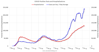 The second graph shows the 7 day average of positive tests reported and daily hospitalizations.
• Record 7-Day Cases
• Record 7-Day Deaths
By Request: Public and Private Sector Payroll Jobs During Presidential Terms
by Calculated Risk on 1/10/2021 11:25:00 AM
Note: I usually post this monthly, but I hesitated recently due to the COVID-19 pandemic. But I've received a number of requests lately - the recent numbers are ugly.
Here is another update of tracking employment during Presidential terms. We frequently use Presidential terms as time markers - we could use Speaker of the House, Fed Chair, or any other marker.
NOTE: Several readers have asked if I could add a lag to these graphs (obviously a new President has zero impact on employment for the month they are elected). But that would open a debate on the proper length of the lag, so I'll just stick to the beginning of each term.
Important: There are many differences between these periods. Overall employment was smaller in the '80s, however the participation rate was increasing in the '80s (younger population and women joining the labor force), and the participation rate is generally declining now. But these graphs give an overview of employment changes.
The first graph shows the change in private sector payroll jobs from when each president took office until the end of their term(s). Presidents Carter and George H.W. Bush only served one term.
Mr. G.W. Bush (red) took office following the bursting of the stock market bubble, and left during the bursting of the housing bubble. Mr. Obama (dark blue) took office during the financial crisis and great recession. There was also a significant recession in the early '80s right after Mr. Reagan (dark red) took office.
There was a recession towards the end of President G.H.W. Bush (light purple) term, and Mr. Clinton (light blue) served for eight years without a recession.
 Click on graph for larger image.
The first graph is for private employment only.
Trump is in Orange (47 months).
The employment recovery during Mr. G.W. Bush's (red) first term was sluggish, and private employment was down 824,000 jobs at the end of his first term. At the end of Mr. Bush's second term, private employment was collapsing, and there were net 387,000 private sector jobs lost during Mr. Bush's two terms.
Private sector employment increased by 20,970,000 under President Clinton (light blue), by 14,714,000 under President Reagan (dark red), 9,039,000 under President Carter (dashed green), 1,511,000 under President G.H.W. Bush (light purple), and 11,849,000 under President Obama (dark blue).
During the 47 months of Trump's term, the economy has lost 2,102,000 private sector jobs.
 A big difference between the presidencies has been public sector employment. Note: the bumps in public sector employment due to the decennial Census in 1980, 1990, 2000, 2010 and 2020.
The public sector grew during Mr. Carter's term (up 1,304,000), during Mr. Reagan's terms (up 1,414,000), during Mr. G.H.W. Bush's term (up 1,127,000), during Mr. Clinton's terms (up 1,934,000), and during Mr. G.W. Bush's terms (up 1,744,000 jobs). However the public sector declined significantly while Mr. Obama was in office (down 277,000 jobs).
During the 47 months of Trump's term, the economy has lost 901,000 public sector jobs.
 The third graph shows the progress towards the Trump goal of adding 10 million jobs over his 4 year term.
After 47 months of Trump's presidency, the economy has lost 3,003,000 jobs, about 12.8 million behind the projection.
A Brief Comment on the events of January 6, 2021
by Calculated Risk on 1/10/2021 11:08:00 AM
Like all Americans, I was horrified by what happened on January 6th.
From former Secretary of Defense James Mattis:
"Today's violent assault on our Capitol, an effort to subjugate American democracy by mob rule, was fomented by Mr. Trump. His use of the Presidency to destroy trust in our election and to poison our respect for fellow citizens has been enabled by pseudo political leaders whose names will live in infamy as profiles in cowardice. Our Constitution and our Republic will overcome this stain and We the People will come together again in our never-ending effort to form a more perfect Union, while Mr. Trump will deservedly be left a man without a country."And a video today from former California Governor Arnold Schwarzenegger: Governor Schwarzenegger's Message Following this Week's Attack on the Capitol
Saturday, January 09, 2021
January 9 COVID-19 Test Results; Record 7-Day Deaths
by Calculated Risk on 1/09/2021 07:23:00 PM
Note: I'm looking forward to not posting this data in a few months.
The US is now averaging close to 2 million tests per day. Based on the experience of other countries, for adequate test-and-trace (and isolation) to reduce infections, the percent positive needs to be under 5% (probably close to 1%), so the US has far too many daily cases - and percent positive - to do effective test-and-trace.
There were 2,000,196 test results reported over the last 24 hours.
There were 261,993 positive tests.
Almost 27,000 US deaths have been reported so far in January. See the graph on US Daily Deaths here.
 Click on graph for larger image.
This data is from the COVID Tracking Project.
The percent positive over the last 24 hours was 13.1% (red line is 7 day average). The percent positive is calculated by dividing positive results by total tests (including pending).
And check out COVID Act Now to see how each state is doing. (updated link to new site)
 The second graph shows the 7 day average of positive tests reported and daily hospitalizations.
• Record 7-Day Deaths
Schedule for Week of January 10, 2021
by Calculated Risk on 1/09/2021 08:11:00 AM
The key reports this week are December CPI and retail sales.
For manufacturing, the December Industrial Production report and the January NY Fed manufacturing survey will be released.
No major economic releases scheduled.
6:00 AM: NFIB Small Business Optimism Index for December.
 10:00 AM ET: Job Openings and Labor Turnover Survey for November from the BLS.
 This graph shows job openings (yellow line), hires (purple), Layoff, Discharges and other (red column), and Quits (light blue column) from the JOLTS.
Jobs openings increased in October to 6.652 million from 6.494 million in September.
The number of job openings (yellow) were down 9% year-over-year, and Quits were up 10% year-over-year.
7:00 AM ET: The Mortgage Bankers Association (MBA) will release the results for the mortgage purchase applications index.
8:30 AM: The Consumer Price Index for December from the BLS. The consensus is for 0.4% increase in CPI, and a 0.1% increase in core CPI.
2:00 PM: the Federal Reserve Beige Book, an informal review by the Federal Reserve Banks of current economic conditions in their Districts.
8:30 AM: The initial weekly unemployment claims report will be released. The consensus is for an increase to 850 thousand from 787 thousand last week.
12:30 PM: Discussion, Fed Chair Jerome Powell, "A Conversation with Federal Reserve Chair Jerome Powell", At a livestream event hosted by Markus Brunnermerier, Director, Princeton University Bendheim Center for Finance
 8:30 AM: Retail sales for December is scheduled to be released. The consensus is for a 0.2% decrease in retail sales.
This graph shows the year-over-year change in retail sales and food service (ex-gasoline) since 1993. In November, Retail and Food service sales, ex-gasoline, increased by 5.9% on a YoY basis.
8:30 AM ET: The Producer Price Index for December from the BLS. The consensus is for a 0.3% increase in PPI, and a 0.2% increase in core PPI.
8:30 AM: The New York Fed Empire State manufacturing survey for January. The consensus is for a reading of 5.5, up from 4.9.
 9:15 AM: The Fed will release Industrial Production and Capacity Utilization for December.
This graph shows industrial production since 1967.
The consensus is for a 0.4% increase in Industrial Production, and for Capacity Utilization to increase to 73.5%.
10:00 AM: University of Michigan's Consumer sentiment index (Preliminary for January).
Friday, January 08, 2021
January 8 COVID-19 Test Results; Record 7-Day Deaths and Cases
by Calculated Risk on 1/08/2021 08:05:00 PM
Note: I'm looking forward to not posting this data in a few months.
The US is now averaging close to 2 million tests per day. Based on the experience of other countries, for adequate test-and-trace (and isolation) to reduce infections, the percent positive needs to be under 5% (probably close to 1%), so the US has far too many daily cases - and percent positive - to do effective test-and-trace.
There were 2.1 million test results reported over the last 24 hours.
There were 310,000 positive tests.
Over 23,000 US deaths have been reported so far in January. See the graph on US Daily Deaths here.
 Click on graph for larger image.
This data is from the COVID Tracking Project.
The percent positive over the last 24 hours was 14.8% (red line is 7 day average). The percent positive is calculated by dividing positive results by total tests (including pending).
And check out COVID Act Now to see how each state is doing. (updated link to new site)
 The second graph shows the 7 day average of positive tests reported and daily hospitalizations.
• Record 7-Day Deaths
• Record 7-Day Cases
AAR: December Rail Carloads down 3.7% YoY, Intermodal Up 12.2% YoY
by Calculated Risk on 1/08/2021 03:04:00 PM
From the Association of American Railroads (AAR) Rail Time Indicators. Graphs and excerpts reprinted with permission.
U.S. rail traffic left something to be desired in 2020 — no surprise, of course, given the pandemic — but traffic finished the year reasonably strong.
In December 2020, U.S. rail intermodal volume was up 12.2% over December 2019, its biggest monthly gain since February 2016. ... For all of 2020, U.S. intermodal originations were 13.46 million containers and trailers — the fourth highest annual total in history (behind 2017, 2018, and 2019) and down 2.0% (276,904 units) from 2019.
...
Total U.S. carloads (not including intermodal) were 11.28 million in 2020, down 13.0% (1.69 million carloads) from 2019 and easily the lowest annual total since sometime before 1988, when our data begin. ... U.S. carloads excluding coal were down 7.9% in 2020 from 2019, though they were up 1.0% in December 2020 over December 2019. That’s their first year-over-year monthly gain in nearly two years.
emphasis added
 Click on graph for larger image.
This graph from the Rail Time Indicators report shows the six week average of U.S. Carloads in 2018, 2019 and 2020:
In December, total carloads were down 3.7%, their smallest monthly decline since May 2019. Still, average weekly carloads in December 2020 (220,265) were the lowest for December since our records begin.
 The second graph shows the six week average of U.S. intermodal in 2018, 2019 and 2020: (using intermodal or shipping containers):
In December 2020, intermodal was up 12.2% over December 2019, its biggest monthly percentage gain since February 2016. Week 50, the second of the five weeks in December 2020, was the highest volume U.S. intermodal week ever. Five other weeks in 2020, all since week 43, are in the all-time intermodal top 10.Note that rail traffic was weak prior to the pandemic, and intermodal has come back strong and was only down 2% annually compared to 2019.
Q4 GDP Forecasts
by Calculated Risk on 1/08/2021 12:50:00 PM
From Goldman Sachs:
We left our Q4 GDP tracking estimate unchanged at +5.0% (qoq ar). [Jan 8 estimate]From the NY Fed Nowcasting Report
The New York Fed Staff Nowcast stands at 2.2% for 2020:Q4 and 5.5 for 2021:Q1 [Jan 8 estimate]And from the Altanta Fed: GDPNow
The GDPNow model estimate for real GDP growth (seasonally adjusted annual rate) in the fourth quarter of 2020 is 8.7 percent on January 8, up from 8.5 percent on January 7. [Jan 8 estimate]
Black Knight: Number of Homeowners in COVID-19-Related Forbearance Plans Decreased
by Calculated Risk on 1/08/2021 12:42:00 PM
Note: Both Black Knight and the MBA (Mortgage Bankers Association) are putting out weekly estimates of mortgages in forbearance.
This data is as of January 5th.
From Black Knight: Slowdown in Rate of Forbearance Improvement
Over the first week of the year, the number of mortgages in active forbearance plans in the U.S. fell by 92,000 (a decline of 3%), the largest weekly drop since early November. The decline was driven by the large volume of quarterly forbearance plan expirations at the end of December, many of which were reaching their nine-month point.
...
Despite the decline, this represents a troubling slow-down in the rate of improvement.
...
Click on graph for larger image.
The 3% decline in the first week of January fell starkly short of the 9% decline seen in the first week of July (which brought about the first quarterly wave of expirations) And it pales in comparison to the 18% reduction in the first week of October when plans began to reach six-month expirations.
While the monthly rate of decline has varied over the past seven months of the pandemic due to fluctuations in scheduled expiration activity, the average rate of improvement over the past 30 days has been -1% month-over-month, down from -7.5% month-over-month on average from June through November.
December marked the last significant wave of quarterly expirations before the first plans begin to reach their 12-month points at the end of March. As such, it’s likely we’ll see only modest improvement in overall forbearance volumes between now and then.
As of Jan. 5, 2.74 million (5.2% of) homeowners remain in COVID-19-related forbearance plans, including 3.3% (932,000) of GSE mortgages, 9.3% (1.13 million) of FHA/VA loans and 5.2% (673,000) of portfolio-held and privately securitized loans. Together, they represent $547 billion in unpaid principal.
emphasis added

NMHC: Rent Payment Tracker Shows Households Paying Rent Decreased 1.7% YoY in Early January
by Calculated Risk on 1/08/2021 11:02:00 AM
From the NMHC: NMHC Rent Payment Tracker Finds 76.6 Percent of Apartment Households Paid Rent as of January 6
The National Multifamily Housing Council (NMHC)’s Rent Payment Tracker found 76.6 percent of apartment households made a full or partial rent payment by January 6 in its survey of almost 11.3 million units of professionally managed apartment units across the country.
This is a 1.7 percentage point, or 192,613 household decrease from the share who paid rent through January 6, 2020 and compares to 75.4 percent that had paid by December 6, 2020. These data encompass a wide variety of market-rate rental properties across the United States, which can vary by size, type and average rental price.
“While there is light at the end of the tunnel with the rollout of vaccines, the country and the multifamily industry continue to face steep challenges,” said Doug Bibby, NMHC President, “The recently passed COVID relief package included $25 billion in desperately needed rental assistance as well as expanded unemployment insurance. Now, it is critical that those funds reach those in need as quickly and efficiently as possible.
emphasis added
 Click on graph for larger image.
This graph from the NMHC Rent Payment Tracker shows the percent of household making full or partial rent payments by the 6th of the month.
This is mostly for large, professionally managed properties.
The second graph shows full month payments through December.
 This shows a decline in rent payments year-over-year, and somewhat more of a decline over the last several months.
CR Note: There are some timing issues month to month, but rent payments appear to be declining.


