by Calculated Risk on 9/26/2018 02:00:00 PM
Wednesday, September 26, 2018
FOMC Statement, Projections, and Press Conference
CR Note: Gone hiking! I will return on Thursday, Oct 4th.
The FOMC Statement is here. (all FOMC statements are here)
You can watch the Powell press conference video here.
The updated projections are here.
For excellent commentary, please see Tim Duy's Fed Watch.
A few Comments on August New Home Sales
by Calculated Risk on 9/26/2018 11:59:00 AM
New home sales for August were reported at 629,000 on a seasonally adjusted annual rate basis (SAAR). This was close to the consensus forecast, however the three previous months were revised down significantly.
Sales in August were up 12.7% year-over-year compared to August 2017. This was strong YoY growth, however this was an easy comparison since new home sales were soft in mid-year 2017.
On Inventory: Months of inventory is now close to the top of the normal range, however the number of units completed and under construction is still somewhat low. Inventory will be something to watch.
Earlier: New Home Sales increase to 629,000 Annual Rate in August.

This graph shows new home sales for 2017 and 2018 by month (Seasonally Adjusted Annual Rate).
Note that new home sales have been up year-over-year every month this year (so far).
Sales are up 6.9% through August compared to the same period in 2017.
This is on track to be close to my forecast for 2018 of 650 thousand new home sales for the year; an increase of about 6% over 2017. There are downside risks to that forecast, such as higher mortgage rates, higher costs (labor and material), and possible policy errors. And new home sales had a strong last few months in 2017, so the comparisons will be more difficult.
And here is another update to the "distressing gap" graph that I first started posting a number of years ago to show the emerging gap caused by distressed sales. Now I'm looking for the gap to close over the next several years.
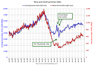
Following the housing bubble and bust, the "distressing gap" appeared mostly because of distressed sales. The gap has persisted even though distressed sales are down significantly, since new home builders focused on more expensive homes.
I expect existing home sales to move more sideways, and I expect this gap to slowly close, mostly from an increase in new home sales.
However, this assumes that the builders will offer some smaller, less expensive homes. If not, then the gap will persist.

This ratio was fairly stable from 1994 through 2006, and then the flood of distressed sales kept the number of existing home sales elevated and depressed new home sales. (Note: This ratio was fairly stable back to the early '70s, but I only have annual data for the earlier years).
In general the ratio has been trending down since the housing bust, and this ratio will probably continue to trend down over the next few years.
Note: Existing home sales are counted when transactions are closed, and new home sales are counted when contracts are signed. So the timing of sales is different.
New Home Sales increase to 629,000 Annual Rate in August
by Calculated Risk on 9/26/2018 10:12:00 AM
The Census Bureau reports New Home Sales in August were at a seasonally adjusted annual rate (SAAR) of 629 thousand.
The previous three months were revised down singnificantly.
"Sales of new single-family houses in August 2018 were at a seasonally adjusted annual rate of 629,000, according to estimates released jointly today by the U.S. Census Bureau and the Department of Housing and Urban Development. This is 3.5 percent above the revised July rate of 608,000 and is 12.7 percent above the August 2017 estimate of 558,000. "
emphasis added
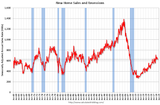 Click on graph for larger image.
The first graph shows New Home Sales vs. recessions since 1963. The dashed line is the current sales rate.
Even with the increase in sales over the last several years, new home sales are still somewhat low historically.
The second graph shows New Home Months of Supply.
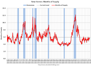 The months of supply decreased in August to 6.1 months from 6.2 months in July.
 The all time record was 12.1 months of supply in January 2009.
This is at the top of the normal range (less than 6 months supply is normal).
"The seasonally-adjusted estimate of new houses for sale at the end of August was 318,000. This represents a supply of 6.1 months at the current sales rate."
 On inventory, according to the Census Bureau:
 "A house is considered for sale when a permit to build has been issued in permit-issuing places or work has begun on the footings or foundation in nonpermit areas and a sales contract has not been signed nor a deposit accepted."Starting in 1973 the Census Bureau broke this down into three categories: Not Started, Under Construction, and Completed.
The third graph shows the three categories of inventory starting in 1973.
The inventory of completed homes for sale is still somewhat low, and the combined total of completed and under construction is also somewhat low.
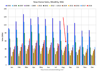 The last graph shows sales NSA (monthly sales, not seasonally adjusted annual rate).
In August 2018 (red column), 53 thousand new homes were sold (NSA). Last year, 45 thousand homes were sold in August.
The all time high for August was 110 thousand in 2005, and the all time low for August was 23 thousand in 2010.
This was close to expectations of 630,000 sales SAAR, however the previous months were revised down significantly. I'll have more later today.
Zillow Case-Shiller Forecast: Slower House Price Gains in August
by Calculated Risk on 9/26/2018 08:20:00 AM
The Case-Shiller house price indexes for July were released yesterday. Zillow forecasts Case-Shiller a month early, and I like to check the Zillow forecasts since they have been pretty close.
From Melissa Allison at Zillow: July Case-Shiller Results and August Forecast: Autumn Chill
A slight autumn chill has fallen over the housing market, and after an incredibly hot past few years, it’s probably fair to say the cooldown is a welcome development for many would-be home buyers.The Zillow forecast is for the year-over-year change for the Case-Shiller National index to be smaller in August than in July.
...
Seasons, just like the housing market, change slowly as environmental conditions shift. Winter in the housing market is certainly not here yet, but it’s increasingly clear that the end of the hot season is rapidly approaching.
Zillow forecasts a further annual slowdown in August, of 5.7 percent. Those Case-Shiller results will be available on Tuesday, Oct. 30.

MBA: Mortgage Applications Increased in Latest Weekly Survey
by Calculated Risk on 9/26/2018 07:00:00 AM
From the MBA: Mortgage Applications Increase in Latest MBA Weekly Survey
Mortgage applications increased 2.9 percent from one week earlier, according to data from the Mortgage Bankers Association’s (MBA) Weekly Mortgage Applications Survey for the week ending September 21, 2018.
... The Refinance Index increased 3 percent from the previous week. The seasonally adjusted Purchase Index increased 3 percent from one week earlier. The unadjusted Purchase Index increased 2 percent compared with the previous week and was 4 percent higher than the same week one year ago. ...
The average contract interest rate for 30-year fixed-rate mortgages with conforming loan balances ($453,100 or less) increased to its highest level since April 2011, 4.97 percent from 4.88 percent, with points increasing to 0.47 from 0.44 (including the origination fee) for 80 percent loan-to-value ratio (LTV) loans.
emphasis added
 Click on graph for larger image.
The first graph shows the refinance index since 1990.
Refinance activity will not pick up significantly unless mortgage rates fall 50 bps or more from the recent level.
 The second graph shows the MBA mortgage purchase index
 According to the MBA, purchase activity is up 4% year-over-year.
Tuesday, September 25, 2018
Wednesday: FOMC Announcement, New Home Sales
by Calculated Risk on 9/25/2018 08:21:00 PM
Wednesday:
• At 7:00 AM ET: The Mortgage Bankers Association (MBA) will release the results for the mortgage purchase applications index.
• At 10:00 AM: New Home Sales for August from the Census Bureau. The consensus is for 630 thousand SAAR, up from 627 thousand in July.
• At 2:00 PM: FOMC Meeting Announcement. The FOMC is expected to increase the Fed Funds rate 25 bps at this meeting.
• At 2:00 PM: FOMC Forecasts This will include the Federal Open Market Committee (FOMC) participants' projections of the appropriate target federal funds rate along with the quarterly economic projections.
• At 2:30 PM: Fed Chair Jerome Powell holds a press briefing following the FOMC announcement.
Freddie Mac: Mortgage Serious Delinquency Rate Decreased in August
by Calculated Risk on 9/25/2018 05:12:00 PM
Freddie Mac reported that the Single-Family serious delinquency rate in August was 0.73%, down from 0.78% in July. Freddie's rate is down from 0.84% in August 2017.
Freddie's serious delinquency rate peaked in February 2010 at 4.20%.
This is the lowest serious delinquency rate for Freddie Mac since January 2008.
These are mortgage loans that are "three monthly payments or more past due or in foreclosure".
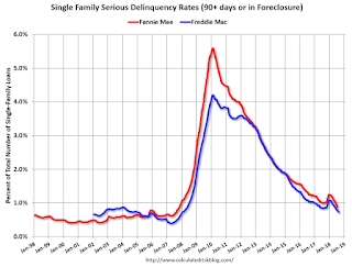
The increase in the delinquency rate late last year was due to the hurricanes (These are serious delinquencies, so it took three months late to be counted). We will probably see another, smaller, bump this year following hurricane Florence.
I expect the delinquency rate to decline to a cycle bottom in the 0.5% to 0.75% range - but this is close to a bottom.
Note: Fannie Mae will report for August soon.
Update: A few comments on the Seasonal Pattern for House Prices
by Calculated Risk on 9/25/2018 02:10:00 PM
CR Note: This is a repeat of earlier posts with updated graphs.
A few key points:
1) There is a clear seasonal pattern for house prices.
2) The surge in distressed sales during the housing bust distorted the seasonal pattern.
3) Even though distressed sales are down significantly, the seasonal factor is based on several years of data - and the factor is now overstating the seasonal change (second graph below).
4) Still the seasonal index is probably a better indicator of actual price movements than the Not Seasonally Adjusted (NSA) index.
For in depth description of these issues, see former Trulia chief economist Jed Kolko's article "Let’s Improve, Not Ignore, Seasonal Adjustment of Housing Data"
Note: I was one of several people to question the change in the seasonal factor (here is a post in 2009) - and this led to S&P Case-Shiller questioning the seasonal factor too (from April 2010). I still use the seasonal factor (I think it is better than using the NSA data).

This graph shows the month-to-month change in the NSA Case-Shiller National index since 1987 (through July 2018). The seasonal pattern was smaller back in the '90s and early '00s, and increased once the bubble burst.
The seasonal swings have declined since the bubble.

The swings in the seasonal factors has started to decrease, and I expect that over the next several years - as recent history is included in the factors - the seasonal factors will move back towards more normal levels.
However, as Kolko noted, there will be a lag with the seasonal factor since it is based on several years of recent data.
Real House Prices and Price-to-Rent Ratio in July
by Calculated Risk on 9/25/2018 11:18:00 AM
Here is the earlier post on Case-Shiller: Case-Shiller: National House Price Index increased 6.0% year-over-year in July
It has been over eleven years since the bubble peak. In the Case-Shiller release this morning, the seasonally adjusted National Index (SA), was reported as being 9.9% above the previous bubble peak. However, in real terms, the National index (SA) is still about 9.6% below the bubble peak (and historically there has been an upward slope to real house prices). The composite 20, in real terms, is still 15.7% below the bubble peak.
The year-over-year increase in prices is mostly moving sideways now around 6%. In July, the index was up 6.0% YoY.
Usually people graph nominal house prices, but it is also important to look at prices in real terms (inflation adjusted). Case-Shiller and others report nominal house prices. As an example, if a house price was $200,000 in January 2000, the price would be close to $285,000 today adjusted for inflation (42%). That is why the second graph below is important - this shows "real" prices (adjusted for inflation).
Nominal House Prices

In nominal terms, the Case-Shiller National index (SA)and the Case-Shiller Composite 20 Index (SA) are both at new all times highs (above the bubble peak).
Real House Prices

In real terms, the National index is back to December 2004 levels, and the Composite 20 index is back to June 2004.
In real terms, house prices are at 2004 levels.
Price-to-Rent
In October 2004, Fed economist John Krainer and researcher Chishen Wei wrote a Fed letter on price to rent ratios: House Prices and Fundamental Value. Kainer and Wei presented a price-to-rent ratio using the OFHEO house price index and the Owners' Equivalent Rent (OER) from the BLS.

This graph shows the price to rent ratio (January 2000 = 1.0).
On a price-to-rent basis, the Case-Shiller National index is back to February 2004 levels, and the Composite 20 index is back to November 2003 levels.
In real terms, prices are back to mid 2004 levels, and the price-to-rent ratio is back to late 2003, early 2004.
Richmond Fed: "Fifth District Manufacturing Activity Was Robust in September"
by Calculated Risk on 9/25/2018 10:02:00 AM
From the Richmond Fed: Fifth District Manufacturing Activity Was Robust in September
Fifth District manufacturing activity was robust in September, according to results of the most recent survey from the Federal Reserve Bank of Richmond. The composite index rose from 24 in August to 29 in September, buoyed by increases in shipments and new orders, while the index of the third component, employment, dropped. Survey respondents were optimistic, expecting growth to continue in the next six months.So far the regional surveys for September have indicated solid growth.
The employment index fell in September but remained positive, while growth in wages and the average workweek expanded. Manufacturing firms continued to struggle to find employees with the skills they needed, and they expect this difficulty to continue in the coming months.
emphasis added


