by Calculated Risk on 6/28/2018 08:33:00 AM
Thursday, June 28, 2018
Weekly Initial Unemployment Claims increased to 227,000
The DOL reported:
In the week ending June 23, the advance figure for seasonally adjusted initial claims was 227,000, an increase of 9,000 from the previous week's unrevised level of 218,000. The 4-week moving average was 222,000, an increase of 1,000 from the previous week's unrevised average of 221,000.The previous week was unrevised.
emphasis added
The following graph shows the 4-week moving average of weekly claims since 1971.
 Click on graph for larger image.
The dashed line on the graph is the current 4-week average. The four-week average of weekly unemployment claims increased to 222,000.
This was higher than the consensus forecast. The low level of claims suggest few layoffs.
Wednesday, June 27, 2018
Thursday: GDP, Unemployment Claims
by Calculated Risk on 6/27/2018 08:27:00 PM
Thursday:
• At 8:30 AM ET, The initial weekly unemployment claims report will be released. The consensus is for 220 thousand initial claims, up from 218 thousand the previous week.
• At 8:30 AM, Gross Domestic Product, 1st quarter 2018 (Third estimate). The consensus is that real GDP increased 2.2% annualized in Q1, unchanged from the second estimate of 2.2% in Q1.
• At 11:00 AM, the Kansas City Fed manufacturing survey for June. This is the last of the regional surveys for June.
Chemical Activity Barometer Increased in June
by Calculated Risk on 6/27/2018 04:52:00 PM
Note: This appears to be a leading indicator for industrial production.
From the American Chemistry Council: Chemical Activity Barometer Continues Upward Climb Into Third Quarter
The Chemical Activity Barometer (CAB), a leading economic indicator created by the American Chemistry Council (ACC), rose 0.1 percent on a three-month moving average (3MMA) basis in June to 122.27. This marked the barometer’s tenth consecutive gain, following revisions. The barometer is up 4.1 percent on a 3MMA compared to a year earlier. The unadjusted CAB also increased, notching a 0.3 percent gain, pushing it to a 4.3 percent gain year-over-year. The March, April, and May readings were all adjusted upward. June readings indicate a continued expansion of U.S. commercial and industrial activity into early 2019.
...
Applying the CAB back to 1912, it has been shown to provide a lead of two to fourteen months, with an average lead of eight months at cycle peaks as determined by the National Bureau of Economic Research. The median lead was also eight months. At business cycle troughs, the CAB leads by one to seven months, with an average lead of four months. The median lead was three months. The CAB is rebased to the average lead (in months) of an average 100 in the base year (the year 2012 was used) of a reference time series. The latter is the Federal Reserve’s Industrial Production Index.
emphasis added
 Click on graph for larger image.
This graph shows the year-over-year change in the 3-month moving average for the Chemical Activity Barometer compared to Industrial Production. It does appear that CAB (red) generally leads Industrial Production (blue).
The year-over-year increase in the CAB has been solid over the last year, suggesting further gains in industrial production in 2018 and early 2019.
Philly Fed: State Coincident Indexes increased in 45 states in May
by Calculated Risk on 6/27/2018 02:26:00 PM
From the Philly Fed:
The Federal Reserve Bank of Philadelphia has released the coincident indexes for the 50 states for May 2018. Over the past three months, the indexes increased in all 50 states, for a three-month diffusion index of 100. In the past month, the indexes increased in 45 states, decreased in one, and remained stable in four, for a one-month diffusion index of 88.Note: These are coincident indexes constructed from state employment data. An explanation from the Philly Fed:
emphasis added
The coincident indexes combine four state-level indicators to summarize current economic conditions in a single statistic. The four state-level variables in each coincident index are nonfarm payroll employment, average hours worked in manufacturing by production workers, the unemployment rate, and wage and salary disbursements deflated by the consumer price index (U.S. city average). The trend for each state’s index is set to the trend of its gross domestic product (GDP), so long-term growth in the state’s index matches long-term growth in its GDP.
 Click on map for larger image.
Here is a map of the three month change in the Philly Fed state coincident indicators. This map was all red during the worst of the recession, and all or mostly green during most of the recent expansion.
Once again, the map is all green on a three month basis.
Source: Philly Fed.
Note: For complaints about red / green issues, please contact the Philly Fed.
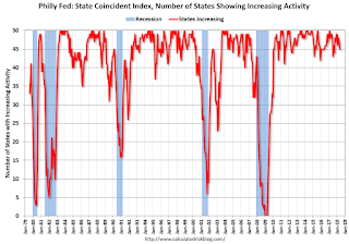
 And here is a graph is of the number of states with one month increasing activity according to the Philly Fed. This graph includes states with minor increases (the Philly Fed lists as unchanged).
In Map, 45 states had increasing activity (including minor increases).
The downturn in 2015 and 2016, in the number of states increasing, was mostly related to the decline in oil prices.
Reis: Apartment Vacancy Rate increased in Q2 to 4.8%
by Calculated Risk on 6/27/2018 11:28:00 AM
Reis reported that the apartment vacancy rate was at 4.8% in Q2 2018, up from 4.7% in Q1, and up from 4.3% in Q2 2017. This is the highest vacancy rate since Q3 2012. The vacancy rate peaked at 8.0% at the end of 2009, and bottomed at 4.1% in 2016.
From Reis:
Once again, the apartment vacancy rate increased in the quarter to 4.8% from 4.7% last quarter and 4.3% in the second quarter of 2017. The vacancy rate has now increased 70 basis points from a low of 4.1% in Q3 2016.
The national average asking rent increased 1.3% in the first quarter while effective rents, which net out landlord concessions, increased 1.2%. At $1,404 per unit (market) and $1,337 per unit (effective), the average rents have increased 4.4% and 4.0%, respectively, from the second quarter of 2017.
Net absorption was 37,265 units, slightly above last quarter’s absorption of 36,124 units but below the average quarterly absorption of 2017 of 46,031 units. Construction was 50,360 units, higher than the first quarter’s 50,244 units but below the 2017 quarterly average of 60,514 units. We still expect total construction for 2018 to surpass that of 2017.
...
The apartment market had slowed at the end of 2017 and early 2018 as the housing market started to accelerate. Momentum in the housing market, however, recently slowed as indicated by recent existing home sales results. These shifts are likely due to the Tax Reform and Jobs Act that doubled the standard deduction and cut the deductibility of state, local and property taxes which lowered the incentive to buy a home.
We expect construction to remain robust for the rest of 2018 and in early 2019 before completions drop off in subsequent periods. Occupancy is expected to remain positive, although vacancy rates are expected to continue to increase as new supply will outpace demand growth. Still, as long as job growth remains positive, we expect rent growth to remain positive over the next few quarters.
emphasis added
 Click on graph for larger image.
This graph shows the apartment vacancy rate starting in 1980. (Annual rate before 1999, quarterly starting in 1999). Note: Reis is just for large cities.
The vacancy rate had mostly moved sideways for the last several years. However, the vacancy rate has bottomed and is now increasing. With more supply coming on line - and less favorable demographics - the vacancy rate will probably continue to increase over the next year.
Apartment vacancy data courtesy of Reis.
NAR: Pending Home Sales Index Decreased 0.5% in May
by Calculated Risk on 6/27/2018 10:03:00 AM
From the NAR: Pending Home Sales Inch Back 0.5 Percent in May
Pending home sales decreased modestly in May and have now fallen on an annualized basis for the fifth straight month, according to the National Association of Realtors®. A larger decline in contract activity in the South offset gains in the Northeast, Midwest and West.This was well below expectations of a 0.7% increase for this index. Note: Contract signings usually lead sales by about 45 to 60 days, so this would usually be for closed sales in June and July.
The Pending Home Sales Index, a forward-looking indicator based on contract signings, decreased 0.5 percent to 105.9 in May from 106.4 in April.
...
The PHSI in the Northeast increased 2.0 percent to 92.4 in May, but is still 4.8 percent below a year ago. In the Midwest the index rose 2.9 percent to 101.4 in May, but is still 2.5 percent lower than May 2017.
Pending home sales in the South declined 3.5 percent to an index of 122.9 in May (unchanged from a year ago). The index in the West inched forward 0.6 percent in May to 94.7, but is 4.1 percent below a year ago.
emphasis added
MBA: Mortgage Applications Decrease in Latest Weekly Survey
by Calculated Risk on 6/27/2018 07:00:00 AM
From the MBA: Mortgage Applications Decrease in Latest MBA Weekly Survey
Mortgage applications decreased 4.9 percent from one week earlier, according to data from the Mortgage Bankers Association’s (MBA) Weekly Mortgage Applications Survey for the week ending June 22, 2018.
... The Refinance Index decreased 4 percent from the previous week. The seasonally adjusted Purchase Index decreased 6 percent from one week earlier. The unadjusted Purchase Index decreased 7 percent compared with the previous week and was 1 percent higher than the same week one year ago. ...
The average contract interest rate for 30-year fixed-rate mortgages with conforming loan balances ($453,100 or less) increased to 4.84 percent from 4.83 percent, with points decreasing to 0.42 from 0.48 (including the origination fee) for 80 percent loan-to-value ratio (LTV) loans.
emphasis added
 Click on graph for larger image.
The first graph shows the refinance index since 1990.
Refinance activity will not pick up significantly unless mortgage rates fall 50 bps or more from the recent level.
 The second graph shows the MBA mortgage purchase index
 According to the MBA, purchase activity is up 1% year-over-year.
Tuesday, June 26, 2018
Wednesday: Durable Goods, Pending Home Sales, Q2 Apartment Vacancy Survey
by Calculated Risk on 6/26/2018 09:01:00 PM
Wednesday:
• At 7:00 AM ET, The Mortgage Bankers Association (MBA) will release the results for the mortgage purchase applications index.
• Early, Reis Q2 2018 Apartment Survey of rents and vacancy rates.
• At 8:30 AM, Durable Goods Orders for May from the Census Bureau. The consensus is for a 0.6% decrease in durable goods orders.
• At 10:00 AM, Pending Home Sales Index for May. The consensus is for a 0.7% increase in the index.
Freddie Mac: Mortgage Serious Delinquency Rate Decreased in May
by Calculated Risk on 6/26/2018 05:43:00 PM
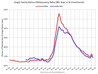
Freddie Mac reported that the Single-Family serious delinquency rate in May was 0.87%, down from 0.94% in April. Freddie's rate is unchanged from 0.87% in May 2017.
Freddie's serious delinquency rate peaked in February 2010 at 4.20%.
These are mortgage loans that are "three monthly payments or more past due or in foreclosure".

The increase in the delinquency rate late last year was due to the hurricanes - no worries about the overall market (These are serious delinquencies, so it took three months late to be counted).
After the hurricane bump, maybe the rate will decline to a cycle bottom in the 0.5% to 0.8% range.
Note: Fannie Mae will report for May soon.
Real House Prices and Price-to-Rent Ratio in April
by Calculated Risk on 6/26/2018 02:31:00 PM
Here is the earlier post on Case-Shiller: Case-Shiller: National House Price Index increased 6.4% year-over-year in April
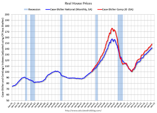
It has been over eleven years since the bubble peak. In the Case-Shiller release this morning, the seasonally adjusted National Index (SA), was reported as being 9.1% above the previous bubble peak. However, in real terms, the National index (SA) is still about 9.9% below the bubble peak (and historically there has been an upward slope to real house prices). The composite 20, in real terms, is still 15.8% below the bubble peak.
The year-over-year increase in prices is mostly moving sideways now around 6%. In April, the index was up 6.4% YoY.
Usually people graph nominal house prices, but it is also important to look at prices in real terms (inflation adjusted). Case-Shiller and others report nominal house prices. As an example, if a house price was $200,000 in January 2000, the price would be close to $284,000 today adjusted for inflation (42%). That is why the second graph below is important - this shows "real" prices (adjusted for inflation).
Nominal House Prices

In nominal terms, the Case-Shiller National index (SA)and the Case-Shiller Composite 20 Index (SA) are both at new all times highs (above the bubble peak).
Real House Prices

In real terms, the National index is back to December 2004 levels, and the Composite 20 index is back to June 2004.
In real terms, house prices are at 2004 levels.
Price-to-Rent
In October 2004, Fed economist John Krainer and researcher Chishen Wei wrote a Fed letter on price to rent ratios: House Prices and Fundamental Value. Kainer and Wei presented a price-to-rent ratio using the OFHEO house price index and the Owners' Equivalent Rent (OER) from the BLS.

This graph shows the price to rent ratio (January 2000 = 1.0).
On a price-to-rent basis, the Case-Shiller National index is back to February 2004 levels, and the Composite 20 index is back to December 2003 levels.
In real terms, prices are back to mid 2004 levels, and the price-to-rent ratio is back to late 2003, early 2004.


