by Calculated Risk on 5/07/2018 12:01:00 PM
Monday, May 07, 2018
Update: Framing Lumber Prices Up Sharply Year-over-year, At Record Prices
Here is another monthly update on framing lumber prices. Early in 2013 lumber prices came close to the housing bubble highs - and now prices are well above the bubble highs.
This graph shows two measures of lumber prices: 1) Framing Lumber from Random Lengths through March 2018 (via NAHB), and 2) CME framing futures.

Right now Random Lengths prices are up 22% from a year ago, and CME futures are up about 51% year-over-year.
There is a seasonal pattern for lumber prices. Prices frequently peak around May, and bottom around October or November - although there is quite a bit of seasonal variability.
Rising costs - both material and labor - will be headwinds for the building industry this year.
Black Knight Mortgage Monitor for March
by Calculated Risk on 5/07/2018 09:06:00 AM
Black Knight released their Mortgage Monitor report for February today. According to Black Knight, 3.73% of mortgages were delinquent in March, up from 3.62% in March 2017. The increase was primarily due to the hurricanes. Black Knight also reported that 0.63% of mortgages were in the foreclosure process, down from 0.88% a year ago.
This gives a total of 4.36% delinquent or in foreclosure.
Press Release: Black Knight’s Mortgage Monitor: Home Prices See Strongest Start to Any Year Since 2005; San Jose’s 12-Month Growth Greater than Median Prices in Half of 100 Largest Markets
Today, the Data & Analytics division of Black Knight, Inc. released its latest Mortgage Monitor Report, based on data as of the end of March 2018. This month, leveraging data from the Black Knight Home Price Index, the company finds that 2018 home prices have seen the strongest gains to start any year since 2005. Home price growth has been widespread – 98 of the largest markets and 97 percent of 916 observed Core Based Statistical Areas (CBSAs) have all had annual increases, with the Western United States seeing some of the greatest gains. As Black Knight Data & Analytics Executive Vice President Ben Graboske explained, acceleration in the annual rate of home price appreciation at the national level continued through February, but that acceleration is not being seen in all markets.
“At the national level, home prices rose 1.24 percent since the start of 2018, with both January and February having their strongest respective single-month growth rates in 13 years,” said Graboske. “As of the end of February, home prices had risen 6.65 percent from a year ago, a metric that continues to increase. The rate of appreciation has accelerated by 42 basis points over the past six months and by 72 basis points over the past 12 months. This acceleration, combined with a nearly 40 basis point increase in the prevailing 30-year fixed interest rate during that same time frame, is creating a tighter affordability climate. We have now seen monthly increases in the national median home price for 27 of the past 28 months, and annual gains for 70 consecutive months.
“While almost all markets are seeing home prices rise, rates of appreciation vary across the country with the highest being seen in Western states. In fact, of the 11 markets with price gains of 10 percent or more, all 11 are in the Western United States. Across the country, we see an approximately 60-40 split in the number of markets experiencing home price appreciation vs. those with some degree of deceleration. By far, the heaviest areas of acceleration are San Jose and Las Vegas. The former has seen the rate of appreciation increase by 18 percent from just under six percent at the start of 2017 to a 24.1 percent annual rise in home prices as of February. The median home price in San Jose now stands at $1.17 million – the highest of any metro – an increase of $226,000 from just one year ago. To put that in perspective, more than half of the nation’s 100 largest markets have median home prices below this $226,000 annual growth in San Jose’s median home price. In Las Vegas, which has now surpassed Seattle as the second fastest-appreciating market nationwide, home prices are up nearly 15 percent from last year. Even so, Las Vegas home prices remain 22 percent below their pre-recession peak.”
The month’s data also showed the continued impact of rising mortgage interest rates on the population of borrowers who could both likely qualify for and gain a rate benefit from refinancing. There are now nearly 2 million fewer refinance candidates than there were entering 2018, a 46 percent decline. The total number of refinance candidates now stands at 2.3 million, the fewest since November 2008, when interest rates were above 6.0 percent. Additionally, the incentive for borrowers to refinance in order to lower their interest rates is all but non-existent among mortgages originated in the past five years. Of the nearly 28 million borrowers with 30-year mortgages originated in 2012 or later, fewer than 45,000 have 75 basis points of interest rate incentive to refinance while also meeting broad-based eligibility requirements.
emphasis added
 Click on graph for larger image.
This graph from Black Knight shows the 90 default activity in the hurricane impacted states.
From Black Knight:
• Prior to the 2017 hurricanes, Texas and Florida accounted for approximately 15% of all default activity for the last 5+ years
• The post-hurricane surge in defaults drove that share as high as 50% in November 2017; it has since subsided to roughly one in five defaults coming from the two states
• Default activity (which includes borrowers temporarily missing payments associated with forbearance plans) spiked from 51K in Q3 2017 to 184K in Q4
• Default activity remained elevated in January and February as well, with 65K defaults in Q1 2018 as a whole
• As of March, default volumes for Texas and Florida declined to 14,4K, only ~1K above the long-term (2000-2005) March average for the two states
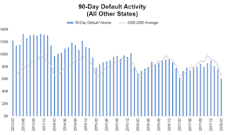
The second graph shows the national default activity excluding the hurricane impacted states.
• Nationally, Q1 2017 saw 282K defaults, just slightly below the 2000-2005 benchmark average (286K)There is much more in the mortgage monitor.
• In non-hurricane-affected areas, default volumes haven now fallen below these longterm benchmarks in each of the past 10 months
• This improvement is largely due to favorable macroeconomic trends, improved performance from seasoned mortgages and the overarching pristine quality of post-recession vintages
• Overall default activity for the 12 months ending March 2018 increased by 10% year-over year, driven by a 90% increase in default activity in Texas and Florida
• However, in non-hurricane affected states defaults were down by 5% year-over-year for the lowest 12-month total since 2004/2005
Sunday, May 06, 2018
Sunday Night Futures
by Calculated Risk on 5/06/2018 06:18:00 PM
Weekend:
• Schedule for Week of May 6, 2018
Monday:
• At 3:00 PM ET, Consumer Credit from the Federal Reserve. The consensus is for consumer credit to increase $16.0 billion in March.
From CNBC: Pre-Market Data and Bloomberg futures: S&P 500 are up 6, and DOW futures are up 66 (fair value).
Oil prices were up over the last week with WTI futures at $69.83 per barrel and Brent at $75.00 per barrel. A year ago, WTI was at $46, and Brent was at $47 - so oil prices are up about 50% year-over-year.
Here is a graph from Gasbuddy.com for nationwide gasoline prices. Nationally prices are at $2.80 per gallon. A year ago prices were at $2.34 per gallon - so gasoline prices are up 46 cents per gallon year-over-year.
Hotels: Occupancy Rate "dips" Year-over-Year, On Pace for Record Year
by Calculated Risk on 5/06/2018 08:09:00 AM
From HotelNewsNow.com: STR: US hotel results for week ending 28 April
The U.S. hotel industry reported mixed year-over-year results in the three key performance metrics during the week of 22-28 April 2018, according to data from STR.The following graph shows the seasonal pattern for the hotel occupancy rate using the four week average.
In comparison with the week of 23-29 April 2017, the industry recorded the following:
• Occupancy: -0.6% to 69.8%
• Average daily rate (ADR): +2.3% to US$130.40
• Revenue per available room (RevPAR): +1.7% to US$91.05
emphasis added
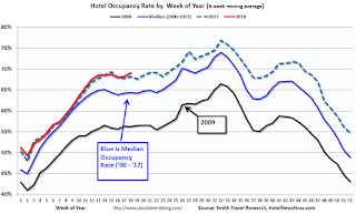 Click on graph for larger image.
The red line is for 2018, dash light blue is 2017 (record year due to hurricanes), blue is the median, and black is for 2009 (the worst year since the Great Depression for hotels).
The occupancy rate, to date, is slightly ahead of the record year in 2017 (2017 finished strong due to the impact of the hurricanes).
Data Source: STR, Courtesy of HotelNewsNow.com
Saturday, May 05, 2018
Schedule for Week of May 6, 2018
by Calculated Risk on 5/05/2018 08:11:00 AM
The key economic report this week is the Consumer Price Index (CPI) on Thursday.
3:00 PM: Consumer Credit from the Federal Reserve. The consensus is for consumer credit to increase $16.0 billion in March.
3:15 AM ET: Panel Discussion, Fed Chair Jerome Powell, Monetary Policy Influences on Global Financial Conditions and International Capital Flows, At the Swiss National Bank and International Monetary Fund High Level Conference on the International Monetary System, Zurich, Switzerland
6:00 AM: NFIB Small Business Optimism Index for April.
 10:00 AM ET: Job Openings and Labor Turnover Survey for March from the BLS.
 This graph shows job openings (yellow line), hires (purple), Layoff, Discharges and other (red column), and Quits (light blue column) from the JOLTS.
Jobs openings decreased in February to 6.052 million from 6.228 in January.
The number of job openings (yellow) were up 7.7% year-over-year, and Quits were up 6.3% year-over-year.
7:00 AM ET: The Mortgage Bankers Association (MBA) will release the results for the mortgage purchase applications index.
8:30 AM: The Producer Price Index for April from the BLS. The consensus is a 0.3% increase in PPI, and a 0.2% increase in core PPI.
8:30 AM ET: The initial weekly unemployment claims report will be released. The consensus is for 220 thousand initial claims, up from 211 thousand the previous week.
8:30 AM: The Consumer Price Index for April from the BLS. The consensus is for a 0.3% increase in CPI, and a 0.2% increase in core CPI.
10:00 AM: University of Michigan's Consumer sentiment index (Preliminary for May). The consensus is for a reading of 99.0, up from 98.8.
Friday, May 04, 2018
Oil Rigs: "Another solid week for rig additions"
by Calculated Risk on 5/04/2018 07:39:00 PM
A few comments from Steven Kopits of Princeton Energy Advisors LLC on May 4, 2018:
• Total US oil rigs were up, +9 to 834
• Horizontal oil rigs were up, +9 at 743
...
• The rig count saw widespread horizontal oil gains this week, including the Permian (+4) and Other US (+4)
• Notwithstanding, since last July’s peak, the Permian has added 75 horizontal oil rigs; all other plays together have gained only 10.
• Vertical oil rigs are at their lowest level since November 2016
• The Brent spread has eased back to just over $5 / barrel, but with the gap closing from below, suggesting that the US consumer is trying to hold on to domestic oil inventories. This pattern suggests continued upward price pressure.
 Click on graph for larger image.
CR note: This graph shows the US horizontal rig count by basin.
Graph and comments Courtesy of Steven Kopits of Princeton Energy Advisors LLC.
AAR: Rail Carloads Up 3.3% YoY, Best April Ever for Intermodal
by Calculated Risk on 5/04/2018 04:13:00 PM
From the Association of American Railroads (AAR) Rail Time Indicators. Graphs and excerpts reprinted with permission.
April was a very good month for U.S. rail traffic. Fifteen of the 20 carload commodity categories the AAR tracks saw higher carloads in April 2018 than in April 2017 — 15 is the most since January 2015. Total carloads were up 3.3% (34,020 carloads) in April ...U.S. intermodal volume in April 2018 was up 6.8%, or 69,630 units, over April 2017. April was the 15th straight year-over-year monthly increase for intermodal, dating back to February 2017. Average weekly intermodal volume in April 2018 was 274,750 units, the third highest for any month on record. April is the seventh straight month in which U.S. intermodal volume was the highest ever for that month.
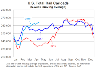 Click on graph for larger image.
This graph from the Rail Time Indicators report shows U.S. average weekly rail carloads (NSA). Light blue is 2018.
Rail carloads have been weak over the last decade due to the decline in coal shipments.
Originated U.S. rail carloads in April 2018 were up 34,020, or 3.3%, over April 2017 to 1.05 million. Total carloads have risen in three of the past five months. Weekly average carloads in April 2018 were 262,757, the most for April since 2015.
 The second graph is for intermodal traffic (using intermodal or shipping containers):
U.S. railroads originated 1,099,000 containers and trailers in April 2018, up 69,630 units, or 6.8%, over April 2017. It’s the 15th straight year-over-year monthly increase for intermodal, dating back to February 2017. Average weekly intermodal volume in April 2018 was 274,750 units, the third highest for any month on record (behind only February 2018 and October 2017). April is the seventh straight month in which U.S. intermodal volume was the highest ever for that month.
Early Q2 GDP Forecasts
by Calculated Risk on 5/04/2018 02:55:00 PM
From Merrill Lynch:
We revise down our 2Q GDP forecast to 3.2% from 3.7% as consumer spending and capex trends appear less bullish and there is a weak handoff between 1Q and 2Q. [May 4 estimate].And from the Altanta Fed: GDPNow
emphasis added
The GDPNow model estimate for real GDP growth (seasonally adjusted annual rate) in the second quarter of 2018 is 4.0 percent on May 3, down from 4.1 percent on May 1. [May 3 estimate]From the NY Fed Nowcasting Report
The New York Fed Staff Nowcast stands at 3.0% for 2018:Q2. [May 4 estimate]CR Note: These early estimates suggest GDP in the 3% to 4% in Q2.
Public and Private Sector Payroll Jobs During Presidential Terms
by Calculated Risk on 5/04/2018 12:15:00 PM
By request, here is another update of tracking employment during Presidential terms. We frequently use Presidential terms as time markers - we could use Speaker of the House, Fed Chair, or any other marker.
NOTE: Several readers have asked if I could add a lag to these graphs (obviously a new President has zero impact on employment for the month they are elected). But that would open a debate on the proper length of the lag, so I'll just stick to the beginning of each term.
Important: There are many differences between these periods. Overall employment was smaller in the '80s, however the participation rate was increasing in the '80s (younger population and women joining the labor force), and the participation rate is generally declining now. But these graphs give an overview of employment changes.
The first graph shows the change in private sector payroll jobs from when each president took office until the end of their term(s). Presidents Carter and George H.W. Bush only served one term.
Mr. G.W. Bush (red) took office following the bursting of the stock market bubble, and left during the bursting of the housing bubble. Mr. Obama (dark blue) took office during the financial crisis and great recession. There was also a significant recession in the early '80s right after Mr. Reagan (dark red) took office.
There was a recession towards the end of President G.H.W. Bush (light purple) term, and Mr Clinton (light blue) served for eight years without a recession.
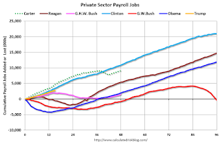
The first graph is for private employment only.
Mr. Trump is in Orange (just 15 months).
The employment recovery during Mr. G.W. Bush's (red) first term was sluggish, and private employment was down 804,000 jobs at the end of his first term. At the end of Mr. Bush's second term, private employment was collapsing, and there were net 391,000 private sector jobs lost during Mr. Bush's two terms.
Private sector employment increased by 20,964,000 under President Clinton (light blue), by 14,717,000 under President Reagan (dark red), 9,041,000 under President Carter (dashed green), 1,509,000 under President G.H.W. Bush (light purple), and 11,907,000 under President Obama (dark blue).
During the first 15 months of Mr. Trump's term, the economy has added 2,723,000 private sector jobs.

The public sector grew during Mr. Carter's term (up 1,304,000), during Mr. Reagan's terms (up 1,414,000), during Mr. G.H.W. Bush's term (up 1,127,000), during Mr. Clinton's terms (up 1,934,000), and during Mr. G.W. Bush's terms (up 1,744,000 jobs). However the public sector declined significantly while Mr. Obama was in office (down 266,000 jobs).
During the first 15 months of Mr. Trump's term, the economy has added 5,000 public sector jobs.
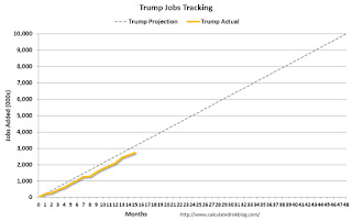
After 15 months of Mr. Trump's presidency, the economy has added 2,728,000 jobs, about 397,000 behind the projection.
Comments on April Employment Report
by Calculated Risk on 5/04/2018 09:19:00 AM
The headline jobs number at 164,000 for April was below consensus expectations of 190 thousand, however the previously two months were revised up a combined 30 thousand. With the revisions, this was close to expectations.
Earlier: April Employment Report: 164,000 Jobs Added, 3.9% Unemployment Rate
In April, the year-over-year employment change was 2.280 million jobs. This has been generally trending down, but is still solid year-over-year growth.
Average Hourly Earnings
Wage growth was about as expected in April, however hourly wages for March were revised down. From the BLS:
"In April, average hourly earnings for all employees on private nonfarm payrolls rose by 4 cents to $26.84. Over the year, average hourly earnings have increased by 67 cents, or 2.6 percent."
 Click on graph for larger image.
This graph is based on “Average Hourly Earnings” from the Current Employment Statistics (CES) (aka "Establishment") monthly employment report. Note: There are also two quarterly sources for earnings data: 1) “Hourly Compensation,” from the BLS’s Productivity and Costs; and 2) the Employment Cost Index which includes wage/salary and benefit compensation.
The graph shows the nominal year-over-year change in "Average Hourly Earnings" for all private employees. Nominal wage growth was at 2.6% YoY in April.
Wage growth had been trending up, although growth has been moving sideways recently.
Prime (25 to 54 Years Old) Participation
 Since the overall participation rate has declined due to cyclical (recession) and demographic (aging population, younger people staying in school) reasons, here is the employment-population ratio for the key working age group: 25 to 54 years old.
In the earlier period the participation rate for this group was trending up as women joined the labor force. Since the early '90s, the participation rate moved more sideways, with a downward drift starting around '00 - and with ups and downs related to the business cycle.
The 25 to 54 participation rate decreased in April to 82.0%, and the 25 to 54 employment population ratio was unchanged at 79.2%.
The participation rate had been trending down for this group since the late '90s, however, with more younger workers (and fewer 50+ age workers), the prime participation rate might move up some more.
Part Time for Economic Reasons
 From the BLS report:
"The number of persons employed part time for economic reasons (sometimes referred to as involuntary part-time workers) was essentially unchanged at 5.0 million in April. These individuals, who would have preferred full-time employment, were working part time because their hours had been reduced or because they were unable to find full-time jobs."The number of persons working part time for economic reasons has been generally trending down, and the number decreased in April. The number working part time for economic reasons suggests a little slack still in the labor market.
These workers are included in the alternate measure of labor underutilization (U-6) that decreased to 7.8% in April. This is the lowest level for U-6 since 2001.
Unemployed over 26 Weeks
 This graph shows the number of workers unemployed for 27 weeks or more.
 According to the BLS, there are 1.293 million workers who have been unemployed for more than 26 weeks and still want a job. This was down from 1.322 million in March.
This is the lowest level since September 2007.
This is trending down, but remains a little elevated.
The headline jobs number was a little disappointing, however the previous two months were revised up. For the first four months of 2018, job growth has been solid averaging close to 200 thousand per month.


