by Calculated Risk on 10/27/2016 08:34:00 AM
Thursday, October 27, 2016
Weekly Initial Unemployment Claims decrease to 258,000
The DOL reported:
In the week ending October 22, the advance figure for seasonally adjusted initial claims was 258,000, a decrease of 3,000 from the previous week's revised level. The previous week's level was revised up by 1,000 from 260,000 to 261,000. The 4-week moving average was 253,000, an increase of 1,000 from the previous week's revised average. The previous week's average was revised up by 250 from 251,750 to 252,000.The previous week was revised up.
There were no special factors impacting this week's initial claims. This marks 86 consecutive weeks of initial claims below 300,000, the longest streak since 1970.
The following graph shows the 4-week moving average of weekly claims since 1971.
 Click on graph for larger image.
The dashed line on the graph is the current 4-week average. The four-week average of weekly unemployment claims increased to 253,000.
This was close to the consensus forecast. The low level of claims suggests relatively few layoffs.
Wednesday, October 26, 2016
Thursday: Durable Goods, Unemployment Claims, Pending Home Sales and More
by Calculated Risk on 10/26/2016 08:44:00 PM
Thursday:
• At 8:30 AM ET, the initial weekly unemployment claims report will be released. The consensus is for 255 thousand initial claims, down from 260 thousand the previous week. Note: I expect some further impact on claims due to Hurricane Matthew.
• Also at 8:30 AM, Durable Goods Orders for September from the Census Bureau. The consensus is for a 0.2% increase in durable goods orders.
• At 10:00 AM, Pending Home Sales Index for September. The consensus is for a 1.0% increase in the index.
• Also at 10:00 AM, the Q3 Housing Vacancies and Homeownership from the Census Bureau.
• At 11:00 AM, the Kansas City Fed Survey of Manufacturing Activity for October.
Philly Fed: State Coincident Indexes increased in 36 states in September
by Calculated Risk on 10/26/2016 04:05:00 PM
From the Philly Fed:
The Federal Reserve Bank of Philadelphia has released the coincident indexes for the 50 states for September 2016. In the past month, the indexes increased in 36 states, decreased in 11, and remained stable in three, for a one-month diffusion index of 50. Over the past three months, the indexes increased in 40 states, decreased in nine, and remained stable in one, for a three-month diffusion index of 62.Note: These are coincident indexes constructed from state employment data. An explanation from the Philly Fed:
The coincident indexes combine four state-level indicators to summarize current economic conditions in a single statistic. The four state-level variables in each coincident index are nonfarm payroll employment, average hours worked in manufacturing, the unemployment rate, and wage and salary disbursements deflated by the consumer price index (U.S. city average). The trend for each state’s index is set to the trend of its gross domestic product (GDP), so long-term growth in the state’s index matches long-term growth in its GDP.Philly Fed.
 Click on graph for larger image.
This is a graph is of the number of states with one month increasing activity according to the Philly Fed. This graph includes states with minor increases (the Philly Fed lists as unchanged).
In September, 39 states had increasing activity (including minor increases).
Eight states have seen declines over the last 6 months, in order the five worst are Wyoming (worst), Alaska, Louisiana, Kansas, Oklahoma - mostly due to the decline in oil prices.
 Here is a map of the three month change in the Philly Fed state coincident indicators. This map was all red during the worst of the recession, and is mostly green now.
Source: Philly Fed. Note: For complaints about red / green issues, please contact the Philly Fed.
Zillow Forecast: Expect "Modest Acceleration" in YoY Growth in September for the Case-Shiller Indexes
by Calculated Risk on 10/26/2016 01:31:00 PM
The Case-Shiller house price indexes for August were released yesterday. Zillow forecasts Case-Shiller a month early, and I like to check the Zillow forecasts since they have been pretty close.
From Zillow: September Case-Shiller Forecast: Modest Acceleration in Home Price Growth Will Continue
According to Zillow’s September Case-Shiller forecast, the national index and both smaller 10 and 20-city indices look set to continue the acceleration in home price growth they exhibited in August. And after more than two years of steady growth around 5 percent annually, the U.S. National Case-Shiller home price index is within striking distance of reaching its July 2006 peak levels, just 0.1 percent off those levels, according to today’s data.The year-over-year change for the 10-city and 20-city indexes will probably be about the same in the September report as in the August report. The change for the National index will probably be slightly higher.
The September Case-Shiller National Index is expected to grow 5.4 percent year-over-year and 0.7 percent month-to-month (seasonally adjusted). We expect the 10-City Index to grow 4.3 percent year-over-year and 0.3 percent (SA) from July. The 20-City Index is expected to grow 5.1 percent between September 2015 and September 2016, and rise 0.4 percent (SA) from August.
Zillow’s September Case-Shiller forecast is shown in the table below. These forecasts are based on today’s August Case-Shiller data release and the September 2016 Zillow Home Value Index (ZHVI). The September S&P CoreLogic Case-Shiller Indices will not be officially released until Tuesday, November 29.

A few Comments on September New Home Sales
by Calculated Risk on 10/26/2016 11:23:00 AM
New home sales for September were reported below the consensus forecast at 593,000 on a seasonally adjusted annual rate basis (SAAR). And the three previous months were all revised down significantly.
However, sales were up 29.8% year-over-year in September, and this is the best month for September (NSA) since 2007. And sales are up 13.0% year-to-date compared to the same period in 2015.
The glass is more than half full. This is very solid year-over-year growth.
Earlier: New Home Sales at 593,000 Annual Rate in September.
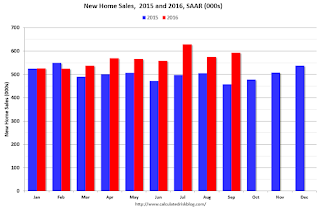
This graph shows new home sales for 2015 and 2016 by month (Seasonally Adjusted Annual Rate). Sales to date are up 13.0% year-over-year, because of very strong year-over-year growth over the last six months.
Overall I expected lower growth this year, in the 4% to 8% range. Slower growth seemed likely this year because Houston (and other oil producing areas) will have a problem this year. It looks like I was too pessimistic on new home sales this year.
And here is another update to the "distressing gap" graph that I first started posting a number of years ago to show the emerging gap caused by distressed sales. Now I'm looking for the gap to close over the next several years.

Following the housing bubble and bust, the "distressing gap" appeared mostly because of distressed sales.
I expect existing home sales to move more sideways, and I expect this gap to slowly close, mostly from an increase in new home sales.
However, this assumes that the builders will offer some smaller, less expensive homes. If not, then the gap will persist.
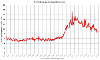
This ratio was fairly stable from 1994 through 2006, and then the flood of distressed sales kept the number of existing home sales elevated and depressed new home sales. (Note: This ratio was fairly stable back to the early '70s, but I only have annual data for the earlier years).
In general the ratio has been trending down, and this ratio will probably continue to trend down over the next several years.
Note: Existing home sales are counted when transactions are closed, and new home sales are counted when contracts are signed. So the timing of sales is different.
New Home Sales at 593,000 Annual Rate in September
by Calculated Risk on 10/26/2016 10:12:00 AM
The Census Bureau reports New Home Sales in September were at a seasonally adjusted annual rate (SAAR) of 593 thousand.
The previous three months were revised down by a total of 85 thousand (SAAR).
"Sales of new single-family houses in September 2016 were at a seasonally adjusted annual rate of 593,000, according to estimates released jointly today by the U.S. Census Bureau and the Department of Housing and Urban Development. This is 3.1 percent above the revised August rate of 575,000 and is 29.8 percent above the September 2015 estimate of 457,000. "
emphasis added
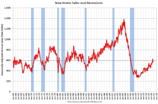 Click on graph for larger image.
The first graph shows New Home Sales vs. recessions since 1963. The dashed line is the current sales rate.
Even with the increase in sales since the bottom, new home sales are still fairly low historically.
The second graph shows New Home Months of Supply.
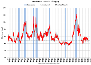 The months of supply decreased in September to 4.8 months.
 The all time record was 12.1 months of supply in January 2009.
This is now in the normal range (less than 6 months supply is normal).
"The seasonally adjusted estimate of new houses for sale at the end of September was 235,000. This represents a supply of 4.8 months at the current sales rate."
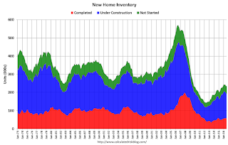 On inventory, according to the Census Bureau:
 "A house is considered for sale when a permit to build has been issued in permit-issuing places or work has begun on the footings or foundation in nonpermit areas and a sales contract has not been signed nor a deposit accepted."Starting in 1973 the Census Bureau broke this down into three categories: Not Started, Under Construction, and Completed.
The third graph shows the three categories of inventory starting in 1973.
The inventory of completed homes for sale is still low, and the combined total of completed and under construction is also low.
 The last graph shows sales NSA (monthly sales, not seasonally adjusted annual rate).
In September 2016 (red column), 50 thousand new homes were sold (NSA). Last year 35 thousand homes were sold in September.
The all time high for September was 99 thousand in 2005, and the all time low for September was 24 thousand in 2011.
This was below expectations of 600,000 sales SAAR in September. I'll have more later today.
MBA: "Mortgage Applications Decrease in Latest MBA Weekly Survey"
by Calculated Risk on 10/26/2016 07:00:00 AM
From the MBA: Mortgage Applications Decrease in Latest MBA Weekly Survey
Mortgage applications decreased 4.1 percent from one week earlier, according to data from the Mortgage Bankers Association’s (MBA) Weekly Mortgage Applications Survey for the week ending October 21, 2016. The prior week’s results included an adjustment for the Columbus Day holiday.
... The Refinance Index decreased 2 percent from the previous week to its lowest level since June 2016. The seasonally adjusted Purchase Index decreased 7 percent from one week earlier to its lowest level since January 2016. The unadjusted Purchase Index increased 3 percent compared with the previous week and was 9 percent higher than the same week one year ago.
...
The average contract interest rate for 30-year fixed-rate mortgages with conforming loan balances ($417,000 or less) decreased to 3.71 percent from 3.73 percent, with points increasing to 0.37 from 0.36 (including the origination fee) for 80 percent loan-to-value ratio (LTV) loans.
emphasis added
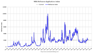 Click on graph for larger image.
The first graph shows the refinance index since 1990.
Refinance activity increased this year since rates declined, however, since rates are up a little recently, refinance activity has declined a little.
 The second graph shows the MBA mortgage purchase index.
 The purchase index was "9 percent higher than the same week one year ago".
Tuesday, October 25, 2016
Wednesday: New Home Sales
by Calculated Risk on 10/25/2016 07:27:00 PM
From Matthew Graham at Mortgage News Daily: Mortgage Rates Stuck at Highs For Now
Mortgage Rates were unchanged in many cases today, with a handful of lenders inconsequentially better or worse versus yesterday's latest offerings [at 3.55% for 30 year fixed]. Despite moving lower on 4 out of the past 6 days, rates were never able to put meaningful distance between themselves and the highest levels in more than 4 months.Wednesday:
emphasis added
• At 7:00 AM ET, The Mortgage Bankers Association (MBA) will release the results for the mortgage purchase applications index.
• At 10:00 AM, New Home Sales for September from the Census Bureau. The consensus is for a decrease in sales to 600 thousand Seasonally Adjusted Annual Rate (SAAR) in September from 609 thousand in August.
Chemical Activity Barometer indicated Solid Growth in October
by Calculated Risk on 10/25/2016 02:31:00 PM
Here is an indicator that I'm following that appears to be a leading indicator for industrial production.
From the American Chemistry Council: Chemical Activity Barometer Enters Third Quarter with Strong Performance
The Chemical Activity Barometer (CAB), a leading economic indicator created by the American Chemistry Council (ACC), notched another solid gain of 0.3 percent in October, following an upwardly revised gain of 0.4 percent in September. Accounting for adjustments, the CAB is up 4.2 percent over this time last year, a marked increase over earlier comparisons and the greatest year-over-year gain since August 2014. All data is measured on a three-month moving average (3MMA). On an unadjusted basis the CAB climbed 0.3 percent in October, following a 0.4 percent gain in September.
...
Applying the CAB back to 1912, it has been shown to provide a lead of two to fourteen months, with an average lead of eight months at cycle peaks as determined by the National Bureau of Economic Research. The median lead was also eight months. At business cycle troughs, the CAB leads by one to seven months, with an average lead of four months. The median lead was three months. The CAB is rebased to the average lead (in months) of an average 100 in the base year (the year 2012 was used) of a reference time series. The latter is the Federal Reserve’s Industrial Production Index.
emphasis added
 Click on graph for larger image.
This graph shows the year-over-year change in the 3-month moving average for the Chemical Activity Barometer compared to Industrial Production. It does appear that CAB (red) generally leads Industrial Production (blue).
Currently CAB has increased solidly over the last several months, and this suggests an increase in Industrial Production over the next year.
Real Prices and Price-to-Rent Ratio in August
by Calculated Risk on 10/25/2016 11:55:00 AM
Here is the earlier post on Case-Shiller: Case-Shiller: National House Price Index increased 5.3% year-over-year in August
The year-over-year increase in prices is mostly moving sideways now around 5%. In August, the index was up 5.3% YoY.
In the earlier post, I graphed nominal house prices, but it is also important to look at prices in real terms (inflation adjusted). Case-Shiller, CoreLogic and others report nominal house prices. As an example, if a house price was $200,000 in January 2000, the price would be close to $275,000 today adjusted for inflation (37%). That is why the second graph below is important - this shows "real" prices (adjusted for inflation).
It has been almost ten years since the bubble peak. In the Case-Shiller release this morning, the National Index was reported as being only 1.6% below the bubble peak (seasonally adjusted). However, in real terms, the National index is still about 16.2% below the bubble peak.
Nominal House Prices

In nominal terms, the Case-Shiller National index (SA) is back to December 2005 levels, and the Case-Shiller Composite 20 Index (SA) is back to June 2005 levels, and the CoreLogic index (NSA) is back to August 2005.
Real House Prices
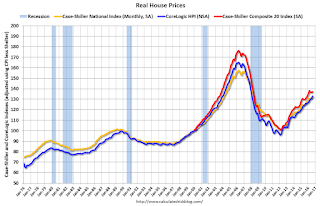
CPI less Shelter has declined over the last two years pushing up real house prices.
In real terms, the National index is back to February 2004 levels, the Composite 20 index is back to October 2003, and the CoreLogic index back to January 2004.
In real terms, house prices are back to late 2003 / early 2004 levels.
Price-to-Rent
In October 2004, Fed economist John Krainer and researcher Chishen Wei wrote a Fed letter on price to rent ratios: House Prices and Fundamental Value. Kainer and Wei presented a price-to-rent ratio using the OFHEO house price index and the Owners' Equivalent Rent (OER) from the BLS.

This graph shows the price to rent ratio (January 1998 = 1.0).
On a price-to-rent basis, the Case-Shiller National index is back to August 2003 levels, the Composite 20 index is back to April 2003 levels, and the CoreLogic index is back to July 2003.
In real terms, and as a price-to-rent ratio, prices are back to late 2003 - and the price-to-rent ratio maybe moving a little more sideways now.


