by Calculated Risk on 2/28/2016 11:19:00 AM
Sunday, February 28, 2016
Hotel Occupancy in 2016: Tracking Record Year
Here is an update on hotel occupancy from HotelNewsNow.com: STR: US results for week ending 20 February
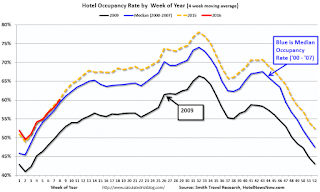
The U.S. hotel industry reported positive results in the three key performance metrics during the week of 14-20 February 2016, according to data from STR, Inc.The following graph shows the seasonal pattern for the hotel occupancy rate using the four week average. The occupancy rate should continue to increase into the Spring, and then increased further during the Summer travel period.
In year-over-year measurements, the industry’s occupancy increased 0.6% to 64.3%. Average daily rate for the week was up 2.1% to US$120.04. Revenue per available room rose 2.7% to US$77.17.
emphasis added
 The red line is for 2016, dashed orange is 2015, blue is the median, and black is for 2009 - the worst year since the Great Depression for hotels.
2015 was the best year on record for hotels.
So far 2016 is tracking 2015. A solid start to the year.
Data Source: Smith Travel Research, Courtesy of HotelNewsNow.com
Saturday, February 27, 2016
February 2016: Unofficial Problem Bank list declines to 228 Institutions
by Calculated Risk on 2/27/2016 02:56:00 PM
This is an unofficial list of Problem Banks compiled only from public sources.
Here is the unofficial problem bank list for February 2016.
Changes and comments from surferdude808:
Update on the Unofficial Problem Bank List for February 2016. During the month, the list fell from 238 institutions to 228 after 11 removals and two additions. Assets dropped by $3.5 billion to an aggregate $66.0 billion. The asset total was updated to reflect fourth quarter figures, which resulted in a small increase of $728 million. A year ago, the list held 357 institutions with assets of $109.2 billion. This past week, the FDIC released fourth quarter industry results and an update on the Official Problem Bank List. FDIC said the official list held 183 problem banks, a decline of 20 during the quarter. Over the same horizon, the unofficial list declined by 27 banks.
Actions have been terminated against Centrue Bank, Streator, IL ($942 million Ticker: TRUE); Four Oaks Bank & Trust Company, Four Oaks, NC ($690 million); OneUnited Bank, Boston, MA ($649 million); New Peoples Bank, Inc., Honaker, VA ($634 million; Highlands Union Bank, Abingdon, VA ($618 million Ticker: HBKA); Arthur State Bank, Union, SC ($459 million); The First National Bank of Russell Springs, Russell Springs, KY ($206 million); The First National Bank of Absecon, Absecon, NJ ($147 million Ticker: ASCN); Asian Bank, Philadelphia, PA ($130 million); F&M Bank and Trust Company, Hannibal, MO ($114 million); and Ruby Valley National Bank, Twin Bridges, MT ($91 million).
Gateway Bank, FSB, Oakland, CA ($142 million) found a merger partner in order to get off the list. [UPDATE: This was an error, Gateway did not merge.]
Additions this month were Dieterich Bank, N.A., Dieterich, IL ($574 million) and Louisa Community Bank, Louisa, KY ($32 million).
Schedule for Week of February 28, 2016
by Calculated Risk on 2/27/2016 08:09:00 AM
The key report this week is the February employment report on Friday.
Other key indicators include February vehicle sales, the February ISM manufacturing and non-manufacturing indexes, and the January trade deficit.
9:45 AM: Chicago Purchasing Managers Index for February. The consensus is for a reading of 52.9, down from 55.6 in January.
10:00 AM: Pending Home Sales Index for January. The consensus is for a 0.5% increase in the index.
10:30 AM: Dallas Fed Manufacturing Survey for February.
 10:00 AM: ISM Manufacturing Index for February. The consensus is for the ISM to be at 48.5, up from 48.2 in January.
Here is a long term graph of the ISM manufacturing index.
The ISM manufacturing index indicated contraction at 48.2% in January. The employment index was at 45.9%, and the new orders index was at 51.5%.
10:00 AM: Construction Spending for January. The consensus is for a 0.5% increase in construction spending.
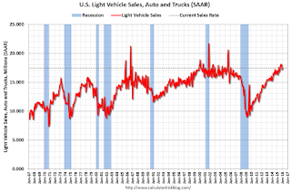
 All day: Light vehicle sales for February. The consensus is for light vehicle sales to increase to 17.6 million SAAR in February from 17.5 million in January (Seasonally Adjusted Annual Rate).
This graph shows light vehicle sales since the BEA started keeping data in 1967. The dashed line is the January sales rate.
7:00 AM ET: The Mortgage Bankers Association (MBA) will release the results for the mortgage purchase applications index.
8:15 AM: The ADP Employment Report for February. This report is for private payrolls only (no government). The consensus is for 185,000 payroll jobs added in February, down from 206,000 in January.
2:00 PM: the Federal Reserve Beige Book, an informal review by the Federal Reserve Banks of current economic conditions in their Districts.
8:30 AM: The initial weekly unemployment claims report will be released. The consensus is for 270 thousand initial claims, down from 272 thousand the previous week.
10:00 AM: Manufacturers' Shipments, Inventories and Orders (Factory Orders) for January. The consensus is a 2.0% increase in orders.
10:00 AM: the ISM non-Manufacturing Index for February. The consensus is for index to decrease to 53.1 in February from 53.5 in January.
8:30 AM: Employment Report for February. The consensus is for an increase of 190,000 non-farm payroll jobs added in February, up from the 151,000 non-farm payroll jobs added in January.
The consensus is for the unemployment rate to be unchanged at 4.9%.
 This graph shows the year-over-year change in total non-farm employment since 1968.
In December, the year-over-year change was 2.67 million jobs.
A key will be the change in real wages.
 8:30 AM: Trade Balance report for January from the Census Bureau.
 This graph shows the U.S. trade deficit, with and without petroleum, through December. The blue line is the total deficit, and the black line is the petroleum deficit, and the red line is the trade deficit ex-petroleum products.
The consensus is for the trade deficit to be at $43.9 billion from $43.4 billion in December.
Friday, February 26, 2016
Freddie Mac: Mortgage Serious Delinquency rate increased slightly in January
by Calculated Risk on 2/26/2016 02:30:00 PM
Freddie Mac reported that the Single-Family serious delinquency rate increased in January to 1.33% from 1.32% in December. Freddie's rate is down from 1.86% in January 2015.
Freddie's serious delinquency rate peaked in February 2010 at 4.20%.
These are mortgage loans that are "three monthly payments or more past due or in foreclosure".
Note: Fannie Mae is expected to report early next week.

Although the rate is generally declining, the "normal" serious delinquency rate is under 1%.
The serious delinquency rate has fallen 0.53 percentage points over the last year, and at that rate of improvement, the serious delinquency rate will not be below 1% until the second half of this year.
I expect an above normal level of Fannie and Freddie distressed sales through 2016 (mostly in judicial foreclosure states).
Earlier: February Consumer Sentiment at 91.7
by Calculated Risk on 2/26/2016 12:29:00 PM
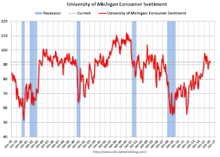
The University of Michigan consumer sentiment index for February was at 91.7, up from the preliminary reading of 90.7, and down from 92.0 in January:
"Consumer confidence nearly recovered the entire small loss it recorded at mid month, with the Sentiment Index finishing February just 0.3 Index-points below January. Although consumers are not as optimistic as at the start of last year, the Sentiment Index is just 6.5% below the cyclical peak of 98.1 set in January 2015. Such a small decline is hardly consistent with the onset of a downturn in consumer spending. ...This was above the consensus forecast of 91.0.
...
Most of the decline from last year’s peak has been in how consumers view year-ahead prospects for the economy, while the outlook for their personal financial situation has improved to its best level in ten years."
emphasis added

Click on graph for larger image.
Personal Income increased 0.5% in January, Spending increased 0.5%
by Calculated Risk on 2/26/2016 08:45:00 AM
The BEA released the Personal Income and Outlays report for January:
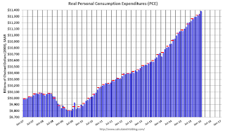
Personal income increased $79.6 billion, or 0.5 percent ... in January, according to the Bureau of Economic Analysis. Personal consumption expenditures (PCE) increased $63.0 billion, or 0.5 percent.The following graph shows real Personal Consumption Expenditures (PCE) through January 2016 (2009 dollars). Note that the y-axis doesn't start at zero to better show the change.
...
Real PCE -- PCE adjusted to remove price changes -- increased 0.4 percent in January, compared with an increase of 0.2 percent in December. ... The price index for PCE increased 0.1 percent in January, in contrast to a decrease of 0.1 percent in December. The PCE price index, excluding food and energy, increased 0.3 percent, compared with an increase of 0.1 percent.
The January PCE price index increased 1.3 percent from January a year ago. The January PCE price index, excluding food and energy, increased 1.7 percent from January a year ago.
 Click on graph for larger image.
The dashed red lines are the quarterly levels for real PCE.
The increase in personal income was above consensus expectations. And the increase in PCE was also above the consensus. A solid start for 2016.
On inflation: The PCE price index increased 1.3 percent year-over-year due to the sharp decline in oil prices. The core PCE price index (excluding food and energy) increased 1.7 percent year-over-year in January.
Q4 GDP Revised Up to 1.0% Annual Rate
by Calculated Risk on 2/26/2016 08:33:00 AM
From the BEA: Gross Domestic Product: Fourth Quarter 2015 (Second Estimate)
Real gross domestic product -- the value of the goods and services produced by the nation’s economy less the value of the goods and services used up in production, adjusted for price changes -- increased at an annual rate of 1.0 percent in the fourth quarter of 2015, according to the "second" estimate released by the Bureau of Economic Analysis. In the third quarter, real GDP increased 2.0 percent.Here is a Comparison of Second and Advance Estimates. PCE growth was revised down from 2.2% to 2.0%. Residential investment was revised down from 8.1% to 8.0%. This was above the consensus forecast.
The GDP estimate released today is based on more complete source data than were available for the "advance" estimate issued last month. In the advance estimate, the increase in real GDP was 0.7 percent. With this second estimate for the fourth quarter, the general picture of economic growth remains the same; private inventory investment decreased less than previously estimated ...
emphasis added
Thursday, February 25, 2016
Friday: GDP, Personal Income and Outlays, Consumer Sentiment
by Calculated Risk on 2/25/2016 06:58:00 PM
Some interesting analysis from Romer and Romer:
According to an analysis by Gerald Friedman, Senator Sanders’s proposed policies would result in average annual output growth of 5.3% over the next decade, and average monthly job creation of close to 300,000.1 As a result, output in 2026 would be 37% higher than it would have been without the policies, and employment would be 16% higher.Friday:
Although we share many of Senator Sanders’s values and enthusiastically support some of his goals, such as greater public investment in infrastructure and education, we also believe it is vitally important to be realistic about the impact of policies on the performance of the overall economy. For this reason, it is worth examining Friedman’s analysis carefully. Moreover, Friedman has made available an extensive report describing his methodology and assumptions, allowing others to examine the specifics of his analysis.
Unfortunately, careful examination of Friedman’s work confirms the old adage, “if something seems too good to be true, it probably is.” We identify three fundamental problems in Friedman’s analysis. ...
• At 8:30 AM ET, Gross Domestic Product, 4th quarter 2015 (Second estimate). The consensus is that real GDP increased 0.4% annualized in Q4, revised down from 0.7%.
• At 10:00 AM, Personal Income and Outlays for January. The consensus is for a 0.4% increase in personal income, and for a 0.3% increase in personal spending. And for the Core PCE price index to increase 0.2%.
• Also at 10:00 AM,University of Michigan's Consumer sentiment index (final for February). The consensus is for a reading of 91.0, up from the preliminary reading 90.7.
Lawler on Existing Home Sales, Table of Distressed Sales for Selected Cities in January
by Calculated Risk on 2/25/2016 03:34:00 PM
From housing economist Tom Lawler:
Yesterday the National Association of Realtors estimated that US existing home sales ran at a seasonally adjusted annual rate of 5.47 million in January, up 0.4% from December’s downwardly-revised (to 5.45 million from 5.46 million pace, and up 11.0% from January’s upwardly-revised (to 4.93 million from 4.82 million) seasonally adjusted base. The NAR’s unadjusted sales estimate for January was up 7.5% from a year ago. The January release incorporated annual seasonal adjustment revisions, which, as shown in the table below, worked to increase adjusted sales in the early part of the year (especially January and February), and decrease adjusted sales from late Spring through earl Fall.
| Seasonally Adjusted Existing Home Sales in 2015, Old vs. New Seasonal Factors (Annual Rate, 000's) | |||
|---|---|---|---|
| Old Seasonal Factors | New Seasonal Factors | % Change | |
| Jan | 4,820 | 4,930 | 2.3% |
| Feb | 4,890 | 4,970 | 1.6% |
| Mar | 5,210 | 5,250 | 0.8% |
| Apr | 5,090 | 5,140 | 1.0% |
| May | 5,320 | 5,290 | -0.6% |
| Jun | 5,480 | 5,410 | -1.3% |
| Jul | 5,580 | 5,480 | -1.8% |
| Aug | 5,300 | 5,290 | -0.2% |
| Sept | 5,550 | 5,440 | -2.0% |
| Oct | 5,320 | 5,290 | -0.6% |
| Nov | 4,760 | 4,860 | 2.1% |
| Dec* | 5,440 | 5,450 | 0.2% |
| *Note: December’s preliminary sales pace using old seasonal factors was 5.46 million. However, the NAR revised unadjusted sales in December down to 436,000 from 438,000. The number in the table above uses the old seasonal factor but the revised unadjusted sales number. | |||
The NAR’s seasonally-adjusted sales estimate for January was above consensus and slightly higher than my projection, but that was solely attributable to the larger-than-expected downward revision in January seasonal factors.
The NAR also estimated that the inventory of existing homes for sale at the end of January was 1.820 million, up 3.4% from December’s downwardly-revised (to 1.76 million from 1.79 million) level and down 2.2% from last January. The NAR’s estimate was somewhat higher than my projection based on local realtor/MLS reports available about a week ago, though reports released suggest that the NAR’s estimate is “reasonable.” Finally, the NAR estimated that the median existing SF home sales price last month was $215,000, up 8.2% from last January. This YOY increase was slightly higher than my projection.
CR Note: Tom Lawler also sent me the table below of short sales, foreclosures and all cash sales for a several selected cities in January.
On distressed: Total "distressed" share is down in all of these markets.
The All Cash Share (last two columns) is mostly declining year-over-year. As investors pull back, the share of all cash buyers will probably continue to decline.
| Short Sales Share | Foreclosure Sales Share | Total "Distressed" Share | All Cash Share | |||||
|---|---|---|---|---|---|---|---|---|
| Jan- 2015 | Jan- 2014 | Jan- 2015 | Jan- 2014 | Jan- 2015 | Jan- 2014 | Jan- 2015 | Jan- 2014 | |
| Las Vegas | 7.0% | 9.7% | 7.9% | 9.4% | 14.9% | 19.1% | 31.1% | 36.0% |
| Reno** | 4.0% | 10.0% | 6.0% | 6.0% | 10.0% | 16.0% | ||
| Phoenix | 2.3% | 6.3% | 3.9% | 6.8% | 6.2% | 13.1% | 27.4% | 32.0% |
| Sacramento | 4.8% | 6.9% | 4.2% | 9.5% | 9.0% | 16.4% | 19.8% | 22.7% |
| Minneapolis | 2.9% | 4.3% | 11.0% | 16.0% | 13.9% | 20.3% | ||
| Mid-Atlantic | 4.3% | 5.8% | 13.9% | 15.2% | 18.2% | 21.0% | 19.5% | 21.4% |
| Riverside | 3.1% | 3.3% | 4.2% | 5.8% | 7.3% | 9.1% | 18.2% | 19.9% |
| San Bernardino | 1.9% | 4.3% | 4.5% | 6.1% | 6.4% | 10.4% | 19.2% | 21.9% |
| Bay Area CA* | 2.5% | 4.2% | 2.5% | 4.2% | 5.0% | 8.4% | 20.5% | 24.3% |
| So. California* | 3.5% | 5.7% | 4.5% | 5.7% | 8.0% | 11.4% | 22.4% | 26.7% |
| Florida SF | 3.5% | 5.3% | 15.3% | 25.7% | 18.7% | 31.0% | 36.8% | 43.4% |
| Florida C/TH | 2.2% | 3.2% | 12.1% | 20.6% | 14.4% | 23.9% | 61.9% | 69.5% |
| Miami MSA SF | 5.7% | 8.9% | 16.8% | 23.2% | 22.5% | 32.1% | 36.3% | 42.4% |
| Miami MSA C/TH | 2.7% | 3.7% | 14.7% | 23.5% | 17.4% | 27.2% | 65.6% | 70.9% |
| Chicago (city) | 22.8% | 24.1% | ||||||
| Rhode Island | 11.8% | 16.1% | ||||||
| Northeast Florida | 24.8% | 38.1% | ||||||
| Spokane | 15.6% | 24.2% | ||||||
| Spokane | 15.6% | 24.2% | ||||||
| Toledo | 34.7% | 37.6% | ||||||
| Tucson | 29.7% | 34.8% | ||||||
| Knoxville | 26.3% | 28.5% | ||||||
| Peoria | 22.3% | 24.6% | ||||||
| Georgia*** | 24.8% | 31.3% | ||||||
| Omaha | 19.5% | 22.2% | ||||||
| Pensacola | 32.9% | 38.3% | ||||||
| Richmond VA | 13.5% | 18.3% | 21.9% | 22.8% | ||||
| Memphis | 15.6% | 14.8% | ||||||
| Springfield IL** | 16.8% | 16.6% | ||||||
| *share of existing home sales, based on property records **Single Family Only ***GAMLS | ||||||||
A comment on the Labor Force Participation Rate
by Calculated Risk on 2/25/2016 12:38:00 PM
Update on August 16, 2018: A recent article by Ryan Cooper referenced this post. Unfortunately he misunderstood what I wrote. I argued that most of the decline in the overall participation rate since the great recession was due to demographics and long term trends - and was not cyclical, and I've suggested using the prime working age ("25 to 54" years old) participation rate to track the economy (not perfect, but better than the overall rate). Strangely Mr. Cooper used the "25 to 54" years old rate to argue I was wrong. Time has proven me correct, and Mr. Cooper should correct his mistake.
Please see this post (with a spreadsheet) for an explanation.
Original post:
Yesterday I was a guest on Bloomberg's What'd You Miss? talking about housing. One of the earlier guests was Professor J.W. Mason discussing the labor force participation rate (LFPR).
Professor Mason argued that most of the decline in the LFPR is cyclical.
I've written extensively about the LFPR, and I've argued that most of the decline is due to ongoing trends and demographics.
Dr. Mason said that if you looked at each age group by sex, you could construct an "adjusted" LFPR. He presented the following graph:

NOTE: I believe this approach is incorrect.
This graph from Bloomberg shows the BLS reported LFPR and an "adjusted" LFPR using the 1999 LFPR for each age group and gender - and the current population for each group.
As an example, if we look at men in the 40 to 44 age group (these are my calculations using Dr. Mason's method):
• 1999 Labor Force Participation Rate, Men, 40-44: 92.2%
• Jan 2016 LFPR: 90.4%
• Current Population 40-44 Men: 9,572,000
• Current Participation: 8,652,000
• Adjusted Participation (using 1999 LFPR): 8,829,000
• "Missing" Male workers in the 40-44 age group: 177,000
This is the approach that Dr. Mason used to construct the above graph - and this is incomplete and I believe his conclusion is incorrect.
Here is a look at the trend for 40 to 44 year old men (BLS data, only available Not Seasonally Adjusted since 1976).

This graph shows the 40 to 44 year old men participation rate since 1976 (note the scale doesn't start at zero to better show the change).
There is a clear downward trend, and a researcher looking at this trend in the year 2000 might have predicted the 40 to 44 year old men participation rate would be about the level as today (see trend line).
Clearly there are other factors than "economic weakness" causing this downward trend. I listed some reasons a couple of years ago, and newer research from Pew Research suggests stay-at-home dads is one of the reasons: Growing Number of Dads Home with the Kids
Just looking at this graph, I don't think there are many 40 to 44 year old men that will be returning to the labor force - and a careful analysis of each age group by sex shows few "missing workers".
If Dr. Mason had used this trend line for 40 to 44 year old men - instead of the 1999 participation rate - the number of missing workers would be close to zero.
The bottom line is most of the decline in the Labor Force Participation rate is due to ongoing trends (as above) and demographics - and is not cyclical.


