by Calculated Risk on 7/03/2015 12:15:00 PM
Friday, July 03, 2015
Public and Private Sector Payroll Jobs: Carter, Reagan, Bush, Clinton, Bush, Obama
By request, here is an update on an earlier post through the June employment report.
NOTE: Several readers have asked if I could add a lag to these graphs (obviously a new President has zero impact on employment for the month they are elected). But that would open a debate on the proper length of the lag, so I'll just stick to the beginning of each term.
Note: We frequently use Presidential terms as time markers - we could use Speaker of the House, or any other marker.
Important: There are many differences between these periods. Overall employment was smaller in the '80s, however the participation rate was increasing in the '80s (younger population and women joining the labor force), and the participation rate is generally declining now. But these graphs give an overview of employment changes.
First, here is a table for private sector jobs. The top two private sector terms were both under President Clinton. Reagan's 2nd term saw about the same job growth as during Carter's term. Note: There was a severe recession at the beginning of Reagan's first term (when Volcker raised rates to slow inflation) and a recession near the end of Carter's term (gas prices increased sharply and there was an oil embargo).
| Term | Private Sector Jobs Added (000s) |
|---|---|
| Carter | 9,041 |
| Reagan 1 | 5,360 |
| Reagan 2 | 9,357 |
| GHW Bush | 1,510 |
| Clinton 1 | 10,884 |
| Clinton 2 | 10,073 |
| GW Bush 1 | -844 |
| GW Bush 2 | 381 |
| Obama 1 | 2,018 |
| Obama 2 | 6,5161 |
| 129 months into 2nd term: 10,785 pace. | |
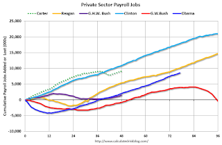
The first graph shows the change in private sector payroll jobs from when each president took office until the end of their term(s). President George H.W. Bush only served one term, and President Obama is in the third year of his second term.
Mr. G.W. Bush (red) took office following the bursting of the stock market bubble, and left during the bursting of the housing bubble. Mr. Obama (blue) took office during the financial crisis and great recession. There was also a significant recession in the early '80s right after Mr. Reagan (yellow) took office.
There was a recession towards the end of President G.H.W. Bush (purple) term, and Mr Clinton (light blue) served for eight years without a recession.
 Click on graph for larger image.
The first graph is for private employment only.
The employment recovery during Mr. G.W. Bush's (red) first term was sluggish, and private employment was down 844,000 jobs at the end of his first term. At the end of Mr. Bush's second term, private employment was collapsing, and there were net 463,000 private sector jobs lost during Mr. Bush's two terms.
Private sector employment increased slightly under President G.H.W. Bush (purple), with 1,510,000 private sector jobs added.
Private sector employment increased by 20,955,000 under President Clinton (light blue), by 14,717,000 under President Reagan (yellow), and 9,041,000 under President Carter (dashed green).
There were only 2,018,000 more private sector jobs at the end of Mr. Obama's first term. Twenty eight months into Mr. Obama's second term, there are now 8,534,000 more private sector jobs than when he initially took office.
 A big difference between the presidencies has been public sector employment. Note the bumps in public sector employment due to the decennial Census in 1980, 1990, 2000, and 2010.
 The public sector grew during Mr. Carter's term (up 1,304,000), during Mr. Reagan's terms (up 1,414,000), during Mr. G.H.W. Bush's term (up 1,127,000), during Mr. Clinton's terms (up 1,934,000), and during Mr. G.W. Bush's terms (up 1,744,000 jobs).
However the public sector has declined significantly since Mr. Obama took office (down 638,000 jobs). These job losses have mostly been at the state and local level, but more recently at the Federal level. This has been a significant drag on overall employment.
And a table for public sector jobs. Public sector jobs declined the most during Obama's first term, and increased the most during Reagan's 2nd term.
| Term | Public Sector Jobs Added (000s) |
|---|---|
| Carter | 1,304 |
| Reagan 1 | -24 |
| Reagan 2 | 1,438 |
| GHW Bush | 1,127 |
| Clinton 1 | 692 |
| Clinton 2 | 1,242 |
| GW Bush 1 | 900 |
| GW Bush 2 | 844 |
| Obama 1 | -702 |
| Obama 2 | 331 |
| 129 months into 2nd term, 55 pace | |
Looking forward, I expect the economy to continue to expand through 2016 (at least), so I don't expect a sharp decline in private employment as happened at the end of Mr. Bush's 2nd term (In 2005 and 2006 I was warning of a coming recession due to the bursting of the housing bubble).
For the public sector, the cutbacks are clearly over at the state and local levels, and it appears cutbacks at the Federal level might also be over. Right now I'm expecting some increase in public employment during Obama's 2nd term, but nothing like what happened during Reagan's second term.
Here is a table of the top three presidential terms for private job creation (they also happen to be the three best terms for total non-farm job creation).
Clinton's two terms were the best for both private and total non-farm job creation, followed by Reagan's 2nd term.
Currently Obama's 2nd term is on pace to be the 2nd best ever for private job creation. However, with very few public sector jobs added, Obama's 2nd term is only on pace to be the third best for total job creation.
Note: Only 33 thousand public sector jobs have been added during the first twenty nine months of Obama's 2nd term (following a record loss of 702 thousand public sector jobs during Obama's 1st term). This is less than 3% of the public sector jobs added during Reagan's 2nd term!
| Top Employment Gains per Presidential Terms (000s) | ||||
|---|---|---|---|---|
| Rank | Term | Private | Public | Total Non-Farm |
| 1 | Clinton 1 | 10,884 | 692 | 11,576 |
| 2 | Clinton 2 | 10,073 | 1,242 | 11,315 |
| 3 | Reagan 2 | 9,357 | 1,438 | 10,795 |
| Obama 21 | 6,516 | 33 | 6,549 | |
| Pace2 | 10,785 | 55 | 10,840 | |
| 129 Months into 2nd Term 2Current Pace for Obama's 2nd Term | ||||
The second table shows the jobs needed per month for Obama's 2nd term to be in the top three presidential terms.
| Average Jobs needed per month (000s) for Obama's 2nd Term | ||||
|---|---|---|---|---|
| to Rank | Private | Total | ||
| #1 | 230 | 265 | ||
| #2 | 187 | 251 | ||
| #3 | 150 | 223 | ||
Schedule for Week of July 5, 2015
by Calculated Risk on 7/03/2015 08:11:00 AM
It feels like a Saturday ...
The key report this coming week is the May Trade Deficit on Tuesday, and the June ISM non-manufacturing index on Monday.
Fed Chair Janet Yellen speaks on Friday on the U.S. Economic Outlook.
10:00 AM ET: The Fed will release the monthly Labor Market Conditions Index (LMCI).
10:00 AM: the ISM non-Manufacturing Index for June. The consensus is for index to increase to 56.0 from 55.7 in May.
 8:30 AM: Trade Balance report for May from the Census Bureau.
 This graph shows the U.S. trade deficit, with and without petroleum, through April. The blue line is the total deficit, and the black line is the petroleum deficit, and the red line is the trade deficit ex-petroleum products.
The consensus is for the U.S. trade deficit to be at $42.0 billion in May from $40.9 billion in April.
 10:00 AM: Job Openings and Labor Turnover Survey for May from the BLS.
 This graph shows job openings (yellow line), hires (purple), Layoff, Discharges and other (red column), and Quits (light blue column) from the JOLTS.
Jobs openings increased in April to 5.376 million from 5.109 million in March.
The number of job openings (yellow) were up 22% year-over-year compared to April 2014, and Quits were up 11% year-over-year.
3:00 PM: Consumer Credit for May from the Federal Reserve. The consensus is for an increase of $18.5 billion in credit.
7:00 AM: The Mortgage Bankers Association (MBA) will release the results for the mortgage purchase applications index.
2:00 PM: The Fed will release the FOMC Minutes for the Meeting of June 16-17, 2015
8:30 AM: The initial weekly unemployment claims report will be released. The consensus is for claims to decrease to 275 thousand from 281 thousand.
12:30 PM, Speech by Fed Chair Janet Yellen, U.S. Economic Outlook, at The City Club of Cleveland's Sally Gries Forum Honoring Women of Achievement, Cleveland, Ohio
Thursday, July 02, 2015
Earlier: Weekly Initial Unemployment Claims increased to 281,000
by Calculated Risk on 7/02/2015 08:24:00 PM
A quick graph of unemployment claims ... Note: Starting with this release, the DOL is including a table of unadjusted State-level "advance"claims.
The DOL reported:
In the week ending June 27, the advance figure for seasonally adjusted initial claims was 281,000, an increase of 10,000 from the previous week's unrevised level of 271,000. The 4-week moving average was 274,750, an increase of 1,000 from the previous week's unrevised average of 273,750.The previous week was unrevised.
There were no special factors impacting this week's initial claims.
The following graph shows the 4-week moving average of weekly claims since 1971.
 Click on graph for larger image.
The dashed line on the graph is the current 4-week average. The four-week average of weekly unemployment claims increased to 274,750.
This was above the consensus forecast of 270,000, and the low level of the 4-week average suggests few layoffs.
Hotels: On Pace for Record Occupancy in 2015, RevPAR up almost 50% from 2009
by Calculated Risk on 7/02/2015 05:08:00 PM
From HotelNewsNow.com: STR: US hotel results for week ending 27 June
The U.S. hotel industry recorded positive results in the three key performance measurements during the week of 21-27 June 2015, according to data from STR, Inc.For the same week in 2009, ADR (average daily rate) was $97.49 and RevPAR (Revenue per available room) was $63.74. ADR is up over 25% since June 2009, and RevPAR is up almost 50%!
In year-over-year measurements, the industry’s occupancy increased 1.1 percent to 76.9 percent. Average daily rate for the week was up 4.6 percent to US$122.15. Revenue per available room increased 5.7 percent to finish the week at US$93.96.
emphasis added
The following graph shows the seasonal pattern for the hotel occupancy rate using the four week average. The occupancy rate will be high during the summer travel season.
 The red line is for 2015, dashed orange is 2014, blue is the median, and black is for 2009 - the worst year since the Great Depression for hotels. Purple is for 2000.
The 4-week average of the occupancy rate is solidly above the median for 2000-2007, and above last year.
Right now 2015 is close to 2000 (best year for hotels) - and so far 2015 has run slightly above 2000 - and this year will probably be the best year ever for hotels.
Data Source: Smith Travel Research, Courtesy of HotelNewsNow.com
Reis: Apartment Vacancy Rate unchanged in Q2 at 4.2%
by Calculated Risk on 7/02/2015 01:15:00 PM
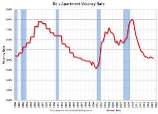
Reis reported that the apartment vacancy rate was unchanged in Q2 2015, compared to Q1, at 4.2% - and also the same as in Q2 2014. The vacancy rate peaked at 8.0% at the end of 2009.
A few comments from Reis Senior Economist and Director of Research Ryan Severino:
Vacancy was unchanged at 4.2% during the quarter with construction and net absorption effectively in balance. Vacancy is cyclical and moves in long phases. For most of the last five years, the market has been in a vacancy compression phase, falling from 8% at the start of 2010 before bottoming out at 4.2% during the first quarter of last year. However, since that time vacancy has been stuck at the 4.2% range for the sixth consecutive quarter. There could still be a quarter when vacancy falls slightly, but that would be an anomaly and not a trend. Clearly, the run of vacancy compression during this cycle is over. From this point forward, with supply projected to exceed demand, we anticipate that vacancy will rise, slowly at first and then more gradually as we move forward.
...
Asking and effective rents both grew by 1.0% during the second quarter. This was a rebound versus the first quarter when they both grew by about 0.6%. Although the apartment market typically exhibits some seasonality, which appears to be the case here, the longer vacancy remains at such low levels, the greater the probability that rent growth will remain this strong. Year‐over‐year rent growth for asking and effective rents have inched up around 3.5% and annualized rent growth during the quarter is around 4%. Both of these are well in excess of core inflation and ahead of any other property type.
...
Although construction continues to increase, we have yet to see the big surge in completions that we have been anticipating. That is not to downplay the relatively large amount of supply that continues to come online so much as it is to highlight the daunting situation yet to come. Even without construction volume leaping, vacancy compression has stalled. At 4.2% the national vacancy rate is unchanged over the last year and appears to have bottomed out. This intimates that once construction activity does increase demand is going to be unable to keep pace and vacancy will rise. Although demand remains relatively stout, construction volumes are set to test historically high levels in 2015. Therefore, the market should not become complacent because vacancy has yet to rise. In recent quarters we have seen an increase in the use of soft openings and push backs in completion dates. Both simply delay the inevitable – vacancy rates will rise. It is only a matter of time at this juncture.
emphasis added
 Click on graph for larger image.
This graph shows the apartment vacancy rate starting in 1980. (Annual rate before 1999, quarterly starting in 1999). Note: Reis is just for large cities.
The vacancy rate is mostly moving sideways now. As completions catchup with starts, the vacancy rate will probably start increasing (See: Are Multi-Family Housing Starts near a peak?)
Apartment vacancy data courtesy of Reis.
June Employment Report Comments and Graphs
by Calculated Risk on 7/02/2015 09:55:00 AM
Earlier: June Employment Report: 223,000 Jobs, 5.3% Unemployment Rate
This was a decent employment report with 223,000 jobs added, although April and May were revised down by a combined 60,000 jobs.
Unfortunately wage growth is still weak, from the BLS: "In June, average hourly earnings for all employees on private nonfarm payrolls were unchanged at $24.95. Over the year, average hourly earnings have risen by 2.0 percent." Weekly hours were unchanged for the fourth month in a row.
A few more numbers: Total employment increased 223,000 from May to June and is now 3.5 million above the previous peak. Total employment is up 12.2 million from the employment recession low.
Private payroll employment also increased 223,000 from May to June, and private employment is now 4.0 million above the previous peak. Private employment is up 12.8 million from the recession low.
In June, the year-over-year change was just over 2.9 million jobs.
Note: The unemployment rate falling to 5.3%, and still little real wage growth - and still a large number of people working part time for economic reasons - indicates slack in the labor market. My view, partially based on demographics, is that the unemployment rate can fall below 5% without a significant pickup in inflation.
Overall this was a decent report.
Employment-Population Ratio, 25 to 54 years old

In the earlier period the participation rate for this group was trending up as women joined the labor force. Since the early '90s, the participation rate moved more sideways, with a downward drift starting around '00 - and with ups and downs related to the business cycle.
The 25 to 54 participation rate was declined in June to 80.8%, and the 25 to 54 employment population ratio was unchanged at 77.2%. As the recovery continues, I expect the participation rate for this group to increase a little more (or at least stabilize for a couple of years) - although the participation rate has been trending down for this group since the late '90s.
Average Hourly Earnings

The graph shows the nominal year-over-year change in "Average Hourly Earnings" for all private employees. Nominal wage growth increased 2.0% YoY - and although the series is noisy - it does appear wage growth is trending up a little. Wages will probably pick up a little more this year.
Note: CPI has been running under 2%, so there has been some real wage growth.
Part Time for Economic Reasons

The number of persons employed part time for economic reasons (sometimes referred to as involuntary part-time workers), at 6.5 million, changed little in June. These individuals, who would have preferred full-time employment, were working part time because their hours had been cut back or because they were unable to find a full-time job.The number of persons working part time for economic reasons decreased in June to 6.51 million from 6.65 million in May. This is the lowest level since Sept 2008 and suggests slack still in the labor market.
These workers are included in the alternate measure of labor underutilization (U-6) that declined to 10.5% in June (lowest level since July 2008).
Unemployed over 26 Weeks
 This graph shows the number of workers unemployed for 27 weeks or more.
 According to the BLS, there are 2.121 million workers who have been unemployed for more than 26 weeks and still want a job. This was down from 2.502 million in May.
This is trending down - and is at the lowest level since September 2008 - but is still high.
State and Local Government
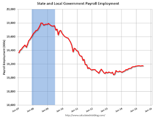 This graph shows total state and government payroll employment since January 2007. State and local governments had lost jobs for four straight years. (Note: Scale doesn't start at zero to better show the change.)
 In June 2015, state and local governments added zero jobs. State and local government employment is now up 132,000 from the bottom, but still 626,000 below the peak.
State and local employment is now generally increasing - slowly. And Federal government layoffs appear to have ended (Federal payrolls were unchanged in June, and Federal employment is up 5,000 year-to-date).
Overall this was a decent employment report for June.
June Employment Report: 223,000 Jobs, 5.3% Unemployment Rate
by Calculated Risk on 7/02/2015 08:33:00 AM
From the BLS:
Total nonfarm payroll employment increased by 223,000 in June, and the unemployment rate declined to 5.3 percent, the U.S. Bureau of Labor Statistics reported today. Job gains occurred in professional and business services, health care, retail trade, financial activities, and in transportation and warehousing.
...
The change in total nonfarm payroll employment for April was revised from +221,000 to +187,000, and the change for May was revised from +280,000 to +254,000. With these revisions, employment gains in April and May combined were 60,000 lower than previously reported.
...
In June, average hourly earnings for all employees on private nonfarm payrolls were unchanged at $24.95. Over the year, average hourly earnings have risen by 2.0 percent.
emphasis added
 Click on graph for larger image.
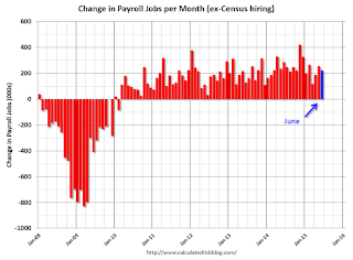
The first graph shows the monthly change in payroll jobs, ex-Census (meaning the impact of the decennial Census temporary hires and layoffs is removed - mostly in 2010 - to show the underlying payroll changes).
Total payrolls increased by 223 thousand in June (private payrolls also increased 223 thousand).
Payrolls for April and May were revised down by a combined 60 thousand.
 This graph shows the year-over-year change in total non-farm employment since 1968.
In June, the year-over-year change was over 2.9 million jobs.
That is a solid year-over-year gain.
 The third graph shows the employment population ratio and the participation rate.
The Labor Force Participation Rate decreased in June to 62.6%. This is the percentage of the working age population in the labor force. A large portion of the recent decline in the participation rate is due to demographics.
The Employment-Population ratio decreased to 59.3% (black line).
I'll post the 25 to 54 age group employment-population ratio graph later.
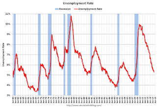 The fourth graph shows the unemployment rate.
 The unemployment rate decreased in June to 5.3%.
This was below expectations of 228,000 jobs, and revisions were down, and no wage growth (some wage weakness is seasonal) ... still a decent report.
I'll have much more later ...
Wednesday, July 01, 2015
Thursday: Jobs, Jobs, Jobs
by Calculated Risk on 7/01/2015 08:14:00 PM
Here is the employment preview I posted earlier: Preview: Employment Report for June
Goldman Sachs is forecasting:
We forecast nonfarm payroll growth of 220k in June, a bit below consensus expectations. Labor market indicators were mixed in June, suggesting a print roughly in line with the 217k monthly average seen so far in 2015. We expect the unemployment rate to decline by one-tenth to 5.4%. Finally, average hourly earnings are likely to rise a softer 0.1% in June as a result of calendar effects.Merrill Lynch is forecasting:
We look for job growth of 220,000, a slowdown from the 280,000 pace in May but consistent with the recent trend. As a result, the unemployment rate will likely lower to 5.4% from 5.5%. With the continued tightening in the labor market, we think average hourly earnings (AHE) will increase a “strong” 0.2%, allowing the yoy rate to hold at 2.3%.Nomura is forecasting:
[W]e forecast a 230k increase in private payrolls, with a 5k increase in government jobs, implying that total nonfarm payrolls will gain 235k. ... We forecast that average hourly earnings for private employees rose by 0.17% m-o-m in June, a slower pace than trend due to a calendar quirk. Last, we expect the household survey to show that the unemployment rate ticked down to 5.4% from 5.5%, previously.Thursday:
• At 8:30 AM ET, the Employment Report for June. The consensus is for an increase of 228,000 non-farm payroll jobs added in June, down from the 280,000 non-farm payroll jobs added in May. The consensus is for the unemployment rate to decrease to 5.4%.
• At 8:30 AM, initial weekly unemployment claims report will be released. The consensus is for claims to decrease to 270 thousand from 271 thousand.
• At 10:00 AM, Manufacturers' Shipments, Inventories and Orders (Factory Orders) for May. The consensus is a 0.3% decrease in orders.
Preview: Employment Report for June
by Calculated Risk on 7/01/2015 05:49:00 PM
Bold prediction: Tomorrow will feel like a Friday!
On Thursday at 8:30 AM ET, the BLS will release the employment report for June. The consensus, according to Bloomberg, is for an increase of 230,000 non-farm payroll jobs in June (with a range of estimates between 202,000 to 252,000), and for the unemployment rate to decline to 5.4%.
The BLS reported 280,000 jobs added in May.
Here is a summary of recent data:
• The ADP employment report showed an increase of 237,000 private sector payroll jobs in June. This was above expectations of 220,000 private sector payroll jobs added. The ADP report hasn't been very useful in predicting the BLS report for any one month, but in general, this suggests employment growth slightly above expectations.
• The ISM manufacturing employment index increased in June to 55.5%. A historical correlation between the ISM manufacturing employment index and the BLS employment report for manufacturing, suggests that private sector BLS manufacturing payroll jobs increased about 10,000 in June. The ADP report indicated a 7,000 increase for manufacturing jobs.
The ISM non-manufacturing index for June will be released next Monday.
• Initial weekly unemployment claims averaged close to 271,000 in June, about the same as in May - and the lowest monthly average since early 2001. For the BLS reference week (includes the 12th of the month), initial claims were at 268,000; down from 275,000 during the reference week in May.
This suggests a lower level of layoffs in June.
• The final June University of Michigan consumer sentiment index increased to 96.1 from the May reading of 90.0. Sentiment is frequently coincident with changes in the labor market, but there are other factors too - like gasoline prices.
• On small business hiring: The small business index from Intuit showed a 25,000 increase in small business employment in June, the same as in May. From Intuit: Small Businesses Employment Increases in June
Small business employment rose by 25,000 jobs in June, an increase of 0.13 percent, matching the gains seen in May. Although the hiring rate fell slightly, it should not be regarded as a reversal of the upward trend that began in June 2009.• Trim Tabs reported that the U.S. economy added 190,000 jobs in June. From TrimTabs:
“Small business employment remains 500,000 below the peak of 21.2 million people employed by small businesses in March 2007,” said Woodward. “Part of this continuing shortfall is because housing construction has failed to return to pre-crisis or even normal levels.”
“A sign of stronger small business activity is the hiring rate, which has been rising slowly but steadily since September 2009. The hiring rate always exceeds the employment increase because hiring reflects replacing workers who leave, as well as added workers,” Woodward said.
TrimTabs Investment Research estimates that the U.S. economy added 190,000 jobs in June, the lowest level in 12 months.• Conclusion: Unfortunately none of the indicators above is very good at predicting the initial BLS employment report. However it looks like this should be another 200+ month (based on ADP, ISM manufacturing, unemployment claims, and small business hiring). There is always some randomness to the employment report, but my guess is in the low 200s.
“Job growth last month broke a streak of eleven consecutive monthly gains exceeding 200,000,” said David Santschi, chief executive officer of TrimTabs. “The economy seems to have lost some momentum heading into the dog days of summer.”
TrimTabs’ employment estimates are based on analysis of daily income tax deposits to the U.S. Treasury from the paychecks of the 142 million U.S. workers subject to withholding.
U.S. Light Vehicle Sales decreased to 17.1 million annual rate in June
by Calculated Risk on 7/01/2015 02:51:00 PM
Based on an AutoData estimate, light vehicle sales were at a 17.1 million SAAR in June. That is up 1.5% from June 2014, and down 3.5% from the 17.7 million annual sales rate last month.
Click on graph for larger image.
This graph shows the historical light vehicle sales from the BEA (blue) and an estimate for June (red, light vehicle sales of 17.1 million SAAR from WardsAuto).
This was close to the consensus forecast of 17.2 million SAAR (seasonally adjusted annual rate).
The second graph shows light vehicle sales since the BEA started keeping data in 1967.

This was below the consensus forecast, but another strong month. It appears 2015 will be the best year for light vehicle sales since 2001.


