 RSS Feed
 by Calculated Risk on 4/25/2015 08:15:00 AM
Saturday, April 25, 2015
April 2015: Unofficial Problem Bank list declines to 342 Institutions
This is an unofficial list of Problem Banks compiled only from public sources.
Here is the unofficial problem bank list for April 2015.
Changes and comments from surferdude808:
Update on the Unofficial Problem Bank List for April 2015. During the month, the list fell from 349 institutions to 342 after nine removals and two additions. Assets dropped by $1.2 billion to an aggregate $105.1 billion. A year ago, the list held 513 institutions with assets of $167.3 billion.
Actions were terminated against Orrstown Bank, Shippensburg, PA ($1.2 billion Ticker: ORRF); Atlantic Coast Bank, Jacksonville, FL ($709 million Ticker: ACFC); The Leaders Bank, Oak Brook, IL ($353 million); PrimeSouth Bank, Blackshear, GA ($326 million); The Exchange Bank, Skiatook, OK ($87 million); and Community Savings, Caldwell, OH ($68 billion). Finding their way off the list through merger were Colonial Bank, FSB, Vineland, NJ ($542 million Ticker: COBK); Baytree National Bank & Trust Company, Lake Forest, IL ($77 million); and Bank Reale, Pasco, WA ($38 million Ticker: BKRL).
The two additions this month were Lone Star National Bank, Pharr, TX ($2.2 billion) and Covenant Bank, Leeds, AL ($76 million).
Friday, April 24, 2015
DOT: Vehicle Miles Driven increased 2.8% year-over-year in February, Rolling 12 Months at All Time High
by Calculated Risk on 4/24/2015 06:34:00 PM
Note: With lower gasoline prices, vehicle miles driven have reached a new high on a rolling 12 month basis.
The Department of Transportation (DOT) reported:
Travel on all roads and streets changed by 2.8% (6.1 billion vehicle miles) for February 2015 as compared with February 2014.The following graph shows the rolling 12 month total vehicle miles driven to remove the seasonal factors.
Travel for the month is estimated to be 221.1 billion vehicle miles
The seasonally adjusted vehicle miles traveled for February 2015 is 254.1 billion miles, a 2.6% (6.4 billion vehicle miles) increase over February 2014. It also represents a -1.2% change (-3.2 billion vehicle miles) compared with January 2015.
The rolling 12 month total is moving up, after moving sideways for several years.
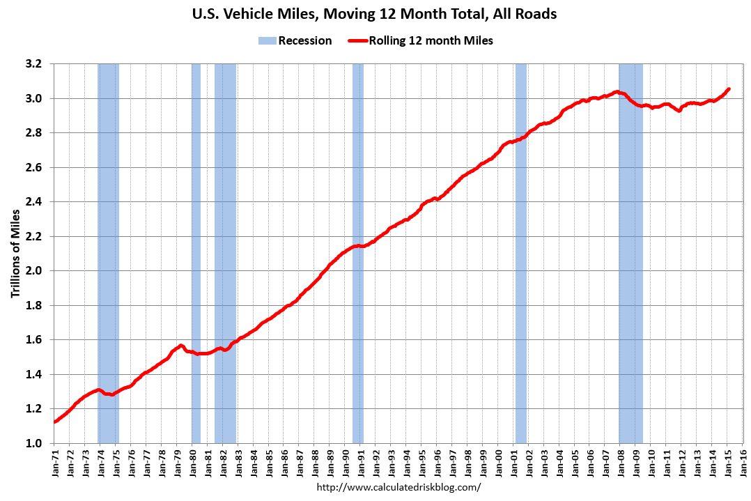 Click on graph for larger image.
In the early '80s, miles driven (rolling 12 months) stayed below the previous peak for 39 months.
Miles driven (rolling 12) had been below the previous peak for 85 months - an all time record - before reaching a new high for miles driven in January (and again in February).
The second graph shows the year-over-year change from the same month in the previous year.
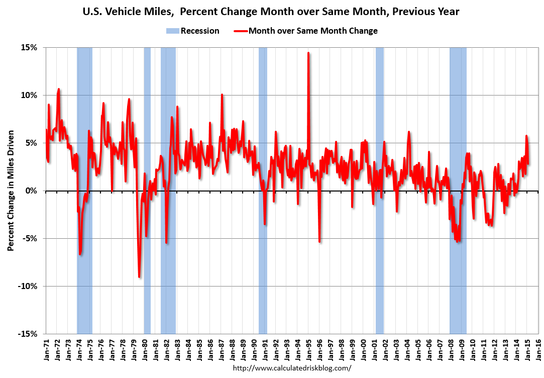 In February 2015, gasoline averaged of $2.30 per gallon according to the EIA. That was down significantly from January 2014 when prices averaged $3.43 per gallon.
 However gasoline prices are just part of the story. The lack of growth in miles driven over the last 7 years was probably also due to the lingering effects of the great recession (lack of wage growth), the aging of the overall population (over 55 drivers drive fewer miles) and changing driving habits of young drivers.
Now, miles driven - on a rolling 12 month basis - is at a new high.
Nomura Forecast: Q1 GDP at 1.0%
by Calculated Risk on 4/24/2015 01:37:00 PM
From economists at Nomura: US Q1 GDP: It will likely show that final sales barely grew, but April data should be better.
Adverse weather conditions, West Coast port disruptions, the stronger dollar and the decline in crude oil prices all likely hurt economic activity in Q1 2015. Business investment slowed considerably as oil and gas exploration projects halted abruptly and precipitously on lower crude oil prices while manufacturing activity was additionally hurt by the stronger dollar. Also, we believe that lower gasoline prices failed to spur consumer activity as it appears that households decided to save or pay down debt using the extra money saved from lower gasoline prices. Furthermore, adverse weather conditions likely hurt consumer and construction activity. Taken together, we expect headline Q1 GDP to grow by 1.0% q-o-q on an annualized rate with final sales increasing by only 0.1%.
However, there are two key sources of uncertainty worth noting. First, the Bureau of Economic Analysis (BEA) will only have the first two months of trade data on hand and will have to make some assumptions for March. This is in no way different from other years. However, due to West Coast port labor disputes, trade activity slowed considerably in the first two months of the year. BEA’s assumptions on how quickly trade activity rebounded will have a notable impact on topline GDP. Second, our work suggests that there is material residual seasonality in topline GDP in Q1 as it tends to be below trend due to strong seasonal patterns in defense spending. As such, we now expect government expenditures to be more of a drag than we had previously assumed. Nevertheless, this factor remains a key source of uncertainty.
Philly Fed: State Coincident Indexes increased in 41 states in March
by Calculated Risk on 4/24/2015 11:59:00 AM
From the Philly Fed:
The Federal Reserve Bank of Philadelphia has released the coincident indexes for the 50 states for March 2015. In the past month, the indexes increased in 41 states, decreased in four, and remained stable in five, for a one-month diffusion index of 74. Over the past three months, the indexes increased in 46 states, decreased in three, and remained stable in one, for a three-month diffusion index of 86.Note: These are coincident indexes constructed from state employment data. An explanation from the Philly Fed:
The coincident indexes combine four state-level indicators to summarize current economic conditions in a single statistic. The four state-level variables in each coincident index are nonfarm payroll employment, average hours worked in manufacturing, the unemployment rate, and wage and salary disbursements deflated by the consumer price index (U.S. city average). The trend for each state’s index is set to the trend of its gross domestic product (GDP), so long-term growth in the state’s index matches long-term growth in its GDP.
 Click on graph for larger image.
This is a graph is of the number of states with one month increasing activity according to the Philly Fed. This graph includes states with minor increases (the Philly Fed lists as unchanged).
In March, 44 states had increasing activity (including minor increases).
It appears we are seeing weakness in several oil producing states including Alaska and Oklahoma. It wouldn't be surprising if North Dakota, Texas and other oil producing states also turned red later this year.
 Here is a map of the three month change in the Philly Fed state coincident indicators. This map was all red during the worst of the recession, and is almost all green again.
 Note: Blue added for Red/Green issues.
Black Knight: Mortgage Delinquencies Declined in March, First time below 5% since August 2007
by Calculated Risk on 4/24/2015 09:15:00 AM
According to Black Knight's First Look report for March, the percent of loans delinquent decreased 12% in March compared to February, and declined 15% year-over-year.
The percent of loans in the foreclosure process declined 2% in March and were down about 27% over the last year.
Black Knight reported the U.S. mortgage delinquency rate (loans 30 or more days past due, but not in foreclosure) was 4.70% in March, down from 5.36% in February. This is the lowest level of delinquencies since August 2007.
The percent of loans in the foreclosure process declined in March to 1.55%. This was the lowest level of foreclosure inventory since December 2007.
The number of delinquent properties, but not in foreclosure, is down 390,000 properties year-over-year, and the number of properties in the foreclosure process is down 288,000 properties year-over-year.
Black Knight will release the complete mortgage monitor for March in early May.
| Black Knight: Percent Loans Delinquent and in Foreclosure Process | ||||
|---|---|---|---|---|
| Mar 2015 | Feb 2015 | Mar 2014 | Mar 2013 | |
| Delinquent | 4.70% | 5.36% | 5.52% | 6.59% |
| In Foreclosure | 1.55% | 1.58% | 2.13% | 3.38% |
| Number of properties: | ||||
| Number of properties that are 30 or more, and less than 90 days past due, but not in foreclosure: | 1,409,000 | 1,646,000 | 1,571,000 | 1,842,000 |
| Number of properties that are 90 or more days delinquent, but not in foreclosure: | 971,000 | 1,067,000 | 1,199,000 | 1,466,000 |
| Number of properties in foreclosure pre-sale inventory: | 782,000 | 800,000 | 1,070,000 | 1,689,000 |
| Total Properties | 3,162,000 | 3,512,000 | 3,840,000 | 4,997,000 |
Merrill Lynch forecasting 1.5% GDP in Q1
by Calculated Risk on 4/24/2015 07:59:00 AM
From Merrill Lynch:
We are forecasting GDP growth of 1.5% in 1Q, suggesting the economy hit a soft patch at the start of the year. Business investment looks particularly weak with a likely decline in nonresidential structures investment, as suggested by the monthly Census data, and sluggish growth in equipment investment. We also look for the trade deficit to widen, reflecting the stronger dollar and weaker growth abroad. There is room for surprise with both the investment and trade figures, however. Most importantly, the BEA does not have estimates yet from the Census Bureau on March trade and construction spending, creating room for interpretation from the BEA. Moreover, the port shutdown on the West Coast disrupted activity, adding additional uncertainty for both trade flows and business investment. Elsewhere, we look for consumer spending to increase 2.0% in 1Q. Both auto sales and core control retail sales improved through the quarter after the slow start. We also expect services spending to look stronger, owing in part to greater spending on utilities given the winter weather. Residential investment is likely to be little changed as a decline in housing starts offsets a pickup in existing home sales.The Atlanta Fed is forecasting:
It is important to remember that there is scope for error in forecasting the first release of GDP since the BEA does not have complete data for the month. Indeed, it is not unusual for the first release of GDP to miss the consensus forecast by a full percentage point in either direction. We would argue that there is additional uncertainty this quarter given the potential drag from the harsh winter weather and port shutdown in February.
The GDPNow model forecast for real GDP growth (seasonally adjusted annual rate) in the first quarter of 2015 was 0.1 percent on April 16, down from 0.2 percent on April 14.Ouch.
Thursday, April 23, 2015
Freddie Mac: 30 Year Mortgage Rates decrease to 3.65% in Latest Weekly Survey
by Calculated Risk on 4/23/2015 07:51:00 PM
From Freddie Mac today: Mortgage Rates Move Down Slightly
Freddie Mac today released the results of its Primary Mortgage Market Survey® (PMMS®), showing average fixed mortgage rates moving down slightly this week and remaining near their 2015 lows as the spring homebuying season continues. ...
30-year fixed-rate mortgage (FRM) averaged 3.65 percent with an average 0.6 point for the week ending April 23, 2015, down from last week when it averaged 3.67 percent. A year ago at this time, the 30-year FRM averaged 4.33 percent.
15-year FRM this week averaged 2.92 percent with an average 0.6 point, down from last week when it averaged 2.94 percent. A year ago at this time, the 15-year FRM averaged 3.39 percent.
 Click on graph for larger image.
This graph shows the 30 year and 15 year fixed rate mortgage interest rates from the Freddie Mac Primary Mortgage Market Survey®.
30 year mortgage rates are up a little (30 bps) from the all time low of 3.35% in late 2012, but down from 4.33% a year ago.
The Freddie Mac survey started in 1971. Mortgage rates were below 5% back in the 1950s.
The PMMS is a weekly survey. Here is an update on daily rates from Matthew Graham at Mortgage News Daily: Mortgage Rates Hold Ground at Recent Highs
Freddie collects data for the Survey from Monday through Wednesday, but most of the responses have been received by Tuesday. This week, that meant that most of the respondents had not yet seen the steep losses on Wednesday. Naturally then, Freddie's numbers suggest rates are lower than they actually are by the time people read about them on Thursday morning. Rates are, in fact, markedly higher than last week's. Whereas most top tier scenarios were being quoted 3.625% for conventional 30yr fixed loans last week, 3.75% is more prevalent today
Lawler: More Builder Results
by Calculated Risk on 4/23/2015 03:31:00 PM
From housing economist Tom Lawler:
PulteGroup reported that net home orders in the quarter ended March 31, 2015 totaled 5,139, up 5.7% from the comparable quarter of 2014. The average net order price last quarter was $332,400, up 0.5% from a year ago. Home deliveries last quarter totaled 3,365, down 2.1% from the comparable quarter of 2014, at an average sales price of $323,000, up 1.9% from a year ago. The company’s order backlog at the end of March was 7,624, up 5.9% from last March. Pulte’s net home building margin was 22.7%, compared to 23.8% a year ago.
Meritage Homes reported that net home orders in the quarter ended March 31, 2015 totaled 1,979, up 29.8% from the comparable quarter of 2014. The average net order price last quarter was $396,000, up 8.8% from a year ago. Home deliveries totaled 1,335, up 20.4% from the comparable quarter of 2014, at an average sales price of $387,000, up 5.7% from a year ago. The company’s order backlog at the end of March was 2,758k up 22.0% from last quarter. The company’s gross home building margin last quarter was 18.5%, down from 22.5% a year ago.
M/I Homes reported that net home orders in the quarter ended March 31, 2015 totaled 1,108, up 12.8% from the comparable quarter of 2014. Home deliveries last quarter totaled 717, down 2.0% from the comparable quarter of 2014, at an average sales price of $325,000, up 8.7% from a year ago. The company’s order backlog at the end of March was 1,613, up 5.8% from last March, at an average order price of $358,000, up 9.8% from a year ago. The company’s gross home building margin last quarter was 21.7%, unchanged from a year ago.
The general theme of builder reports so far compared to a year ago are (1) significantly stronger growth in net orders; (2) substantially lower increases in sales prices (with the exception of M/I Homes); and (3) lower gross margins (with the exception of M/I Homes).
Here are some summary stats.
| Net Orders | Settlements | Average Closing Price | |||||||
|---|---|---|---|---|---|---|---|---|---|
| Qtr. Ended: | 3/15 | 3/14 | % Chg | 3/15 | 3/14 | % Chg | 3/15 | 3/14 | % Chg |
| D.R. Horton | 11,135 | 8,569 | 29.9% | 8,243 | 6,194 | 33.1% | $281,305 | 271,230 | 3.7% |
| PulteGroup | 5,139 | 4,863 | 5.7% | 3,365 | 3,436 | -2.1% | $323,000 | 317,000 | 1.9% |
| NVR | 3,926 | 3,325 | 18.1% | 2,534 | 2,211 | 14.6% | $371,000 | 361,400 | 2.7% |
| Meritage Homes | 1,979 | 1,525 | 29.8% | 1,335 | 1,109 | 20.4% | $387,000 | 366,000 | 5.7% |
| M/I Homes | 1,108 | 982 | 12.8% | 717 | 732 | -2.0% | $325,000 | 299,000 | 8.7% |
| Total | 23,287 | 19,264 | 20.9% | 16,194 | 13,682 | 18.4% | $314,652 | $306,463 | 2.7% |
Sales per active community for the above five builders combined last quarter were up 17.3% from the comparable quarter of 2014.
By way of comparison, the YOY increase in net orders for these five builders combined for the quarter ended March 31, 2014 was 0.4%, net orders per community were down 6.2% YOY; and the average sales price was up 10.4% YOY.
Comments on New Home Sales
by Calculated Risk on 4/23/2015 12:26:00 PM
The new home sales report for March was below expectations at 481 thousand on a seasonally adjusted annual rate basis (SAAR).
However, sales for December, January and February were revised up by a combined 35 thousand (SA). So, including revisions, sales were about as expected.
Even with a little weakness in March, sales in 2015 are off to a solid start.
Earlier: New Home Sales decline to 481,000 Annual Rate in March
The Census Bureau reported that new home sales this year, through March, were 129,000, Not seasonally adjusted (NSA). That is up 22% from 106,000 during the same period of 2014 (NSA). This is very early - and the next several months are usually the strongest of the year NSA - but this is a solid start.
Sales were up 19.4% year-over-year in March, but that was an easy comparison.
 Click on graph for larger image.
This graph shows new home sales for 2014 and 2015 by month (Seasonally Adjusted Annual Rate).
The year-over-year gain will probably be strong in Q2 too (the first half was especially weak in 2014), however I expect the year-over-year increases to slow later this year.
And here is another update to the "distressing gap" graph that I first started posting a number of years ago to show the emerging gap caused by distressed sales. Now I'm looking for the gap to close over the next few years.
 The "distressing gap" graph shows existing home sales (left axis) and new home sales (right axis) through February 2015. This graph starts in 1994, but the relationship has been fairly steady back to the '60s.
Following the housing bubble and bust, the "distressing gap" appeared mostly because of distressed sales.
I expect existing home sales to move sideways (distressed sales will continue to decline and be offset by more conventional / equity sales). And I expect this gap to slowly close, mostly from an increase in new home sales.
Note: Existing home sales are counted when transactions are closed, and new home sales are counted when contracts are signed. So the timing of sales is different.
New Home Sales decline to 481,000 Annual Rate in March
by Calculated Risk on 4/23/2015 10:12:00 AM
The Census Bureau reports New Home Sales in March were at a seasonally adjusted annual rate (SAAR) of 481 thousand.
The previous months were revised up by a total of 35 thousand (SA).
"Sales of new single-family houses in March 2015 were at a seasonally adjusted annual rate of 481,000, according to estimates released jointly today by the U.S. Census Bureau and the Department of Housing and Urban Development. This is 11.4 percent below the revised February rate of 543,000, but is 19.4 percent above the March 2014 estimate of 403,000."
 Click on graph for larger image.
The first graph shows New Home Sales vs. recessions since 1963. The dashed line is the current sales rate.
Even with the increase in sales over the previous two years, new home sales are still close to the bottoms for previous recessions.
The second graph shows New Home Months of Supply.
 The months of supply increased in March to 5.3 months.
 The all time record was 12.1 months of supply in January 2009.
This is now in the normal range (less than 6 months supply is normal).
"The seasonally adjusted estimate of new houses for sale at the end of March was 213,000. This represents a supply of 5.3 months at the current sales rate."
 On inventory, according to the Census Bureau:
 "A house is considered for sale when a permit to build has been issued in permit-issuing places or work has begun on the footings or foundation in nonpermit areas and a sales contract has not been signed nor a deposit accepted."Starting in 1973 the Census Bureau broke this down into three categories: Not Started, Under Construction, and Completed.
The third graph shows the three categories of inventory starting in 1973.
The inventory of completed homes for sale is still low, and the combined total of completed and under construction is also low.
 The last graph shows sales NSA (monthly sales, not seasonally adjusted annual rate).
In March 2015 (red column), 45 thousand new homes were sold (NSA). Last year 39 thousand homes were sold in March. This is the highest for March since 2008.
The high for March was 127 thousand in 2005, and the low for March was 28 thousand in 2011.
This was below expectations of 510,000 sales in March, however with the upward revisions to previous months, this is still a solid start for 2015. I'll have more later today.


