by Calculated Risk on 11/26/2014 03:47:00 PM
Wednesday, November 26, 2014
Zillow: Case-Shiller House Price Index year-over-year change expected to slow further in October
The Case-Shiller house price indexes for September were released yesterday. Zillow has started forecasting Case-Shiller a month early - and I like to check the Zillow forecasts since they have been pretty close.
From Zillow: Oct. 2014 Case-Shiller Prediction: Expect the Slowdown to Continue
The September S&P/Case-Shiller (SPCS) data out [yesterday] showed more slowing in the housing market, with annual growth in the 20-city index falling 0.7 percentage points from August’s pace to 4.9 percent in September. This is the first time annual appreciation for the 20-city index has been below 5 percent since October 2012. The national index was up 4.8 percent on an annual basis in September.So the Case-Shiller index will probably show a lower year-over-year gain in October than in September (4.9% year-over-year for the Composite 20 in September, 4.8% year-over-year for the National Index).
Our current forecast for October SPCS data indicates further slowing, with the annual increase in the 20-City Composite Home Price Index falling to 4.3 percent.
The non-seasonally adjusted (NSA) 20-City index was flat from August to September, and we expect it to decrease 0.4 percent in October. We also expect a monthly decline for the 10-City Composite Index, which is projected to fall 0.4 percent from September to October (NSA).
All forecasts are shown in the table below. These forecasts are based on the September SPCS data release and the October 2014 Zillow Home Value Index (ZHVI), released Nov. 20. Officially, the SPCS Composite Home Price Indices for October will not be released until Tuesday, Dec. 30.
| Zillow October 2014 Forecast for Case-Shiller Index | |||||
|---|---|---|---|---|---|
| Case Shiller Composite 10 | Case Shiller Composite 20 | ||||
| NSA | SA | NSA | SA | ||
| Case Shiller (year ago) | October 2013 | 180.29 | 178.20 | 165.90 | 164.01 |
| Case-Shiller (last month) | September 2014 | 188.68 | 184.84 | 173.72 | 170.19 |
| Zillow Forecast | YoY | 4.2% | 4.2% | 4.3% | 4.3% |
| MoM | -0.4% | 0.2% | -0.4% | 0.2% | |
| Zillow Forecasts1 | 187.9 | 185.4 | 173.0 | 170.8 | |
| Current Post Bubble Low | 146.45 | 149.87 | 134.07 | 137.05 | |
| Date of Post Bubble Low | Mar-12 | Jan-12 | Mar-12 | Jan-12 | |
| Above Post Bubble Low | 28.3% | 23.7% | 29.1% | 24.6% | |
| Bubble Peak | 226.29 | 226.87 | 206.52 | 206.61 | |
| Date of Bubble Peak | Jun-06 | Apr-06 | Jul-06 | Apr-06 | |
| Below Bubble Peak | 17.0% | 18.3% | 16.2% | 17.3% | |
| 1Estimate based on Year-over-year and Month-over-month Zillow forecasts | |||||
Comments on October New Home Sales
by Calculated Risk on 11/26/2014 12:24:00 PM
The new home sales report for October was below expectations at 458 thousand on a seasonally adjusted annual rate basis (SAAR).
Also, sales for the previous three months (July, August and September), were revised down.
Sales this year are significantly below expectations, however, based on the low level of sales, more lots coming available, and demographics, it seems likely sales will continue to increase over the next several years.
Earlier: New Home Sales at 458,000 Annual Rate in October
The Census Bureau reported that new home sales this year, through October, were 371,000, Not seasonally adjusted (NSA). That is up 1% from 367,000 during the same period of 2013 (NSA). Not much of a gain from last year. Right now it looks like sales will barely be up this year.
Sales were up 1.8% year-over-year in October.

This graph shows new home sales for 2013 and 2014 by month (Seasonally Adjusted Annual Rate).
The year-over-year gain will be small in Q4, but I expect sales to be up for the quarter and for the year.
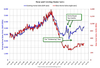
And here is another update to the "distressing gap" graph that I first started posting several years ago to show the emerging gap caused by distressed sales. Now I'm looking for the gap to close over the next few years.

Following the housing bubble and bust, the "distressing gap" appeared mostly because of distressed sales.
I expect existing home sales to mostly move sideways (distressed sales will continue to decline and be somewhat offset by more conventional / equity sales). And I expect this gap to slowly close, mostly from an increase in new home sales.
Note: Existing home sales are counted when transactions are closed, and new home sales are counted when contracts are signed. So the timing of sales is different.
New Home Sales at 458,000 Annual Rate in October
by Calculated Risk on 11/26/2014 10:00:00 AM
The Census Bureau reports New Home Sales in October were at a seasonally adjusted annual rate (SAAR) of 458 thousand.
September sales were revised down from 467 thousand to 455 thousand, and August sales were revised down from 466 thousand to 453 thousand.
"Sales of new single-family houses in October 2014 were at a seasonally adjusted annual rate of 458,000, according to estimates released jointly today by the U.S. Census Bureau and the Department of Housing and Urban Development. This is 0.7 percent above the revised September rate of 455,000 and is 1.8 percent above the October 2013 estimate of 450,000."
 Click on graph for larger image.
The first graph shows New Home Sales vs. recessions since 1963. The dashed line is the current sales rate.
Even with the increase in sales over the previous two years, new home sales are still close to the bottom for previous recessions.
The second graph shows New Home Months of Supply.
 The months of supply increased in October to 5.6 months from 5.5 months in September.
 The all time record was 12.1 months of supply in January 2009.
This is now in the normal range (less than 6 months supply is normal).
"The seasonally adjusted estimate of new houses for sale at the end of October was 212,000. This represents a supply of 5.6 months at the current sales rate."
 On inventory, according to the Census Bureau:
 "A house is considered for sale when a permit to build has been issued in permit-issuing places or work has begun on the footings or foundation in nonpermit areas and a sales contract has not been signed nor a deposit accepted."Starting in 1973 the Census Bureau broke this down into three categories: Not Started, Under Construction, and Completed.
The third graph shows the three categories of inventory starting in 1973.
The inventory of completed homes for sale is still low, and the combined total of completed and under construction is also low.
 The last graph shows sales NSA (monthly sales, not seasonally adjusted annual rate).
In October 2014 (red column), 37 thousand new homes were sold (NSA). Last year 36 thousand homes were sold in October. This was the best October since 2007.
The high for October was 105 thousand in 2005, and the low for October was 23 thousand in 2010.
This was below expectations of 470,000 sales in October, and there were downward revisions to sales in July, August and September.
I'll have more later today.
Personal Income increased 0.2% in October, Spending increased 0.2%
by Calculated Risk on 11/26/2014 08:48:00 AM
The BEA released the Personal Income and Outlays report for October:
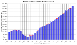
Personal income increased $32.9 billion, or 0.2 percent ... in October, according to the Bureau of Economic Analysis. Personal consumption expenditures (PCE) increased $27.3 billion, or 0.2 percent.The following graph shows real Personal Consumption Expenditures (PCE) through October 2014 (2009 dollars). Note that the y-axis doesn't start at zero to better show the change.
...
Real PCE -- PCE adjusted to remove price changes -- increased 0.2 percent in October, in contrast to a decrease of less than 0.1 percent in September. ... The price index for PCE increased 0.1 percent in October, the same increase as in September. The PCE price index, excluding food and energy, increased 0.2 percent in October, compared with an increase of 0.1 percent in September.
 Click on graph for larger image.
The dashed red lines are the quarterly levels for real PCE.
The increase in personal income was lower than expected, Also the increase in PCE was below the 0.3% consensus, however that consensus was prior to the upward revisions to August and September PCE in the GDP report. It looks like PCE is off to a decent start to Q4.
On inflation: The PCE price index increased 1.4 percent year-over-year, and at a 0.7% annualized rate in October. The core PCE price index (excluding food and energy) increased 1.6 percent year-over-year in October, and at a 2.2% annualized rate in October.
Weekly Initial Unemployment Claims increased to 313,000
by Calculated Risk on 11/26/2014 08:30:00 AM
The DOL reported:
In the week ending November 22, the advance figure for seasonally adjusted initial claims was 313,000, an increase of 21,000 from the previous week's revised level. The previous week's level was revised up by 1,000 from 291,000 to 292,000. The 4-week moving average was 294,000, an increase of 6,250 from the previous week's revised average. The previous week's average was revised up by 250 from 287,500 to 287,750.The previous week was revised up to 292,000
There were no special factors impacting this week's initial claims
The following graph shows the 4-week moving average of weekly claims since January 1971.
 Click on graph for larger image.
The dashed line on the graph is the current 4-week average. The four-week average of weekly unemployment claims increased to 294,000.
This was higher than the consensus forecast of 288,000, but the level suggests few layoffs.


