by Calculated Risk on 10/24/2014 12:31:00 PM
Friday, October 24, 2014
Comments on September New Home Sales
The new home sales report for September was slightly above expectations at 467 thousand on a seasonally adjusted annual rate basis (SAAR). With the downward revision to August sales, sales for September were at the the highest sales rate since July 2008.
Sales for the previous three months (June, July and August) were revised down.
Earlier: New Home Sales increased slightly to 467,000 Annual Rate in September
The Census Bureau reported that new home sales this year, through September, were 338,000, Not seasonally adjusted (NSA). That is up 2.4% from 330,000 during the same period of 2013 (NSA). Not much of a gain from last year. Right now it looks like sales will barely be up this year (maybe 3% or so for the year).
Sales were up 17.0% year-over-year in September - however sales declined sharply in Q3 2013 as mortgage rates increased - so this was an easy comparison. The comparisons for Q4 will be more difficult.

This graph shows new home sales for 2013 and 2014 by month (Seasonally Adjusted Annual Rate).
The year-over-year gain will probably be smaller in Q4, but I expect sales to be up for the quarter and for the year.
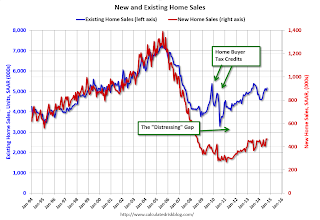
And here is another update to the "distressing gap" graph that I first started posting several years ago to show the emerging gap caused by distressed sales. Now I'm looking for the gap to close over the next few years.

Following the housing bubble and bust, the "distressing gap" appeared mostly because of distressed sales.
I expect existing home sales to mostly move sideways (distressed sales will continue to decline and be somewhat offset by more conventional / equity sales). And I expect this gap to slowly close, mostly from an increase in new home sales.
Note: Existing home sales are counted when transactions are closed, and new home sales are counted when contracts are signed. So the timing of sales is different.
New Home Sales increased slightly to 467,000 Annual Rate in September
by Calculated Risk on 10/24/2014 10:00:00 AM
The Census Bureau reports New Home Sales in September were at a seasonally adjusted annual rate (SAAR) of 467 thousand.
August sales were revised down from 504 thousand to 466 thousand, and July sales were revised down from 427 thousand to 404 thousand.
"Sales of new single-family houses in September 2014 were at a seasonally adjusted annual rate of 467,000, according to estimates released jointly today by the U.S. Census Bureau and the Department of Housing and Urban Development. This is 0.2 percent above the revised August rate of 466,000 and is 17.0 percent above the September 2013 estimate of 399,000."
 Click on graph for larger image.
The first graph shows New Home Sales vs. recessions since 1963. The dashed line is the current sales rate.
Even with the increase in sales over the previous two years, new home sales are still close to the bottom for previous recessions.
The second graph shows New Home Months of Supply.
 The months of supply was unchanged in September at 5.3 months.
 The all time record was 12.1 months of supply in January 2009.
This is now in the normal range (less than 6 months supply is normal).
"The seasonally adjusted estimate of new houses for sale at the end of September was 207,000. This represents a supply of 5.3 months at the current sales rate."
 On inventory, according to the Census Bureau:
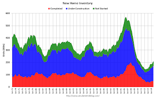
 "A house is considered for sale when a permit to build has been issued in permit-issuing places or work has begun on the footings or foundation in nonpermit areas and a sales contract has not been signed nor a deposit accepted."Starting in 1973 the Census Bureau broke this down into three categories: Not Started, Under Construction, and Completed.
The third graph shows the three categories of inventory starting in 1973.
The inventory of completed homes for sale is still low, and the combined total of completed and under construction is also low.
 The last graph shows sales NSA (monthly sales, not seasonally adjusted annual rate).
In September 2014 (red column), 38 thousand new homes were sold (NSA). Last year 31 thousand homes were sold in September. This was the best September since 2007.
The high for September was 99 thousand in 2005, and the low for September was 24 thousand in 2011.
This was close to expectations of 460,000 sales in September, although there were downward revisions to sales in June, July and August.
I'll have more later today.
Black Knight: Mortgage Delinquencies decreased in September
by Calculated Risk on 10/24/2014 08:01:00 AM
According to Black Knight's First Look report for September, the percent of loans delinquent decreased in September compared to August, and declined by 12% year-over-year.
Also the percent of loans in the foreclosure process declined further in September and were down 33% over the last year. Foreclosure inventory was at the lowest level since February 2008.
Black Knight reported the U.S. mortgage delinquency rate (loans 30 or more days past due, but not in foreclosure) was 5.67% in September, down from 5.90% in August. The normal rate for delinquencies is around 4.5% to 5%.
The percent of loans in the foreclosure process declined to 1.76% in September from 1.80% in August.
The number of delinquent properties, but not in foreclosure, is down 388,000 properties year-over-year, and the number of properties in the foreclosure process is down 435,000 properties year-over-year.
Black Knight will release the complete mortgage monitor for September in early November.
| Black Knight: Percent Loans Delinquent and in Foreclosure Process | ||||
|---|---|---|---|---|
| Sept 2014 | Aug 2014 | Sept 2013 | Sept 2012 | |
| Delinquent | 5.67% | 5.90% | 6.46% | 7.40% |
| In Foreclosure | 1.76% | 1.80% | 2.63% | 3.87% |
| Number of properties: | ||||
| Number of properties that are 30 or more, and less than 90 days past due, but not in foreclosure: | 1,760,000 | 1,852,000 | 1,935,000 | 2,170,000 |
| Number of properties that are 90 or more days delinquent, but not in foreclosure: | 1,118,000 | 1,143,000 | 1,331,000 | 1,530,000 |
| Number of properties in foreclosure pre-sale inventory: | 893,000 | 913,000 | 1,328,000 | 1,940,000 |
| Total Properties | 3,771,000 | 3,908,000 | 4,593,000 | 5,640,000 |
Thursday, October 23, 2014
Friday: New Home Sales
by Calculated Risk on 10/23/2014 09:01:00 PM
The Inland Empire comes full circle ... from the Chris Kirkham at the LA Times: Strong growth is forecast for Inland Empire
[T]he Inland Empire is now the fastest-growing region in Southern California — a trend predicted to continue over the next five years, according to an economic forecast released Thursday.I was very bearish on the Inland Empire during the housing bubble. Here is what I wrote in 2006: Housing: Inverted Reasoning?
The availability of land for development, combined with proximity to ports and major transportation corridors, has given Riverside and San Bernardino counties a growth advantage over more built-out coastal areas over the last two years. Unlike the housing bubble of the mid-2000s — when much of the Inland Empire's job growth was tied to construction and real estate — the economic recovery has been spread across a wider range of industries, such as professional services and goods distribution.
emphasis added
As the housing bubble unwinds, housing related employment will fall; and fall dramatically in areas like the Inland Empire. The more an area is dependent on housing, the larger the negative impact on the local economy will be.This time construction is only a small part of the recovery in the Inland Empire - and that is good news!
So I think some pundits have it backwards: Instead of a strong local economy keeping housing afloat, I think the bursting housing bubble will significantly impact housing dependent local economies.
Friday:
• Early, the Black Knight Financial Services' "First Look" at September Mortgage Data.
• At 10:00 AM ET, New Home Sales for September from the Census Bureau. The consensus is for a decrease in sales to 460 thousand Seasonally Adjusted Annual Rate (SAAR) in September from 504 thousand in August.
FDIC Releases Economic Scenarios for 2015 Stress Testing
by Calculated Risk on 10/23/2014 06:00:00 PM
From the FDIC: FDIC Releases Economic Scenarios for 2015 Stress Testing
The Federal Deposit Insurance Corporation (FDIC) today released the economic scenarios that will be used by certain financial institutions with total consolidated assets of more than $10 billion for stress tests required under the Dodd-Frank Wall Street Reform and Consumer Protection Act of 2010.Here is an excel spreadsheet with the scenarios.
The baseline, adverse, and severely adverse scenarios include key variables that reflect economic activity, including unemployment, exchange rates, prices, income, interest rates, and other salient aspects of the economy and financial markets.
The baseline scenario represents expectations of private sector economic forecasters. The adverse and severely adverse scenarios are not forecasts, rather, they are hypothetical scenarios designed to assess the strength and resilience of financial institutions and their ability to continue to meet the credit needs of households and businesses under stressed economic conditions.
Note: I'm not even on "recession watch", and I think the baseline is the most likely scenario for the next couple of years. However I think these regular stress tests are very helpful for regulators.
The first table is a summary of the baseline scenario (basically in line with most economic forecasts for GDP and unemployment).
| Stress Test Baseline Scenario | ||||
|---|---|---|---|---|
| GDP1 | Unemployment2 | DOW3 | House Prices3 | |
| 2014 | 2.2% | 5.9% | 6.5% | 4.1% |
| 2015 | 2.9% | 5.4% | 5.1% | 2.5% |
| 2016 | 2.9% | 5.3% | 5.3% | 3.0% |
| 2017 | 2.7% | 5.3% | 5.3% | 3.0% |
2 Unemployment is for Q4 of each year.
3 The change in the DOW and House Prices is from Q4 of the preceding year to Q4.
The second table is the adverse scenario. This is moderate recession, but a slow recovery. Under the adverse scenario, unemployment peaks at 8% in 2017. The DOW declines about 28% from peak to trough, and house prices fall 13%.
| Stress Test Adverse Scenario | ||||
|---|---|---|---|---|
| GDP1 | Unemployment2 | DOW3 | House Prices3 | |
| 2014 | 1.3% | 6.4% | 0.0% | 2.6% |
| 2015 | -0.3% | 7.6% | -16.3% | -7.7% |
| 2016 | 1.4% | 8.0% | -7.8% | -5.6% |
| 2017 | 2.0% | 8.0% | 0.1% | 0.9% |
The third table is the severely adverse scenario. This is a severe recession, but a fairly quick recovery. Under the severely adverse scenario, unemployment peaks at 10.1% in 2016. The DOW declines about 58% and house prices fall 25%.
| Stress Test Severely Adverse Scenario | ||||
|---|---|---|---|---|
| GDP1 | Unemployment2 | DOW3 | House Prices3 | |
| 2014 | 0.4% | 6.9% | -11.7% | 1.9% |
| 2015 | -3.7% | 9.9% | -49.8% | -14.9% |
| 2016 | 2.1% | 9.9% | 33.9% | -11.0% |
| 2017 | 3.9% | 9.1% | 43.1% | 2.0% |


