by Calculated Risk on 8/19/2014 03:16:00 PM
Tuesday, August 19, 2014
Early Look at 2015 Cost-Of-Living Adjustments and Maximum Contribution Base
The BLS reported this morning:
The Consumer Price Index for Urban Wage Earners and Clerical Workers (CPI-W) increased 1.9 percent over the last 12 months to an index level of 234.525 (1982-84=100). For the month, the index fell 0.1 percent prior to seasonal adjustment.CPI-W is the index that is used to calculate the Cost-Of-Living Adjustments (COLA). The calculation dates have changed over time (see Cost-of-Living Adjustments), but the current calculation uses the average CPI-W for the three months in Q3 (July, August, September) and compares to the average for the highest previous average of Q3 months. Note: this is not the headline CPI-U, and is not seasonally adjusted (NSA).
Since the highest Q3 average was last year (Q3 2013), at 230.327, we only have to compare to last year.
 Click on graph for larger image.
This graph shows CPI-W since January 2000. The red lines are the Q3 average of CPI-W for each year.
Note: The year labeled for the calculation, and the adjustment is effective for December of that year (received by beneficiaries in January of the following year).
CPI-W was up 1.9% year-over-year in July, and although this is early - we need the data for August and September - my current guess is COLA will be higher than the previous two years, and will probably be close to 2% this year.
If gasoline prices continue to decline, COLA could be below 2%, but probably still higher than the previous two years (1.7% and 1.5% in 2013 and 2014).
Contribution and Benefit Base
The contribution base will be adjusted using the National Average Wage Index. This is based on a one year lag. The National Average Wage Index is not available for 2013 yet, but wages probably increased again in 2013. If wages increased the same as last year, then the contribution base next year will be increased to around $120,500 from the current $117,000.
Remember - this is an early look. What matters is average CPI-W for all three months in Q3 (July, August and September).
Key Measures Show Low Inflation in July
by Calculated Risk on 8/19/2014 12:14:00 PM
The Cleveland Fed released the median CPI and the trimmed-mean CPI this morning:
According to the Federal Reserve Bank of Cleveland, the median Consumer Price Index rose 0.1% (1.5% annualized rate) in July. The 16% trimmed-mean Consumer Price Index also increased 0.1% (1.6% annualized rate) during the month. The median CPI and 16% trimmed-mean CPI are measures of core inflation calculated by the Federal Reserve Bank of Cleveland based on data released in the Bureau of Labor Statistics' (BLS) monthly CPI report.Note: The Cleveland Fed has the median CPI details for July here.
Earlier today, the BLS reported that the seasonally adjusted CPI for all urban consumers rose 0.1% (1.1% annualized rate) in July. The CPI less food and energy increased 0.1% (1.2% annualized rate) on a seasonally adjusted basis.
 Click on graph for larger image.
This graph shows the year-over-year change for these four key measures of inflation. On a year-over-year basis, the median CPI rose 2.2%, the trimmed-mean CPI rose 1.9%, and the CPI less food and energy rose 1.9%. Core PCE is for June and increased just 1.5% year-over-year.
On a monthly basis, median CPI was at 1.5% annualized, trimmed-mean CPI was at 1.6% annualized, and core CPI increased 1.2% annualized.
On a year-over-year basis these measures suggest inflation remains at or below the Fed's target of 2%.
A few comments on July Housing Starts
by Calculated Risk on 8/19/2014 10:14:00 AM
This was a solid report for housing starts in July.
There were 585 thousand total housing starts during the first seven months of 2014 (not seasonally adjusted, NSA), up 9.1% from the 563 thousand during the same period of 2013. Single family starts are up 3%, and multi-family starts up 24%. The key weakness has been in single family starts.
Starts were up 21.7% year-over-year in July.
This solid year-over-year increase was due to a combination of more starts in July (highest this year), and an easier comparison to last year. There was a huge surge in housing starts early in 2013, and then a lull - and finally more starts at the end of the year.

This graph shows the month to month comparison between 2013 (blue) and 2014 (red).
Starts in Q1 averaged 925 thousand SAAR, and starts in Q2 averaged 997 thousand SAAR (up 8% from Q1). Q3 is off to a solid start.
This year, I expect starts to mostly increase throughout the year (Q1 will probably be the weakest quarter, and Q2 the second weakest). The comparisons will be easy for the next few months, and starts should finish the year up double digits from 2013.
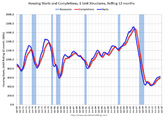
Below is an update to the graph comparing multi-family starts and completions. Since it usually takes over a year on average to complete a multi-family project, there is a lag between multi-family starts and completions. Completions are important because that is new supply added to the market, and starts are important because that is future new supply (units under construction is also important for employment).
These graphs use a 12 month rolling total for NSA starts and completions.

The rolling 12 month total for starts (blue line) has been increasing steadily, and completions (red line) are lagging behind - but completions will continue to follow starts up (completions lag starts by about 12 months).
This means there will be an increase in multi-family completions later this year and in 2015.

Single family starts had been moving up, but recently starts have been moving sideways on a rolling 12 months basis.
Note the exceptionally low level of single family starts and completions. The "wide bottom" was what I was forecasting several years ago, and now I expect several years of increasing single family starts and completions.
Housing Starts increase to 1.093 million Annual Rate in July
by Calculated Risk on 8/19/2014 08:30:00 AM
From the Census Bureau: Permits, Starts and Completions
Housing Starts:
Privately-owned housing starts in July were at a seasonally adjusted annual rate of 1,093,000. This is 15.7 percent above the revised June estimate of 945,000 and is 21.7 percent above the July 2013 rate of 898,000.
Single-family housing starts in July were at a rate of 656,000; this is 8.3 percent above the revised June figure of 606,000. The July rate for units in buildings with five units or more was 423,000.
emphasis added
Building Permits:
Privately-owned housing units authorized by building permits in July were at a seasonally adjusted annual rate of 1,052,000. This is 8.1 percent above the revised June rate of 973,000 and is 7.7 percent above the July 2013 estimate of 977,000.
Single-family authorizations in July were at a rate of 640,000; this is 0.9 percent above the revised June figure of 634,000. Authorizations of units in buildings with five units or more were at a rate of 382,000 in July.
 Click on graph for larger image.
The first graph shows single and multi-family housing starts for the last several years.
Multi-family starts (red, 2+ units) increased in July (Multi-family is volatile month-to-month).
Single-family starts (blue) also increased in July.
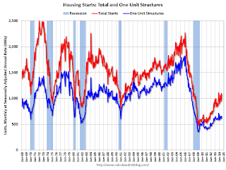
The second graph shows total and single unit starts since 1968.
 The second graph shows the huge collapse following the housing bubble, and that housing starts have been increasing after moving sideways for about two years and a half years.
 This was well above expectations of 963 thousand starts in July. Note: Starts for June were revised higher too.
This was a solid report with starts up 21.7% year-over-year in July.
Monday, August 18, 2014
Tuesday: Housing Starts, CPI
by Calculated Risk on 8/18/2014 08:45:00 PM
From Nick Timiraos at the WSJ: In Phoenix, a Realty Check as Market Moderates
Among the cities most battered by the 2006 bust, Phoenix was the first to snap back in 2011. Prices, off by 56% from peak, then rebounded sharply, trimming that drop by a third. The number of homes in some stage of foreclosure has fallen to about 4,300 homes today from more than 50,000 four years ago.The Phoenix market is slowly moving back to normal. There is still a ways to go until traditional buyers feel confident, but the sharp decline in distressed sales a clear positive.
Now, prices and sales are cooling off. Inventories of homes listed for sale have climbed to their highest level in three years while the number of houses sold in June fell 12% from a year earlier. ...
As the foreclosure boom that fueled much of the recovery fades, income and population growth are reasserting themselves as drivers of the housing market in places such as Phoenix. Meanwhile, lingering scars from the bust are playing out as some of the country's hottest housing markets struggle to pass the baton from bargain-hunting investors, who typically pay cash, to traditional buyers with mortgages.
Tuesday:
• At 8:30 AM ET, Consumer Price Index for July. The consensus is for a 0.1% increase in CPI in July and for core CPI to increase 0.2%.
• Also at 8:30 AM, Housing Starts for July. Total housing starts were at 893 thousand (SAAR) in June. Single family starts were at 575 thousand SAAR in June. The consensus is for total housing starts to increase to 963 thousand (SAAR) in July.


