by Calculated Risk on 4/21/2014 04:27:00 PM
Monday, April 21, 2014
Weekly Update: Housing Tracker Existing Home Inventory up 6.1% year-over-year on April 21st
Here is another weekly update on housing inventory ...
There is a clear seasonal pattern for inventory, with the low point for inventory in late December or early January, and then usually peaking in mid-to-late summer.
The Realtor (NAR) data is monthly and released with a lag (the most recent data was for February - March inventory data will be released tomorrow). However Ben at Housing Tracker (Department of Numbers) has provided me some weekly inventory data for the last several years.
 Click on graph for larger image.
This graph shows the Housing Tracker reported weekly inventory for the 54 metro areas for 2010, 2011, 2012, 2013 and 2014.
In 2011 and 2012, inventory only increased slightly early in the year and then declined significantly through the end of each year.
In 2013 (Blue), inventory increased for most of the year before declining seasonally during the holidays. Inventory in 2013 finished up 2.7% YoY.
Inventory in 2014 (Red) is now 6.1% above the same week in 2013.
Inventory is still very low, but this increase in inventory should slow house price increases.
Note: One of the key questions for 2014 will be: How much will inventory increase? My guess is inventory will be up 10% to 15% year-over-year by the end of 2014 (inventory would still be below normal).
Chicago Fed: "Economic Growth Moderated in March"
by Calculated Risk on 4/21/2014 01:25:00 PM
The Chicago Fed released the national activity index (a composite index of other indicators): Economic Growth Moderated in March
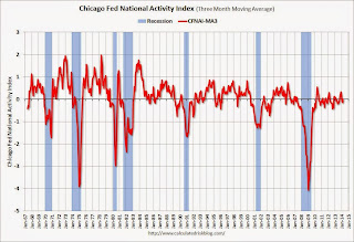
Led by declines in production-related indicators, the Chicago Fed National Activity Index (CFNAI) decreased to +0.20 in March from +0.53 in February. Two of the four broad categories of indicators that make up the index made positive contributions to the index in March, and two of the four categories decreased from February. ...This graph shows the Chicago Fed National Activity Index (three month moving average) since 1967.
The index’s three-month moving average, CFNAI-MA3, increased to a neutral reading in March from –0.14 in February, marking its third consecutive nonpositive value. March’s CFNAI-MA3 suggests that growth in national economic activity was at its historical trend. The economic growth reflected in this level of the CFNAI-MA3 suggests limited inflationary pressure from economic activity over the coming year.
emphasis added
 Click on graph for larger image.
This suggests economic activity was at the historical trend in March (using the three-month average).
According to the Chicago Fed:
What is the National Activity Index? The index is a weighted average of 85 indicators of national economic activity drawn from four broad categories of data: 1) production and income; 2) employment, unemployment, and hours; 3) personal consumption and housing; and 4) sales, orders, and inventories.
A zero value for the index indicates that the national economy is expanding at its historical trend rate of growth; negative values indicate below-average growth; and positive values indicate above-average growth.
Report: Property Tax Collections above Pre-Recession Peak
by Calculated Risk on 4/21/2014 11:22:00 AM
From Bloomberg: Property-Tax Collections Rising at Fastest Pace Since U.S. Crash
Property-tax collections nationally rose to $182.8 billion during the last three months of 2013 ... according to a U.S. Census estimate last month. That topped the previous peak four years earlier ...
In cities including San Jose, California, Nashville, Tennessee, Houston and Washington, revenue from real-estate levies has set records, or is poised to.
Local governments are using the money to hire police, increase salaries and pave roads after the decline in property values and 18-month recession that ended in 2009 forced them to eliminate about 600,000 workers ...
 Click on graph for larger image.
Here is the report from the Census Bureau: Quarterly Summary of State and Local Government Tax Revenue for 2013:Q4
This graph from the Census Bureau report shows Q4 property taxes since 2003 - and property taxes have increased slightly in Q4 2013 and are back to the pre-recession peak.
This another data point suggesting that aggregate layoffs are over at the state and local level.
DOT: Vehicle Miles Driven decreased 0.8% year-over-year in February
by Calculated Risk on 4/21/2014 09:50:00 AM
Some of this monthly decline appears weather related since miles driven were down 3.0% in the Northeast. Miles driven were up 0.4% in the West.
The Department of Transportation (DOT) reported:
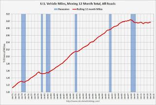
Travel on all roads and streets changed by -0.8% (-1.7 billion vehicle miles) for February 2014 as compared with February 2013.The following graph shows the rolling 12 month total vehicle miles driven.
...
Travel for the month is estimated to be 212.8 billion vehicle miles.
The rolling 12 month total is still mostly moving sideways but has started to increase a little recently.
 Click on graph for larger image.
In the early '80s, miles driven (rolling 12 months) stayed below the previous peak for 39 months.
Currently miles driven has been below the previous peak for 75 months - 6+ years - and still counting. Currently miles driven (rolling 12 months) are about 2.3% below the previous peak.
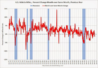
The second graph shows the year-over-year change from the same month in the previous year.
 In February 2014, gasoline averaged of $3.43 per gallon according to the EIA. that was down from February 2013 when prices averaged $3.73 per gallon.
As we've discussed, gasoline prices are just part of the story. The lack of growth in miles driven over the last 6 years is probably also due to the lingering effects of the great recession (high unemployment rate and lack of wage growth), the aging of the overall population (over 55 drivers drive fewer miles) and changing driving habits of young drivers.
With all these factors, it might take a few more years before we see a new peak in miles driven.
Sunday, April 20, 2014
Sunday Night Futures
by Calculated Risk on 4/20/2014 08:39:00 PM
An article from Tim Logan at the LA Times on a subject I've discussed with several people via email: Student debt holds back many would-be home buyers
Of the many factors holding back young home buyers — rising prices, tougher lending standards, a still-shaky job market — none looms larger than the recent explosion of college debt.Monday:
The amount owed on student loans has tripled in a decade, to nearly $1.1 trillion, according to the Federal Reserve Bank of New York. People in their 20s and 30s — often the best-educated and highest-earning among them — owe most of that tab. That is keeping a crucial segment of home buyers on the sidelines, deferring one of the traditional markers of adult success.
• At 8:30 AM ET, the Chicago Fed National Activity Index for March. This is a composite index of other data.
Weekend:
• Schedule for Week of April 20th
From CNBC: Pre-Market Data and Bloomberg futures: the S&P futures are up 3 and DOW futures are up 35 (fair value).
Oil prices are up recently with WTI futures at $104.25 per barrel and Brent at $109.53 per barrel.
Below is a graph from Gasbuddy.com for nationwide gasoline prices. Nationally prices are around $3.63 per gallon (up sharply over the last ten weeks and more than 10 cents above the level of a year ago). If you click on "show crude oil prices", the graph displays oil prices for WTI, not Brent; gasoline prices in most of the U.S. are impacted more by Brent prices.
| Orange County Historical Gas Price Charts Provided by GasBuddy.com |


