by Calculated Risk on 6/25/2013 12:10:00 PM
Tuesday, June 25, 2013
A few comments on House Prices and New Home Sales
First on house prices, Zillow's chief economist Stan Humphries wrote this morning:
“Today’s Case-Shiller numbers may reflect where the housing market has been in some of the frothier metros, but they are not indicative of where it’s headed. The housing market worm has turned over the past few weeks – inventory levels are beginning to show signs of easing, and mortgage interest rates are creeping up. Going forward, both of these factors will help mitigate extreme price spikes caused by very strong housing demand and very low housing supply,” said Zillow Chief Economist Dr. Stan Humphries. “Runaway appreciation in many of the large, coastal metros that form the backbone of the Case-Shiller indices will begin to moderate. Home value appreciation in some of these areas will have to slow down, or potentially fall, as higher bottom-line prices are no longer masked by rock-bottom mortgage rates. In general, the national housing recovery is strong and sustainable, but pockets of volatility will emerge as local fundamentals shift. Buyers expecting home values to continue rising at this pace indefinitely may be in for a shock.”I agree with Humphries view on prices. I've been tracking inventory weekly, and it appears inventory levels are starting to increase (even after seasonal adjustment). Also I've heard reports from several real estate agents that the market has "slowed" (fewer multiple offer situations), even before mortgage rates increased. I also think Humphries is correct that this will slow down price increases going forward.
emphasis added
However I don't think this will impact the ongoing recovery in residential investment (housing starts and new home sales). The new home sales report this morning was solid with sales above expectations and significant upward revisions to prior months. The key points right now are that sales are increasing and will probably continue to increase for some time.
Now that we have five months of data for 2013, one way to look at the growth rate is to use the "not seasonally adjusted" (NSA) year-to-date data. According to the Census Bureau, there were 202 thousand new homes sold in 2013 through May, up about 29% from the 156 thousand sold during the same period in 2012. That is a very solid increase in sales, and this was the highest sales for these months since 2008.
Note: For 2013, estimates are sales will increase to around 450 to 460 thousand, or an increase of around 22% to 25% on an annual basis from the 369 thousand in 2012.
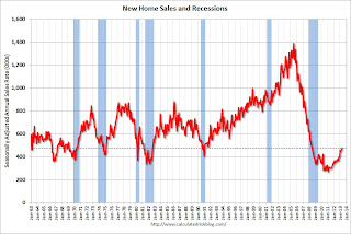
Although there has been a large increase in the sales rate, sales are just above the lows for previous recessions. This suggests significant upside over the next few years. Based on estimates of household formation and demographics, I expect sales to increase to 750 to 800 thousand over the next several years - substantially higher than the current sales rate.
And an important point worth repeating every month: Housing is historically the best leading indicator for the economy, and this is one of the reasons I think The future's so bright, I gotta wear shades.
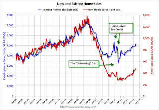
And here is another update to the "distressing gap" graph that I first started posting over four years ago to show the emerging gap caused by distressed sales. Now I'm looking for the gap to start to close over the next few years.
 Click on graph for larger image.
The "distressing gap" graph shows existing home sales (left axis) and new home sales (right axis) through May 2013. This graph starts in 1994, but the relationship has been fairly steady back to the '60s.
Following the housing bubble and bust, the "distressing gap" appeared mostly because of distressed sales. The flood of distressed sales kept existing home sales elevated, and depressed new home sales since builders weren't able to compete with the low prices of all the foreclosed properties.
I don't expect much of an increase in existing home sales (distressed sales will slowly decline and be offset by more conventional sales). But I do expect this gap to continue to close - mostly from an increase in new home sales.
 Another way to look at this is a ratio of existing to new home sales.
This ratio was fairly stable from 1994 through 2006, and then the flood of distressed sales kept the number of existing home sales elevated and depressed new home sales. (Note: This ratio was fairly stable back to the early '70s, but I only have annual data for the earlier years).
In general the ratio has been trending down, and I expect this ratio to trend down over the next several years as the number of distressed sales declines and new home sales increase.
Note: Existing home sales are counted when transactions are closed, and new home sales are counted when contracts are signed. So the timing of sales is different.
New Home Sales at 476,000 SAAR in May
by Calculated Risk on 6/25/2013 10:00:00 AM
The Census Bureau reports New Home Sales in May were at a seasonally adjusted annual rate (SAAR) of 476 thousand. This was up from 466 thousand SAAR in April (April sales were revised up from 454 thousand).
February sales were revised up from 429 thousand to 445 thousand, and March sales were revised up from 444 thousand to 451 thousand. Very strong upward revisions.
The first graph shows New Home Sales vs. recessions since 1963. The dashed line is the current sales rate.
"Sales of new single-family houses in May 2013 were at a seasonally adjusted annual rate of 476,000, according to estimates released jointly today by the U.S. Census Bureau and the Department of Housing and Urban Development. This is 2.1 percent above the revised April rate of 466,000 and is 29.0 percent above the May 2012 estimate of 369,000."
 Click on graph for larger image in graph gallery.
The second graph shows New Home Months of Supply.
The months of supply increased in May to 4.1 months from 4.0 months in April.
The all time record was 12.1 months of supply in January 2009.
 This is now in the normal range (less than 6 months supply is normal).
"The seasonally adjusted estimate of new houses for sale at the end of May was 161,000. This represents a supply of 4.1 months at the current sales rate."On inventory, according to the Census Bureau:
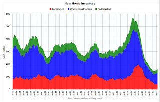
"A house is considered for sale when a permit to build has been issued in permit-issuing places or work has begun on the footings or foundation in nonpermit areas and a sales contract has not been signed nor a deposit accepted."Starting in 1973 the Census Bureau broke this down into three categories: Not Started, Under Construction, and Completed.
 This graph shows the three categories of inventory starting in 1973.
The inventory of completed homes for sale is at a record low. The combined total of completed and under construction is also just above the record low.
The last graph shows sales NSA (monthly sales, not seasonally adjusted annual rate).
In May 2013 (red column), 45 thousand new homes were sold (NSA). Last year 35 thousand homes were sold in May. The high for May was 120 thousand in 2005, and the low for May was 26 thousand in 2010.

This was above expectations of 460,000 sales in May, and a very solid report, especially with all the upward revision to previous months. I'll have more later today.
Case-Shiller: Comp 20 House Prices increased 12.1% year-over-year in April
by Calculated Risk on 6/25/2013 09:16:00 AM
S&P/Case-Shiller released the monthly Home Price Indices for April ("April" is a 3 month average of February, March and April prices).
This release includes prices for 20 individual cities, two composite indices (for 10 cities and 20 cities).
Note: Case-Shiller reports Not Seasonally Adjusted (NSA), I use the SA data for the graphs.
From S&P: Home Prices Set Record Monthly Rise in April 2013 According to the S&P/Case-Shiller Home Price Indices
Data through April 2013, released today by S&P Dow Jones Indices for its S&P/Case-Shiller1 Home Price Indices ... showed average home prices increased 11.6% and 12.1% for the 10- and 20-City Composites in the 12 months ending in April 2013. From March to April, the 10- and 20-City Composites rose 2.6% and 2.5%.
All 20 cities and both Composites showed positive year-over-year returns for at least the fourth consecutive month. Atlanta, Dallas, Detroit and Minneapolis posted their highest annual gains since the start of their respective indices. On a monthly basis, all cities with the exception of Detroit posted positive change.
“The 10- and 20-City Composites posted their highest monthly gains in the history of S&P/Case-Shiller Home Price Indices,” says David M. Blitzer, Chairman of the Index Committee at S&P Dow Jones Indices. “Thirteen cities posted monthly increases of over two percentage points, with San Francisco leading at 4.9%."
For the month of April, 19 of the 20 cities showed positive returns; Detroit was the only MSA to remain flat. Compared to March 2013, thirteen cities showed improvement with Minneapolis showing the largest change with a gain of 2.9% compared to its March return of -1.1%. California is seeing impressive returns all around with gains ranging from 3.4% to 4.9%. Los Angeles, San Diego and San Francisco posted their highest gains since 2004, 1988 and 1987, respectively. Looking at the east coast, Miami showed its largest return, 2.4%, in seven and a half years.
 Click on graph for larger image.
 The first graph shows the nominal seasonally adjusted Composite 10 and Composite 20 indices (the Composite 20 was started in January 2000).
The Composite 10 index is off 25.6% from the peak, and up 1.7% in April (SA). The Composite 10 is up 12.8% from the post bubble low set in Jan 2012 (SA).
The Composite 20 index is off 24.8% from the peak, and up 1.7% (SA) in April. The Composite 20 is up 13.5% from the post-bubble low set in Jan 2012 (SA).
 The second graph shows the Year over year change in both indices.
The Composite 10 SA is up 11.6% compared to April 2012.
The Composite 20 SA is up 12.1% compared to April 2012. This was the eleventh consecutive month with a year-over-year gain and this was the largest year-over-year gain for the Composite 20 index since 2006.
Prices increased (SA) in 20 of the 20 Case-Shiller cities in April seasonally adjusted. Prices in Las Vegas are off 52.6% from the peak, and prices in Denver and Dallas are at new highs.
This was above the consensus forecast for a 10.9% YoY increase. I'll have more on prices later.
LPS: Mortgage Delinquency Rate lowest since May 2008, Foreclosure inventories lowest since March 2009
by Calculated Risk on 6/25/2013 07:32:00 AM
According to the First Look report for May to be released today by Lender Processing Services (LPS), the percent of loans delinquent decreased in May compared to April, and declined about 12% year-over-year. Also the percent of loans in the foreclosure process declined further in May and were down almost 27% over the last year.
LPS reported the U.S. mortgage delinquency rate (loans 30 or more days past due, but not in foreclosure) decreased to 6.08% from 6.21% in April. Note: the normal rate for delinquencies is around 4.5% to 5%.
The percent of loans in the foreclosure process declined to 3.05% in May from 3.17% in April.
The number of delinquent properties, but not in foreclosure, is down about 13% year-over-year (452,000 fewer properties delinquent), and the number of properties in the foreclosure process is down 27% or 585,000 properties year-over-year.
The percent (and number) of loans 90+ days delinquent and in the foreclosure process is still high, but declining fairly quickly.
LPS will release the complete mortgage monitor for May in early July.
| LPS: Percent Loans Delinquent and in Foreclosure Process | |||
|---|---|---|---|
| May 2013 | Apr 2013 | May 2012 | |
| Delinquent | 6.08% | 6.21% | 7.20% |
| In Foreclosure | 3.05% | 3.17% | 4.12% |
| Number of properties: | |||
| Number of properties that are 30 or more, and less than 90 days past due, but not in foreclosure: | 1,708,000 | 1,717,000 | 1,924,000 |
| Number of properties that are 90 or more days delinquent, but not in foreclosure: | 1,335,000 | 1,394,000 | 1,571,000 |
| Number of properties in foreclosure pre-sale inventory: | 1,525,000 | 1,588,000 | 2,111,000 |
| Total Properties | 4,569,000 | 4,699,000 | 5,605,000 |
Monday, June 24, 2013
Tuesday: New Home Sales, Case-Shiller House Prices, Durable Goods, Consumer Confidence and more
by Calculated Risk on 6/24/2013 09:26:00 PM
Plenty of data tomorrow ...
Tuesday:
• Early: LPS "First Look" at May mortgage performance data. Expect further declines in delinquencies and foreclosures.
• At 8:30 AM ET, the Durable Goods Orders for May from the Census Bureau. The consensus is for a 3.3% increase in durable goods orders.
• At 9:00 AM, the S&P/Case-Shiller House Price Index for April. Although this is the April report, it is really a 3 month average of February, March and April. The consensus is for a 10.9% year-over-year increase in the Composite 20 index (NSA) for December. The Zillow forecast is for the Composite 20 to increase 12.1% year-over-year, and for prices to increase 1.7% month-to-month seasonally adjusted.
• Also at 9:00 AM, the FHFA House Price Index for April 2013. This was original a GSE only repeat sales, however there is also an expanded index that deserves more attention. The consensus is for a 1.2% increase.
• At 10:00 AM, the New Home Sales report for May from the Census Bureau. The consensus is for an increase in sales to 460 thousand Seasonally Adjusted Annual Rate (SAAR) in May from 454 thousand in April.
• Also at 10:00 AM, the Conference Board's consumer confidence index for June. The consensus is for the index to decrease to 75.0 from 76.2.
• Also at 10:00 AM, Richmond Fed Survey of Manufacturing Activity for June. The consensus is for a reading of 2 for this survey, up from minus 2 in May (above zero is expansion).
Existing Home Inventory is up 16.9% year-to-date on June 24th
by Calculated Risk on 6/24/2013 06:29:00 PM
Weekly Update: One of key questions for 2013 is Will Housing inventory bottom this year?. Since this is a very important question, I'm tracking inventory weekly in 2013.
There is a clear seasonal pattern for inventory, with the low point for inventory in late December or early January, and then peaking in mid-to-late summer.
The Realtor (NAR) data is monthly and released with a lag (the most recent data was for May). However Ben at Housing Tracker (Department of Numbers) has provided me some weekly inventory data for the last several years. This is displayed on the graph below as a percentage change from the first week of the year (to normalize the data).
In 2010 (blue), inventory increased more than the normal seasonal pattern, and finished the year up 7%. However in 2011 and 2012, there was only a small increase in inventory early in the year, followed by a sharp decline for the rest of the year.
 Click on graph for larger image.
Note: the data is a little weird for early 2011 (spikes down briefly).
So far in 2013, inventory is up 16.9%, and I expect further increases over the next few months.
Inventory is well above the peak percentage increases for 2011 and 2012 and this suggests to me that inventory is near the bottom. It now seems likely - at least by this measure - that inventory bottomed early this year.
It is important to remember that inventory is still very low, and is down 14.3% from the same week last year according to Housing Tracker. Once inventory starts to increase (more than seasonal), I expect price increases to slow.
Market Update
by Calculated Risk on 6/24/2013 04:56:00 PM

Click on graph for larger image.
By request - following the recent sell-off - here are a couple of stock market graphs. The first graph shows the S&P 500 since 1990 (this excludes dividends).
The dashed line is the closing price today. The market is only up 10.3% year-to-date.
The second graph (click on graph for larger image) is from Doug Short and shows the S&P 500 since the 2007 high ...
LPS: House Price Index increased 1.5% in April, Up 8.1% year-over-year
by Calculated Risk on 6/24/2013 12:30:00 PM
Notes: I follow several house price indexes (Case-Shiller, CoreLogic, LPS, Zillow, FHFA, FNC and more). The timing of different house prices indexes can be a little confusing. LPS uses April closings only (not a three month average like Case-Shiller or a weighted average like CoreLogic), excludes short sales and REOs, and is not seasonally adjusted.
From LPS: LPS' April HPI Report: Home Prices Up 1.5 Percent from March, 8.1 Percent Year-Over-Year
Lender Processing Services ... today released its latest LPS Home Price Index (HPI) report, based on April 2013 residential real estate transactions. The LPS HPI combines the company’s extensive property and loan-level databases to produce a repeat sales analysis of home prices as of their transaction dates every month for each of more than 15,500 U.S. ZIP codes. The LPS HPI represents the price of non-distressed sales by taking into account price discounts for REO and short sales.The LPS HPI is off 18.2% from the peak in June 2006. Note: The press release has data for the 20 largest states, and 40 MSAs. LPS shows prices off 47.7% from the peak in Las Vegas, 39.6% off from the peak in Riverside-San Bernardino, CA (Inland Empire), and at a new peak in Austin, Dallas and Denver! (Also, on the state level, new peaks for the Colorado and Texas).
Note: Case-Shiller for April will be released tomorrow.
Dallas Fed: Regional Manufacturing Activity "surges" in June
by Calculated Risk on 6/24/2013 10:30:00 AM
From the Dallas Fed: Texas Manufacturing Activity Surges and Outlook Improves
Texas factory activity increased sharply in June, according to business executives responding to the Texas Manufacturing Outlook Survey. The production index, a key measure of state manufacturing conditions, rose six points to 17.1, posting its highest reading in more than two years.This was above expectations of a reading of 0.0 for the general business activity index. This is the 3rd regional Fed report for June and all were above expectations and indicated expansion.
Notably stronger manufacturing activity was reflected in other survey measures as well. The new orders index climbed to 13 in June, a level not seen since July 2011. The capacity utilization index rose to a two-year high, jumping from 6.4 to 15.3. The shipments index advanced 12 points to 15.4.
Perceptions of broader business conditions rebounded strongly in June. The general business activity index rose to 6.5 after posting negative readings in April and May. The company outlook index soared 20 points to 13.3, reaching its highest level in 16 months.
Labor market indicators reflected steady labor demand and longer workweeks. The employment index was zero in June, suggesting no change in employment levels. The hours worked index moved up to 4.8 after four months in negative territory.
emphasis added
Chicago Fed: "Economic Activity slightly improved in May"
by Calculated Risk on 6/24/2013 08:38:00 AM
The Chicago Fed released the national activity index (a composite index of other indicators): Index shows economic activity slightly improved in May
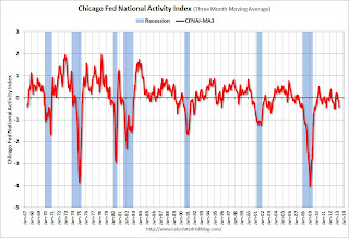
Led by improvements in production-related indicators, the Chicago Fed National Activity Index (CFNAI) increased to –0.30 in May from –0.52 in April.This graph shows the Chicago Fed National Activity Index (three month moving average) since 1967.
The index’s three-month moving average, CFNAI-MA3, decreased to –0.43 in May from –0.13 in April, marking its third consecutive reading below zero and its lowest level since October 2012. May’s CFNAI-MA3 suggests that growth in national economic activity was below its historical trend. The economic growth reflected in this level of the CFNAI-MA3 suggests subdued inflationary pressure from economic activity over the coming year.
emphasis added
 Click on graph for larger image.
This suggests economic activity was below the historical trend in May (using the three-month average).
According to the Chicago Fed:
What is the National Activity Index? The index is a weighted average of 85 indicators of national economic activity drawn from four broad categories of data: 1) production and income; 2) employment, unemployment, and hours; 3) personal consumption and housing; and 4) sales, orders, and inventories.
A zero value for the index indicates that the national economy is expanding at its historical trend rate of growth; negative values indicate below-average growth; and positive values indicate above-average growth.


