 RSS Feed
 by Calculated Risk on 3/30/2010 02:28:00 PM
Tuesday, March 30, 2010
Irish banks may require up to €32 billion
From the IrishTimes.com: Irish banks may require up to €32 billion to cover losses
Irish banks may require up to €32 billion to cover the losses from bad property loans transferred to the National Asset Management Agency (Nama), it has emerged.And all the details from the Minister for Finance.
The true scale of the “black hole” left in the sector by toxic property debt was laid bare today as Nama confirmed the initial tranche of bad loans would be acquired at a discount of 47 per cent, substantially more than the Government’s initial estimate of 30 per cent.
| Book value of amounts transferred in Tranche 1 | Price paid by NAMA for tranche 1 | Haircut | |
|---|---|---|---|
| AIB | €3.29 | €1.88 | 43% |
| BOI | €1.93 | €1.26 | 35% |
| Anglo | €10.00 | €5.00(1) | 50% |
| INBS | €0.67 | €0.28 | 58% |
| EBS | €0.14 | €0.09 | 36% |
(1) Estimate; every 1% increase in haircut reduces price paid by NAMA for
tranche 1 by €100m
Philly Fed State Coincident Indicators
by Calculated Risk on 3/30/2010 12:41:00 PM
 Click on map for larger image.
Here is a map of the three month change in the Philly Fed state coincident indicators. Twenty five states are showing declining three month activity. The index increased in 18 states, and was unchanged in 7
Here is the Philadelphia Fed state coincident index release for February.
In the past month, the indexes increased in 21 states, decreased in 22, and remained unchanged in seven for a one-month diffusion index of -2. Over the past three months, the indexes increased in 18 states, decreased in 25, and remained unchanged in seven for a three-month diffusion index of -14.
 The second graph is of the monthly Philly Fed data of the number of states with one month increasing activity. Based on this indicator, most of the U.S. was in recession in early 2008.
Although the graph shows the recession ending in July 2009 (based on other data), just over half the country was still in recession in February according to this index.
Note: this graph includes states with minor increases (the Philly Fed lists as unchanged).
Case-Shiller House Price Graphs for January
by Calculated Risk on 3/30/2010 10:44:00 AM
Finally. Every month the S&P website crashes when the Case-Shiller data is released.
IMPORTANT: These graphs are Not Seasonally Adjusted (NSA). Unfortunately this month only the NSA data is currently available. Usually I report the SA data, but that isn't available.
S&P/Case-Shiller released the monthly Home Price Indices for January (actually a 3 month average).
The monthly data includes prices for 20 individual cities, and two composite indices (10 cities and 20 cities). Click on graph for larger image in new window.
The first graph shows the nominal not seasonally adjusted Composite 10 and Composite 20 indices (the Composite 20 was started in January 2000).
The Composite 10 index is off 30.2% from the peak, and down about 0.2% in January (media reports are an increase seasonally adjusted - but that data isn't available).
The Composite 20 index is off 29.6% from the peak, and down about 0.4% in January (NSA). The second graph shows the Year over year change in both indices.
The Composite 10 is essentially flat compared to January 2009.
The Composite 20 is off 0.7% from January 2009.
The third graph shows the price declines from the peak for each city included in S&P/Case-Shiller indices. Prices decreased (NSA) in 18 of the 20 Case-Shiller cities in January NSA.
On a SA basis from the NY Times: U.S. Home Prices Prices Inch Up, but Troubles Remain
Twelve of the cities in the index went up in January from December. Los Angeles was the biggest gainer, up 1.7 percent. Chicago was the biggest loser, dropping 0.8 percent.NOTE: Usually I report the Seasonally Adjusted data (see NY Times article), but that data wasn't available. So remember these graphs are NSA.
Case-Shiller House Prices increase in January
by Calculated Risk on 3/30/2010 09:04:00 AM
From Bloomberg: Home Prices in 20 U.S. Cities Increased 0.3% in January
The S&P/Case-Shiller home-price index climbed 0.3 percent from the prior month on a seasonally adjusted basis after a similar gain in December, the group said today in New York. The gauge was down 0.7 percent from January 2009, the smallest year- over-year decrease in two years.Graphs soon (S&P site always crashes when this data is released).
...
“While we continue to see improvements in the year-over- year data for all 20 cities, the rebound in housing prices seen last fall is fading,” David Blitzer, chairman of the index committee at S&P, said in a statement.
Monday, March 29, 2010
Housing: Sales activity picking up
by Calculated Risk on 3/29/2010 10:16:00 PM
As expected, sales are picking up again (contracts must be signed before April 30th to qualify for the Federal tax credit):
From David Streitfeld at the NY Times: Spurt of Home Buying as End of Tax Credit Looms (ht Ann)
After several disastrous months for home sales across the country, when volume dropped by 23 percent, the pace appears to be picking up again. The number of Des Moines homes under contract in February rose by a third from the January level. The number of pending contracts jumped 10 percent in Naples, Fla., 14 percent in Houston and 21 percent in Portland, Ore.And unfortunately some people are calling for an extension:
These deals will be reflected in the national sales reports when they become final, this month or next. There is no evidence that prices have begun to move in response to the higher volume. Indeed, so many homes are coming on the market that prices might well fall further.
Robert Shiller, a professor of economics at Yale and co-developer of the Standard & Poor’s/Case-Shiller housing price index, is an early advocate. He thinks the credit was a bad idea that nevertheless the market cannot do without.Dr. Shiller is right that the credit was a bad idea, but he is forgetting that existing home sales add little to the economy - and encouraging new home sales with an excess supply is counterproductive.
“You don’t make drug addicts go cold turkey,” Mr. Shiller said. “The credit interferes with the market in an arbitrary way, but ending it now would be psychologically powerful. People will be in a bad mood about buying a house.” He advocates phasing it out gradually.
I am hearing from agents that sales activity is picking up in California too. But I don't expect the increase in sales to be as significant this May and June (when contracts close), as last October and November when the first tax credit was expiring.
We must remember not to mistake activity with accomplishment (to quote John Wooden). This little extra activity does nothing to reduce the overall supply.
Ireland to Report Bank Writedowns Tuesday
by Calculated Risk on 3/29/2010 07:52:00 PM
Two different perspectives, first from The Times: Ireland on the brink of full-scale bank nationalisation
The Republic of Ireland faced the prospect last night of having most of its banking system nationalised amid growing speculation that the Dublin Government would raise its stakes in both remaining private sector operators — Allied Irish Bank and Bank of Ireland.But Karl Whelan at The Irish Economy blog writes: Super Tuesday Leaks
[A] report [yesterday] that the Government’s stake in AIB would rise from 25 per cent to 70 per cent and its holding in BoI would be lifted from 16 per cent to 40 per cent.
...
With the Irish Nationwide and EBS building societies being merged and nationalised, and Anglo Irish Bank, the other large banking company, also nationalised, most of the industry would be in the State’s hands.
Ireland is the first significant Western country to be faced with the humiliation of wholesale bank nationalisation in this crisis, although the Republic took its three main banks into state ownership 18 months ago.
There is nothing new about the idea of the state potentially owning 70 percent of AIB. Even based on previous expectations for NAMA discounts, this was always a possibility. ... [I]t is hard to reconcile the continuing circulation of the same ownership statistics as before with the new information (if such it is) on discounts and also on capital levels.The world has come full circle. The main stream media screams "nationalization" and the blog keeps the numbers in perspective.
Note: NAMA is National Asset Management Agency, a "bad bank" set up by the government to take many of the distressed assets in Ireland. This was a very different approach than in the U.S.
Market and Greece Update
by Calculated Risk on 3/29/2010 04:00:00 PM
First, from the NY Times: In Crucial Test, Greece Raises $6.7 Billion in Bond Sale
The bonds, worth $6.7 billion, were priced to yield 6 percent, according to banks that managed the sale, meaning that Greece was paying a princely 3.34 percentage points above what Germany, considered the European benchmark, pays to borrow at a similar maturity. It was also well above the rates paid by governments in Portugal, Spain, Ireland and Italy, other countries whose indebtedness has caused concern.Since it is almost the end of Q1 ... here is a market update:
 Click on graph for larger image in new window.
The first graph shows the S&P 500 since 1990.
The dashed line is the closing price today. The S&P 500 was first at this level in December 1998; over 11 years ago.
The S&P 500 is up 73.4% from the bottom in 2009 (497 points), and still off 25% from the peak (392 points below the max).

The second graph is from Doug Short of dshort.com (financial planner): "Four Bad Bears".
Note that the Great Depression crash is based on the DOW; the three others are for the S&P 500.
Residential Investment Stalled
by Calculated Risk on 3/29/2010 01:37:00 PM
The BEA released an update to the underlying detail tables for Q4 today. The following graph uses the updated data for Residential Investment through Q4, and an estimate for Q1 based on housing data through February (a 10% annualized decline in residential investment).
Note: Residential Investment includes new single family structures, new multi-family structures, home improvement, brokers' commissions on sale of structures and a few minor categories. Click on graph for large image.
This graph shows total Residential Investment, and single-family structures, both as a percent of GDP.
Residential investment (RI) is one of the best leading indicators for the economy. Usually RI as percent of GDP is declining before a recession, and climbs sharply coming out of a recession.
Note: The 2001 recession was a business led recession. Some readers will notice the sharp decline in 1966 and wonder why the economy didn't slide into a recession - the answer is the rapid build-up for the Vietnam war kept the economy out of recession (not the best antidote).
But this time RI is moving sideways. This time is different.
The reason RI is moving sideways is because of the huge overhang of existing housing units (both single family and rental units). And this is one of the key reasons I think the current recovery will be sluggish and choppy - and that unemployment will stay elevated for some time.
Stated simply: One of the usual engines of recovery - residential investment - isn't contributing this time.
ATA Truck Tonnage Index declines in February
by Calculated Risk on 3/29/2010 10:56:00 AM
From the American Trucking Association: ATA Truck Tonnage Index Fell 0.5 Percent in February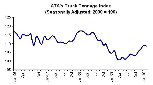 Click on graph for slightly larger image in new window.
The American Trucking Associations’ advance seasonally adjusted (SA) For-Hire Truck Tonnage Index decreased 0.5 percent in February, following a revised 1.9 percent increase in January [revised down from 3.1%]. The latest drop put the SA index at 108.5 (2000=100), down from 109.1 in January.Trucking is a coincident indicator for the economy, but the snow makes it difficult to tell about February.
...
Compared with February 2009, SA tonnage increased 2.6 percent, which was the third consecutive year-over-year gain. For the first two months of 2010, SA tonnage was up 3.5 percent compared with the same period last year. For all of 2009, the tonnage index contracted 8.7 percent, which was the largest annual decrease since 1982.
ATA Chief Economist Bob Costello said that the February tonnage reading is difficult to interpret because of the severe winter storms that impacted truck freight movements during the month, particularly on the East Coast.
...
Trucking serves as a barometer of the U.S. economy, representing nearly 69 percent of tonnage carried by all modes of domestic freight transportation, including manufactured and retail goods. Trucks hauled 10.2 billion tons of freight in 2008. Motor carriers collected $660.3 billion, or 83.1 percent of total revenue earned by all transport modes.
February Personal Income Flat, Spending Increases
by Calculated Risk on 3/29/2010 08:30:00 AM
From the BEA: Personal Income and Outlays, January 2010
Personal income increased $1.2 billion, or less than 0.1 percent ... Personal consumption expenditures (PCE) increased $34.7 billion, or 0.3 percent.Stagnant income and increased spending means the saving rate declined again ...
...
Real PCE -- PCE adjusted to remove price changes -- increased 0.3 percent in February, compared with an increase of 0.2 percent in January.
...
Personal saving -- DPI less personal outlays -- was $340.0 billion in February, compared with $374.9 billion in January. Personal saving as a percentage of disposable personal income was 3.1 percent in February, compared with 3.4 percent in January.
 Click on graph for large image.
This graph shows the saving rate starting in 1959 (using a three month trailing average for smoothing) through the February Personal Income report. The saving rate fell to 3.1% in February.
I still expect the saving rate to rise over the next couple of years - possibly to 8% or more - slowing the growth in PCE.
The following graph shows real Personal Consumption Expenditures (PCE) through February (2005 dollars). Note that the y-axis doesn't start at zero to better show the change.
 The quarterly change in PCE is based on the change from the average in one quarter, compared to the average of the preceding quarter.
The colored rectangles show the quarters, and the blue bars are the real monthly PCE.
The increase in PCE in February was fairly strong (a 3.0% annual rate over the last three months). Using the Two Month average method, this suggests PCE growth in Q1 2010 will be around 3.0%. That will be the highest growth rate since Q1 2007, however this is being driven by less saving and transfer payments - not growth in income.
The National Bureau of Economic Research (NBER) uses several measures to determine if the economy is in recession. One of the measures is real personal income less transfer payments (see NBER memo). This declined in February to $9,006.4 billion (SAAR) from $9,020.2 billion in January, and is barely above the low of September 2009 ($9,000 billion).
 This graph shows real personal income less transfer payments since 1969.
This measure of economic activity is moving sideways - similar to what happened following the 2001 recession.
To sum it up:
This is a decent report for PCE, but PCE growth is not sustainable without income growth.


